Product Photography
Context & Research
Outcomes
Create a Logo: -
For this project we have been asked to produce product photography for a fictious company called “Good Vibes”. The brief has asked me to create a logo for it and include it on a billboard campaign for the fictious company. As I have created three logos, I have created a Google Forms voting page to see which one the people thing I should use. This will go into my Primary Research Section.
Subject Research
Primary Research: -
I made a survey on Google Forms to see what my class mates thought of the logos and which one they would like me to use, as of now I have received 3 responses with 66.7% chosen option 3 out of the 33.3% who chose option 1. For me this was a good way to see what the people think of the logo and it gives me a good idea of what I should be using for this next project.
Secondary Research: -
Product Photography is a very small type of commercial photography which is used for selling products online. The aim is to clearly show the product for the people online shopping to have a better experience of viewing and to see what it would look like in real life.Usually most product photographers have to be really technical compared to other types of photographers, because the shots are taken in a studio environment with specific studio lighting. These type of photographers can get really creative with all types of props and models especially with either natural or artificial lighting.
Most product photography features show the brand and other visual featureswhich would make the shopper look at the item and buy it. The type of images that would be taken are a key factor to selling things online for the viewer.
Their are many different types of Product Photography which are usually related to different business uses, some vary in different styles.
E-Commerce Product Photography: -
As I have talked about the E-Commerce and how it works in my own blog, I will put a link into my previous article below to refresh your memory if you don’t know what it is.
E-Commerce Multi-Media Campaign — Owen Phillips Media & PhotographyThis type of Product Photography is centred around selling online and most have different styles for their shop, different shops usually have different requirements for their photography whether it is white background or a black background. These shots can easily be done by picking the colour for the background which is plain and the goal is to represent the product to the customer as if they are going to receive it. Most often white backgrounds are used as it is a very simple and bland colour. Most sites like Amazon or eBay use this type of medium.
Creative Product Photography: -
This type of product photography goes way past the plain and simple white background used and incorporates a artistic element with a background, props and even a bit of false greenery in a form of a plant etc. This type of medium is usually used for content branding, advertising and even used digitally. Most of them are used on product pages as it represents that type of product. These type of images even work well on social media platforms and throughout your online shop.
Print Product Photography: -
This type of product photography is mainly used to create a tangible marketing or advertising material, usually requires plenty of pixels to create, the image used will probably resized for many type of print product photography. It is so you can capture enough visual information to avoid any type of distortion in the printed photographs.
Lifestyle Product Photography: -
Putting the product into a contextual environment helps the shoppers imagine themselves with the product in the lives and this could potentially appeal to the customer instead of trying to focus on the features of the product. In traditional terms this is usually expensive and can include models, different locations and even assistants to help you. Another one also requires Adobe Photoshop and turn it into a stock photo which is your contextual environment, all this is called lifestyle compositions.
Food Product Photography: -
This type of product photography mainly shows food and beverage which are available to purchase, photographers who work on this type of medium work closely with a food stylist to prep the plater and make it look good to be photographed. Some images may even feature the preparation stage. They also use complex lighting techniques and complex backgrounds.
360 Degree Spin Photography: -
This is a very special type of product photography where you take a series of images and combine them together to create a GIF type of image. These type of images can give the buyer a complete look from every angle of the product. Most people usually add a few lines of code or more to make the photographs animated.
Now I am going to be moving onto the different types of lighting techniques people use when they create product photography.
”Hard light photography” is used a lot as it gives off a sharp edge shadow of the side of the item, these type of shots are usually best shot from above the item as this gives off plenty of texture enhancements and creates more contrast in the photograph.Another type of Hard light is called “Specular” which retains it’s qualities of reflectiveness. When the light shines onto the subject, it bounces off the subject into the camera. The bright spot which is the highlight of the technique appears on shiny objects when illuminated. It is very important in modern day computer graphics as they provide a strong visual cue for object shape and location.
Linking into “Specular”, “Diffused” is another type of lighting which has all of it’s reflective qualities removed, as the light hits the object, the light does not reflect any form of light back into the camera.
“Flat white photography” is softer light which is shot on non-reflective white material, it is usually white paper. A contact shadow happens when the light meets the subject, but then a softer light goes past that. All this helps give the product place. For example glasses are usually require attention as it is a see through object at one end.
“Natural light” is a technique where a window of light creates soft light coming in from one direction. This creates a long soft shadow which could be left dark or changed to be lighter. A comforting casual look uses natural light with a grey background and with messy reflections of the subject which are natural.
Practical Skills
Production Considerations: -
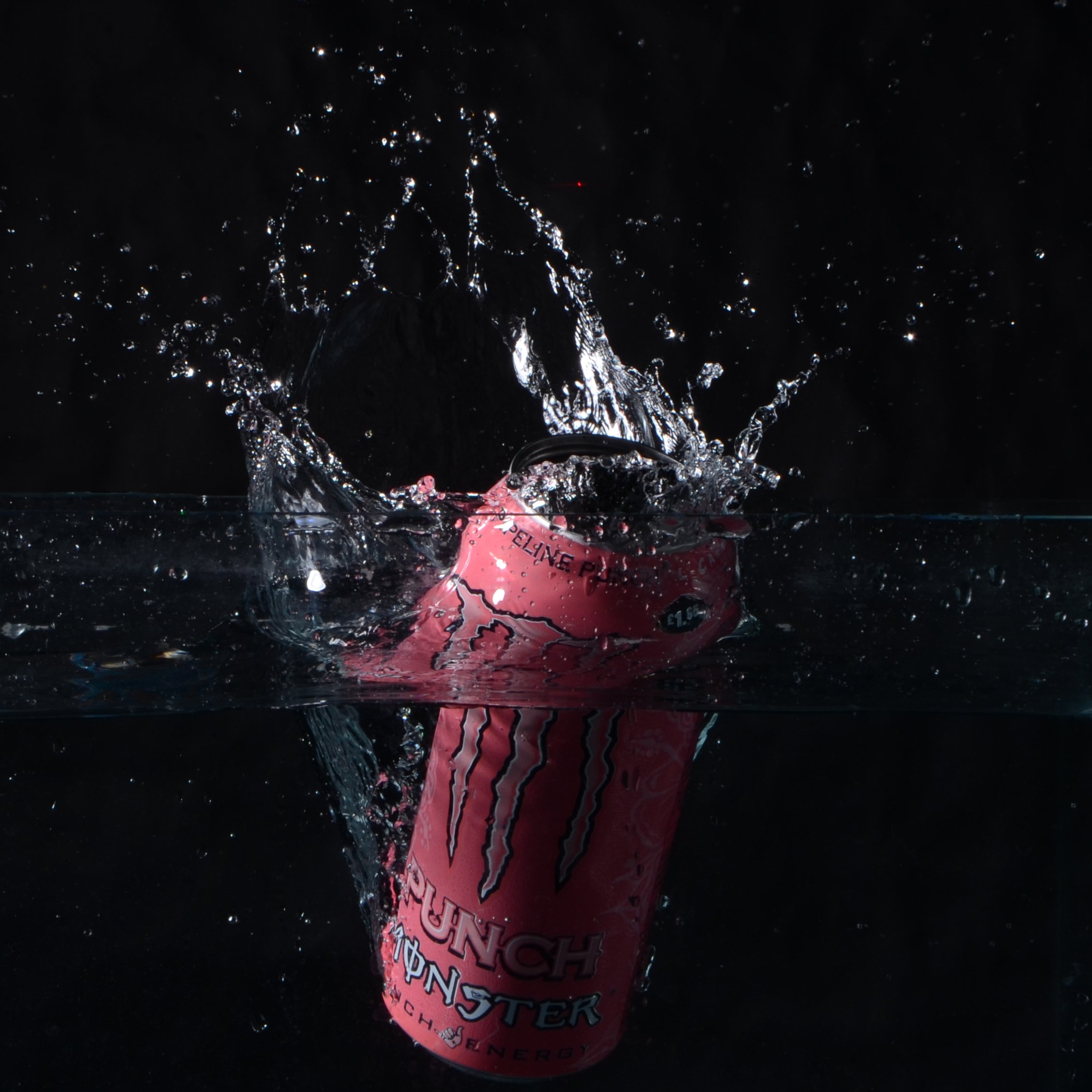
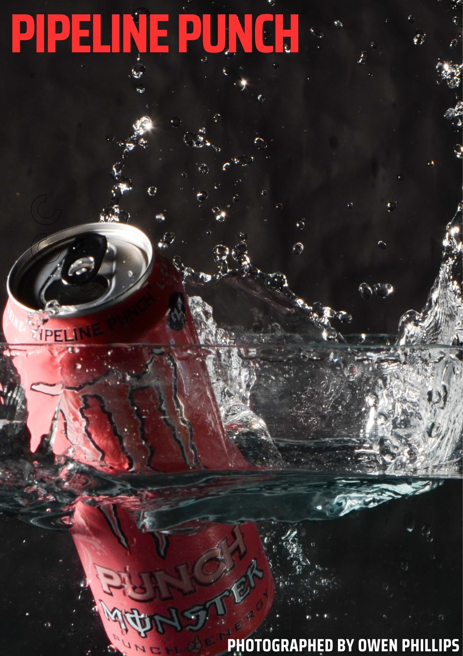
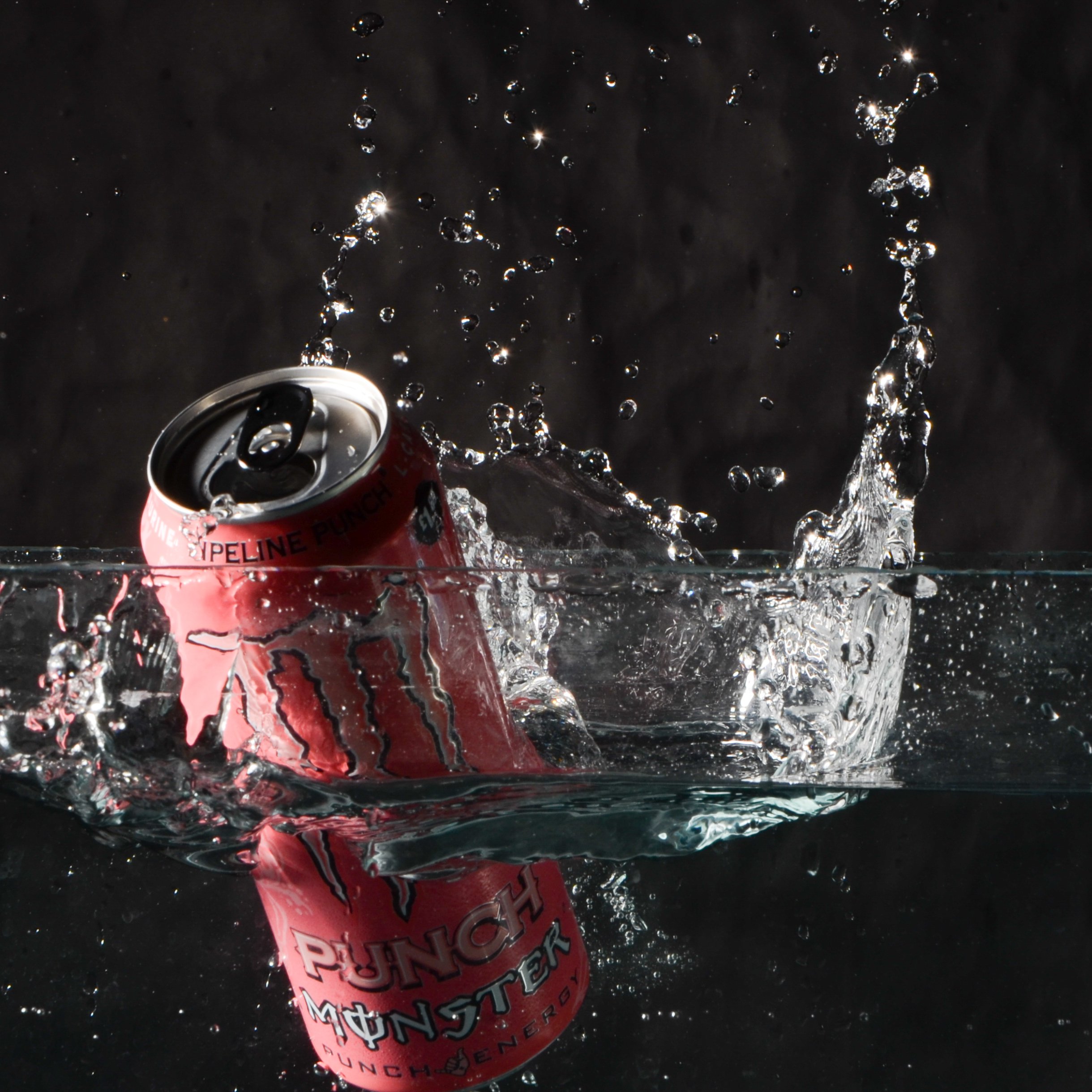
For this assignment, the ideas I want to do for my project is do some water splash photography featuring a good looking can with a funky design on it and crop it to only the can and the splash which makes the image look good as you have captured the water and the can. I will be using the laser which makes the lights flash as something is dropped passed it. I think this is a good basis to start off with as it is creative.
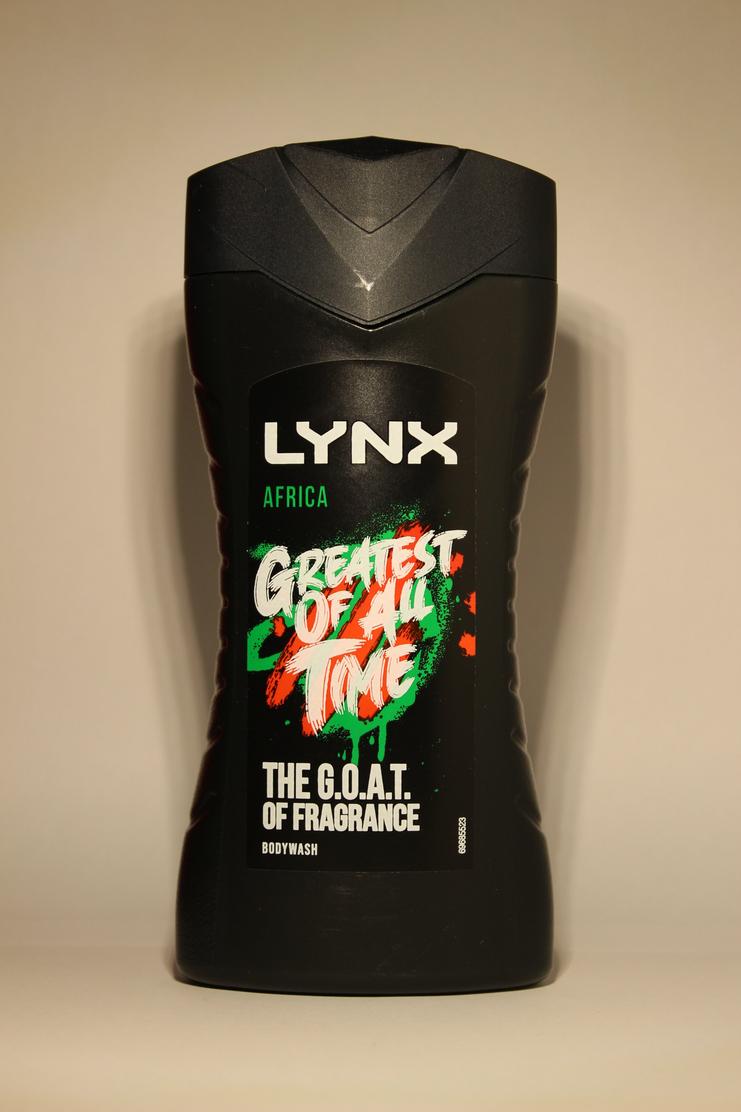
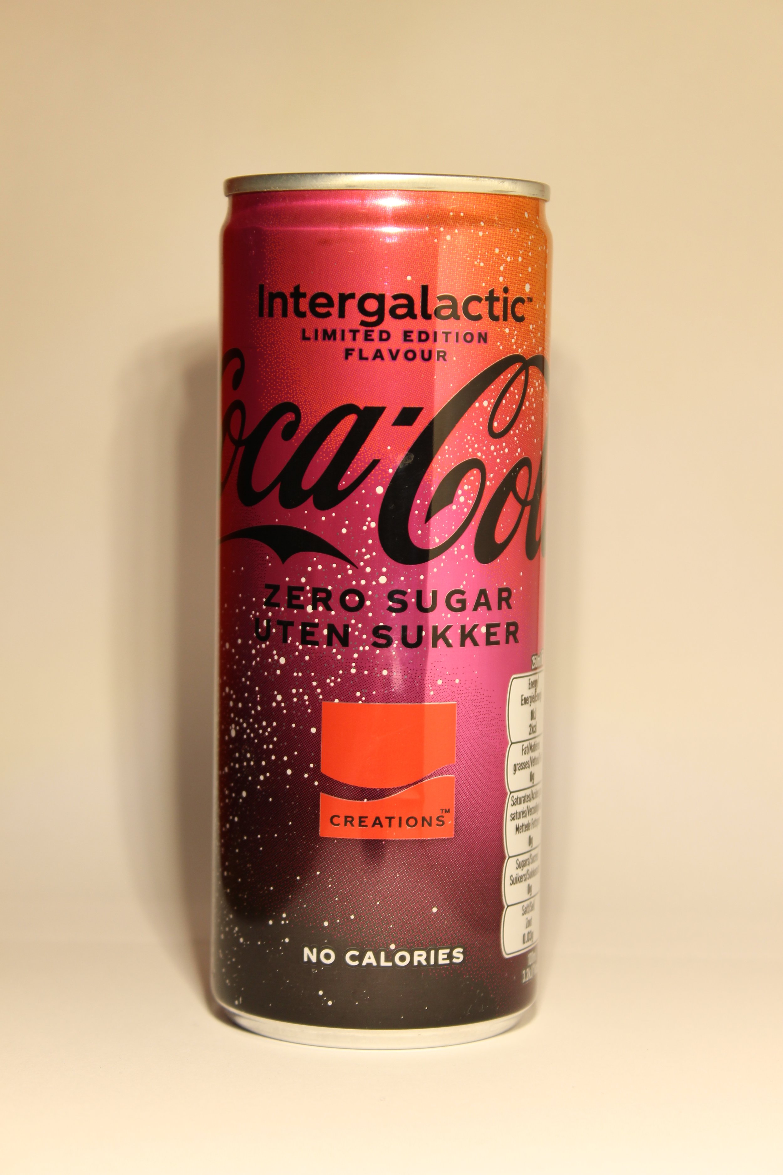
For my next set of images if this doesn’t pan out as how I want it, I will do a simple product shoot using “Hard lighting” their is no shadows from the image whatsoever and it is a dead sharp and crisp image. For this I will need a white background with something white to sit the product on top of, some sort of levitated platform (a table or stool), a tripod and a camera.
Production: -
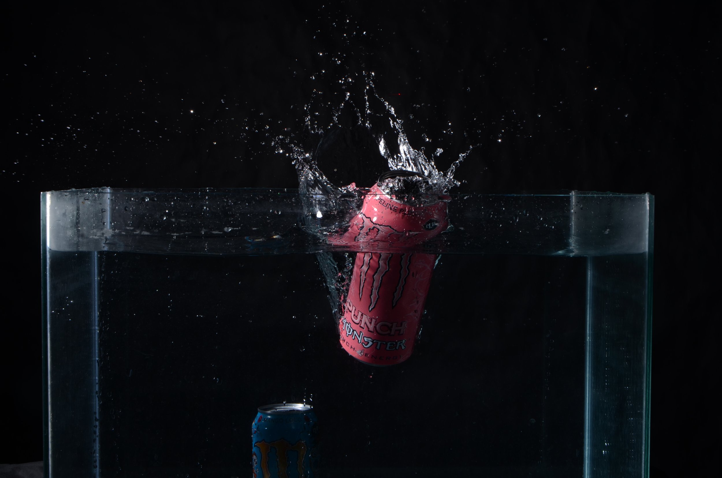
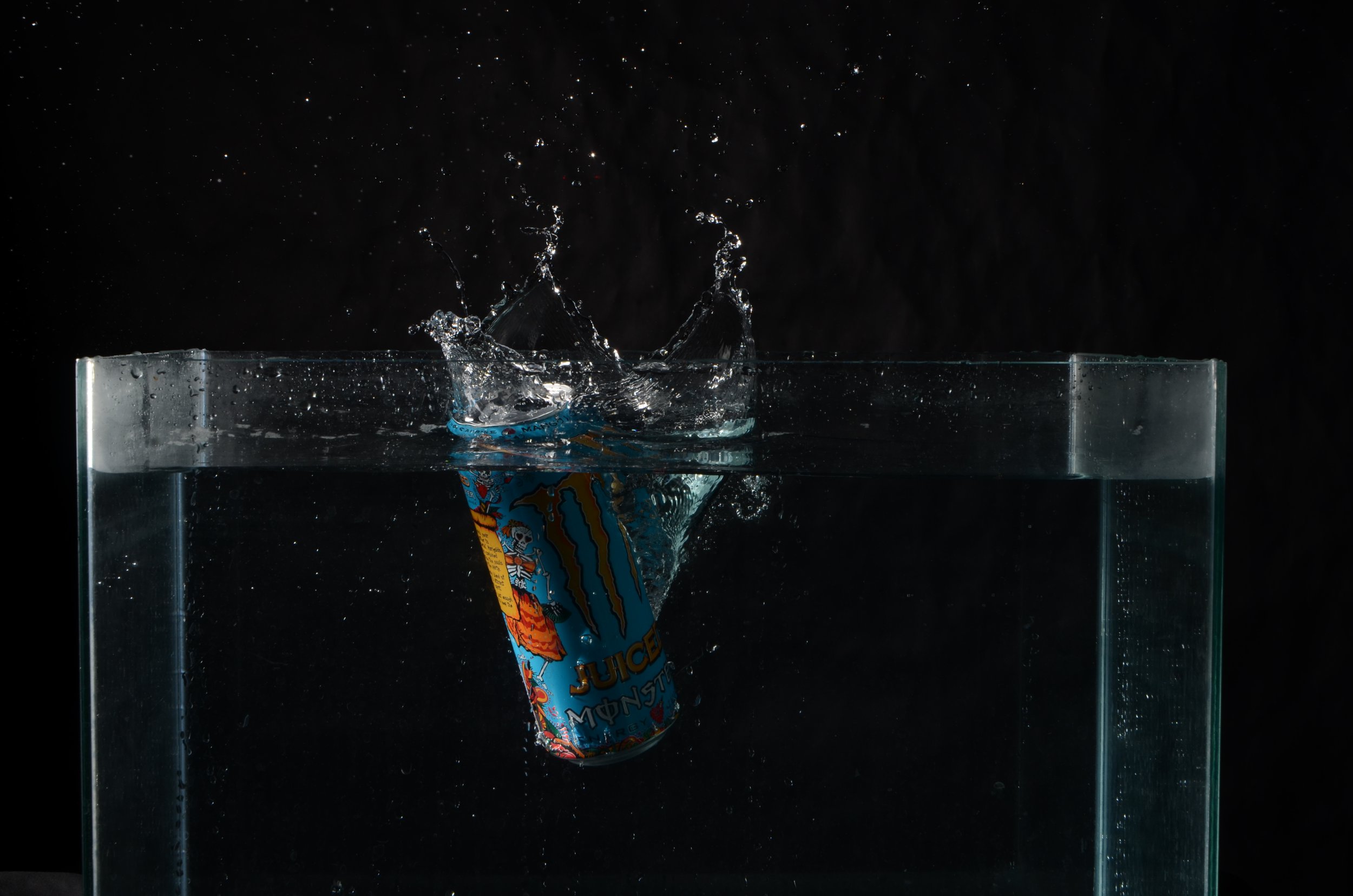
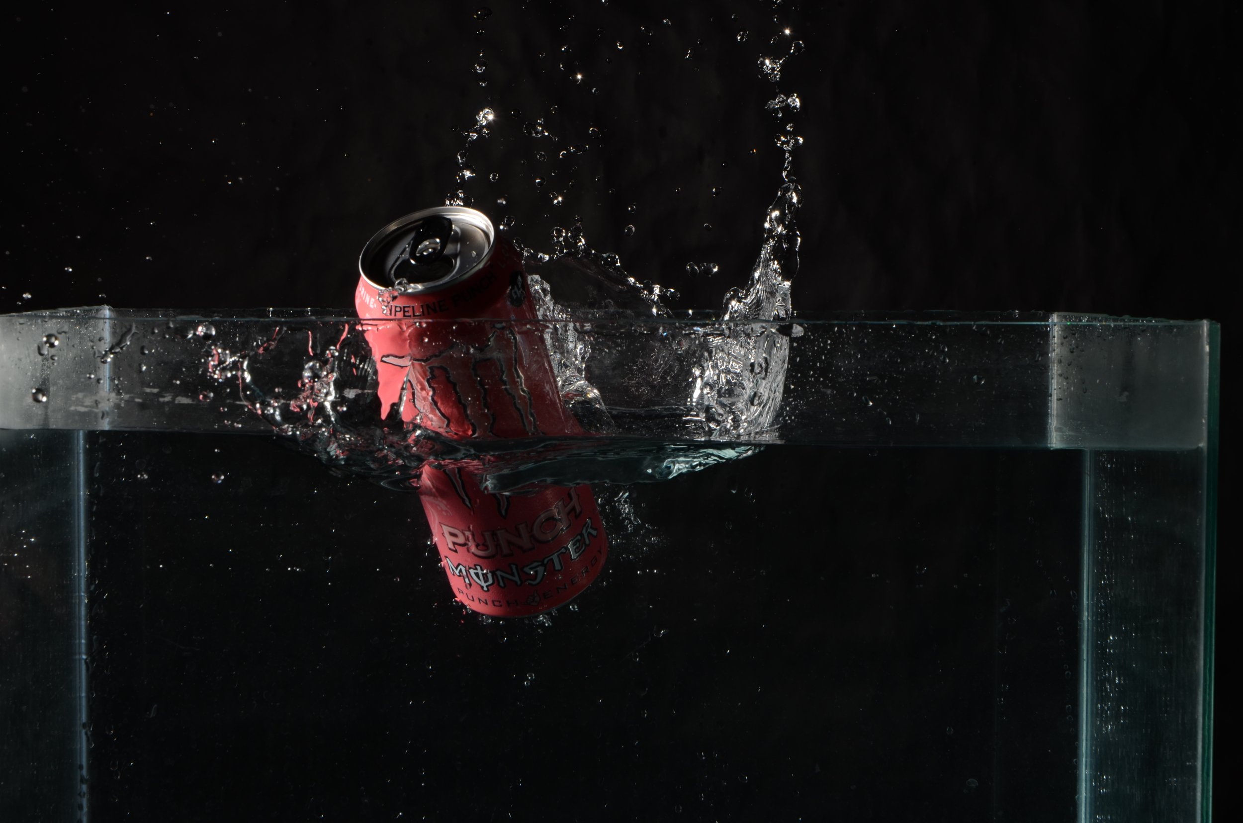
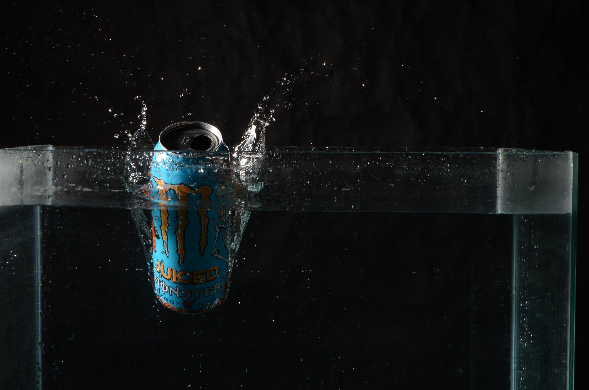
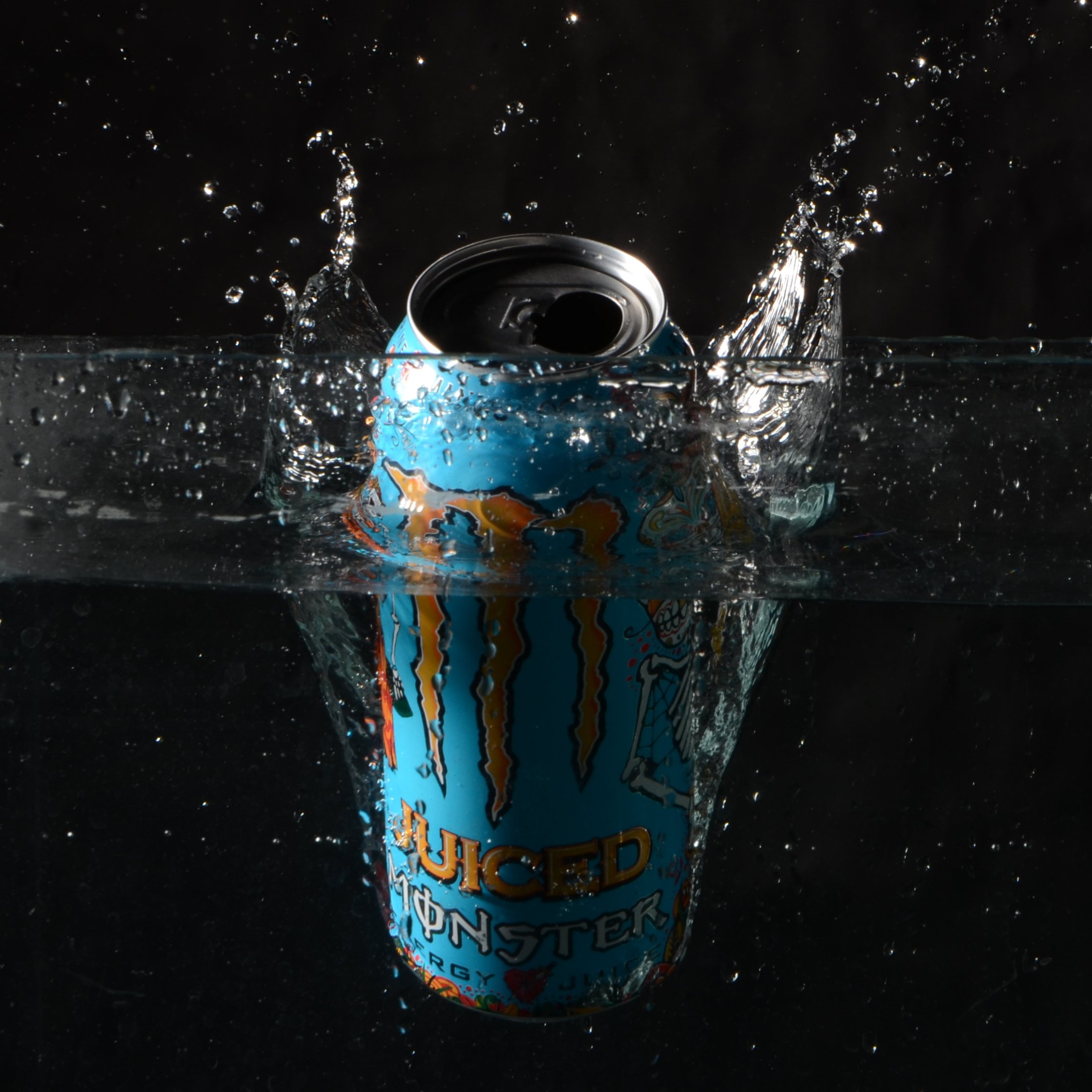
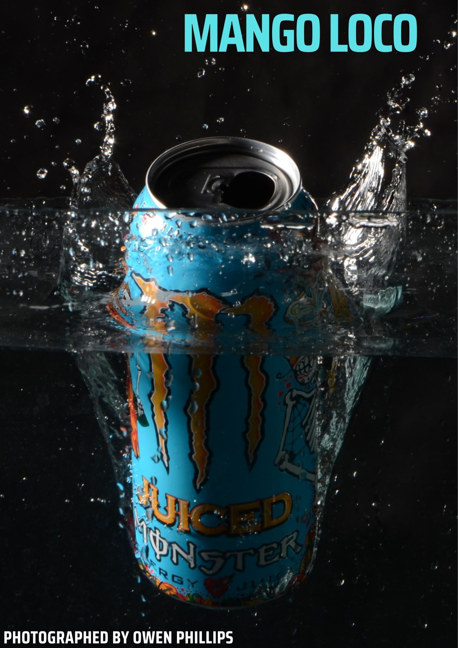
For the water splash images using the Monster cans, we used a laser which made the lights flash when we dropped the object into the fish tank full of water. I took about 21 shots and out of 4 of them were usable for this project.
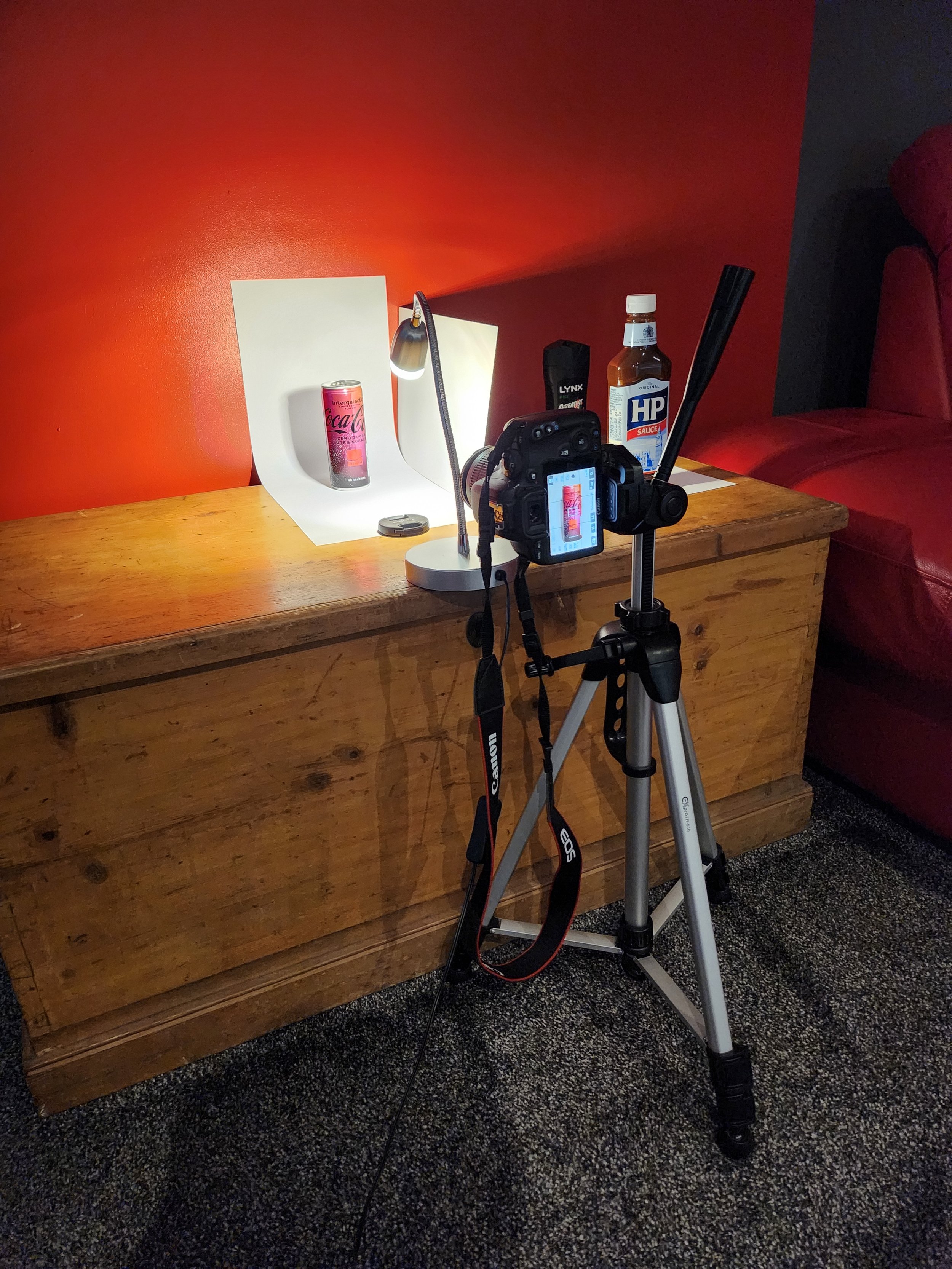
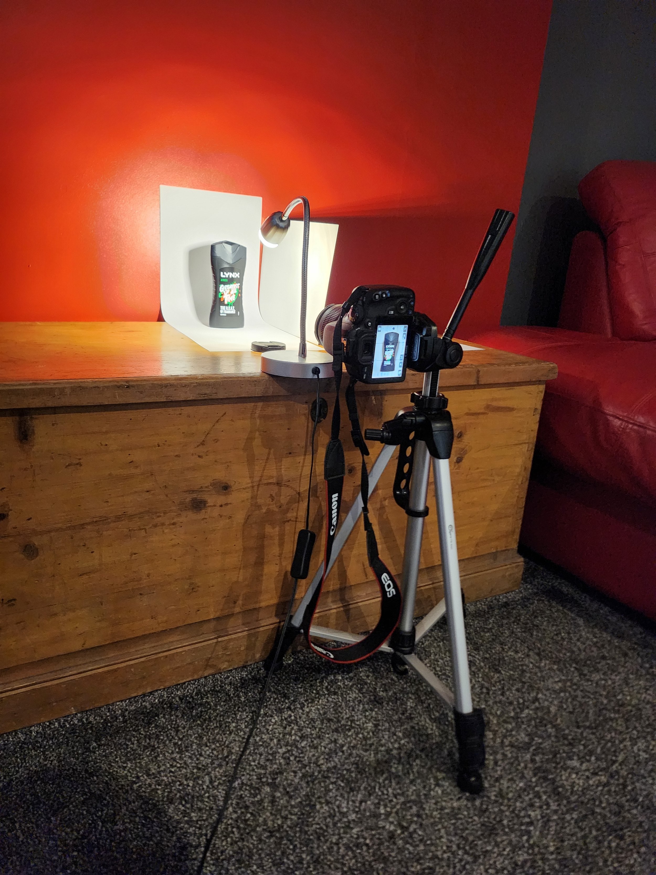
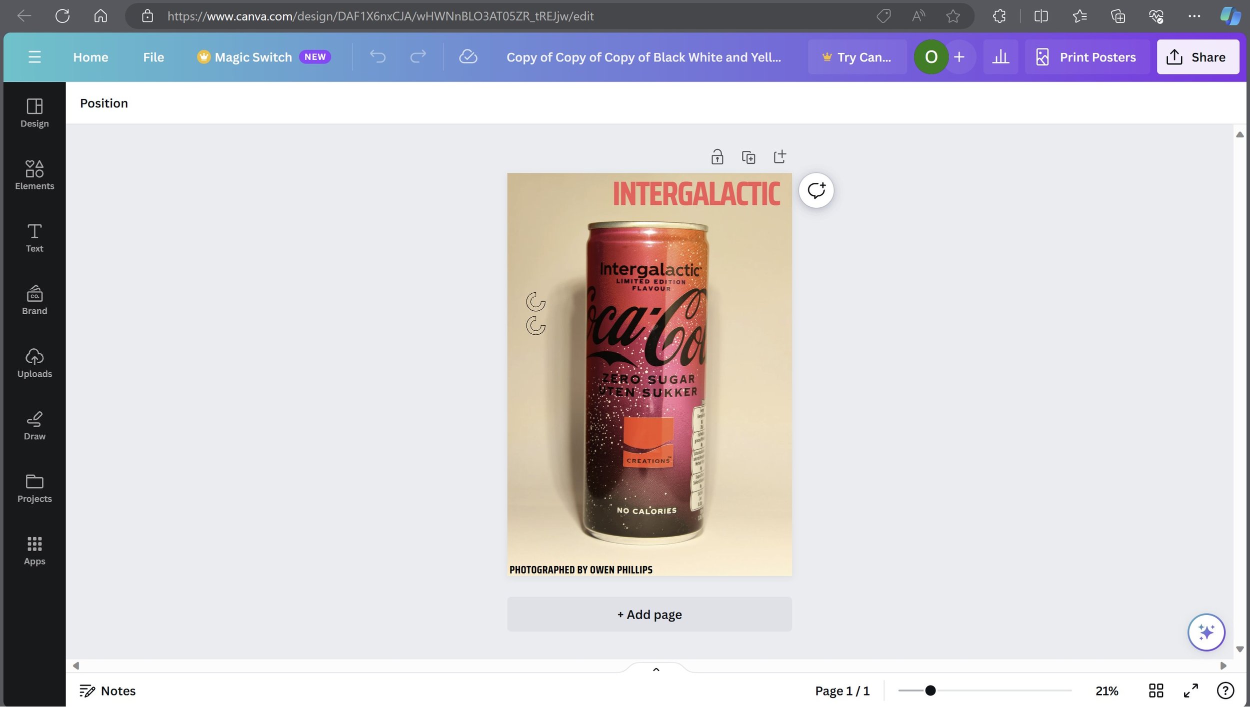
For the last two images, I will not edit them, as I think they don’t need any altering. I created a DIY setup to shoot this, I used two pieces of clean white paper, a lighting source which was a light, a tripod and Canon EOS 100d. I shot landscape as you can see. Behind the scenes for this shoot is below.
Post-Production
Edited Images: -
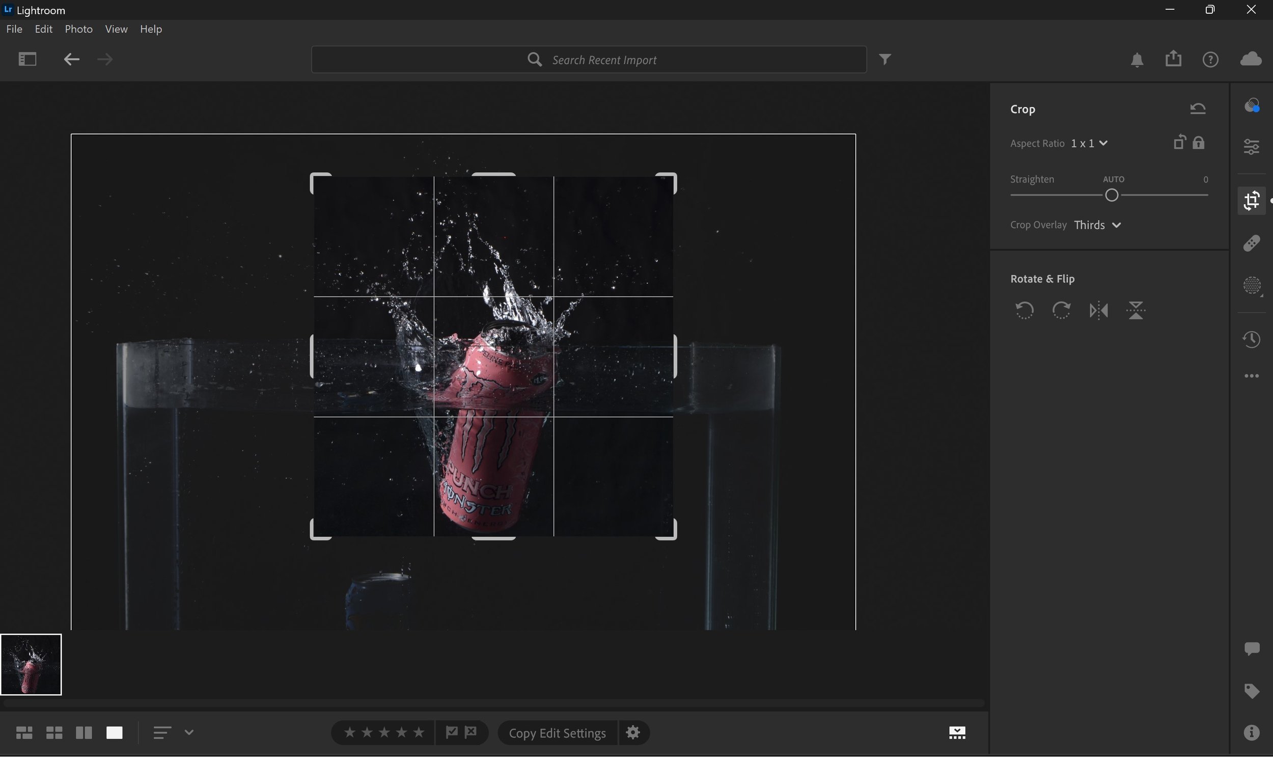
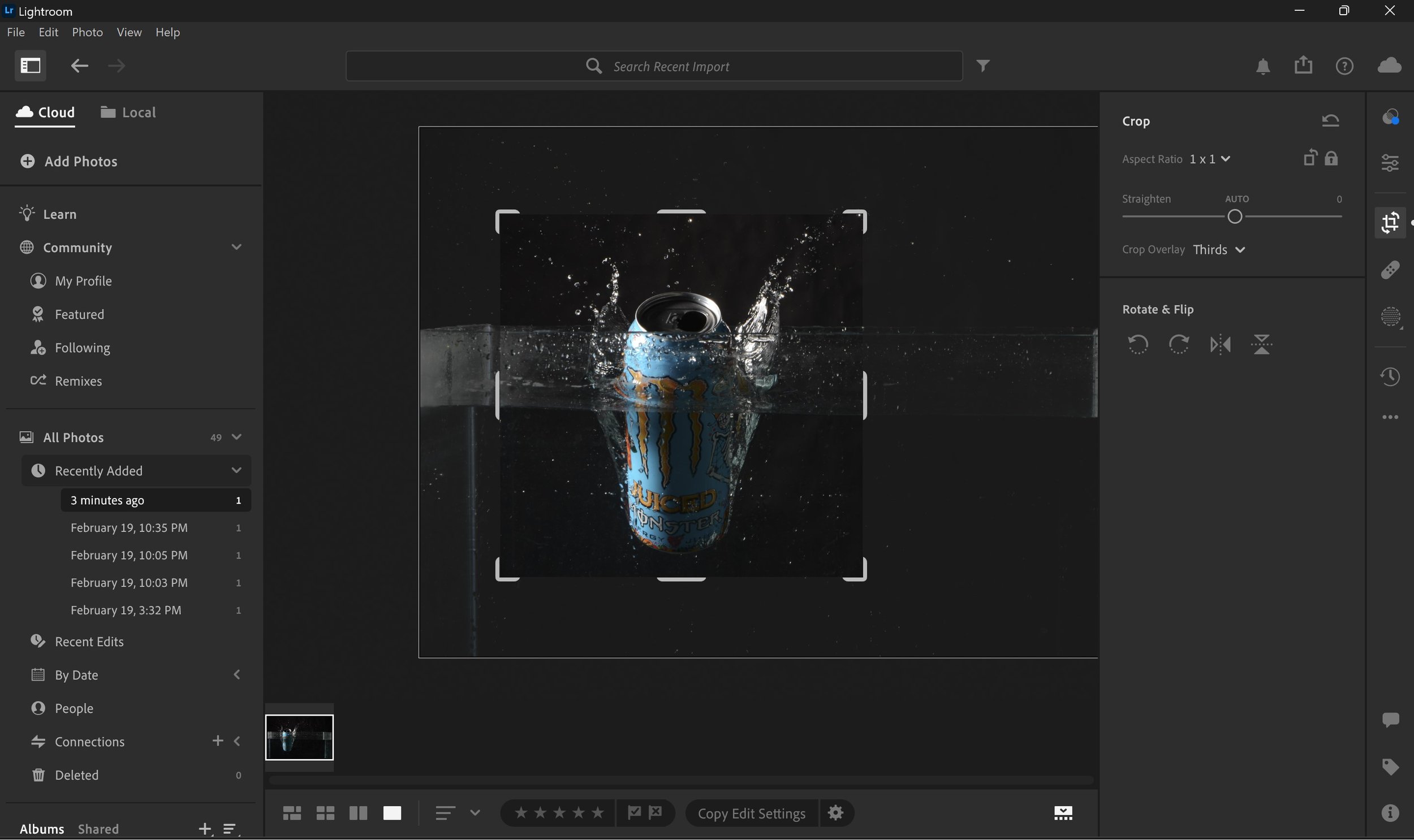
For most of the images, I have cropped them and not altered any of the exposure or contrast levels, but with this Punchline Punch Monster Energy Can I altered the Exposure as the red/pink looked too dark for my liking and effectively it brightened the image up. The software used is Adobe Lightroom.
As you can see with these two images above, I have cropped the image using the square crop to only catch the action in the images, like the water splash and the can itself. There was no alterations the levels to these images whatsoever. The software used is Adobe Lightroom.
Advertising Posters & Billboard Designing: -
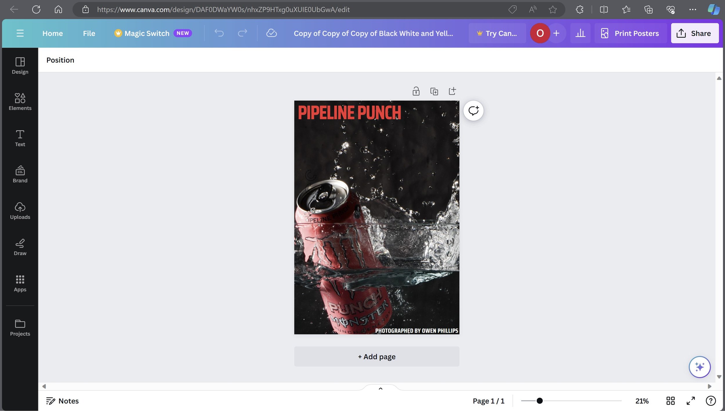
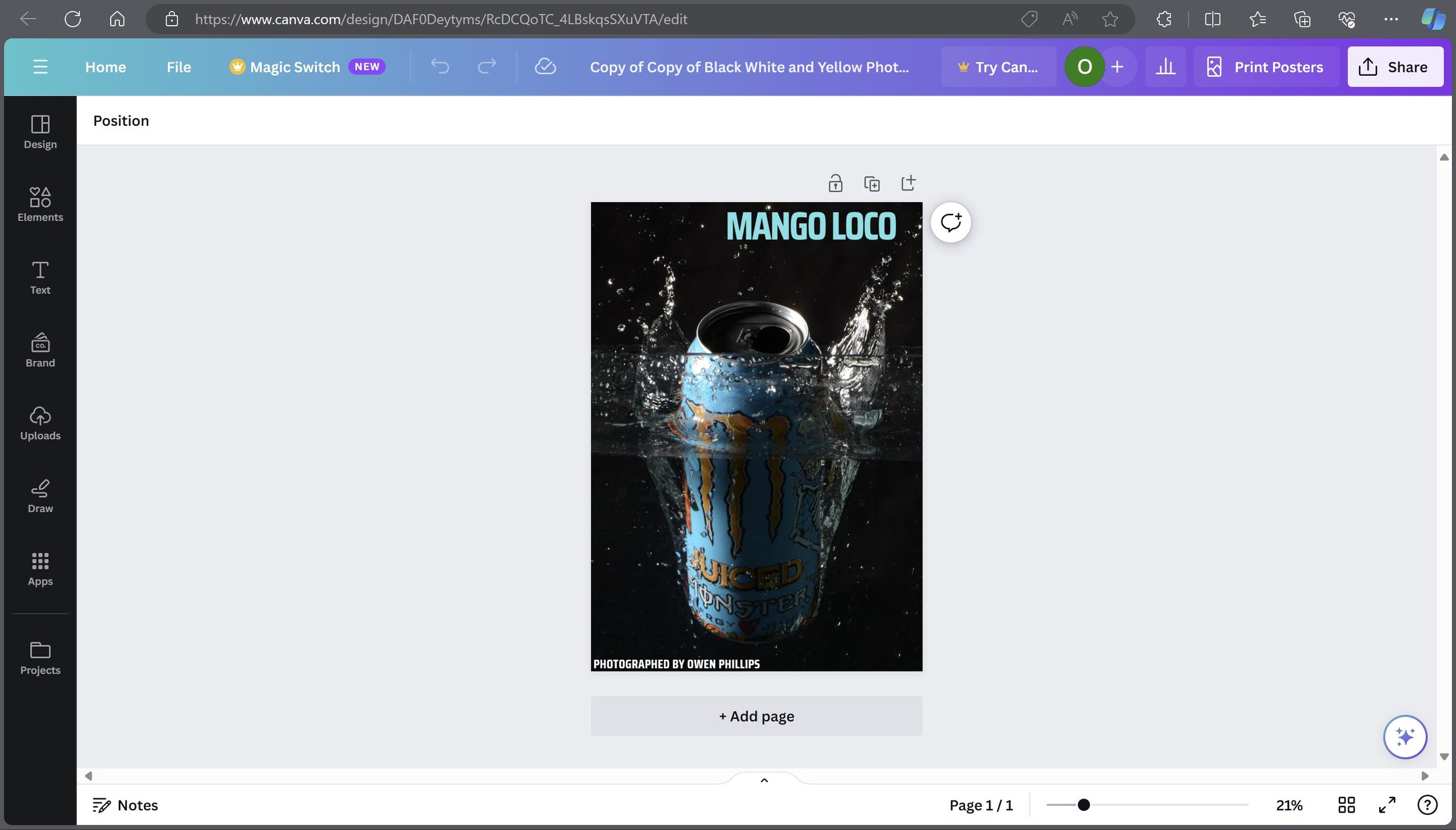
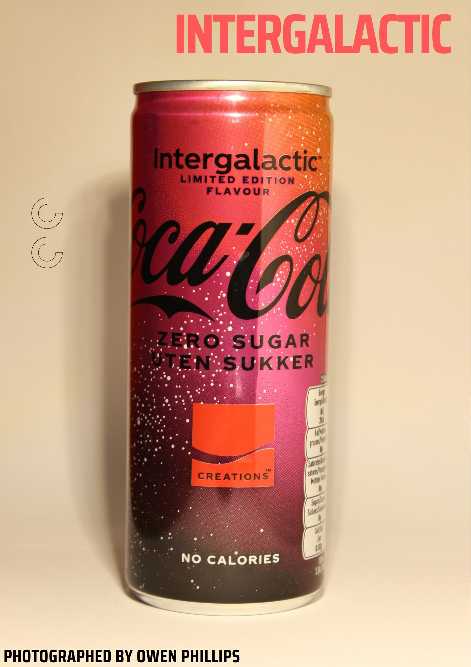
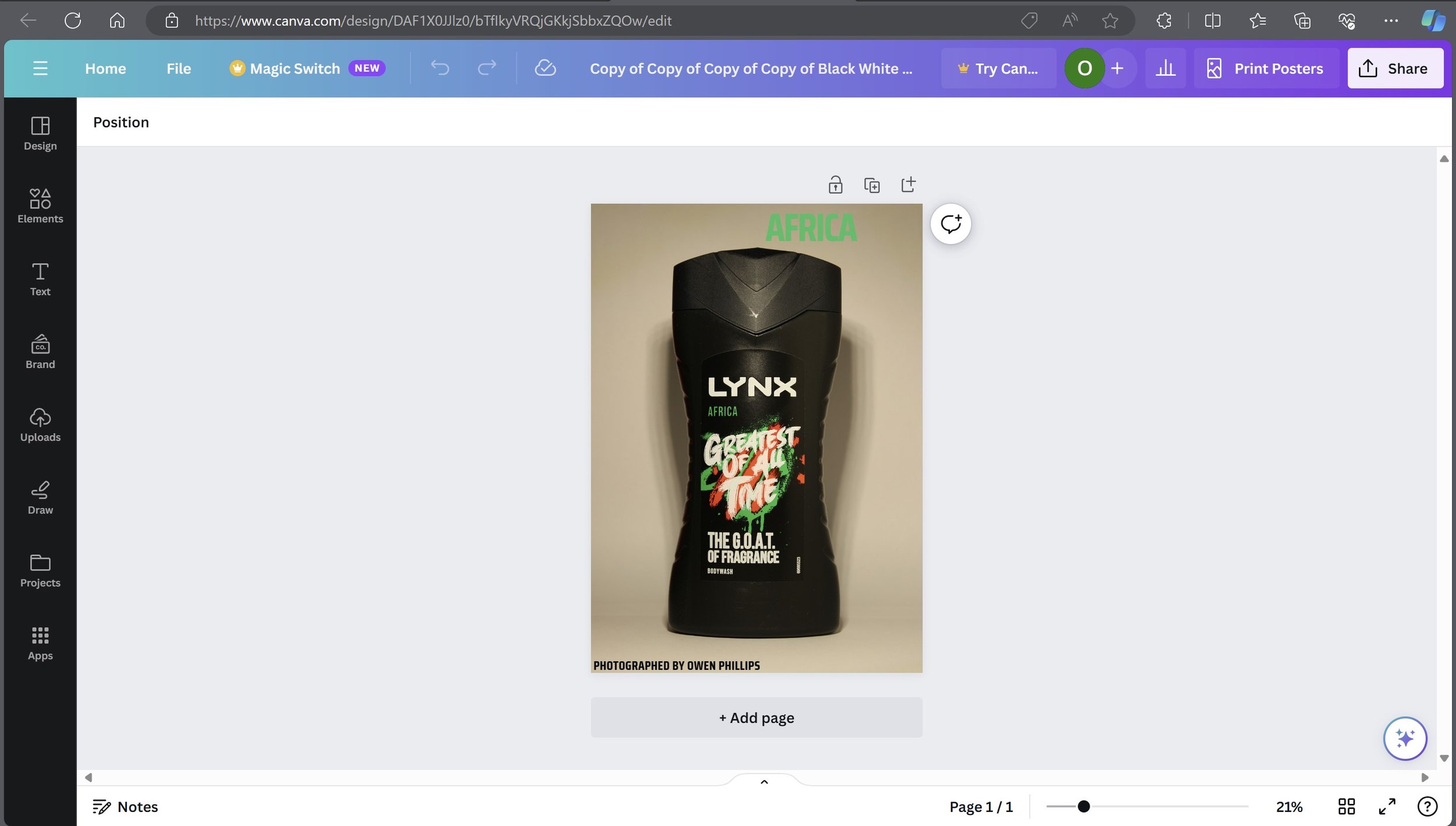
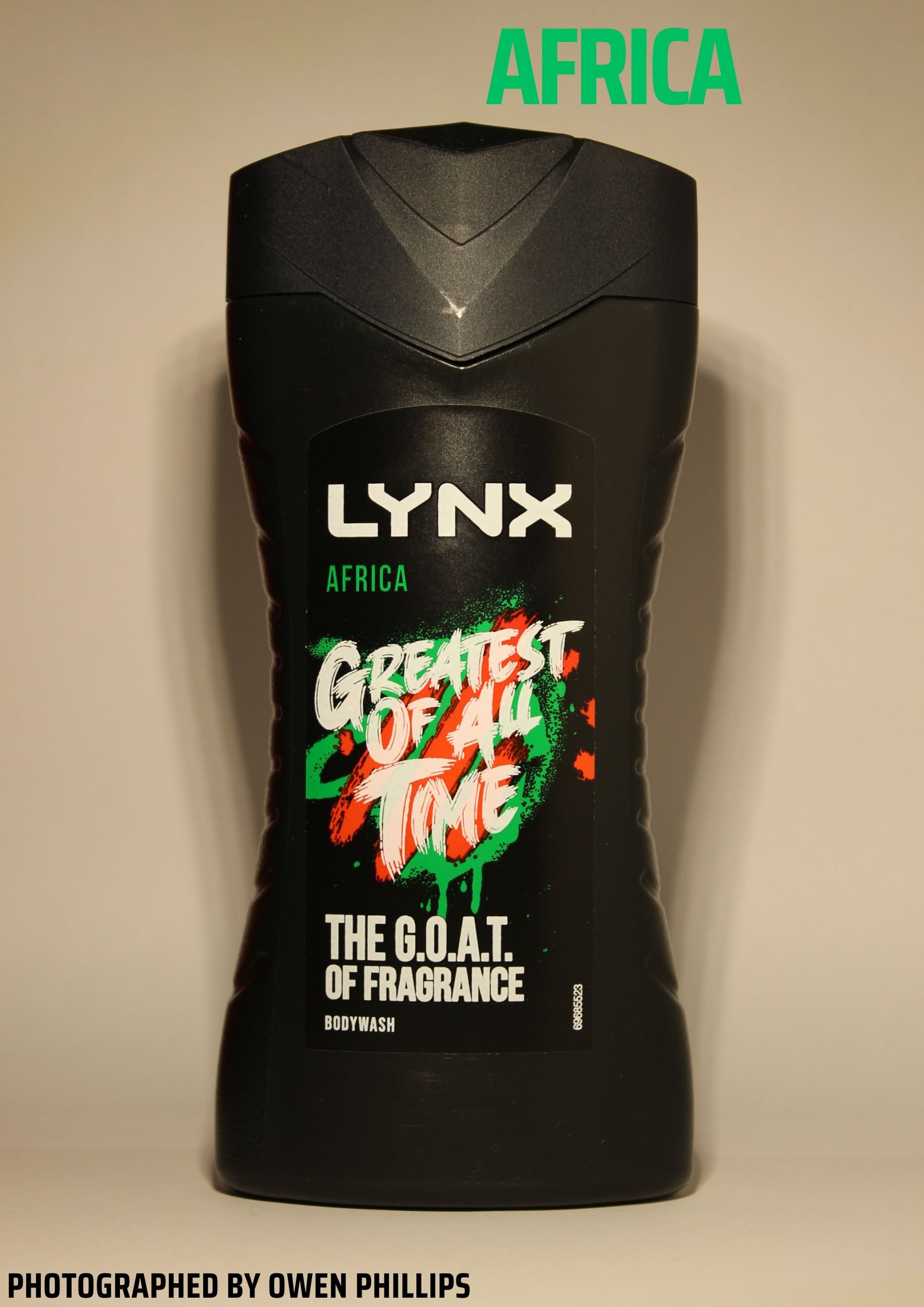
I used a site called Canva which is a graphic design website to create these advertising posters. The way I designed this is fairly simple, The type of text I used is Saria Condensed. I used the bold version for the title of the poster and the standard one for the bottom text. I changed the colour and text for the titles depending on which flavour or image it is.
Billboard Designs from Graphic Burger: -
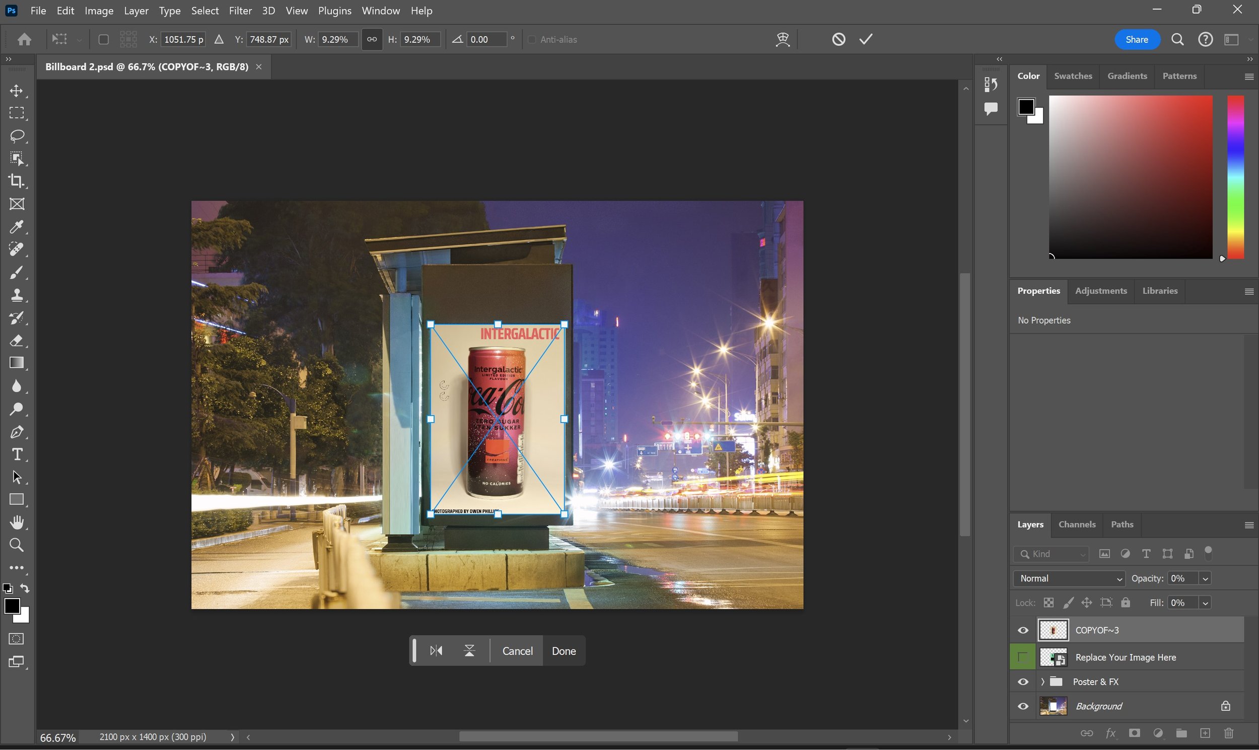
I used a site called Graphic Burger to find templates for the billboard advertising screens. The site allows you to download a set of photoshop files and all you do is drag in your image into the program and it places it into the selected slot on the layer. In this case we are dragging out newly created advertising poster created from Canva into Photoshop. I used my two favourite image from the shoot to create these Billboard Designs.
Presentation
Final Selected Product Photography Images: -
Final Billboard Design: -
Evaluation & Reflection
What are your three strengths & three weaknesses of your Product Photography?
My first strength for this project is the planning was well thought out and it was clearly talked about in my blog, and I knew exactly what I was going to do, secondly, I think my final products are strong especially the water splash images as it shows the splash from the water and a clear view of the actual Monster cans. Lastly which makes my images look good was the use of the advertising posters and of course putting them into the bus stop billboards as well which makes it realistic.
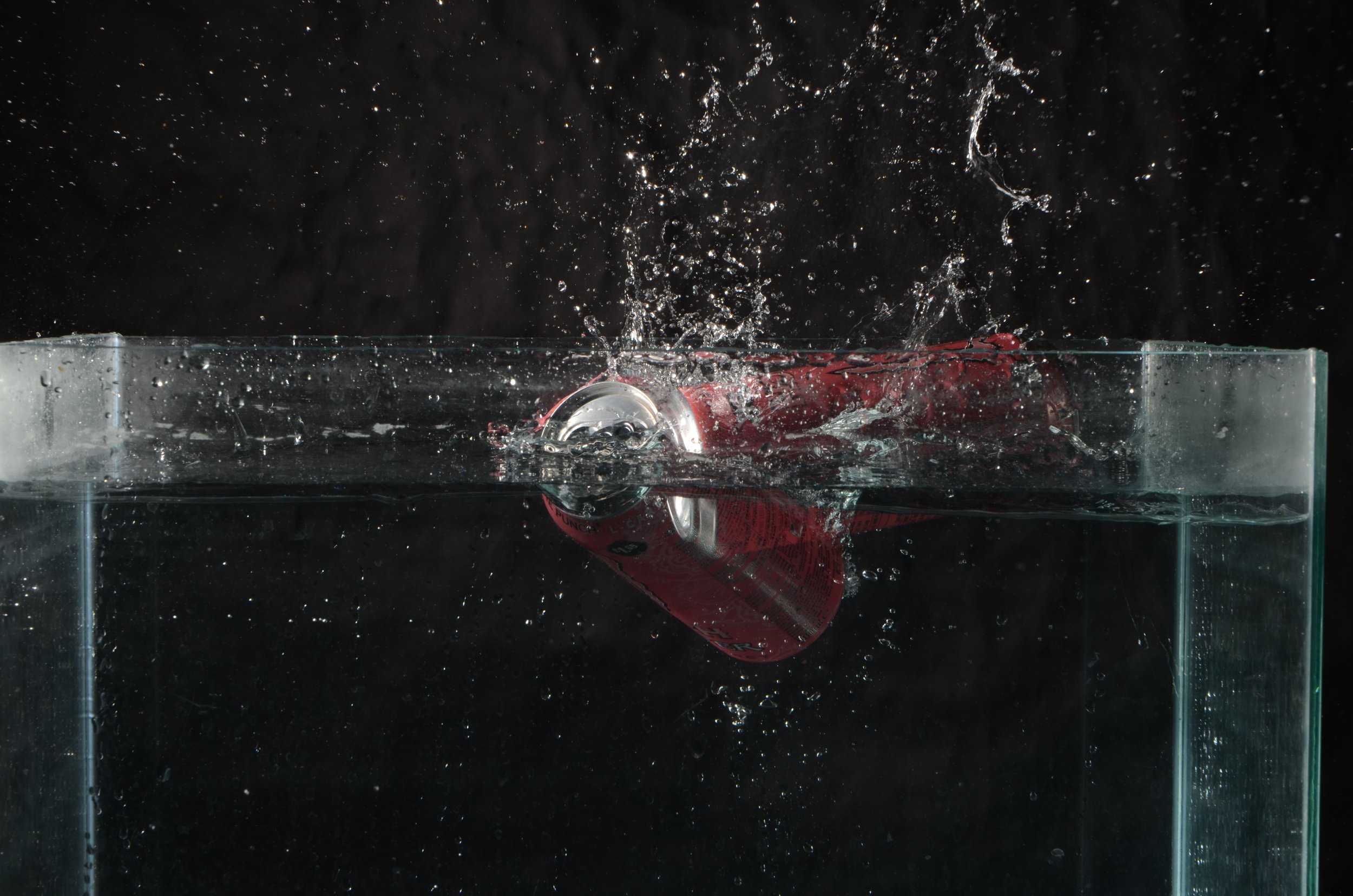
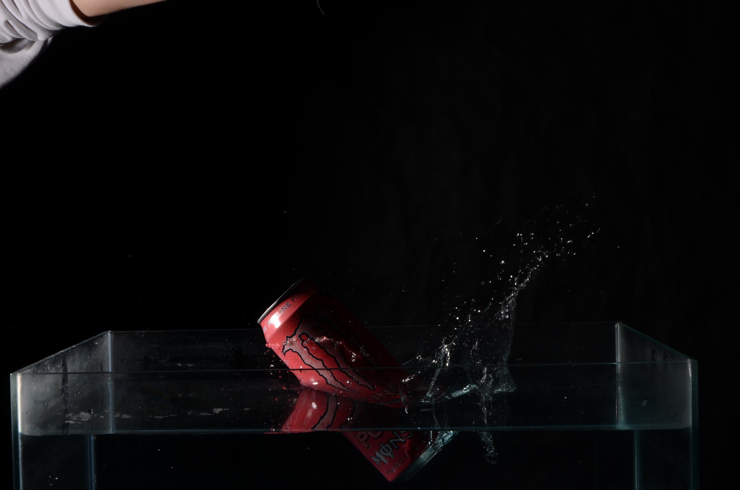
My first weakness is some of the water splash images that I had taken were either miss timed or looked good from the splash but couldn’t see the artwork of the can. I have placed some of these examples below.
Secondly, I should of photographed more images of the hard light product photography as from looking at my two brilliant examples, I feel as I could of used different products then just the two I have used and this leads me onto the time management problems I had because if I had more time to shoot and experiment, I think I could of come out with a better selection of images and more in detail images using the logo I created for the fictious company “Good Vibes” .
What do you now understand about the characteristics and contexts of Product Photography?
I learnt mostly about all the different types of lighting that is involved in creating product photography, such as Hard Light, Soft Light, Flat white and even Specular light which is another type of Hard light. I also learned about how there is many different types of product photography for the different industries that it is used in, E-Commerce is a huge medium as it requires you to sell it online and it requires product photography to be involved. 360 Degree product photography is probably the most interesting one as you take a series of images from different angles and then you put it together to make a moving image of the product.
What were your key areas of development during this assignment work, Give Explanations
I think experimenting was a huge factor through out this assignment as at the beginning I didn’t know how I was going to shoot my ideas. After researching into every bit of lighting techniques and of course I asked my lectures for support with setting up the lighting rigs etc. I also learned more about different camera settings which need to be set up for the water splash.
Authentication Document
E-Commerce Multi-Media Campaign
In this brief we have been asked to create a 45 second fashion clothing or footwear promotional video and a fashion magazine.
We have been asked to create this as if we were employed by a fashion/footwear company, for this project it is a fictious company called HIP.
We are commissioned to create their first campaign video which will be published in a form of a magazine and video footage across social media platforms.
The company’s target audience demographic is between 18-25 year old with the backdrop for the campaign having a urban vibe.
Context & Research
Outcomes
Three Logos for “HIP”: -
For creating these logos, I used a free graphic design site called Canva, I used three different mock-up designs on the site to create the logos. I will also use “Google Forms” to ask people which logo is the best looking and that will be the one that I will use for this project.
Photography Shoot for “HIP”: -
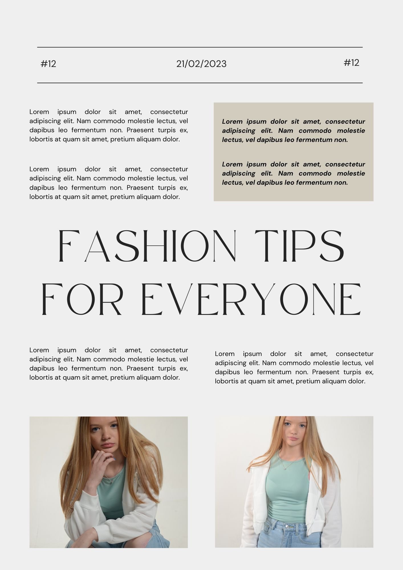
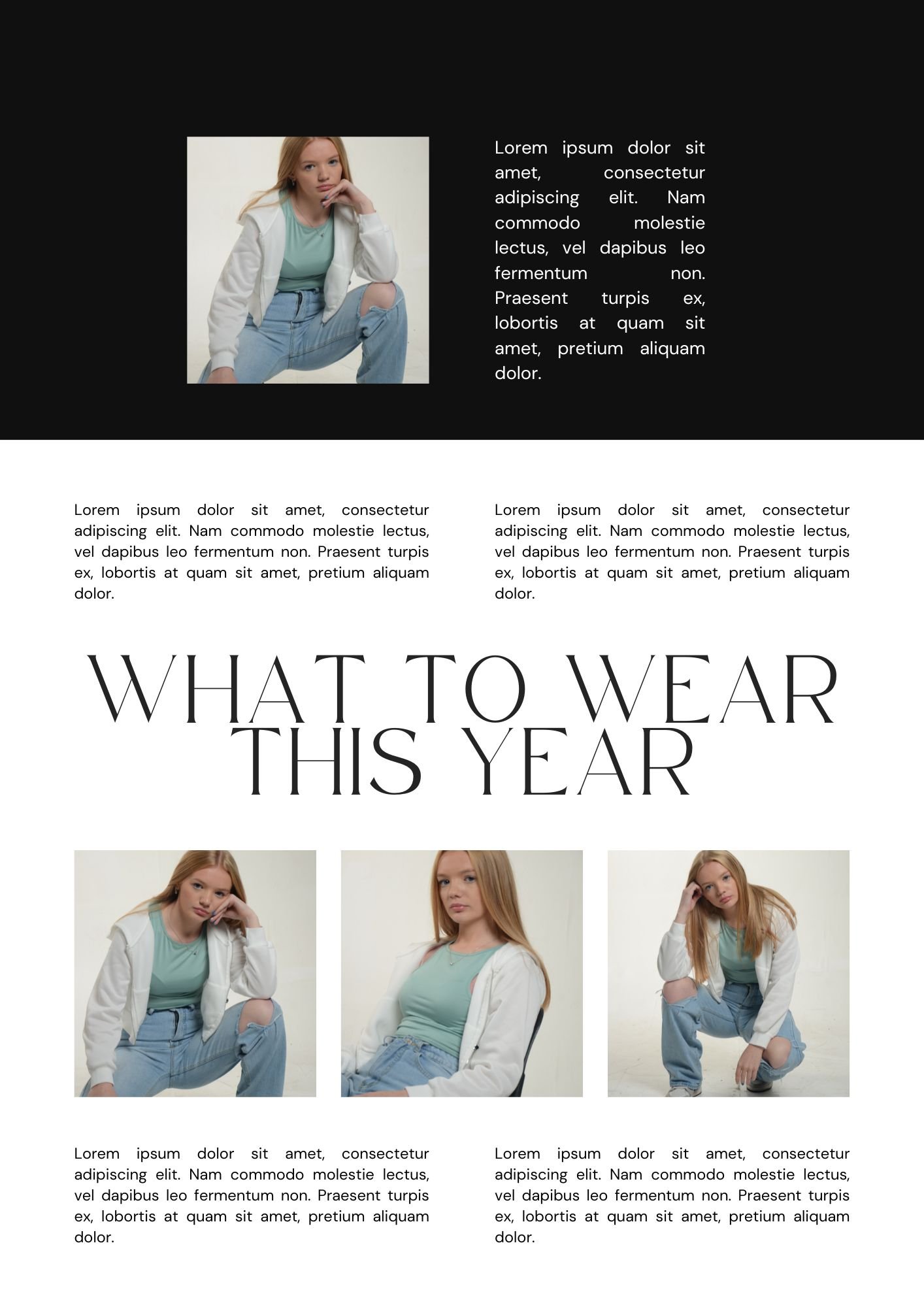
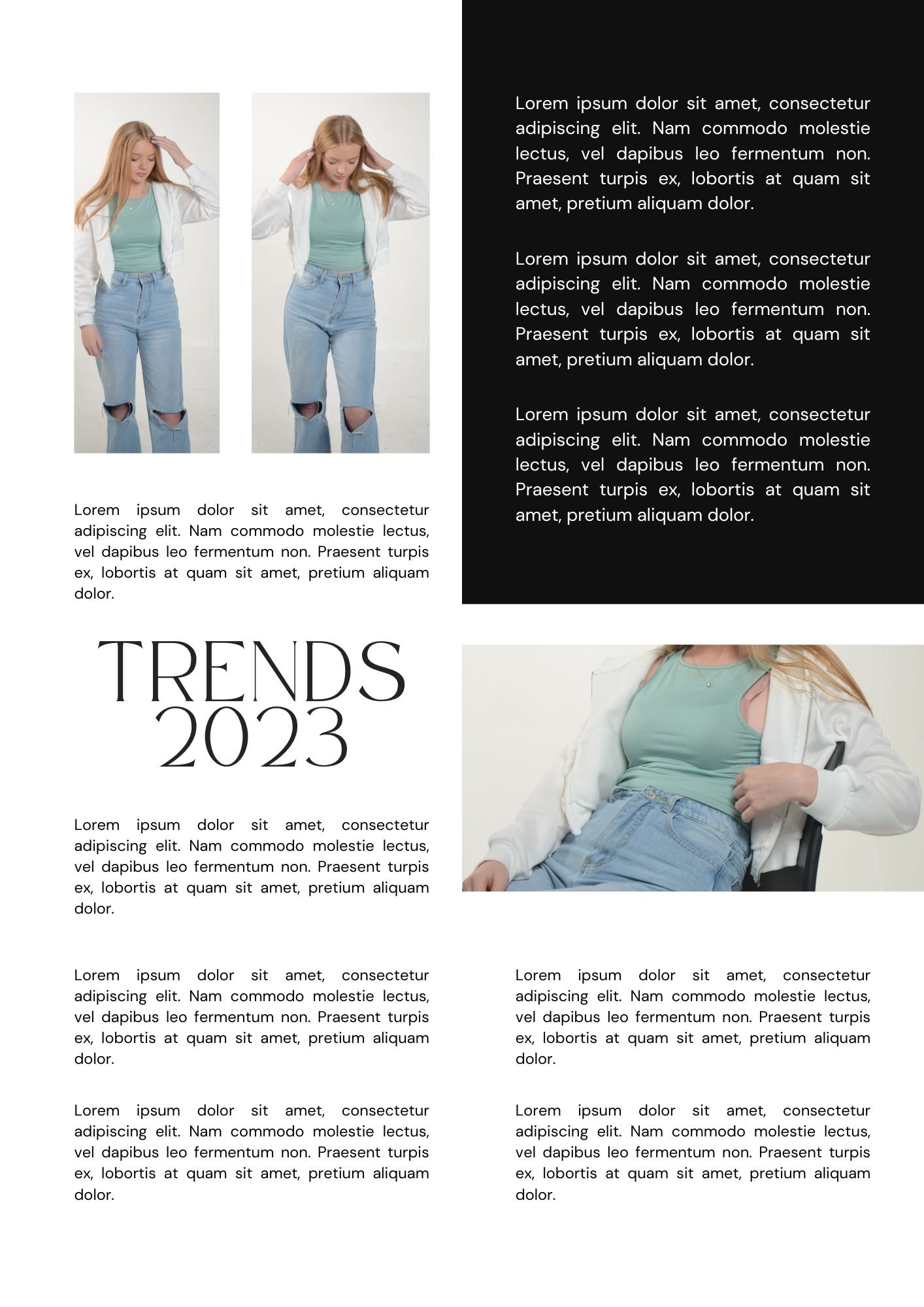
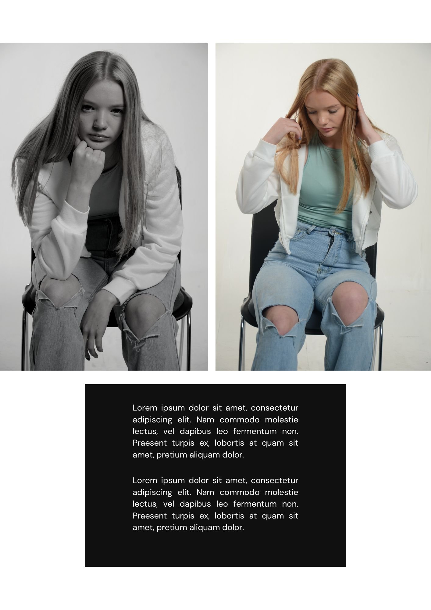
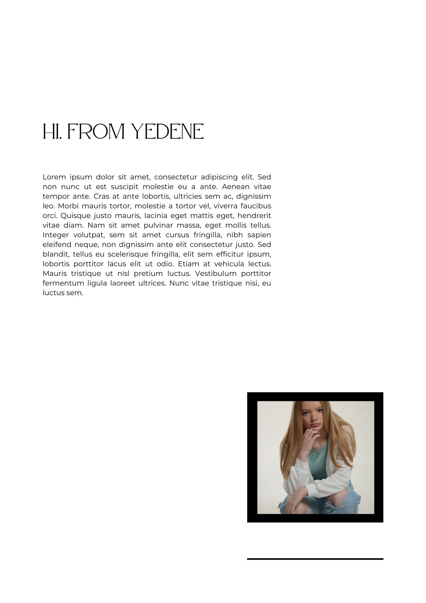
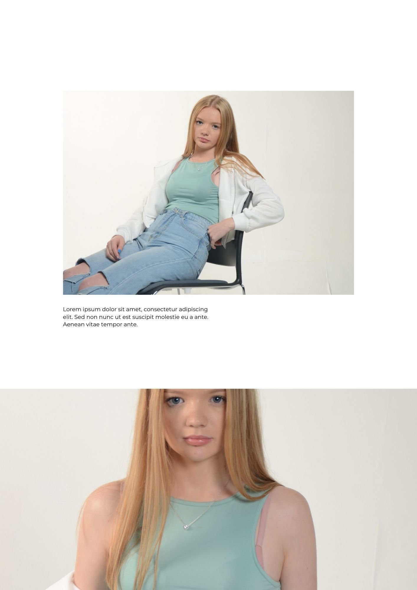
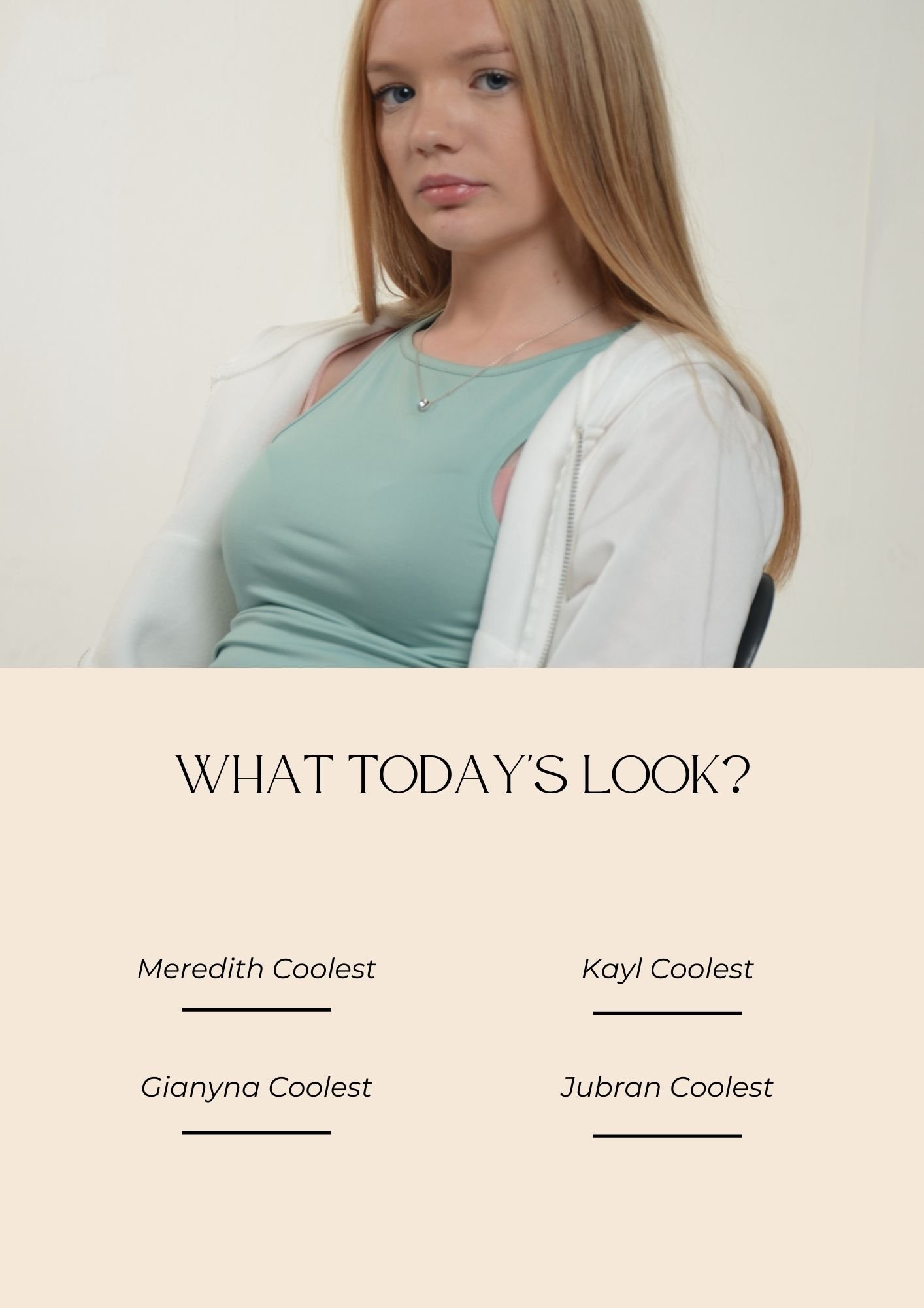
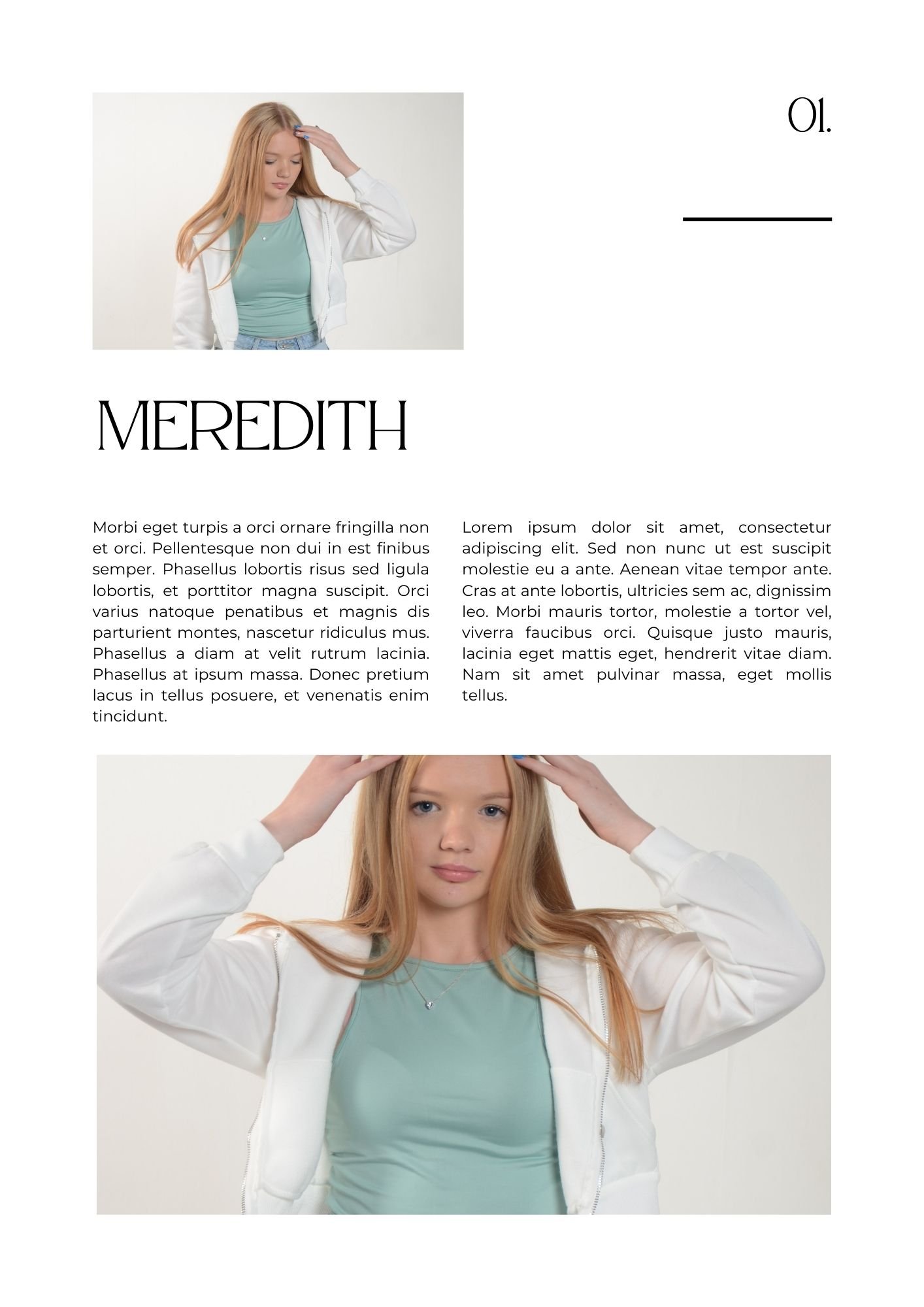
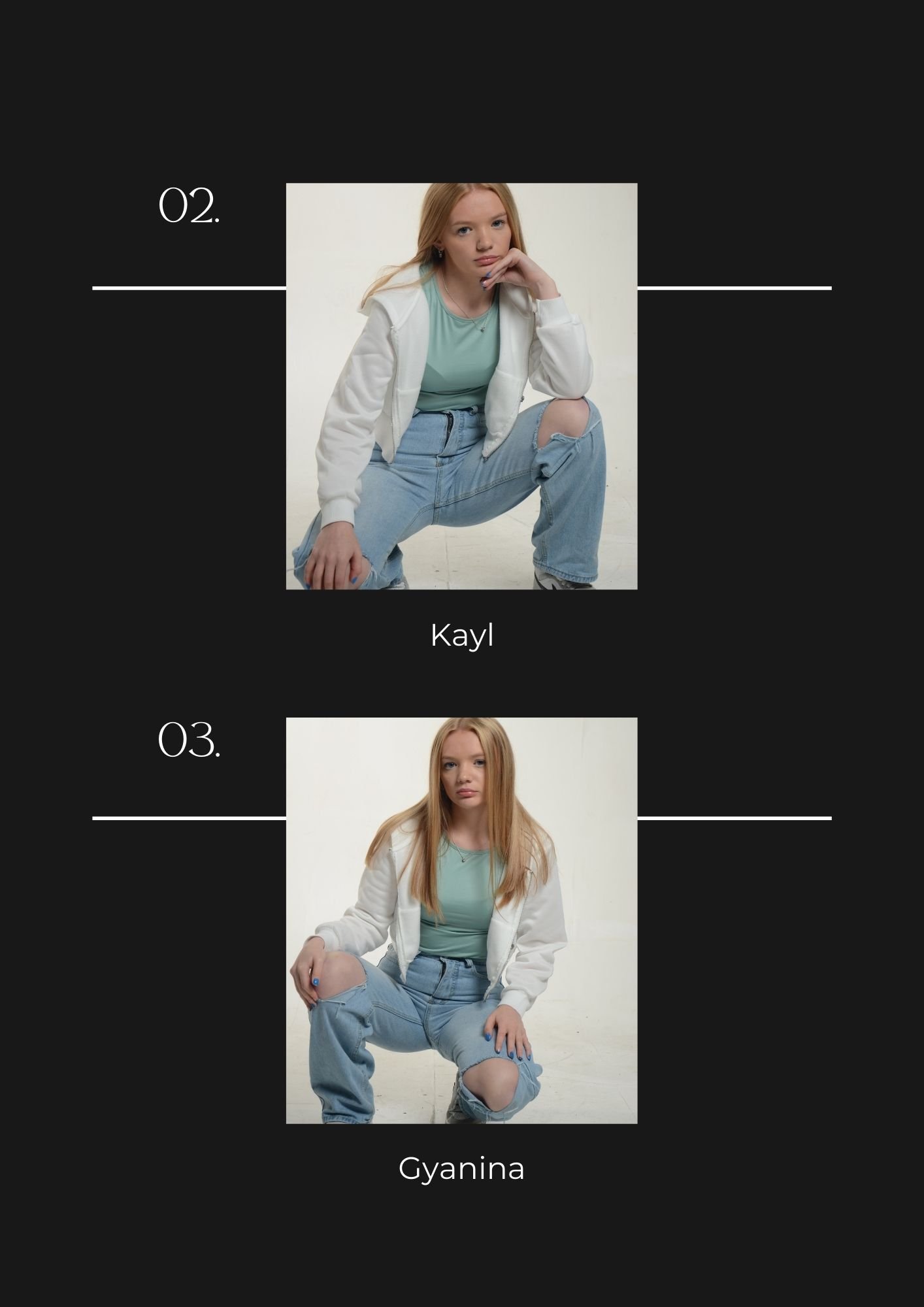
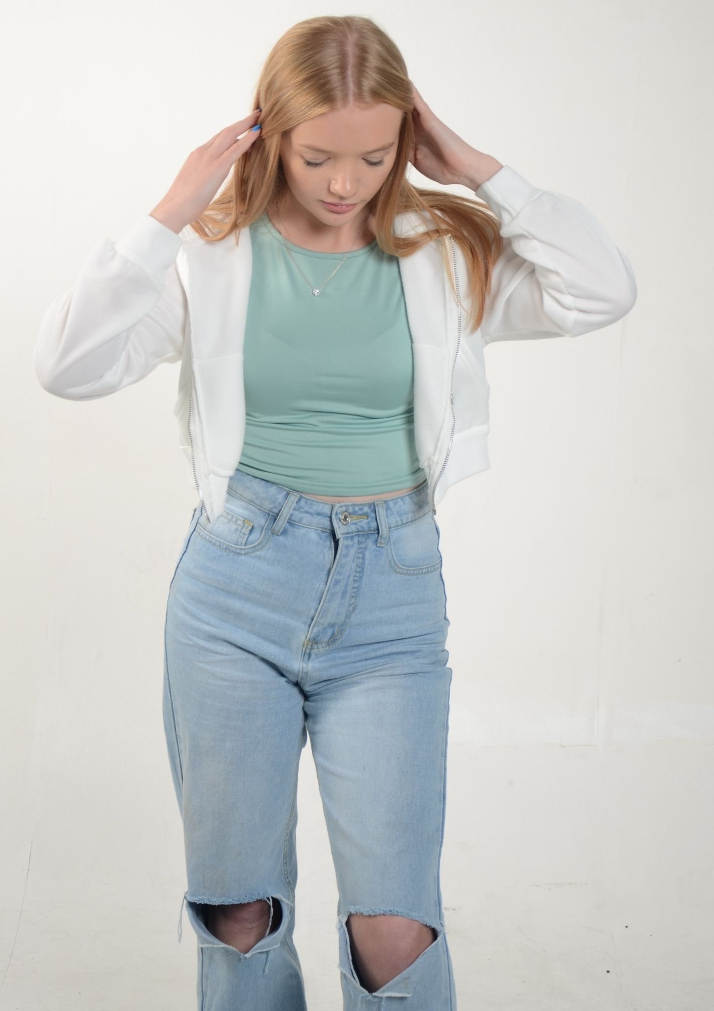
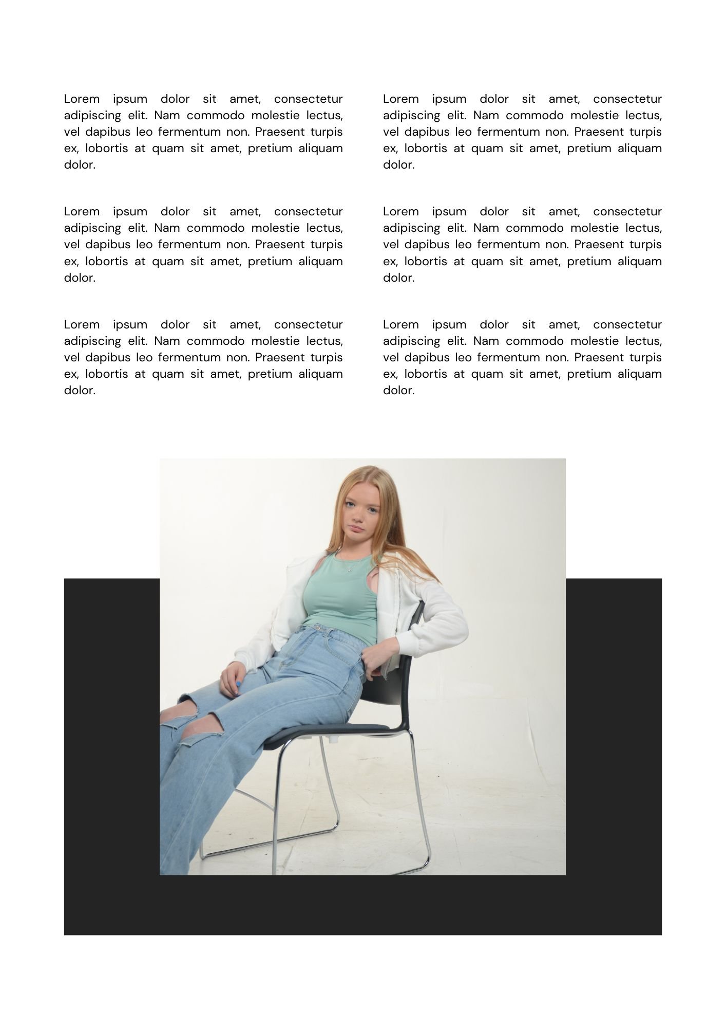
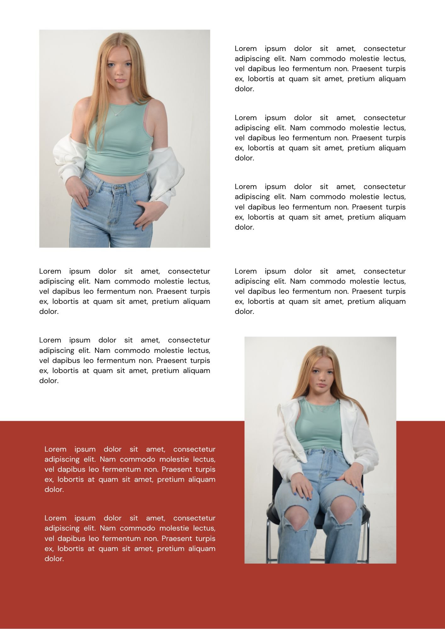
In the photography studio I taken about 77 images, But I have selected 12 photos as my favourites for this assignment. The lighting technique which was used in the studio is called “High Key Lighting” which makes the frame of the image really bright with soft lighting, minimal shadows and with low contrast. In other words the technique uses minimal shadows with the majority of the image composed of highlights. The idea to use is lighting style isn’t just because it is popular in the fashion industry, but it a very pleasant and attractive style which is one of the reasons why it is used in film as well like, sitcoms or comedies.
Generally speaking, how to setup “High Key Lights”. This type generally reduces the amount of shadows in the image, a forth key light may be added as shown in the diagram. In order to maintain the correct exposure levels for the shoot you can move the key light further from the subject.
x2 Mock Up Magazine Designs + Supporting Pages: -
Context & Subject Research
Primary Research: -
I made a survey on Google forms after I created three logos for project “HIP” and I received 8 responses with them being in favour of Option 2 (5 votes @ 62.5%) out of Option 3 (3 votes @ 37.5%). Nobody liked Option 1. This was a brilliant option for me to do because it’s a simple way to see what the public opinion is on the logos which I have created. In this case it is class mates who casted votes on the survey.
Group Mock-Up Video - A Potential Outcome
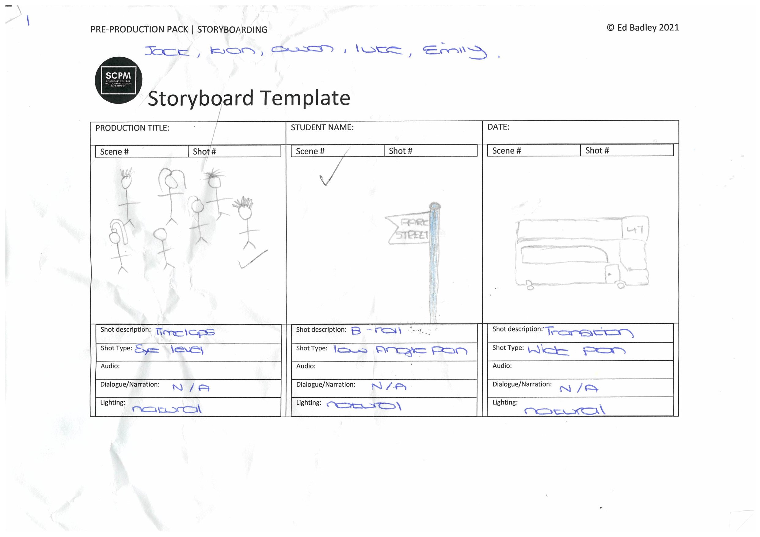
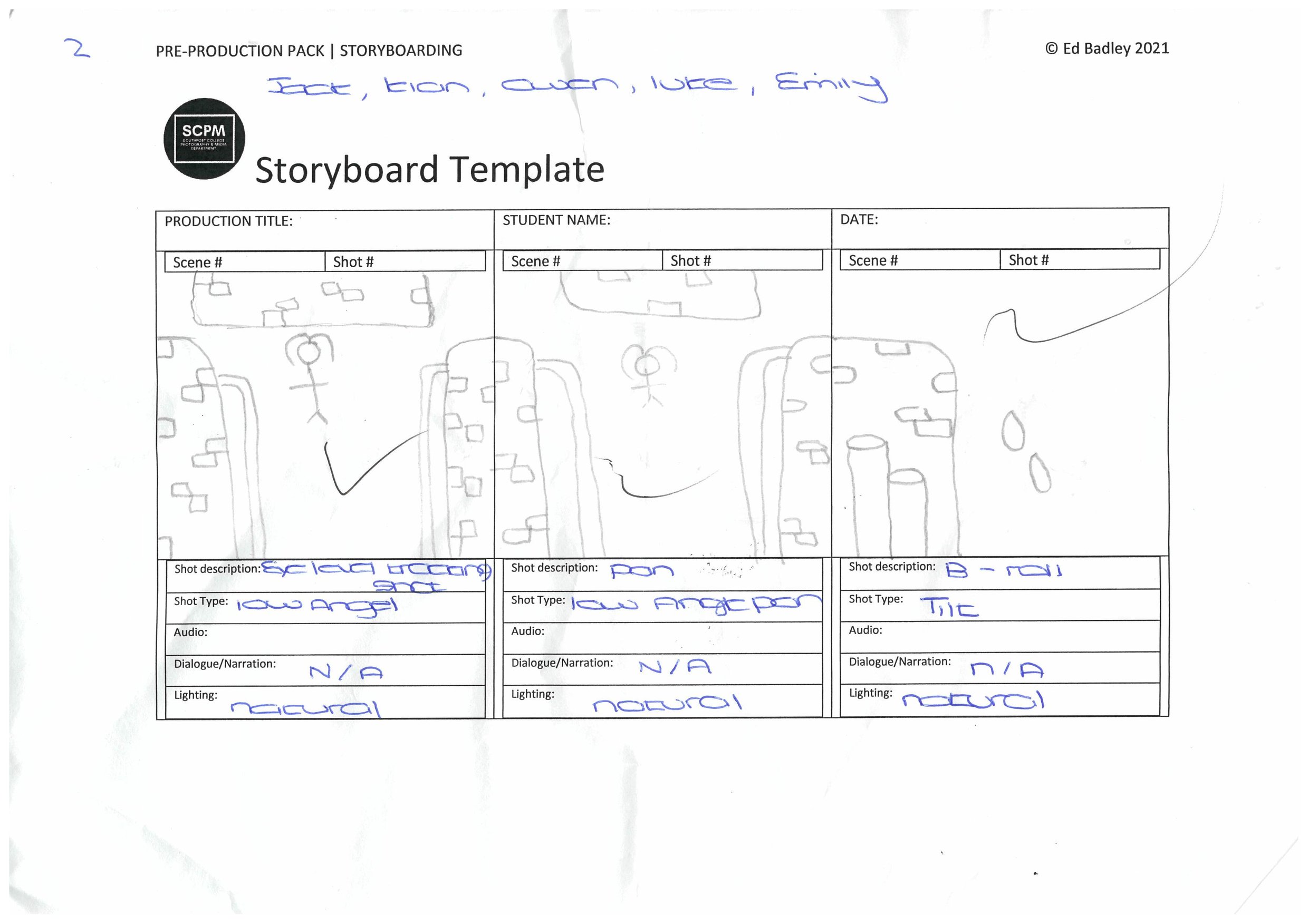
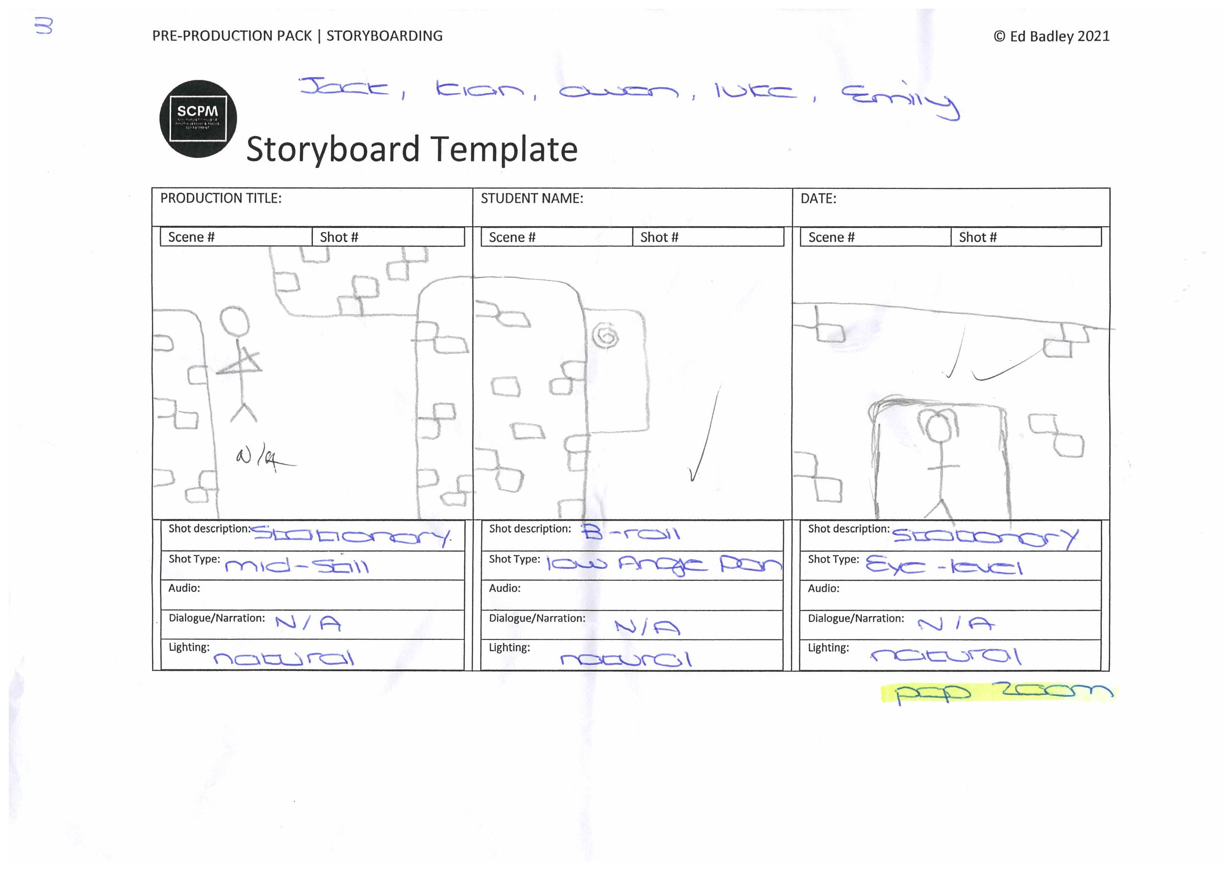
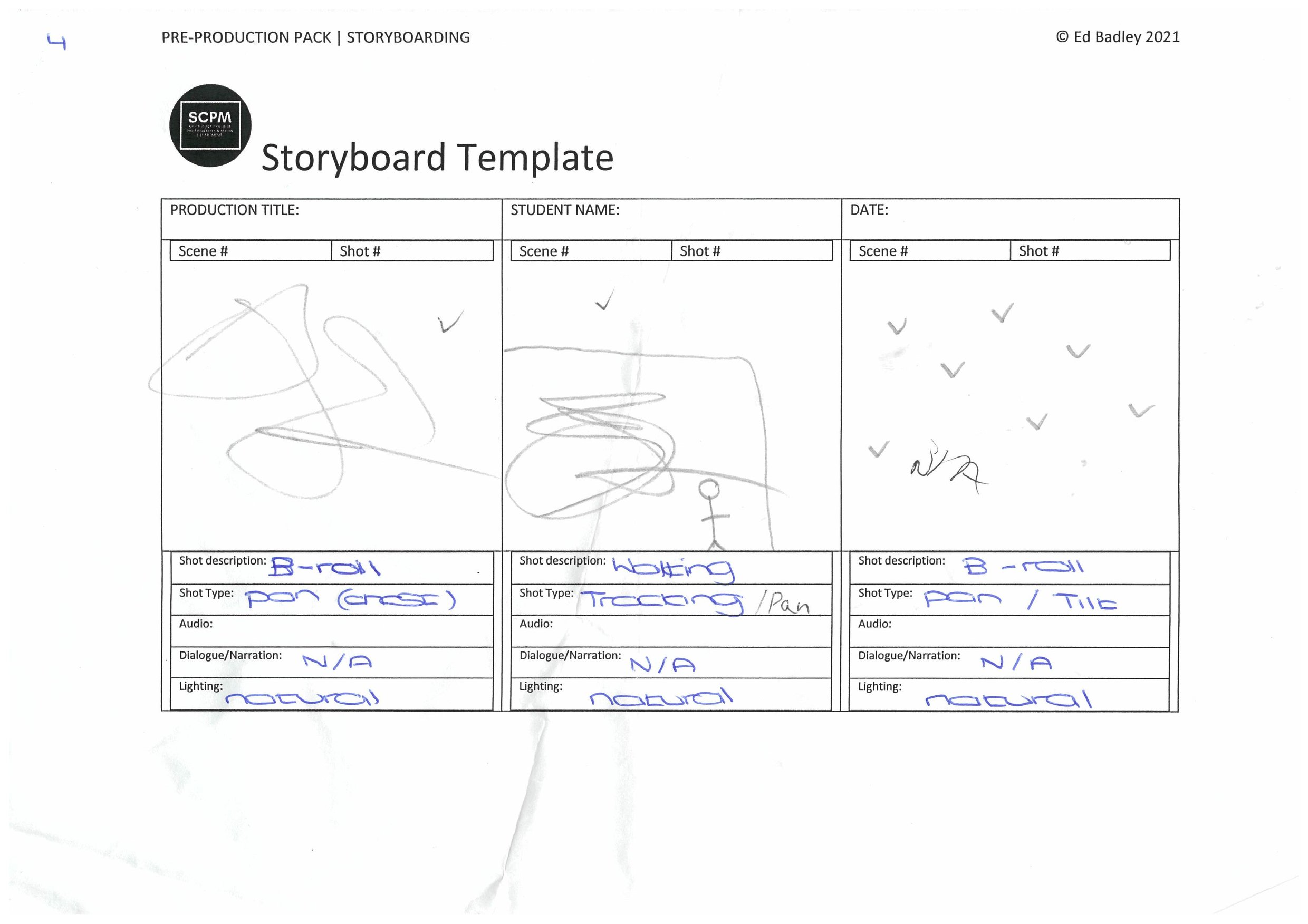
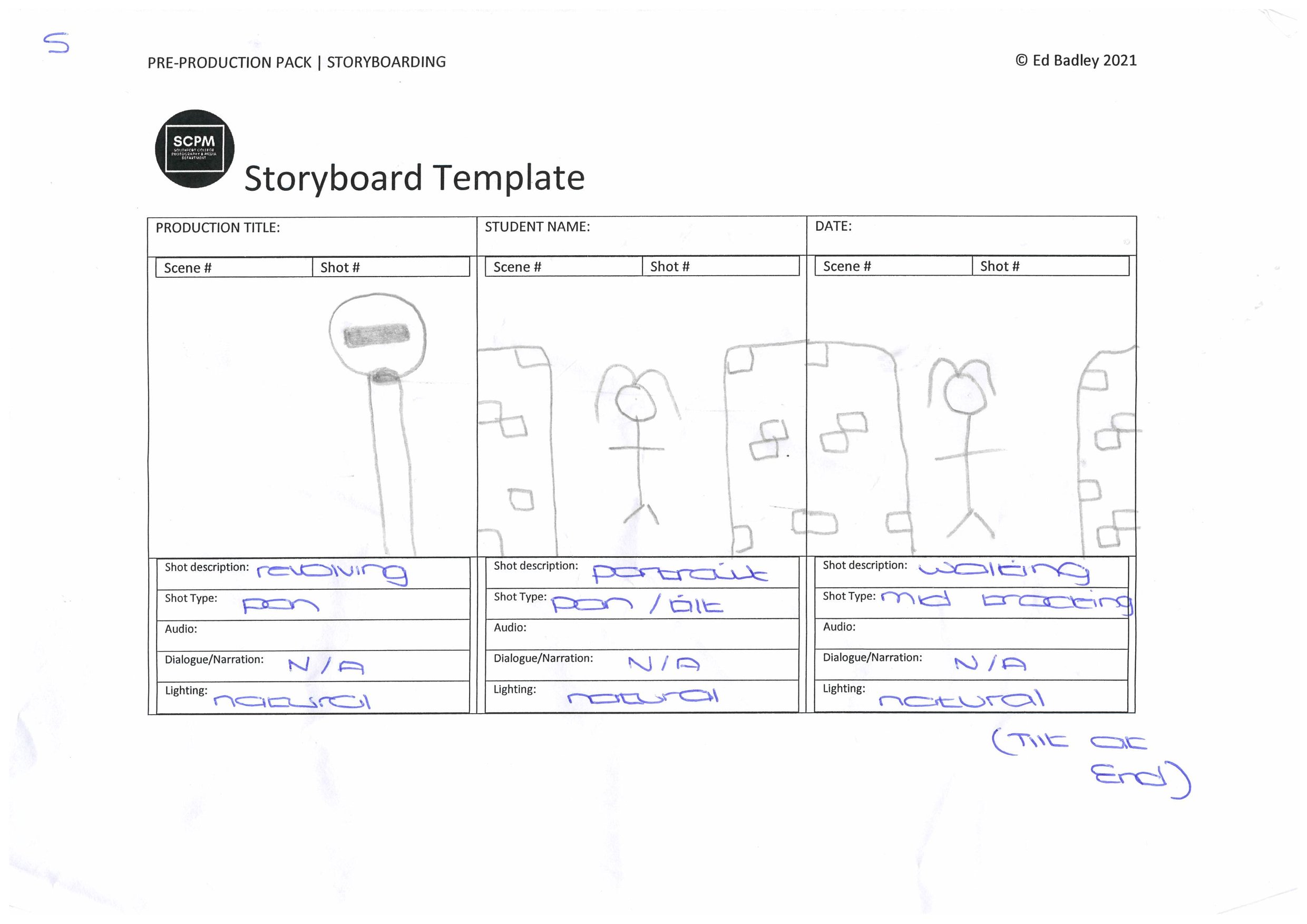
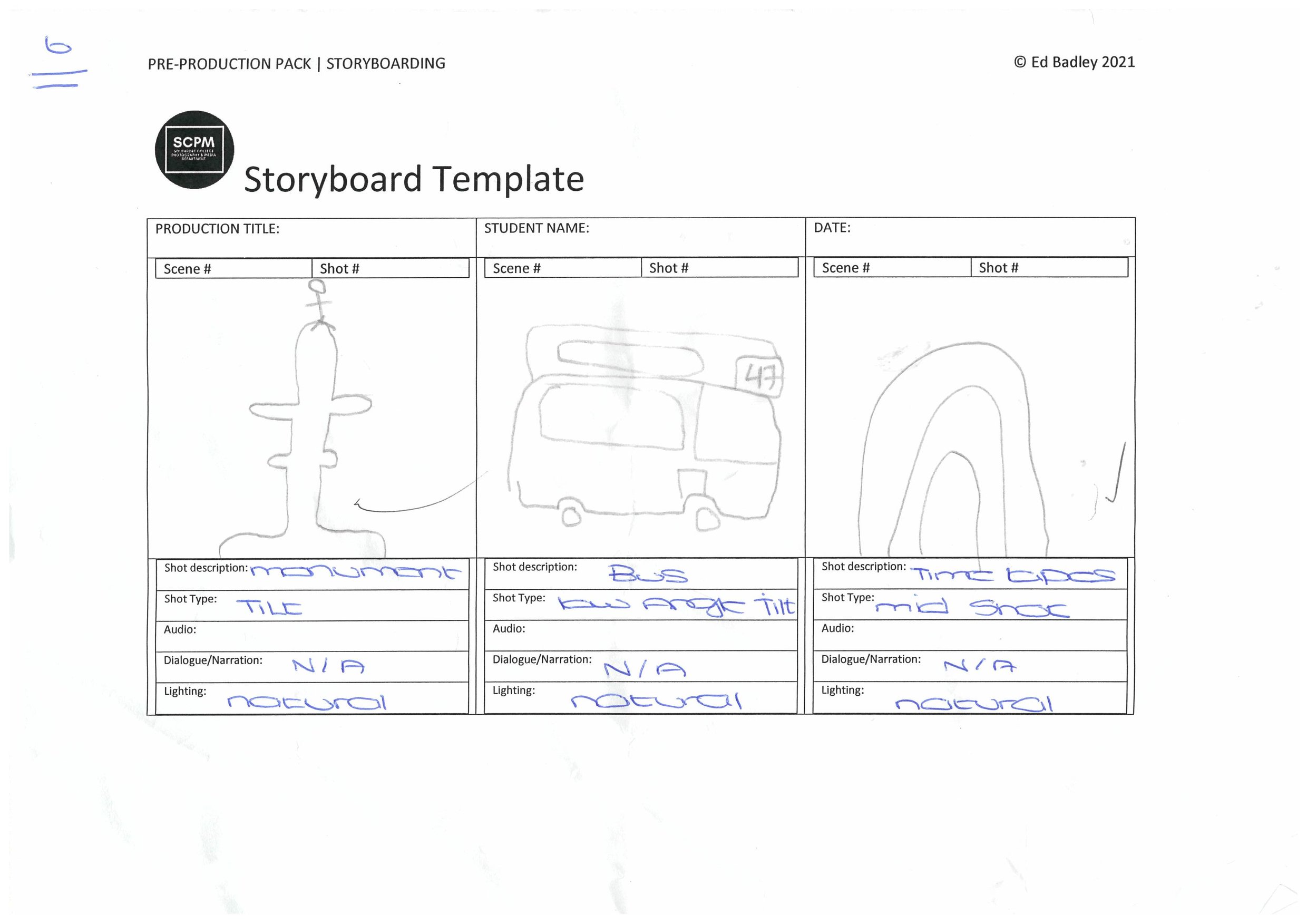
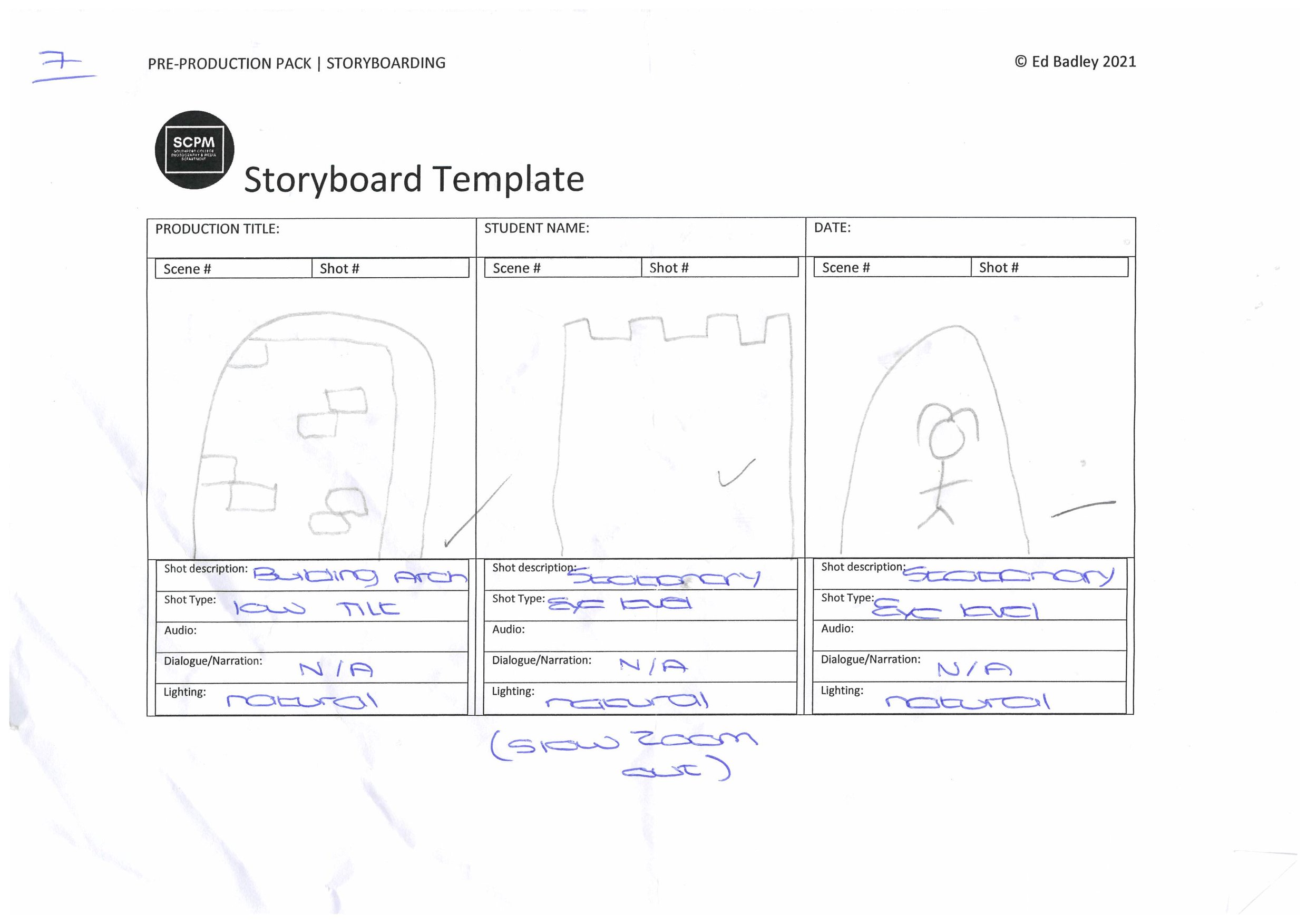
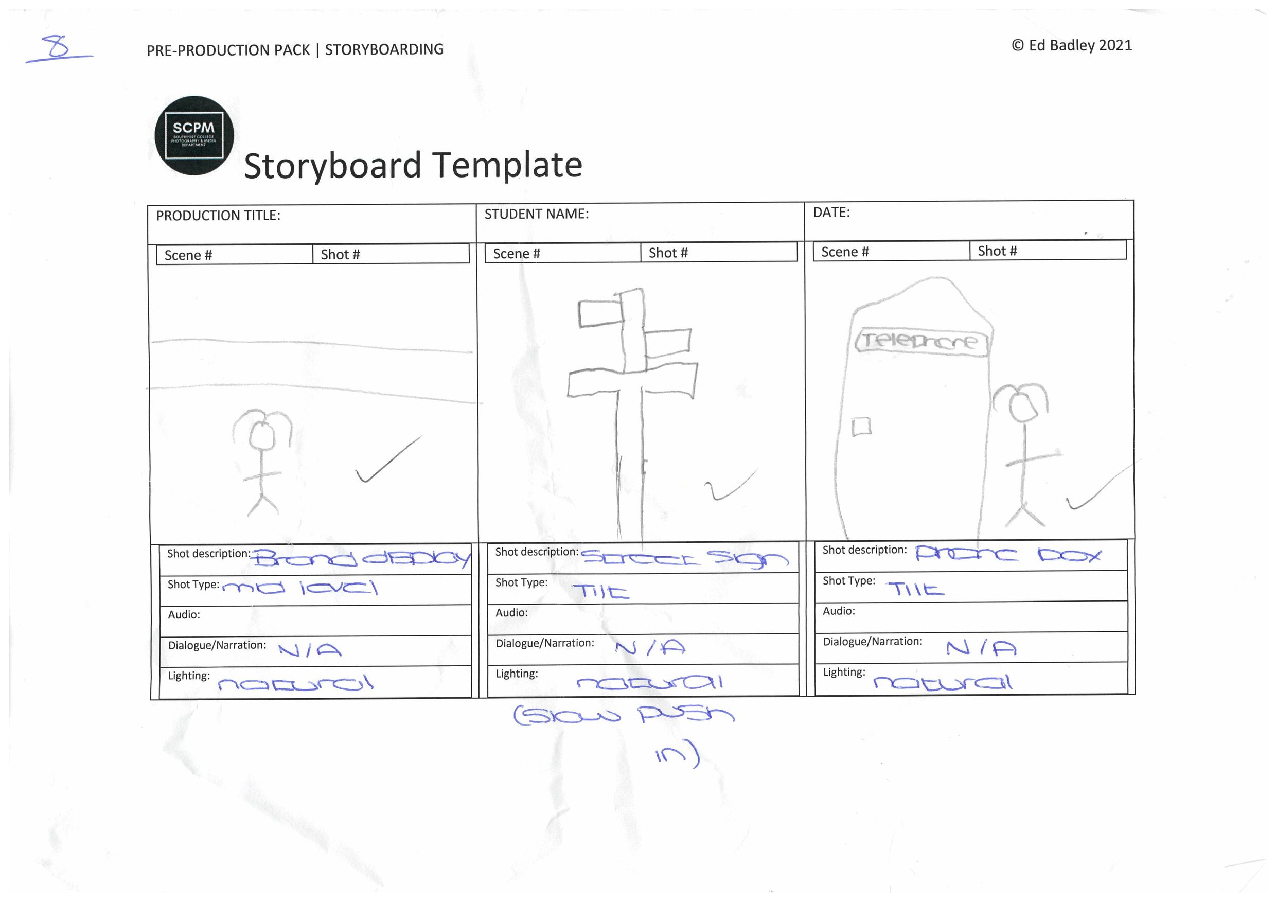
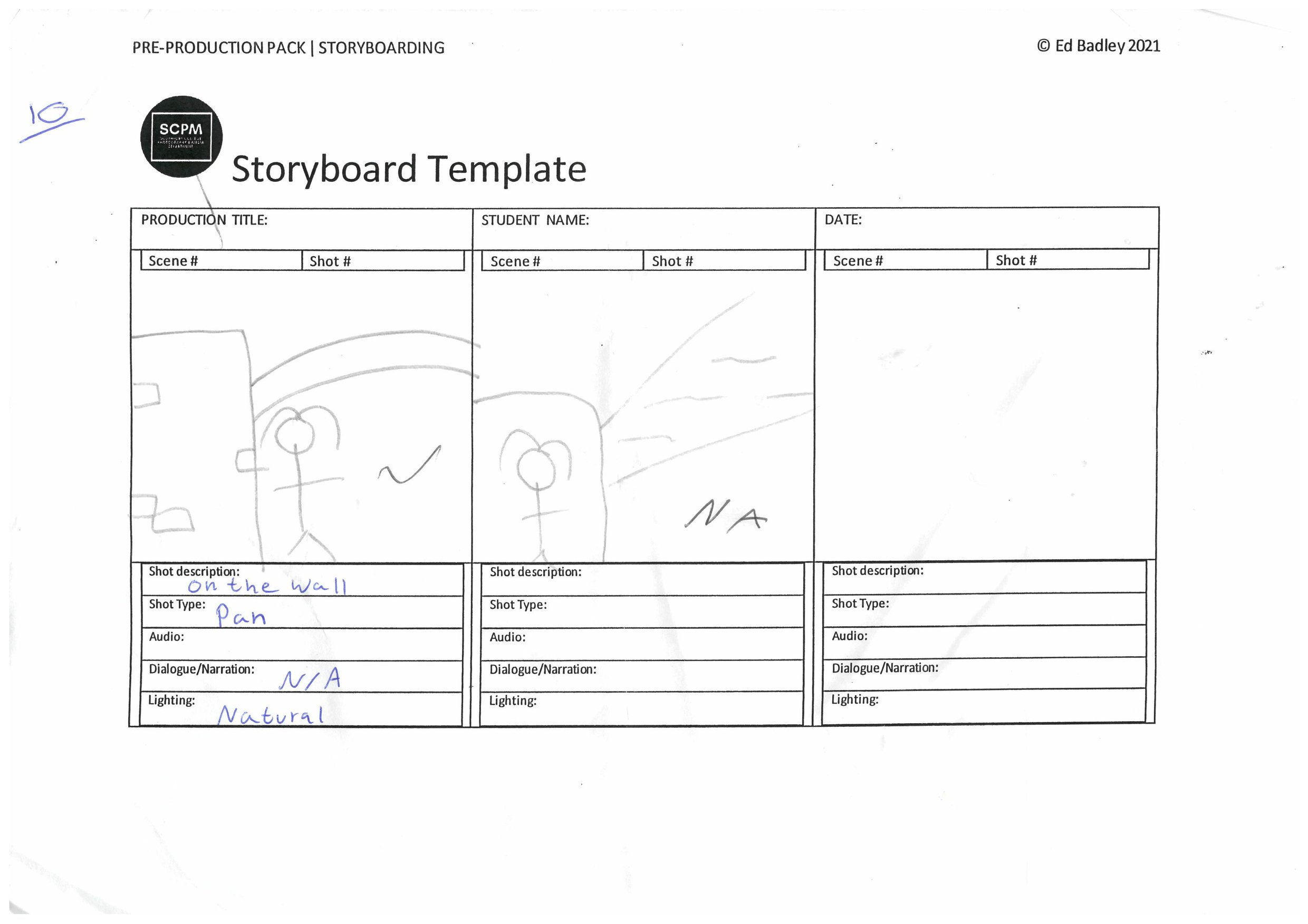
Storyboard: -
To help us get back into producing again, we were commissioned to create a fashion video in groups. In my group especially we had jobs in the team to create the film. Jack was Chief Cameraman, Owen (me) assistant cameraman, Kian was storyboard manager/video framing, Luke was video editor and Emily was the model.
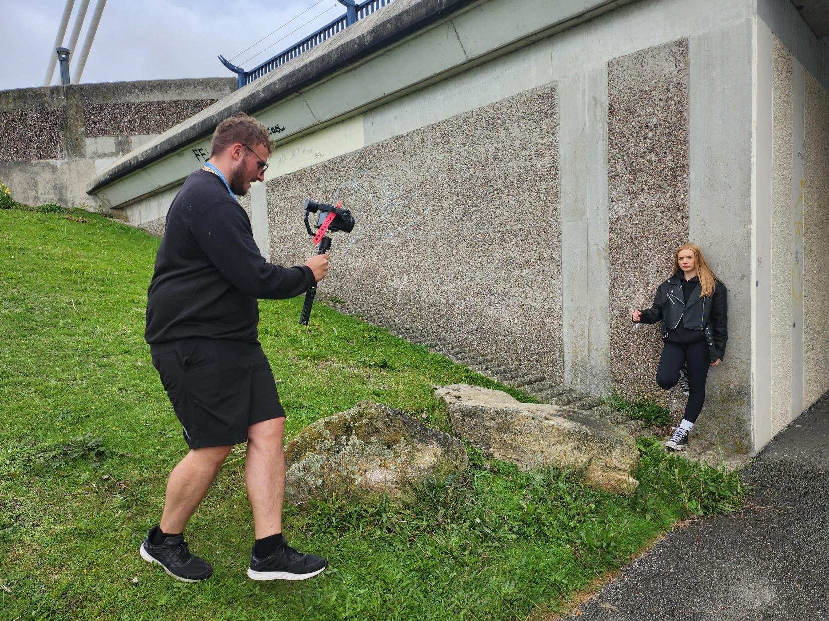
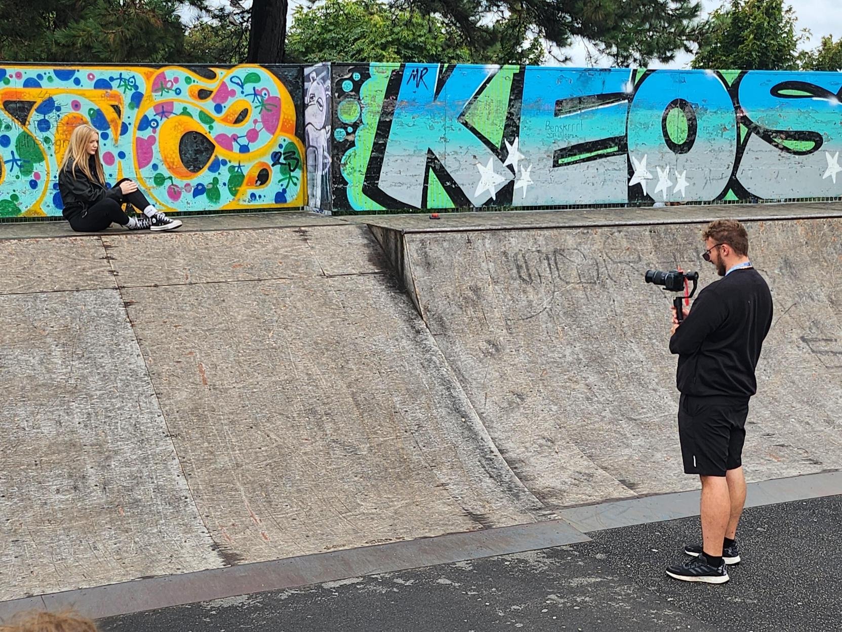
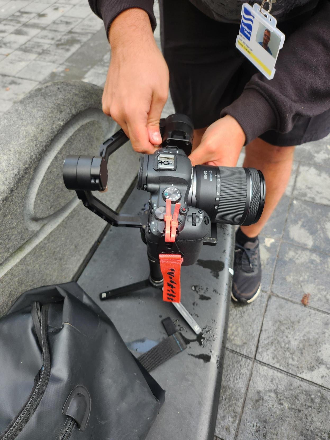
Behind the Scenes: -
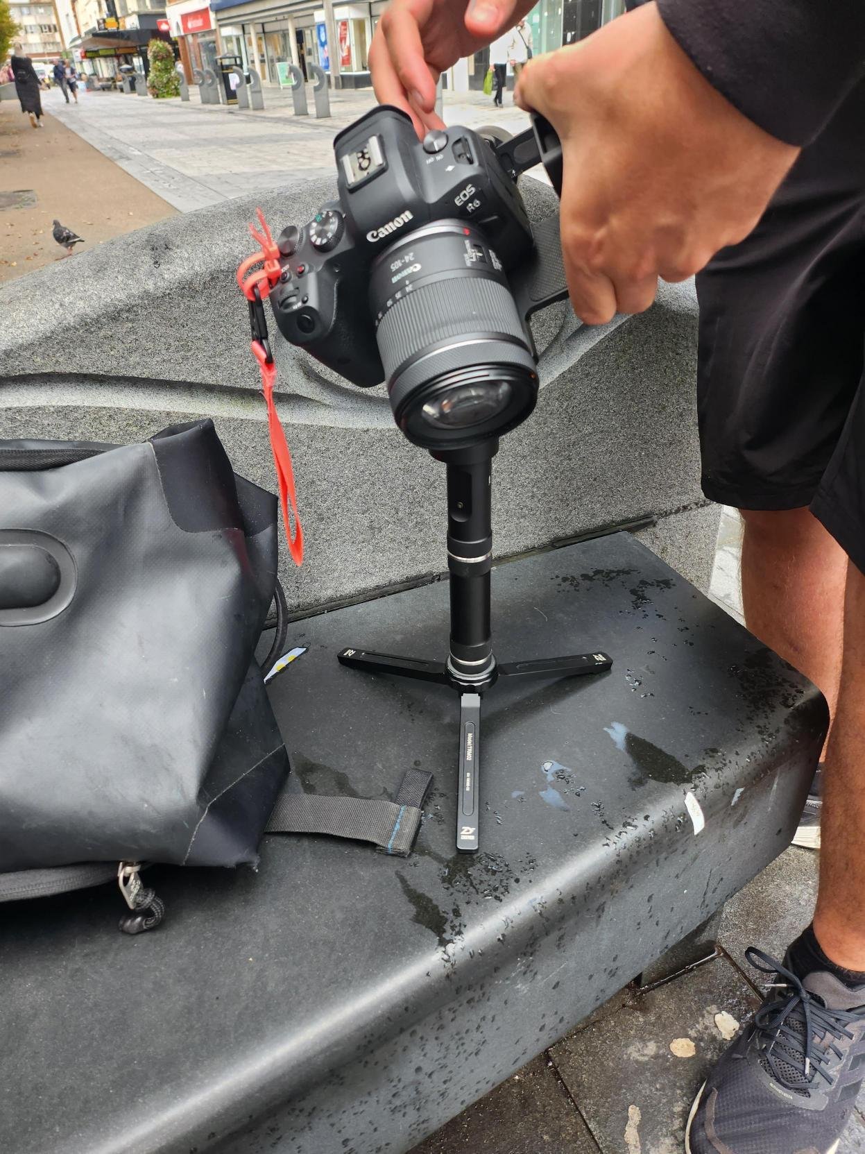
As the behind the scenes footage shows for the Mock-Up video, We used our own equipment, we used Jack’s Canon EOS R6 and my motorised gimbal called Zhiyun Crane Plus.
The Group Final Production: -
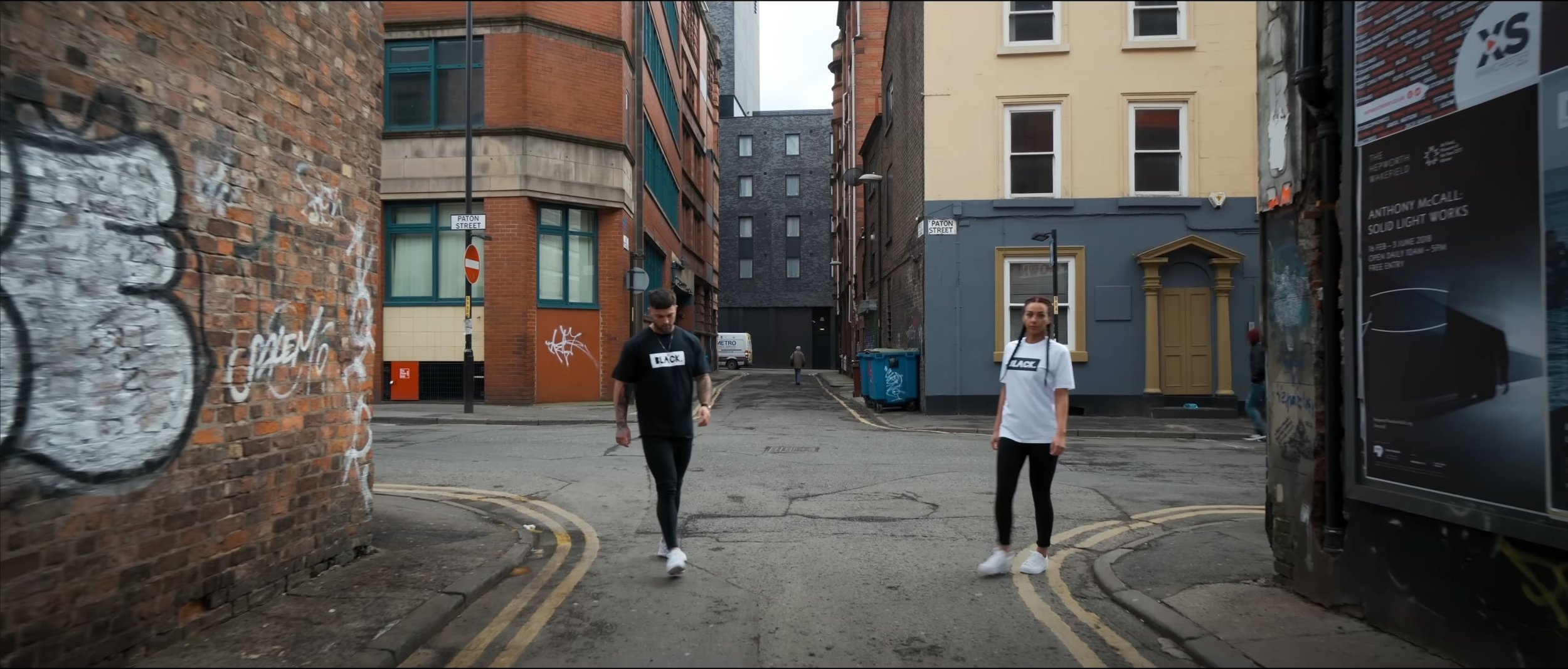
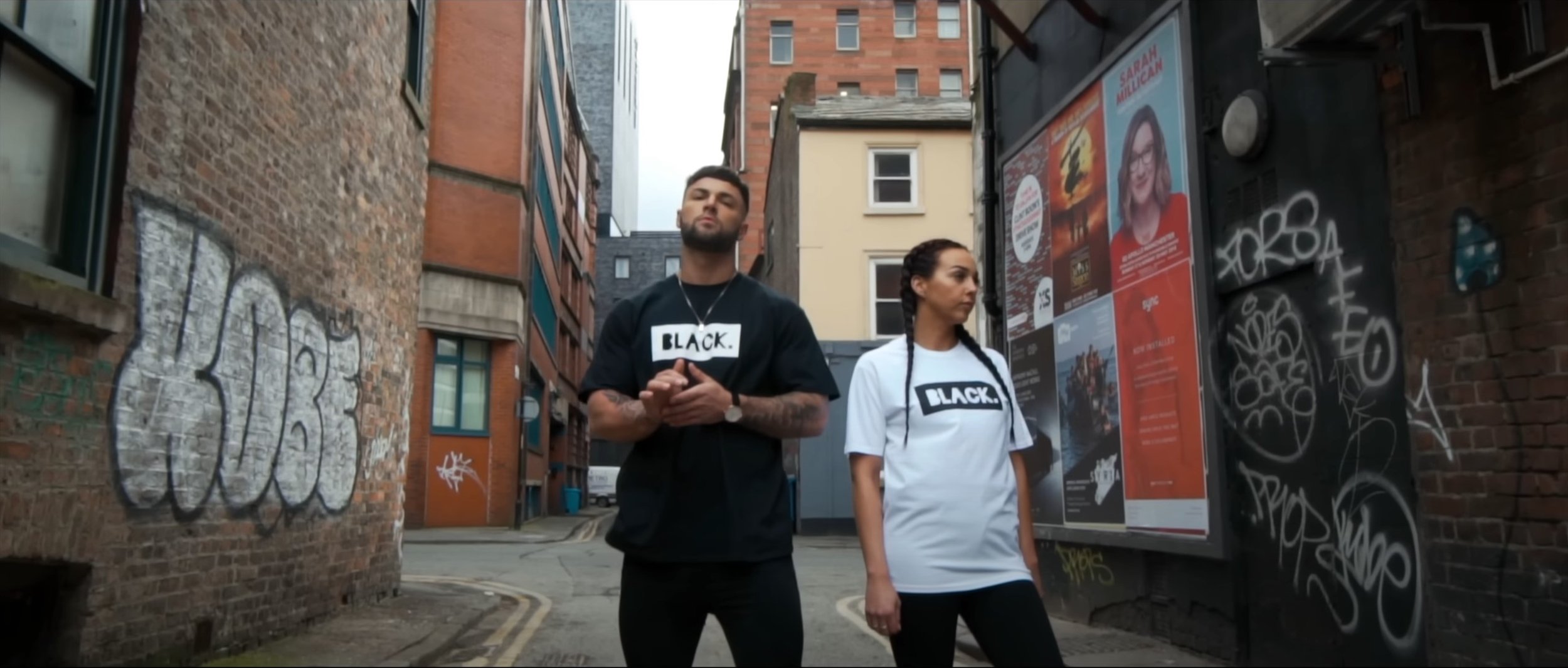
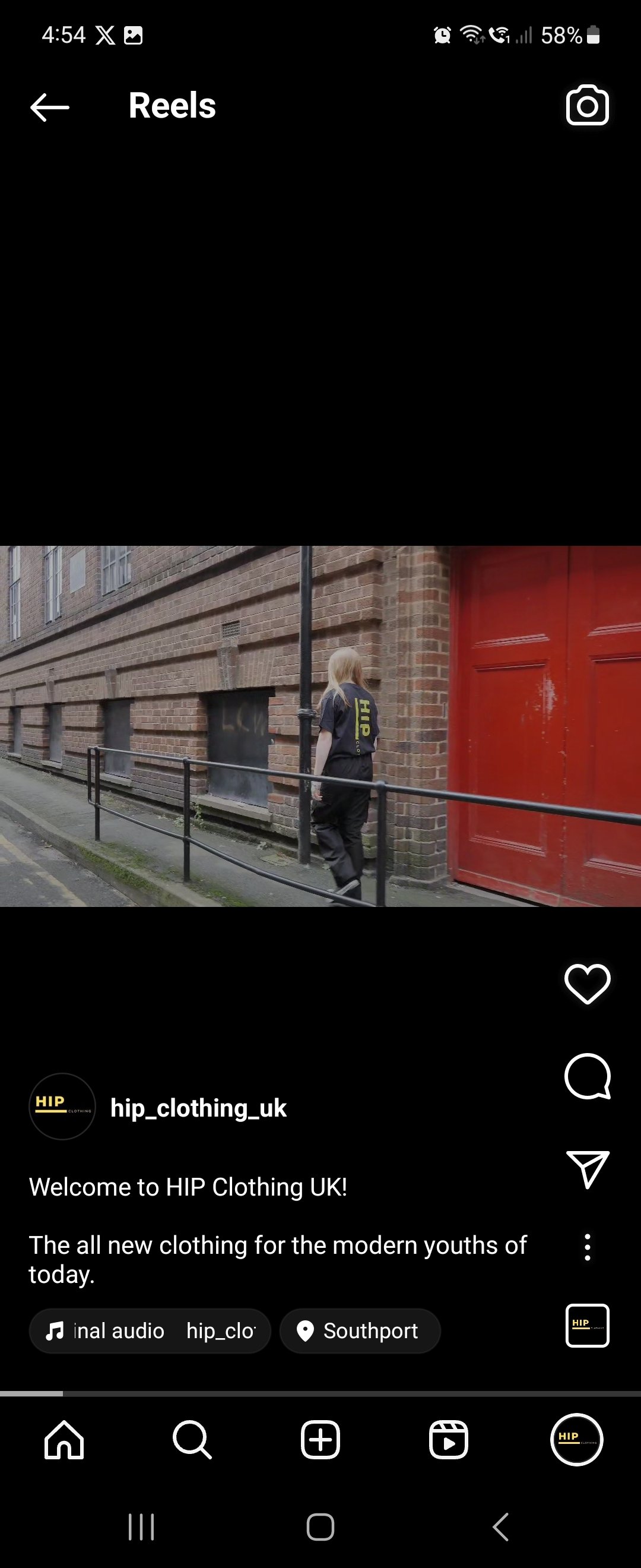
In this video we tried to emulate the “BLACK. promotional video” but the locations we used were based in and around Southport Town Centre.
Secondary Research: -
E-Commerce has become huge due to the rise of the internet, with the functionality of buying and selling goods or services. This also enables a wide variety of systems for both buyers and sellers such as a secure online payment encryption and the functionality of being able to use your mobile for shopping.
Most businesses use this medium to check their online presence to conduct marketing strategies and to oversee logistics and fulfilment. According eMarketer, in 2022 the whole sector will surpass $5 trillion for the first time with more then a fifth of sales, but they say by 2025 even with the slowing of growth the sector could exceed $7 trillion total spending.
Pretty Little Things
One of the biggest E-Commerce websites is “Pretty Little Thing” with their aim is to sell the latest fashion for women. Like most online shops, their aim is to sell clothes, shoes etc, so their latest marketing strategy is to find the latest upcoming influencer to boost their sales and model their clothes for them, for “Pretty Little Things” it is somebody called “Molly-Mae”.
With some of the online stores they tend to display the in studio shots first as they are trying to sell that item of clothing rather then the main focal point being the model in question, but on this occasion they are showcasing the model “Molly-Mae” because people are going to buy that particular clothing because of the person modelling it.
Usually for most companies, when you click on the listing it displays the model in a studio wearing that item of clothing, but Pretty Little Thing” are going for a urban vibe with mainly the focal point again being the model, they are still taking close up shots of the clothing with the last image on the listing being the item not being worn on its own in a studio environment.
Analyse a Promotional Video: -
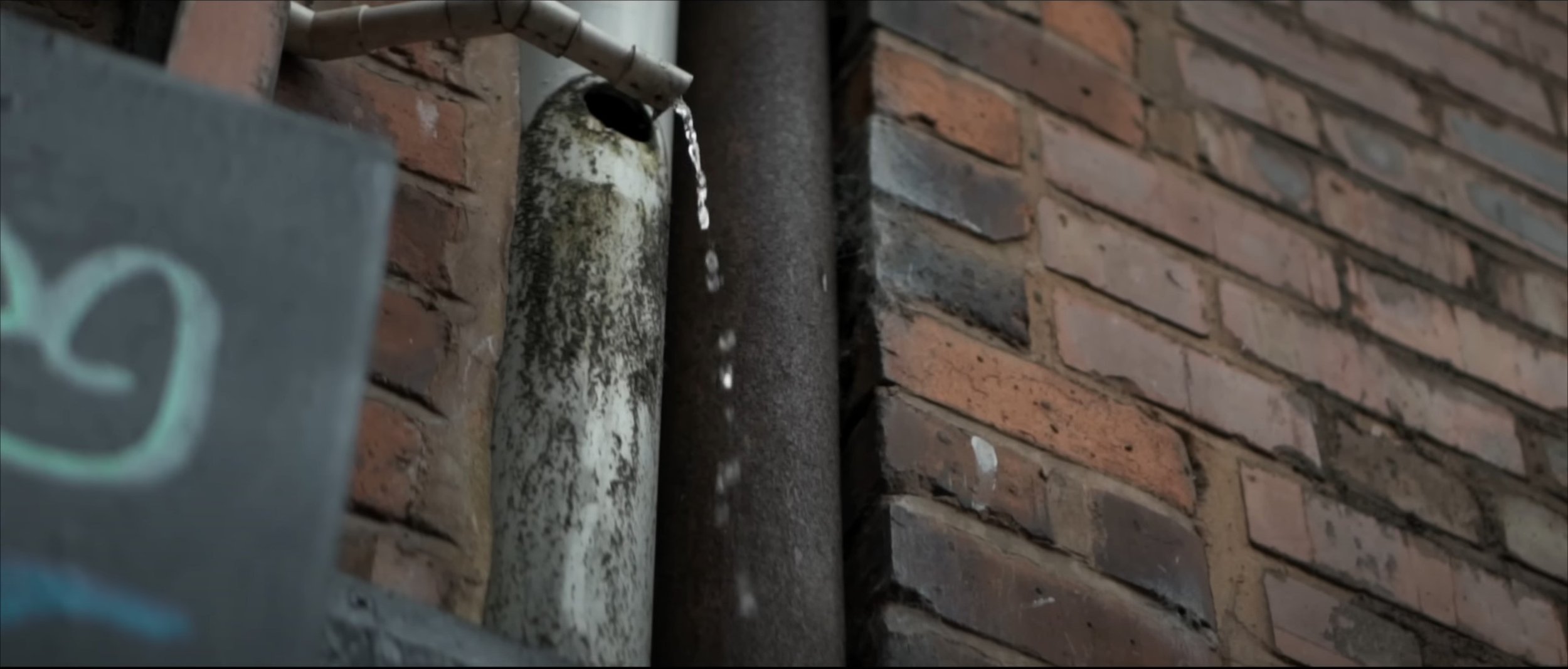
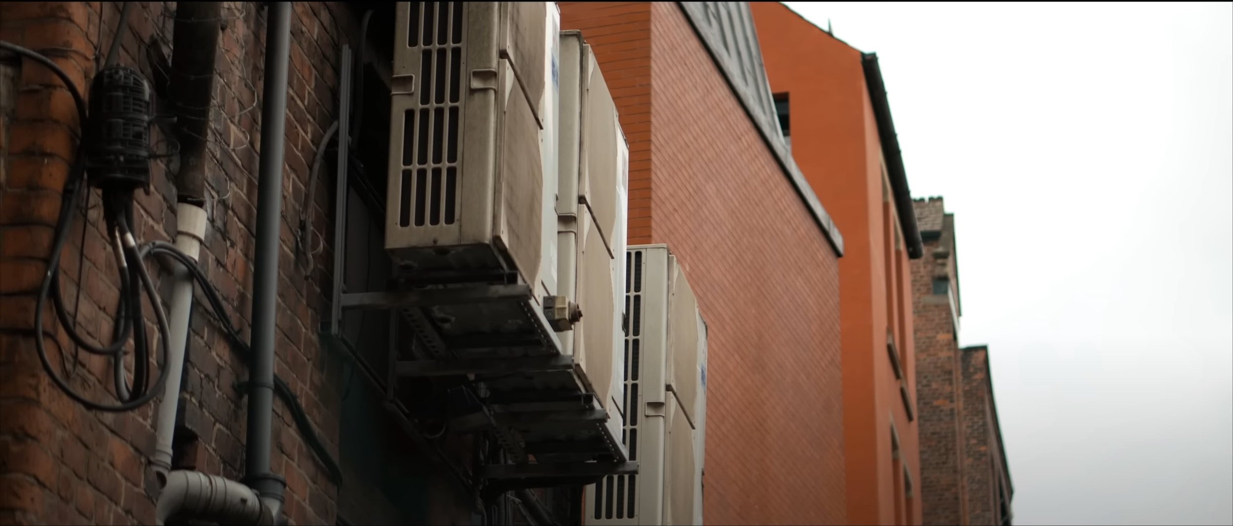
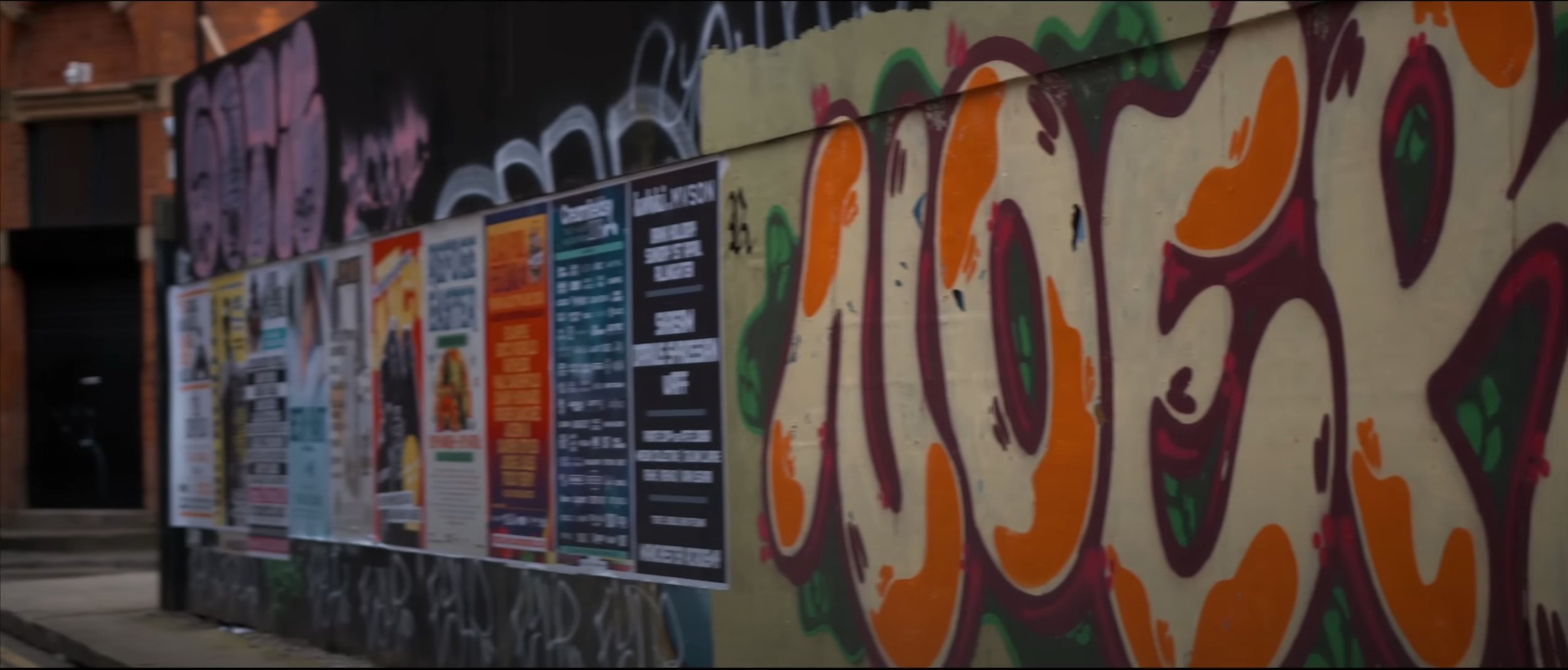
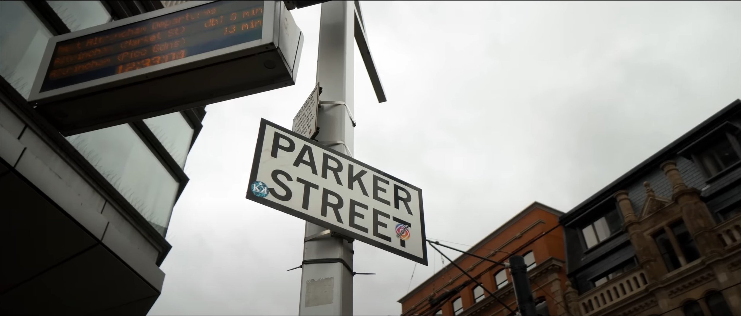
After watching this video a few times I can analyse this video; to start with the video heavily relies on the beat to transition from scene to scene or clip to clip. The video also relies on plenty of B-Roll shots which are filler shots to fit in between the main shots of the two models modelling that item of clothing. The setting of the video is in a urban type atmosphere, which works really well with the shot types and angles used throughout the video. For example the eye level dolly shot used at the beginning, low angle pan, medium close up, tilt down close up, medium wide dolly. There is so much more in the video, their is a simple title at the beginning and end saying “BLACK” which symbolises the clothing brand in question. The video isn’t following much of a storyline, but is definitely following a well planned out storyboard or shot list to create something really good filmography wise at a low budget. The lighting used is natural lighting from daylight, from what I can tell no extra lighting has been used in this production, they seem to be heavily relying on the camera and of course the daylight. The screen grabs for the video are below: -
Production Planning
The Background Of My Production: -
In groups at the start of year we created a Mock-Up clothing promotional video and when we were shooting, I wasn’t personally happy with the shot types, angles and movements used in the original video, especially the editing. So I thought I’d re-record the idea again, but have my own take on it with my own music which I have picked and my take on the filming. I am using the same model again as I thought that initially worked with what we were doing. This time I have had a t shirt printed for the production as well which will give this production some context and purpose.
Storyboard
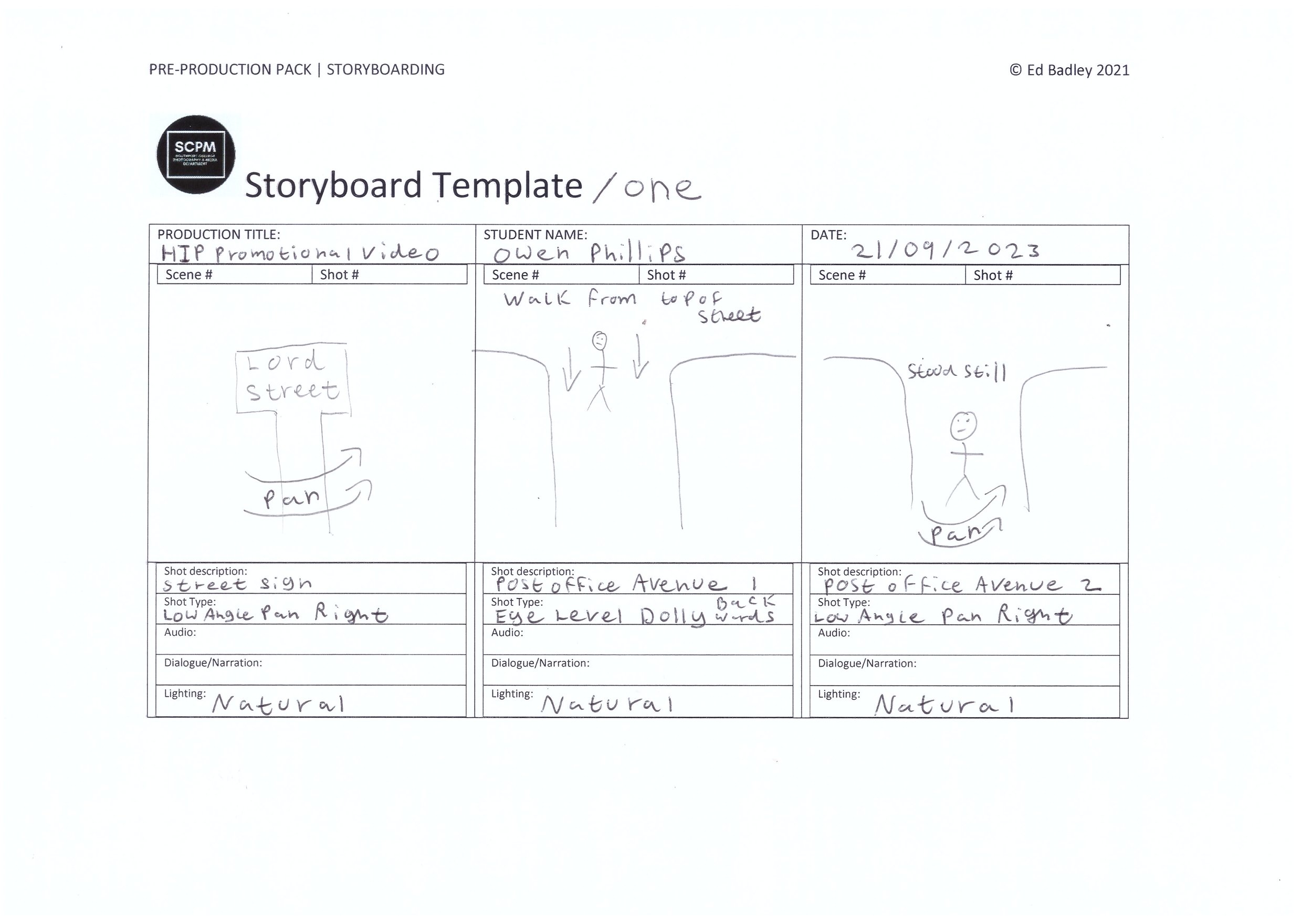
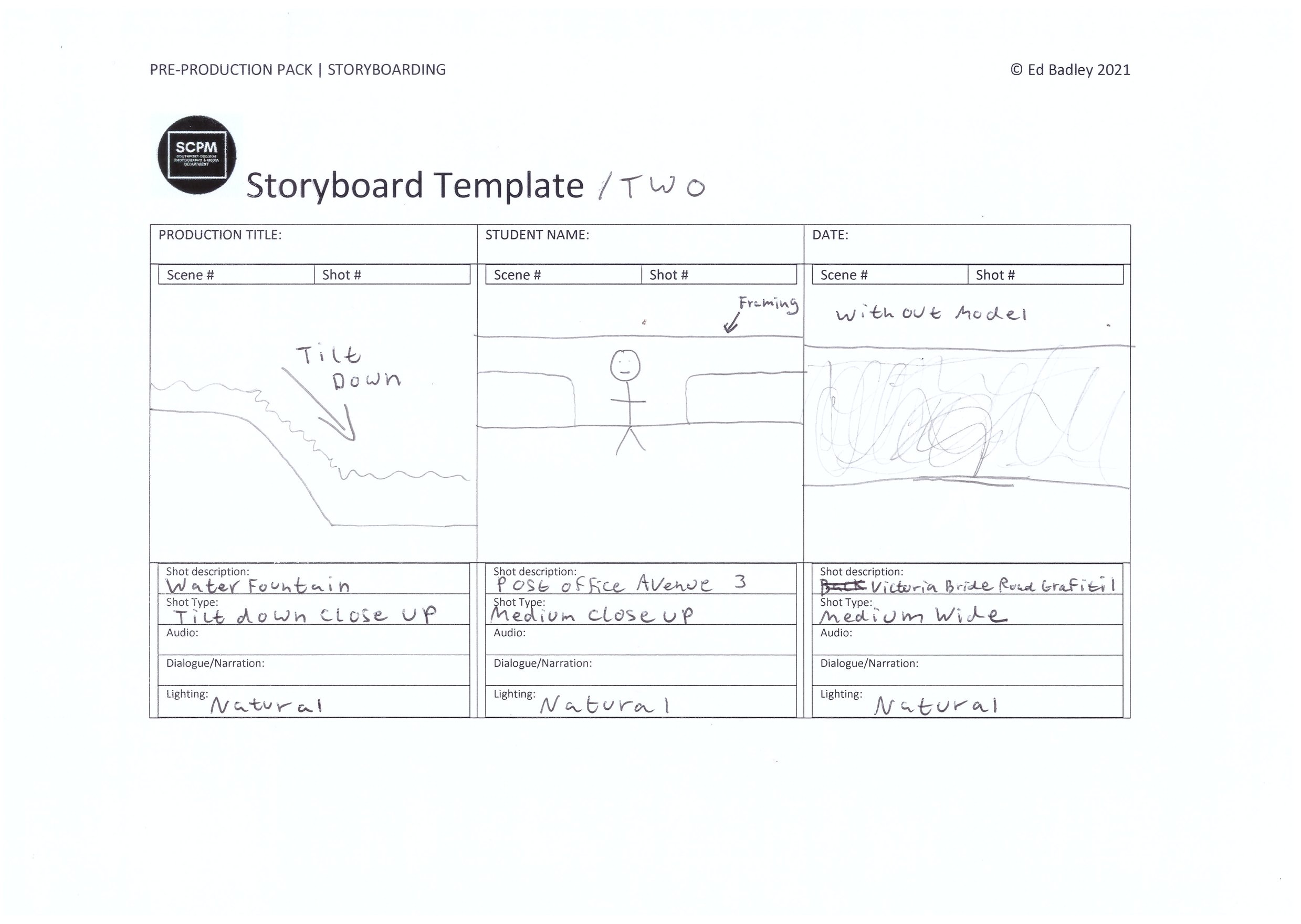
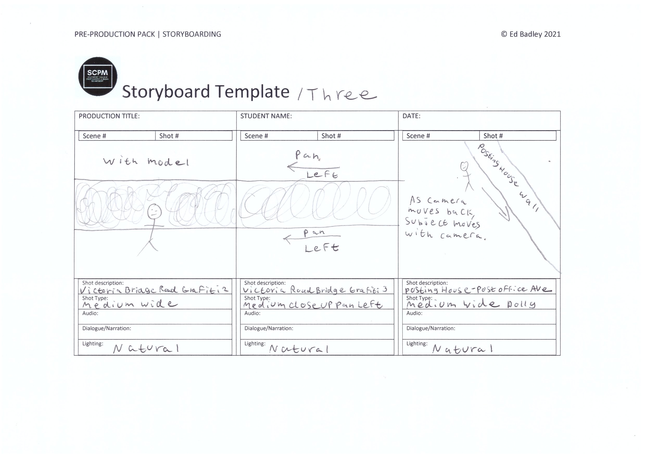
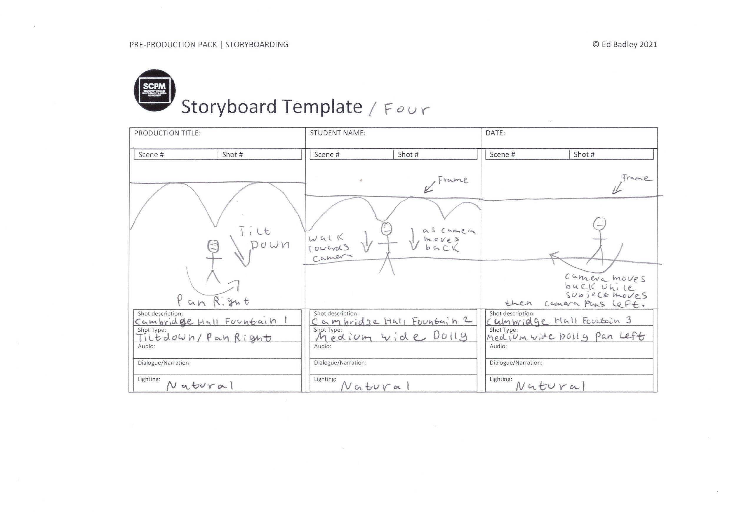
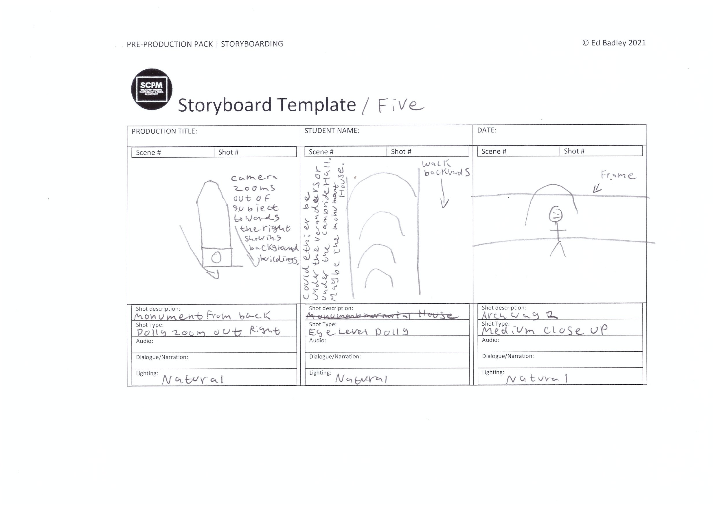
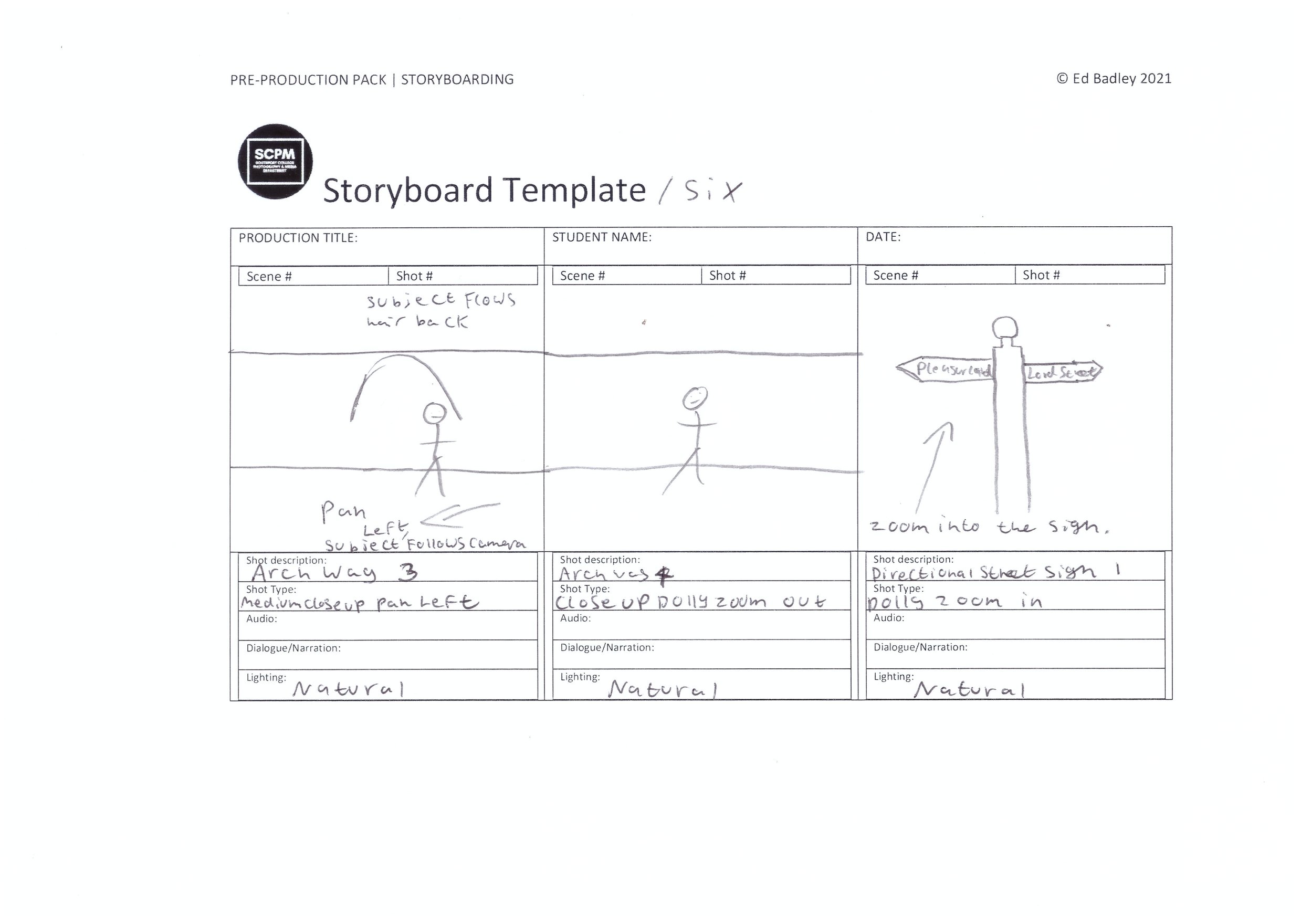
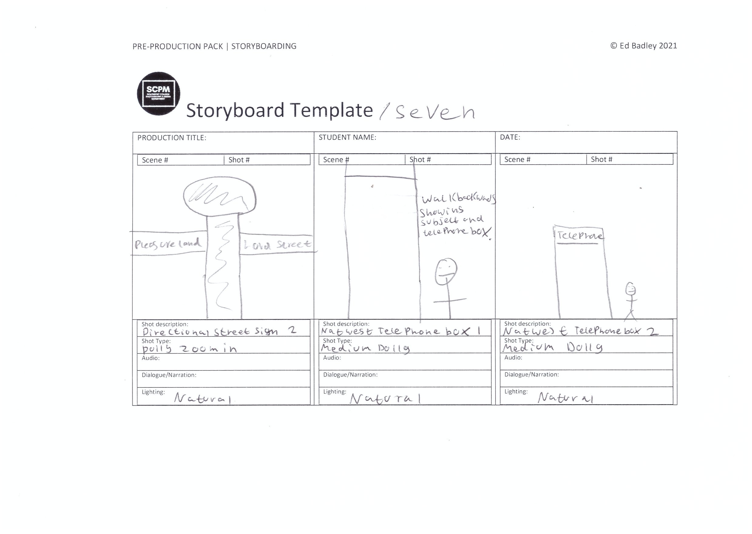
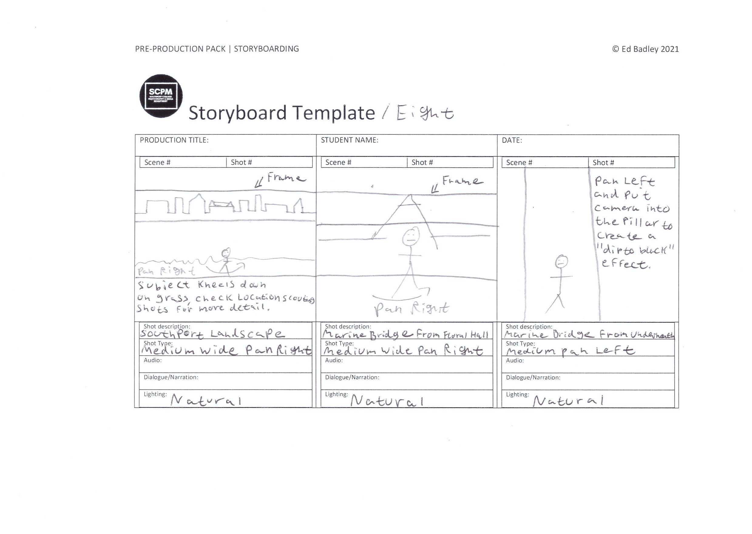
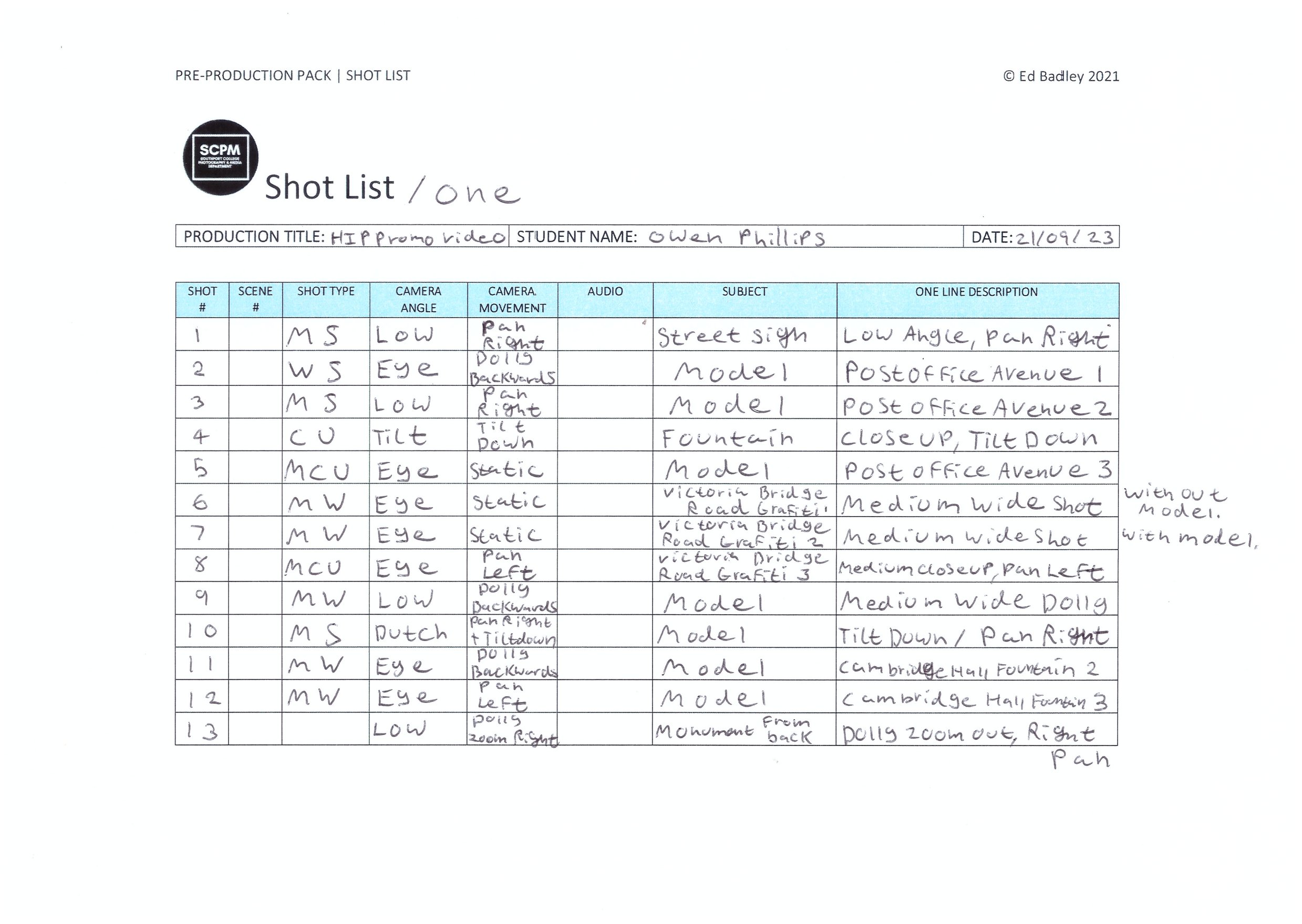
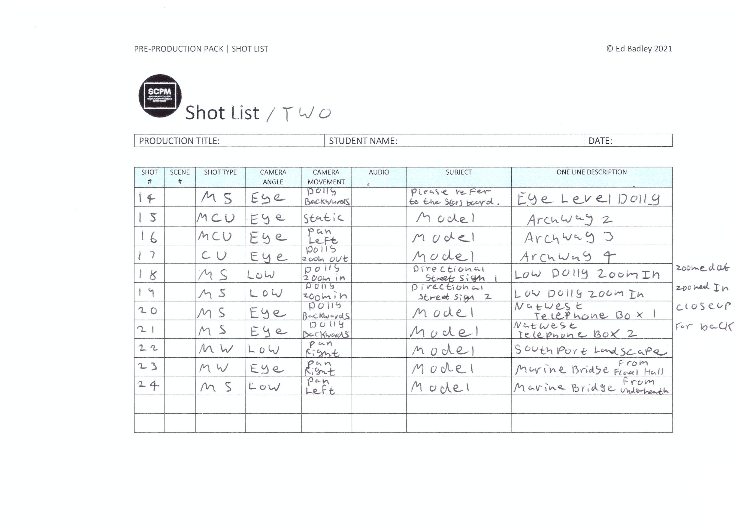
For this project, I have used the storyboard boxes as a drawn shot list to help me with the kind of shots I want to film in this production, If I film loads then I can pick out the best shots I want to use and this means I have plenty enough shots to cut down to the 45 seconds of footage which is required by the brief, nothing longer.
Shot List
Location Scouting
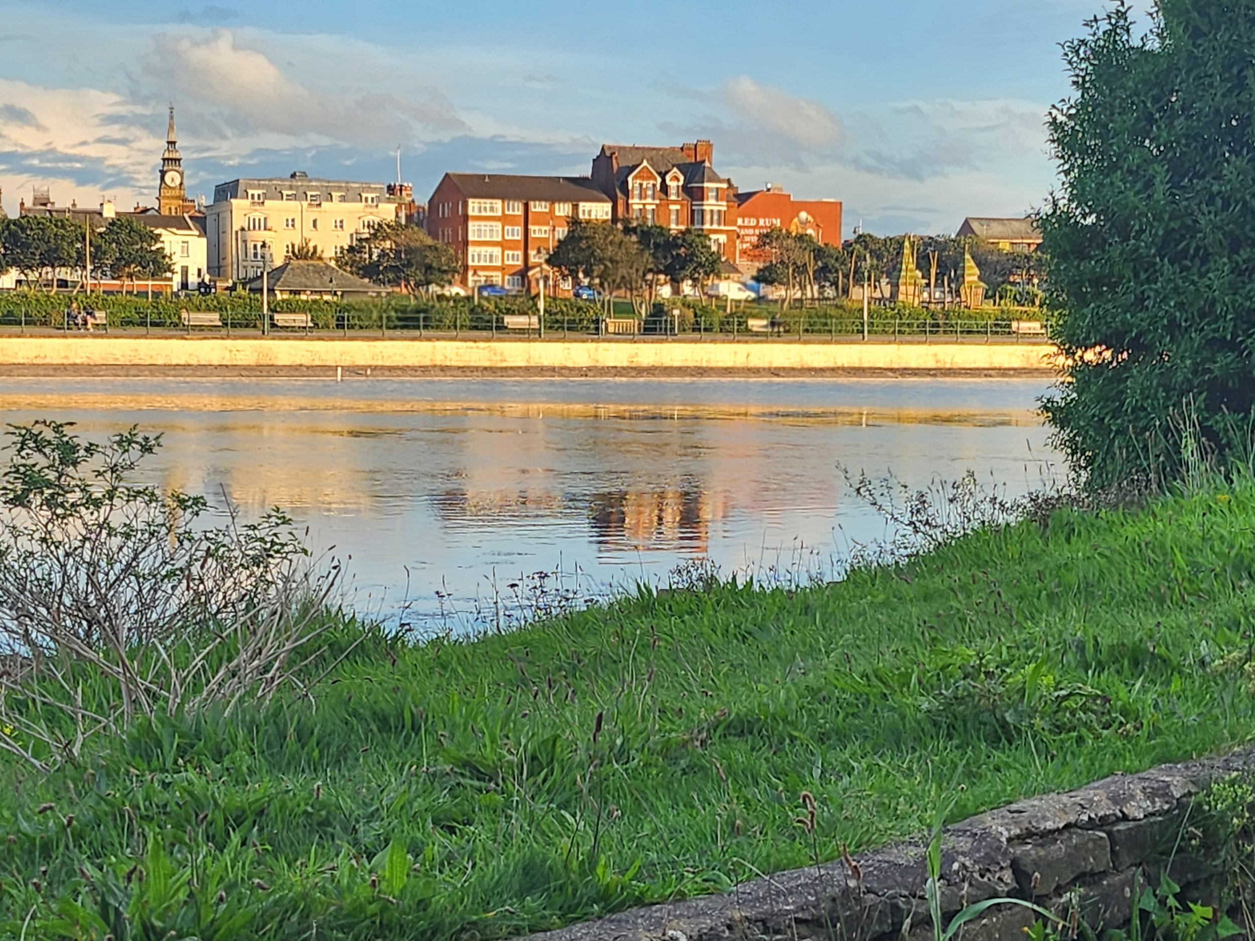
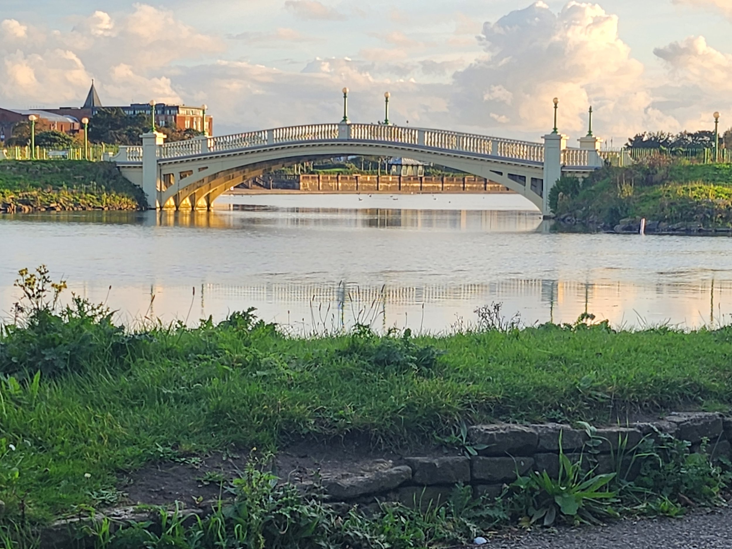
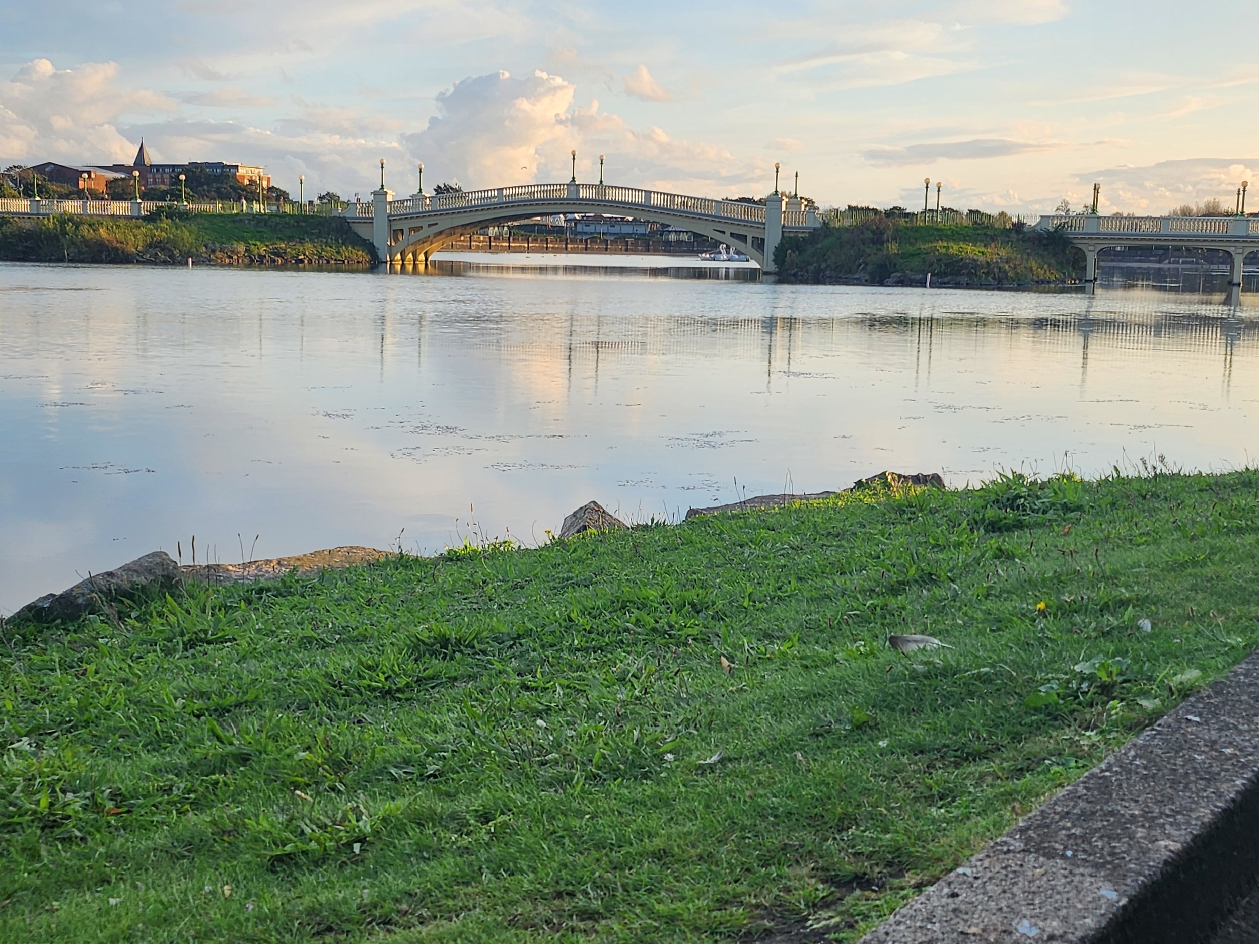
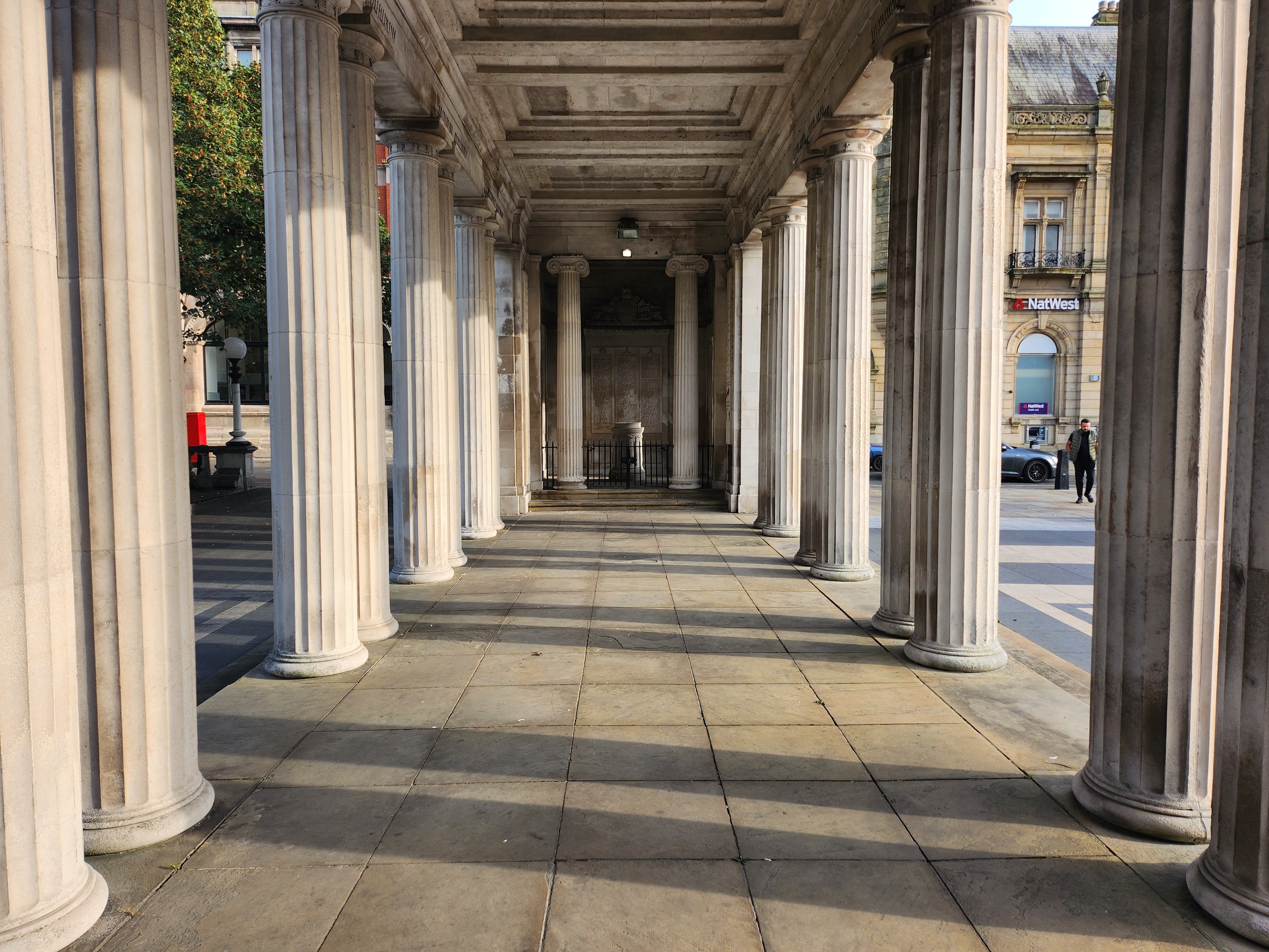
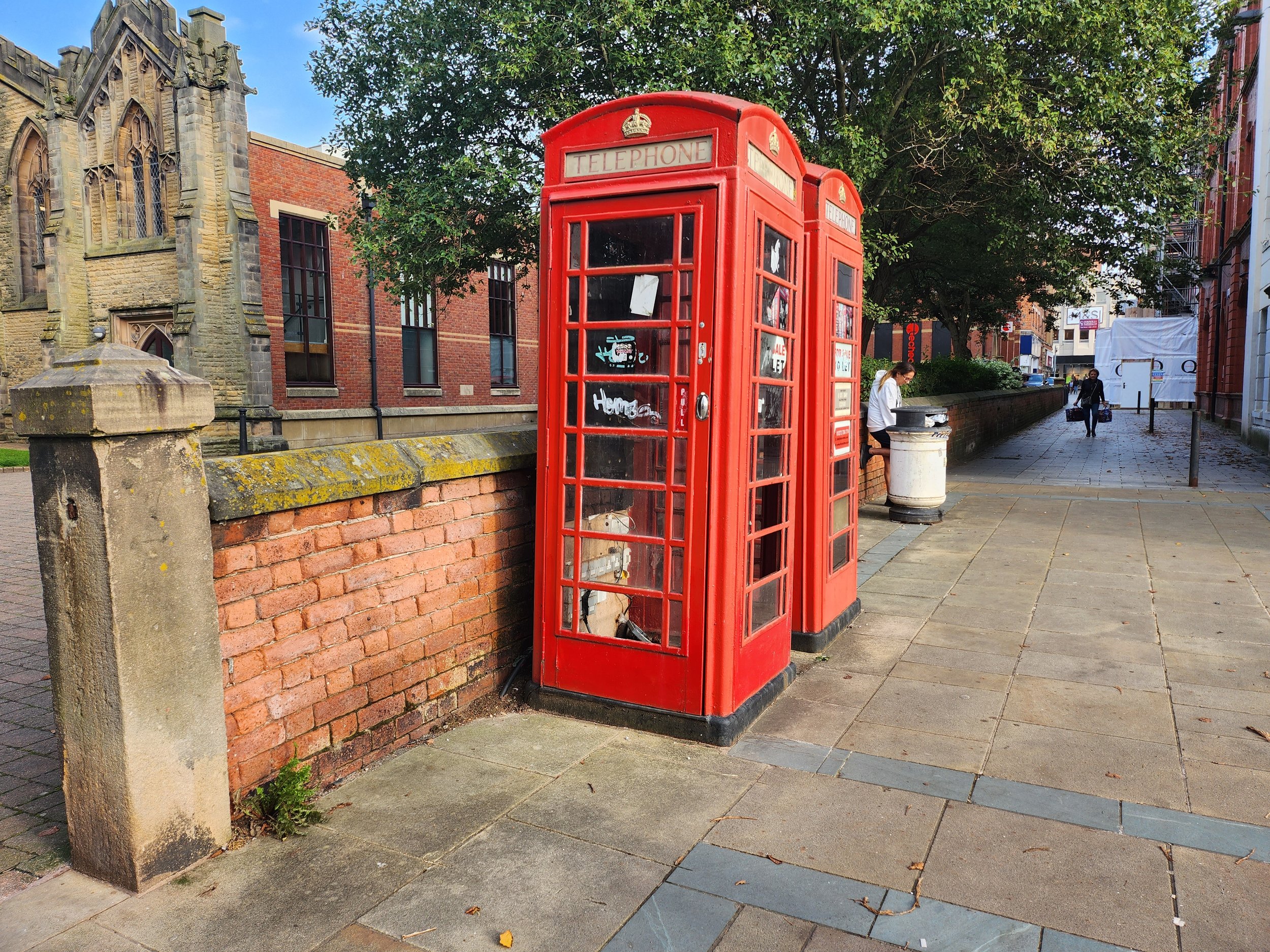
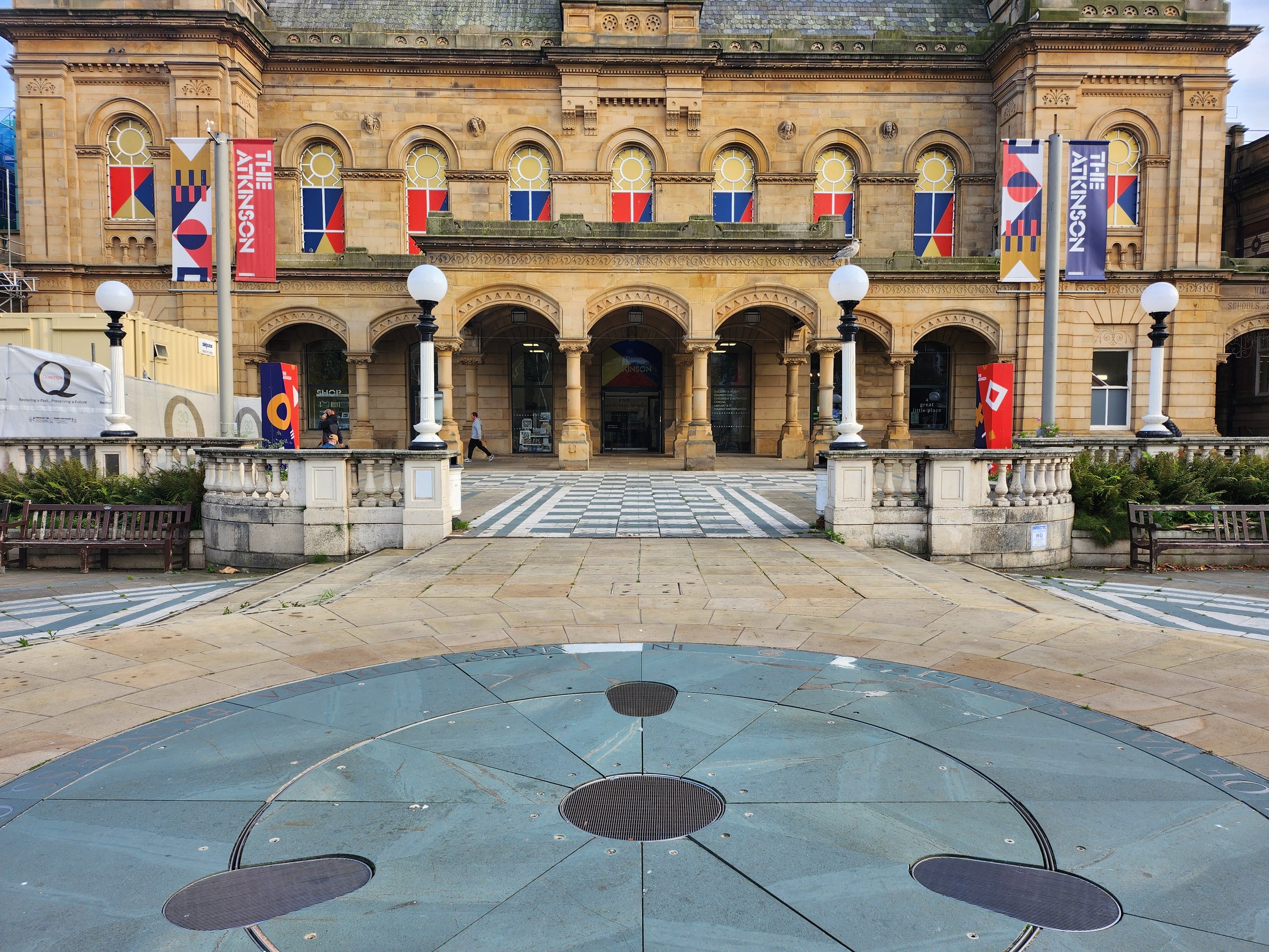
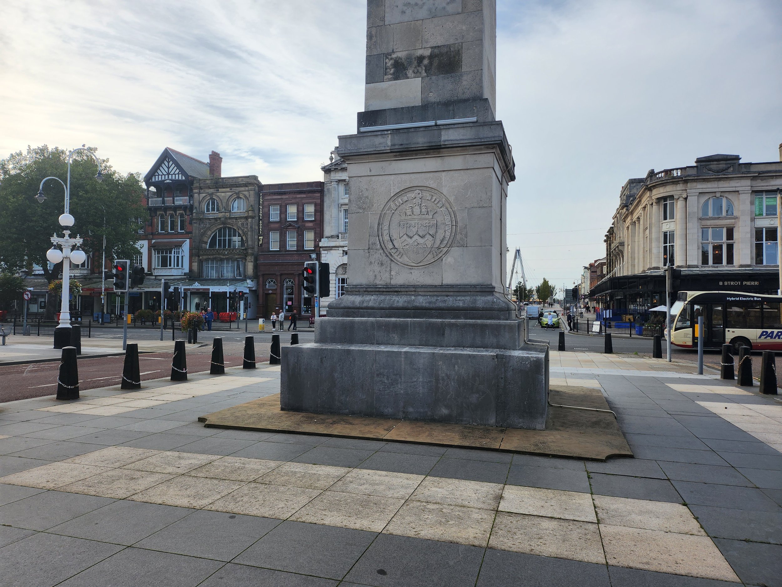
These are all the locations for shooting this promotional video. I have labelled all the images corresponding to the storyboard and shot list to show the locations in which I will be filming. I have also doubled up on some of the shots just in case one location doesn’t fit in with what I am wanting to make. For context, “Shot 11 - Storyboard 3”, the archways in the background, especially underneath them maybe used for “Shot 15 - Storyboard 5“
Practical Considerations
Weekly Production Schedule: -
 Weekly Production Schedule - 2nd
to 8th October 2023
|
|
MONDAY |
TUESDAY |
WEDNESDAY |
THURSDAY |
FRIDAY |
SATURDAY |
SUNDAY |
|
TIME(S) |
9:00am - 12:05pm |
9:00am -12:05pm |
2:25pm – 3:55pm |
12:50pm – 3:55pm |
6pm – 9pm |
3pm – 6pm |
N/A |
|
LOCATION(S) |
Southport Town Centre |
Home |
College – Photography Studio |
Home |
Home |
Home |
N/A |
|
SCENE(S) |
All Scenes |
N/A |
Magazine Scenes |
N/A |
N/A |
N/A |
N/A |
|
EQUIPMENT NEEDED |
Lumix GH5 Zihyun Crane Plus Tripod |
Computer Premier Pro |
Nikon DT700 |
Computer Premier Pro |
Computer |
Computer |
N/A |
|
PEOPLE NEEDED |
Emily Morris |
N/A |
Emily Morris |
N/A |
N/A |
N/A |
N/A |
|
COSTUME/ PROPS/MAKE-UP |
HIP Clothing T-Shirt |
N/A |
HIP Clothing T-Shirt |
N/A |
N/A |
N/A |
N/A |
|
SPECIFIC CONSIDERATIONS |
Film Day |
Editing Stage – First Cut |
Photography Shoot |
Editing Stage – Final Cut |
Blog Work |
Blog Work |
Completion Day |
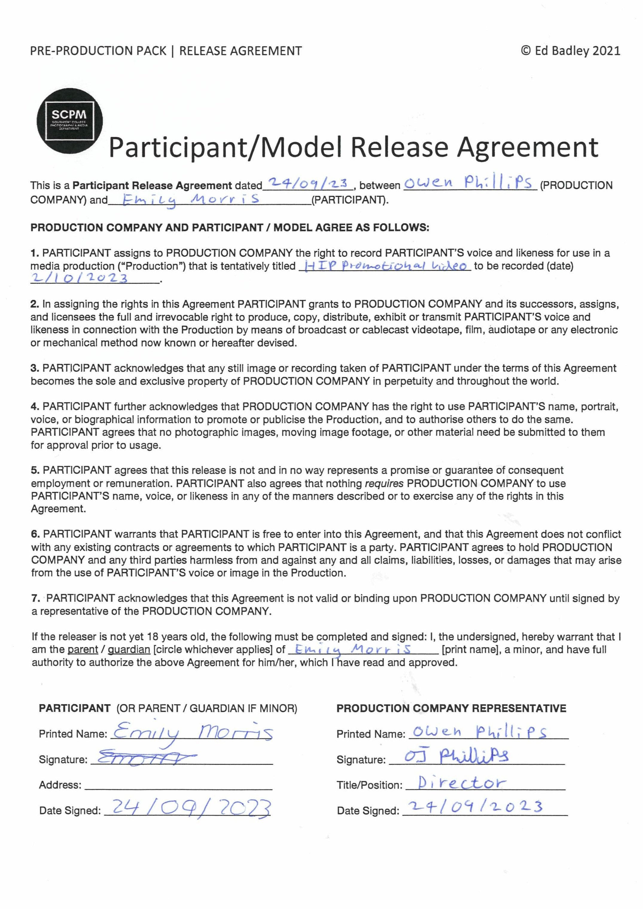
Model Release Agreement: -
The change of colour of the logo in Canva: -
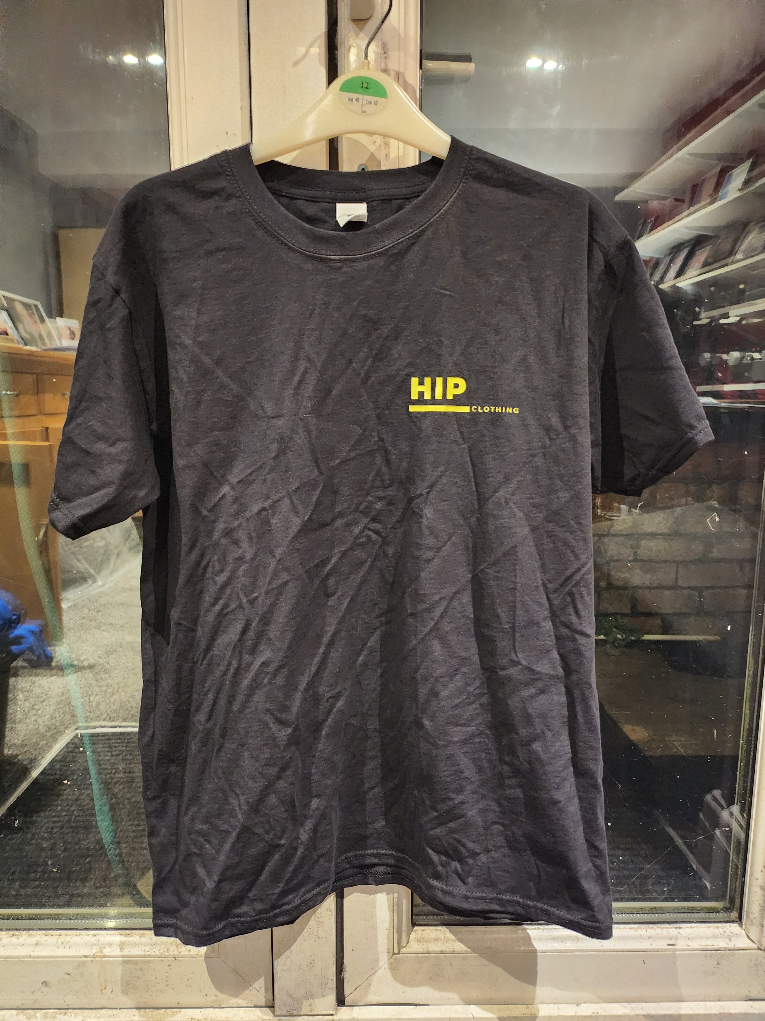
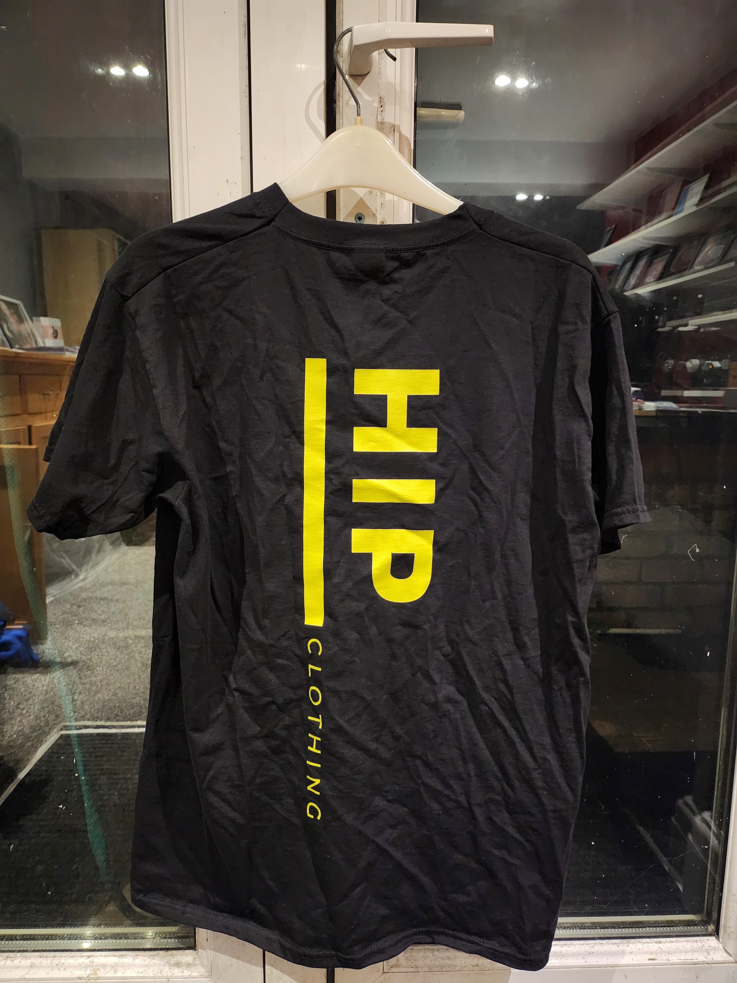
For the T-Shirt which I was getting made for the shoot, I wanted to change the colours for the logo, something a little bit less boring them a black logo on a white background, So I changed the colour to a black background with a yellow background. I’ve always loved this type of colour scheme since I digitalised my Dad’s garage logo (which is now a trade mark I registered) So I thought it would work for this logo and it did.
The HIP T-Shirt
What issues and problems did I encounter during filming and how did I resolve them?
One of the biggest issues I encountered during filming was the weather on the day of filming. It was borderline in terms of if it was going to rain and it did for a few minutes but we managed to push through and get all the clips I wanted. Another problem I encountered with it raining was that I couldn’t do all the location shots I wanted to do, for example the Southport Landscape on the Marine Lake; it would of been too wet to sit down on the grass hence why I didn’t do that part. So I instead filmed some filler shots outside of Christ Church.
Post-Production & Presentation - Video Stills & Editing
Premier Pro Timeline: -
As you can see in the timeline below, the clips that I have used below with no special effects used, so it is purely clips cut in line with the beat to create a sense of pace throughout the video. I have only added a “film dissolve” transition at the beginning and end for a fade in and out effects rather then a “cut to black” transition. I have added at the end of the video my final magazine cover and the logo of the fashion company as well, that was specified in the brief to do. Catchy copyright free background music was added, I have made my own cut by shortening the track by cutting it and dragging it together using the audio transition “constant power” to transfer from one cut of the track to the other without the audio dipping in and out when transferring from track to track. I have also used the audio transition “exponential fade” at the end of the video which fades out the audio, it is also inline with the fade out of the video.
The audio used in the fashion promotional video: -
Presentation
HIP Promotional Video: -
The Final Selection of My Favourite Photographs: -
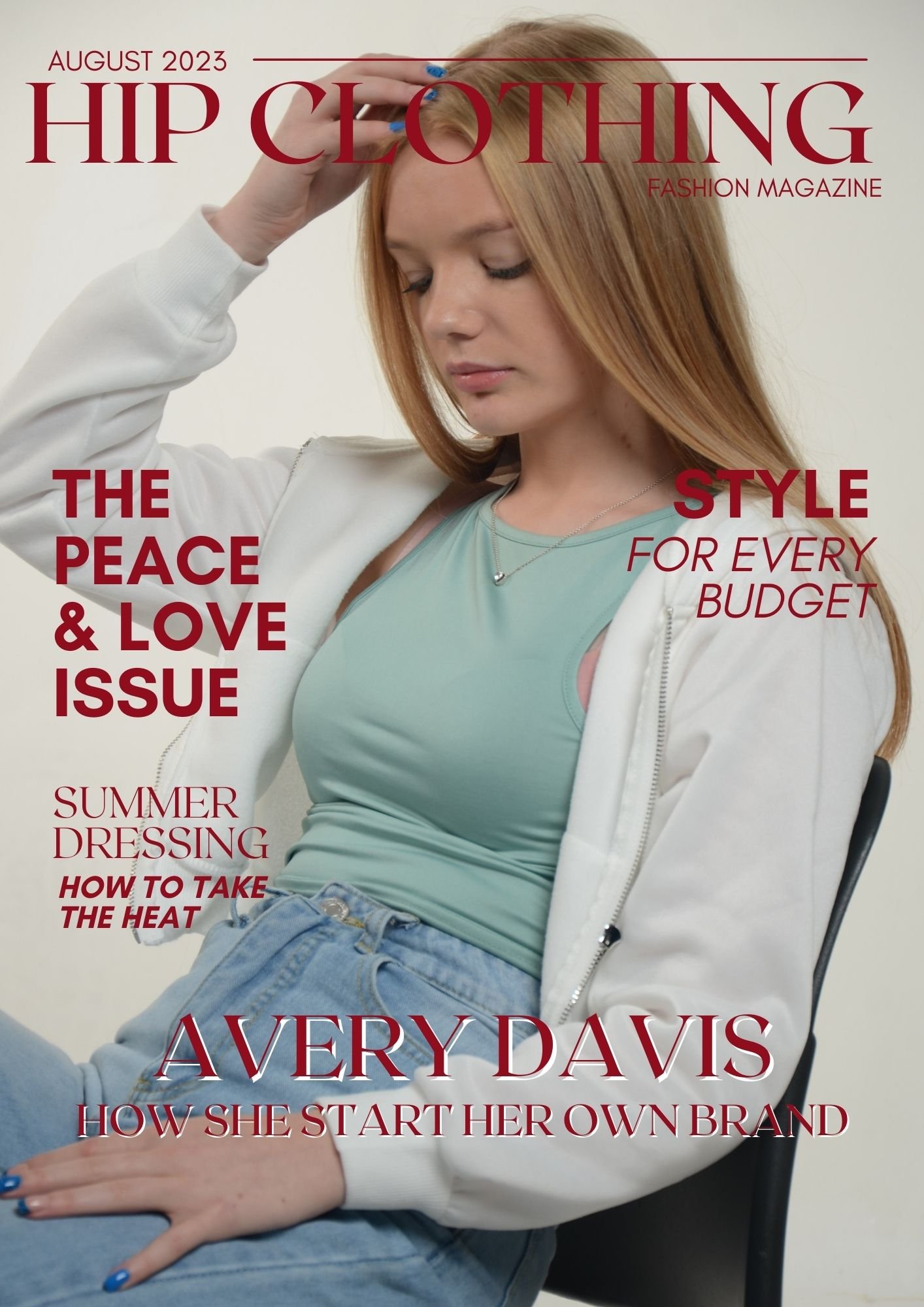
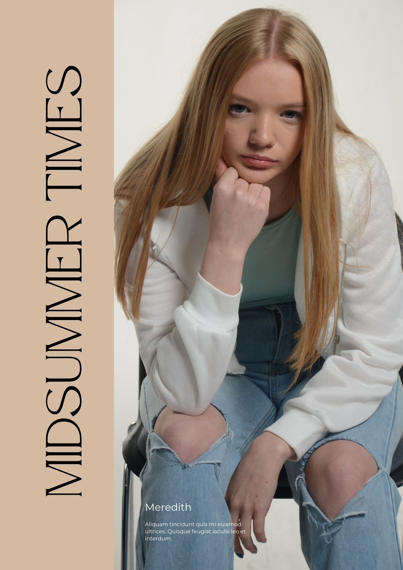
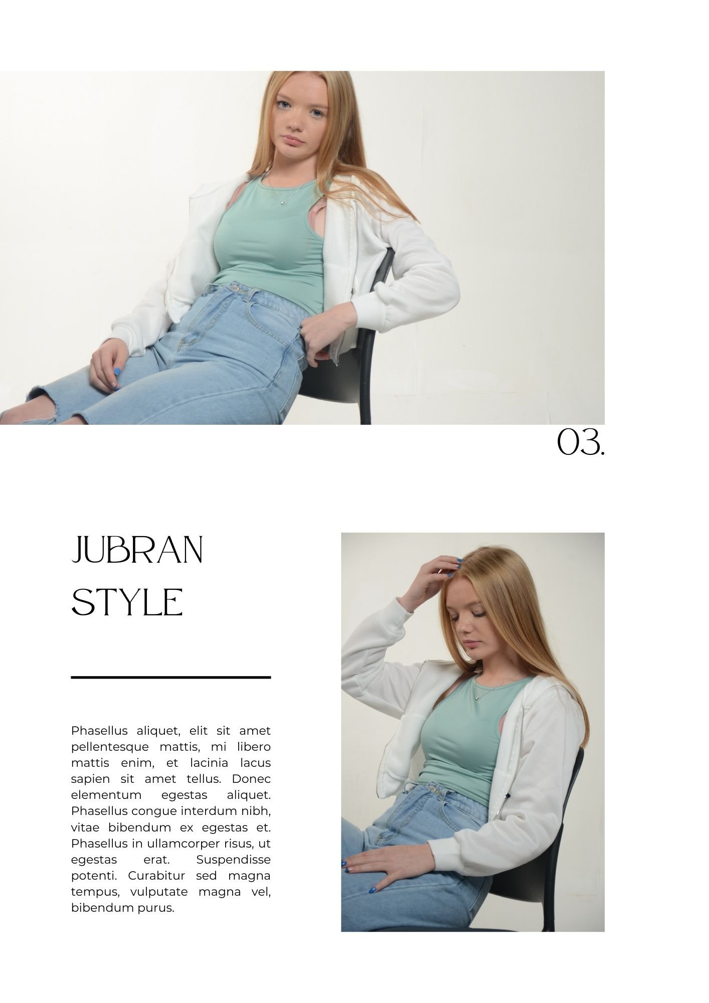
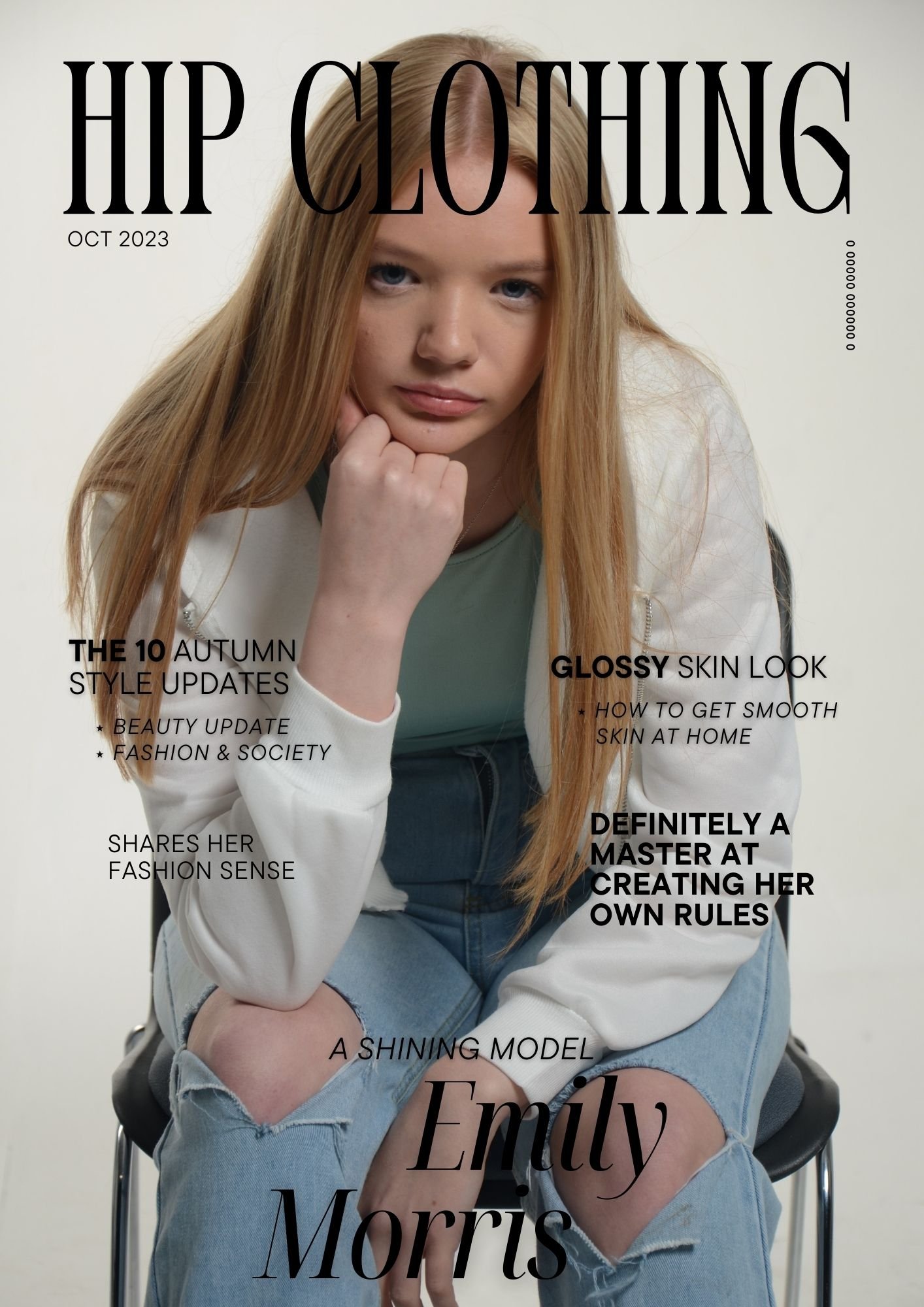
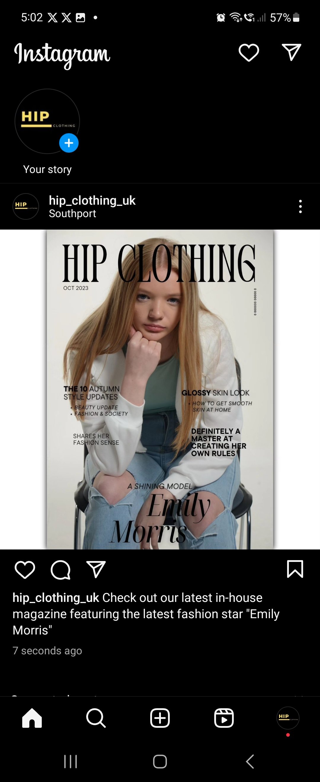
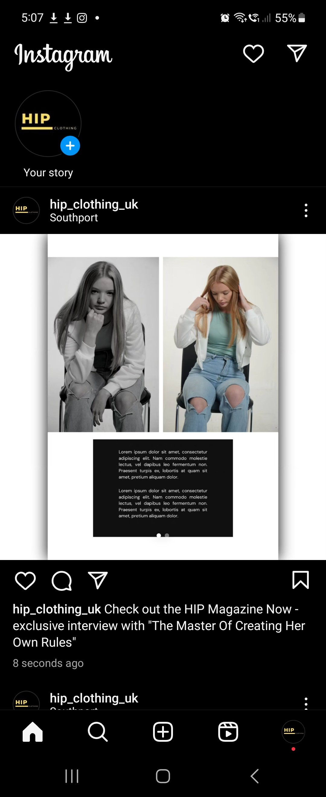
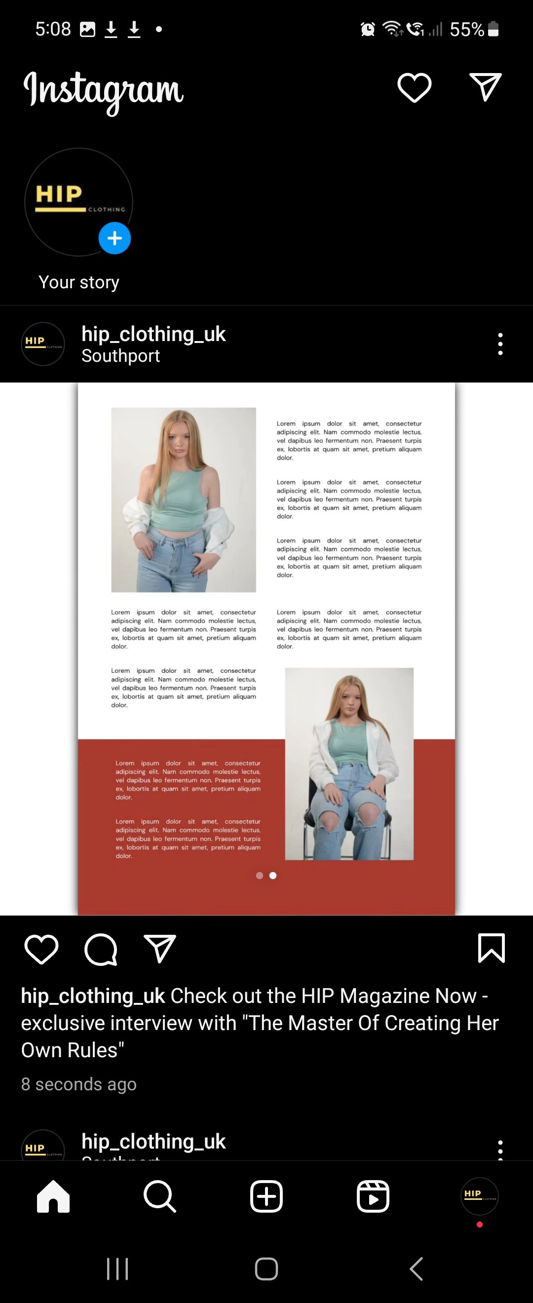
HIP Promotional Magazine: -
“This is a Virtual Magazine in the Form of a Slideshow”
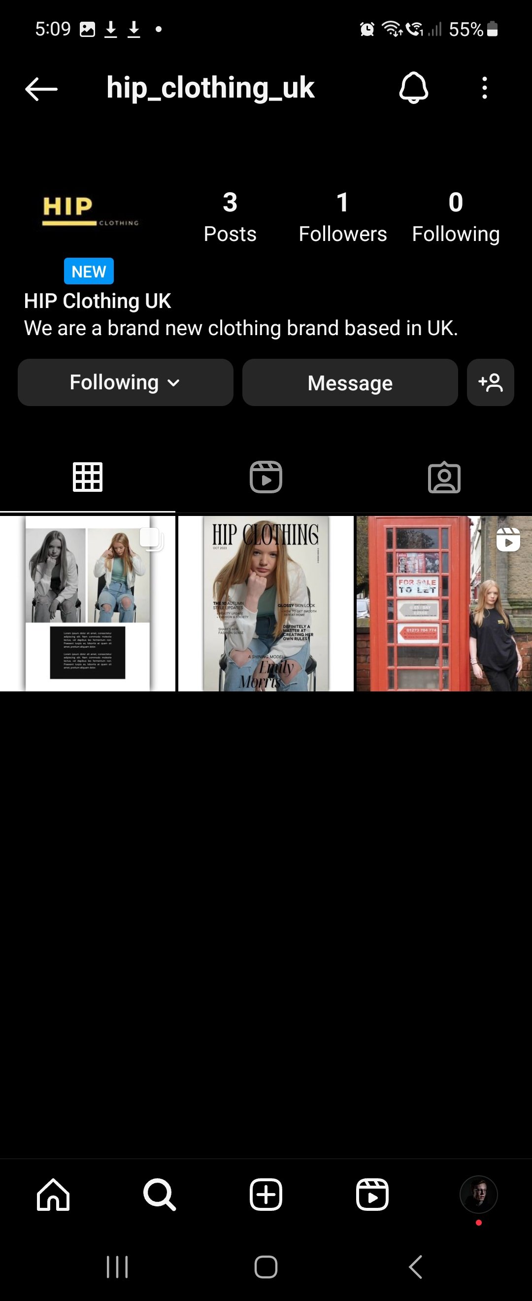
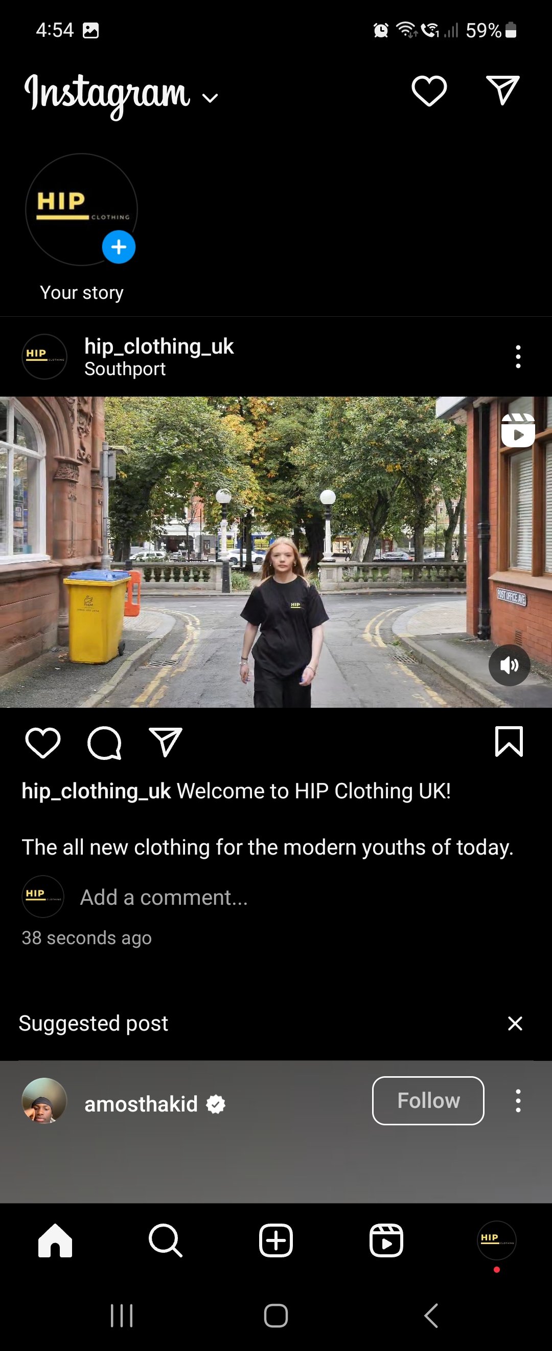
HIP Instagram Page: -
Evaluation & Reflection
Annotate three strengths and three weaknesses of your final images / video promotion assignment. What went well and what could you do to adapt the work produced to improve and develop it?
For the film side, I thought the planning is probably the strongest part of this production as I knew what I was going to film, and it was alterable if necessary. The choice of locations in Southport is a strength because I wanted an urban type of atmosphere for the shoot that worked with the type of video I wanted to create. The editing style I went for with cut the video to the track while the model walks was something I was experimenting with throughout and it took me a few tries to make it work and this leads me onto my weaknesses for this production, some of the cuts in my final production were miss timed by a few seconds. The next weakness is that the sped-up parts went on for far too long and should have been cut and put some more B-Roll in there from different locations and as I never filmed lots of B-Roll shots, I should have pulled the film back into editing for another final cut and re-recorded some more B-Roll shots. But in an ideal world with another week or so I would have done that but due to the project needed to be handed tomorrow as I am writing this, I don’t have the time to pull it back and re-edit.
For the photography side, the strongest point was the lighting in the studio was set up correctly, it was High Key lighting used which creates minimal shadows with low contrast but makes the frame bright using soft lighting. The next strength is the poses used and this improved my communication skills for directing the model as well because it was poor before, and this has gained my confidence to talk more often in the studio. This leads me onto my weaknesses, one of them was we should have had a chance of outfit for the model as it was the same outfit used throughout the shoot and magazine. I also think different camera angles should have been used as it seemed to be the same medium shot or close shots used throughout the shoot.
What experiments and exploration did you do? How did it affect the development of your project?
For the film side, I was experimenting with the editing side of the film because I tried editing the video to the music, for example I cut the video to the track while my model was walking. As I have reflected as a weakness in the production, I missed timed cuts in the video.
For the photography side, I was learning how to direct my model in the studio for the type of pose I wanted them to do, and I found that as one of the hardest things as I didn’t know what to say. But now as I have experimented in the studio with somebody, I am comfortable to be around, which means my communication skills should have improved for next time.
What do you now understand about the e-commerce fashion media industry? What did you find out?
I understand that a lot of different factors go into the making of the fashion media industry with the rise of online shop and the fact that a lot of marketing goes into creating the online shop with out they are advertising a specific type of product or how they use a famous person as a focal point to sell their clothes which is another huge thing in this industry currently. In the photography terms I found out that they use mostly studio work to sell their clothes as on location shots is really distracting, this leads me onto the most common lighting technique they use is High Key lighting.
Authentication Document

