Documentary Photography
Contest & Research
Documentary Photography Research
Analyse x3 Photographers
Sir Donald McCullin MBE aka Don McCullin was born on the 9th October 1935, He grew up in Finsbury Park in London. From an early age he was called up for National Service in the RAF, after returning from his postings he bought home a twin reflex Rolleicord camera and began photographing a local gang named “The Guv’nors” they also happen to be his friends. More by accident then anything else, McCullin persuaded the “Observer” to show them the picture editor in 1959, this started his career off.

He has won various awards such as the “British Press Award” for his essay of the construction of the Berlin Wall in 1961. He also won the “World Press Photo Award” where he covered the armed eruption of the ethnic and nationalistic tension in Cyprus in 1964 and lastly he was awarded the “Commander of the Order of the British Empire” (CBE) award, he was the first photojournalist to be awarded this specific award in 1993.

Limassol, Cyprus in 1964 - The Cyprus Civil War
From having a look at the visual elements and analysing the image, from the start I can tell that rule of thirds is being used used here as two thirds of this image is empty compared the other third has the man walking out the door and the soldier run towards battle. The lighting techniques used are natural but with the way the sun is facing, it has cast a shadow on the wall. Frame within a frame is also being used with the man standing in the door way. The storytelling aspect of this image is telling us that as their is a war going on, other people are living their normal lives as you can see somebody is walking out of the door while the soldier is running into battle.

Londonderry, Northern Ireland in 1971
From having a look at the visual elements of this image, I can see that it it uses the leading of lines composition as when you look at the image your drawn to the curb and it leads you to where the soldier is. This also uses a rule of thirds because the young man is in the first three squares of the image and the soldier is in the last two squares at the bottom of the image. The lighting techniques are natural and as you can see their is no shadows being cast in this one - so the light must be shining from above these two subjects. The storytelling aspect of this image is telling us that it feels like a normal day to a few in Northern Ireland even when their is a war being fought, you can see this by the young man is walking with a parcel in his hand and the soldier on the floor is holding a gun aiming/shooting.

Gang of Boys Escaping CS Gas, Londonderry, N.Ireland in 1971
From having a look at the visual elements of image, I can see that it is using leading of lines because when you look at the image the kids are jumping off this huge concrete wall and your eyes are lead to following them down the wall and where their running to. This image also uses rule of thirds with the last 2 segments of the third is showing the kids on the wall and then the first third is showing them running on the floor. The lighting techniques seem very generic and natural. The smoke that is in the air sets the atmosphere and creates a special effect which suggests poisoners gas has been set off and this shows the storytelling of the image because all the kids are running away and getting to safety.

Hue, Vietnam in 1968
To start with this image shows frame within a frame because the image is shot between two posts. Rule of thirds is also being used in this shot as well because most of the action is using the middle three boxes of the image. What makes this photograph really interesting is the fact that you can see the soldier is throwing a grenade in the battle field and at the same time he has lost his balance when throwing. The lighting techniques used in this image is generic and is using the natural daylight to generate the image.

The Christian Youth Celebrating the Death of a Young Palestinian Girl, Beirut in 1976
From a storytelling point of view I can see that these 6 people are celebrating the death of a Palestinian Girl, but from the facial expressions and actions I can see one of them is holding a gun pointing it towards the dead body suggesting that he could of killed her and the other kids seem to be laughing and joking about death and thinking it is a normal event when really it isn’t. The visual effects shown in the image where their is plenty of smoke being show, this suggests that this is residue from a grenade or gas. The lighting techniques used is generic and relaying on natural light. Rule of thirds is being shown in this video with the middle third of the image is where the young kids are and the bottom middle third is showing the dead Palestinian Girl.
Sebastiao Riberio Salgado Junior was born 8th February 1944, he grew up in Aimores, Minas Gerais, Brazil. By trade Salagardo is a Economist after earning a “BA Degree” from UFES and a “Master’s Degree” from University of Sao Paulo. He also earned a PhD from the University of Paris. As a first job as an economist, he worked in Africa at the “International Coffee Organisation” - He would often be travelling on missions for the World Bank.

On his travels around Africa he started getting into taking photographs, He eventually abandoned his career as an economist and became a photographer in 1973. Sebastiao has worked for many photography firms; most notably “Sygma, Gamma and Magnum Photos”. After working for many firms he started his own Agency in Paris called “Amazonas Images” to help represent his own work a lot more. He has won many awards - to name a few, in 1992 he one a “Centenary Medal” from the “Royal Photographic Society” and the “Crystal Award” from the “World Economic Forum”

Serra Pelada, Gold Mine, Brazil in 1986
From the storytelling point of view I can see that these people are climbing up a big hill using wooden ladders out of a gold mine and of course as you can tell by the clothes they are wearing, they are old and worn out. On one side of the image you can see their carrying a bag of gold from the mine and the other side they are carrying nothing. From a composition point of view it uses leading of lines because your eyes are focused up to the top of hill. The lighting techniques used in the this image are very generic a relays on natural light to generate the image.

Serra Pelada, Gold Mine, Brazil in 1986
From a storytelling point of view I can see that these people are climbing up a big hill using wooden ladders, but in this image it is more of wide shot of the hill, but with a close up of somebodies back and it is looking very sweaty and muddy as it all seems really hard work. The wide shot of the image above shows the vast scale of the gold mine and the whole complex. As you can see all the climbers are carrying up bags of gold and it seems they are leaving a few behind as they can’t carry them all up. From the composition side, the image uses leading of lines because your eyes are following towards the ladder and up it. Lighting techniques used are very generic and is relaying on natural light to generate the image.

Refugee Camp, Benako, Tanzania in 1994
From a storytelling point of view, this is showing a very depressing and poor atmosphere. One of the saddest parts is where their is a baby and its mother on the floor, but the baby’s expression is suggesting that the comfort they are receiving from their mother seems good, but in a very depressing situation. Apart from that the image suggests poverty and everyone seems to be struggling. The lighting techniques used are are very generic and relaying on natural lighting. The composition used in this image is rule of thirds because every third has something happening in it, for example the middle bottom third has the mother and baby.

Yanomami Indigenous Territory, State of Amazonas, Brazil in 2014
From a storytelling stand point, this image is so ambiguous; meaning it could be open to interpretation by anyone who looks at it, but from what I can tell he is either surrendering or he is saying stop. I think the guys behind him and presumably surrendering as they are not fighting. From a composition point of view it is almost as if it is using frame within a frame with all the branches overshadowing the images. Lighting techniques which are being used are very generic and relaying on natural light to generate the image shown.

The Oil Fields, Kuwait in 1991.
From a storytelling point of view, you can see that this is showing a firefighter trying to put out the flames in the oil fields, I believe it took them nine months to put it all out properly. From a composition point of view I can see the contrast has been cranked up really high to showcase the fire in its best light. Rule of thirds has been used as each third has something happening in it. So far most of the images have been shot in the daytime, but with this one, It has been shot at night time and rather then relaying on the daylight, he is depending on the light from the fire to bring out the image.
Practical Skills
Pre-Production
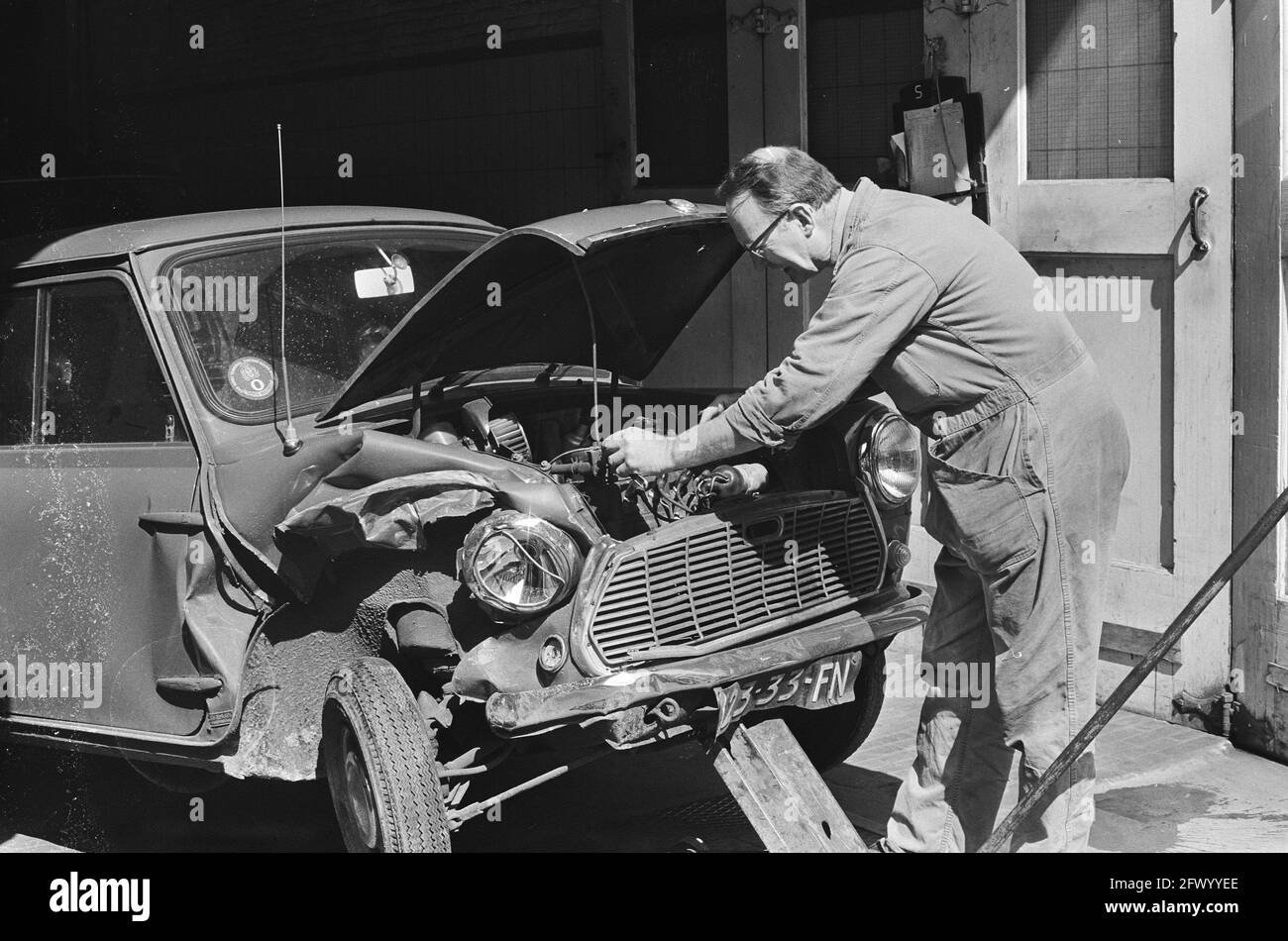
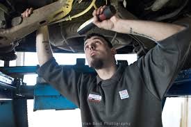
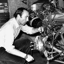
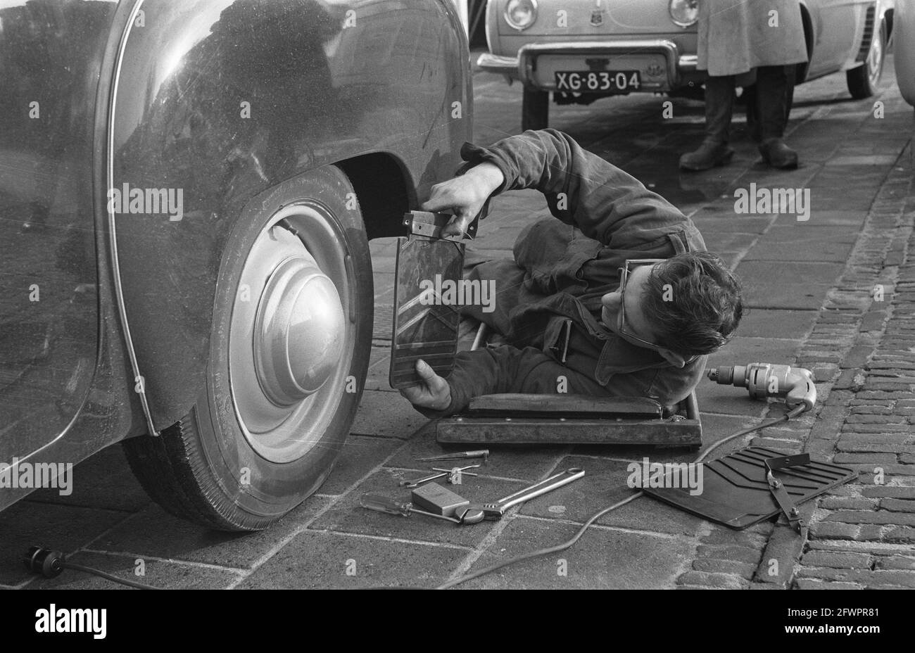
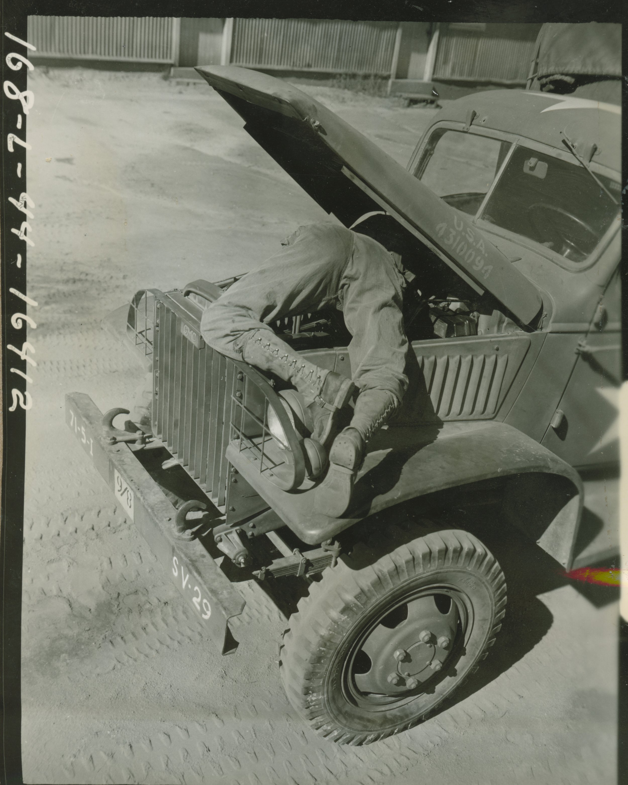
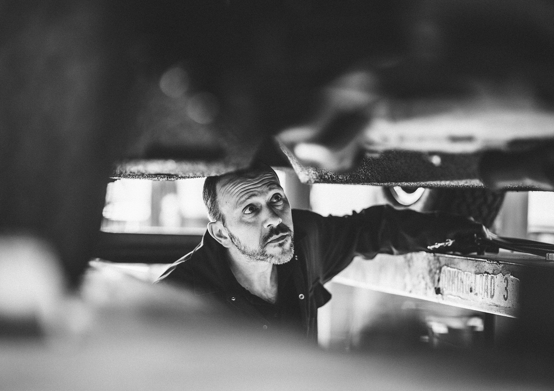
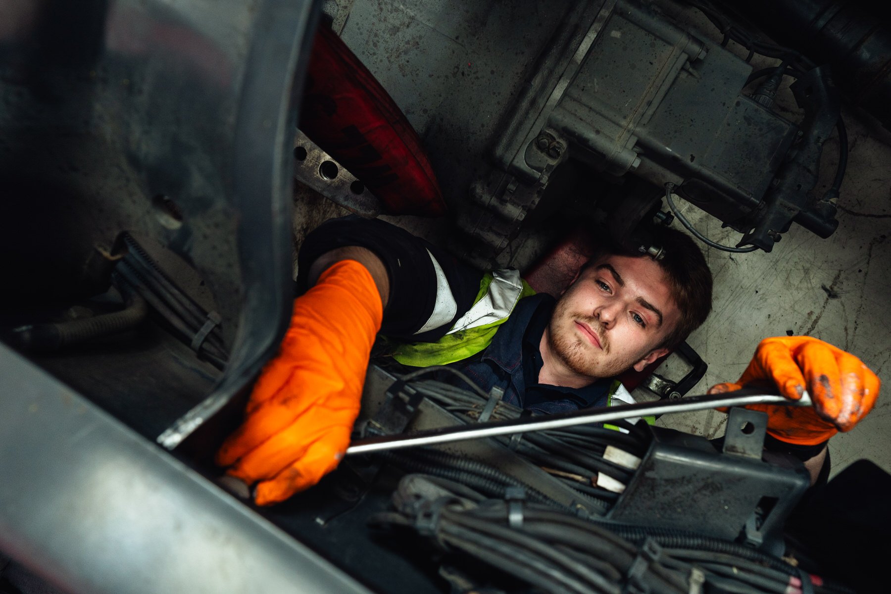
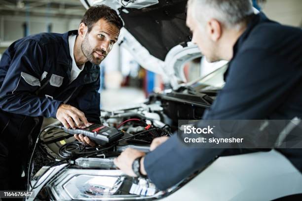
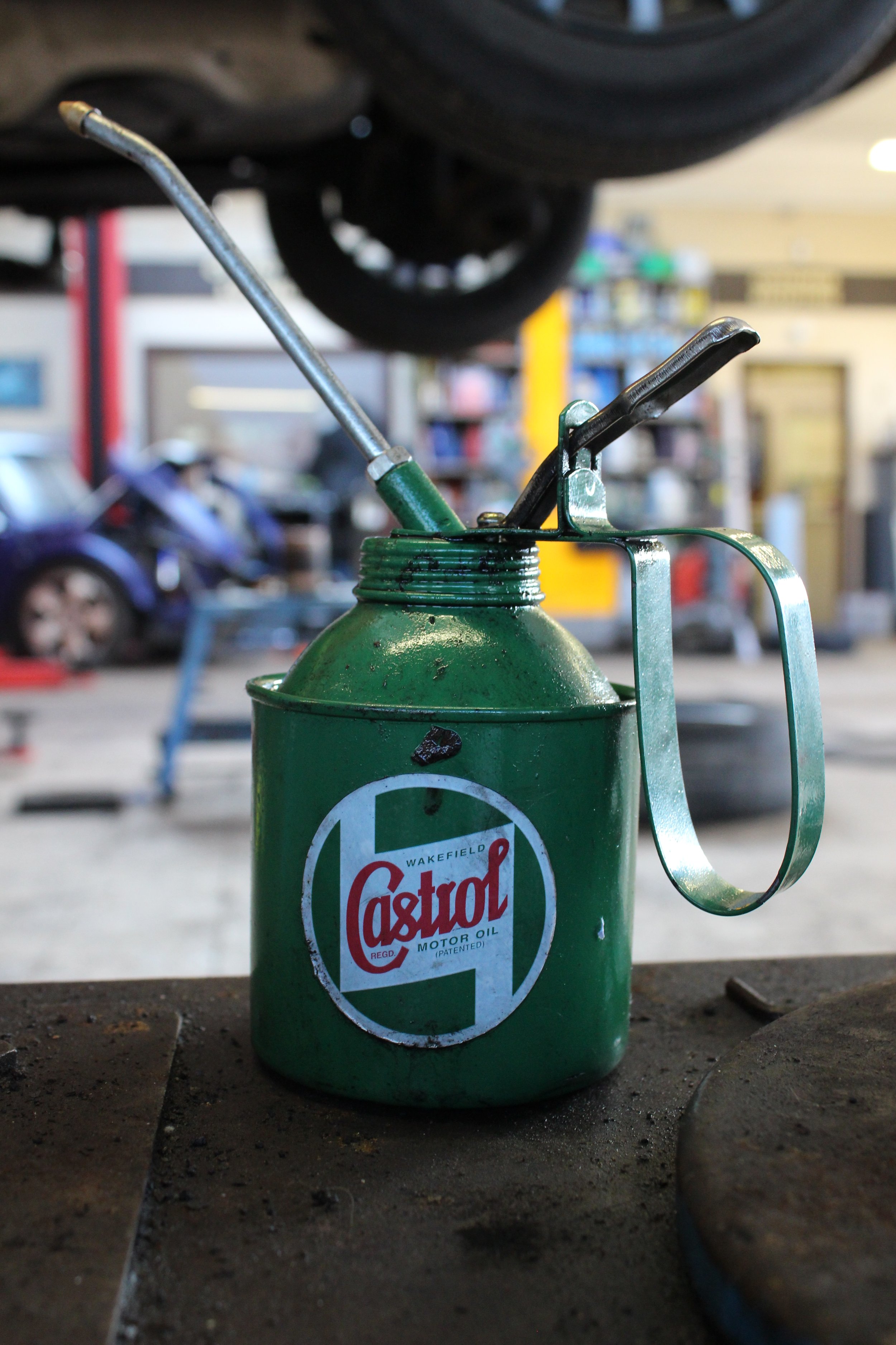
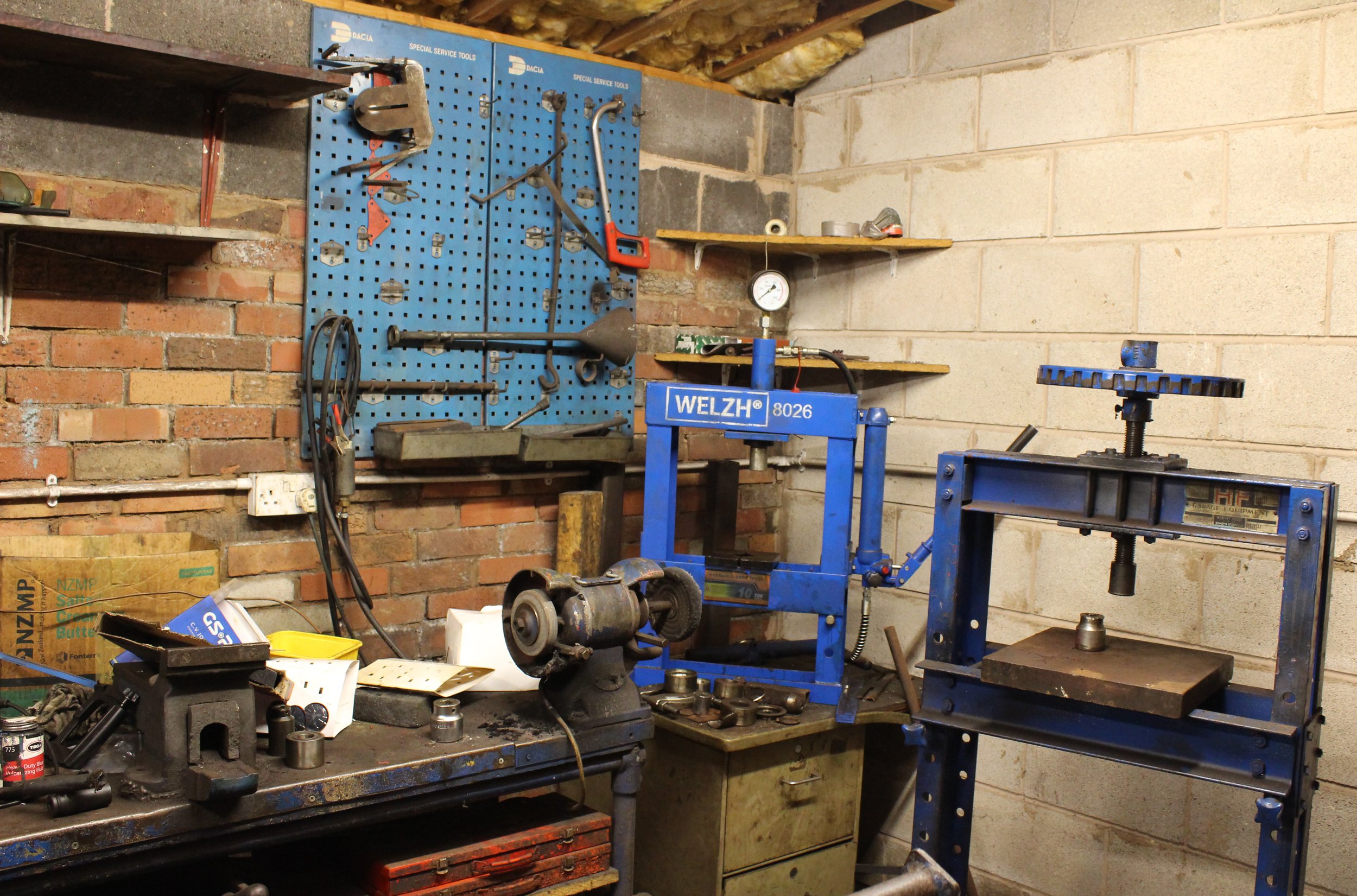
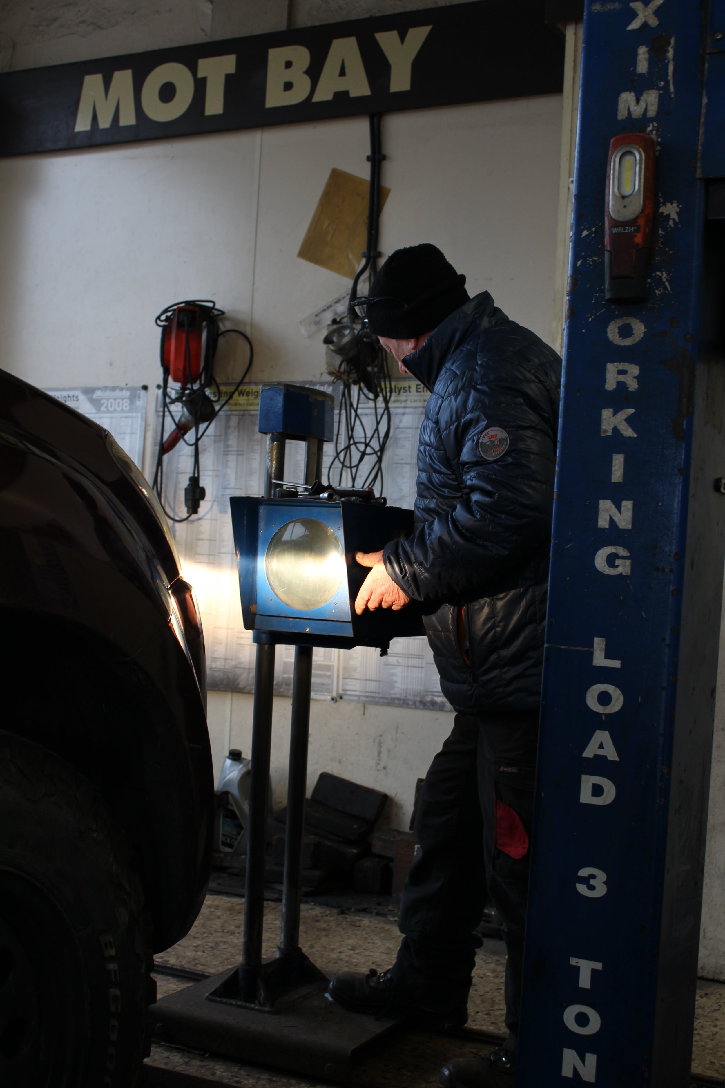
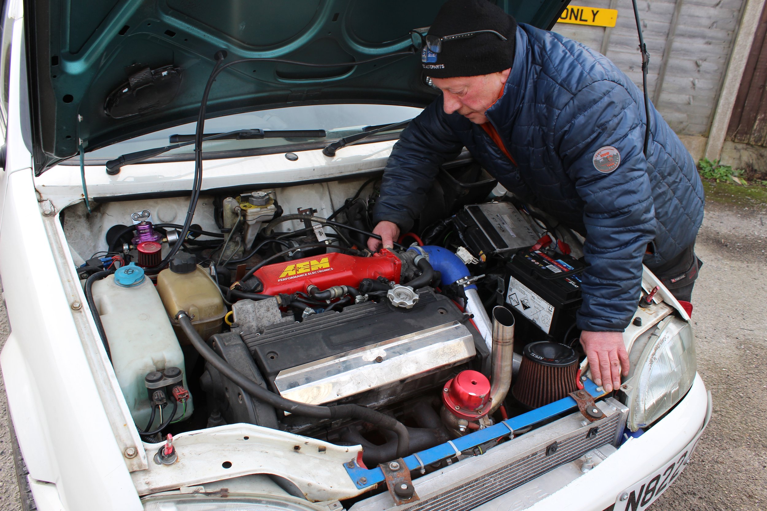
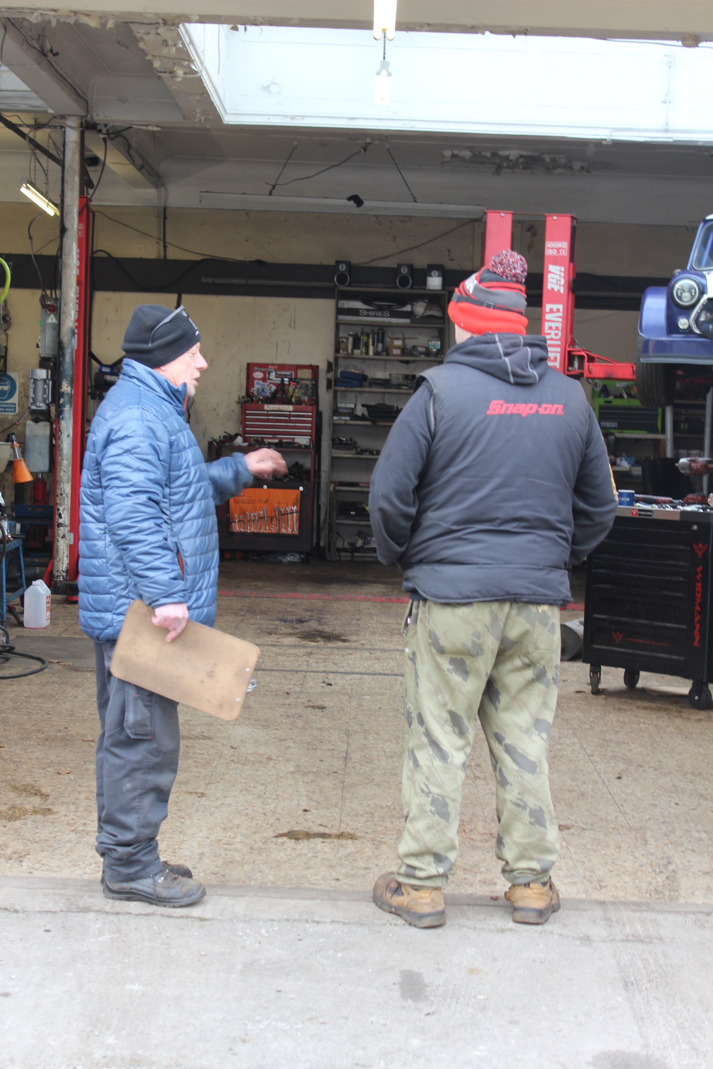
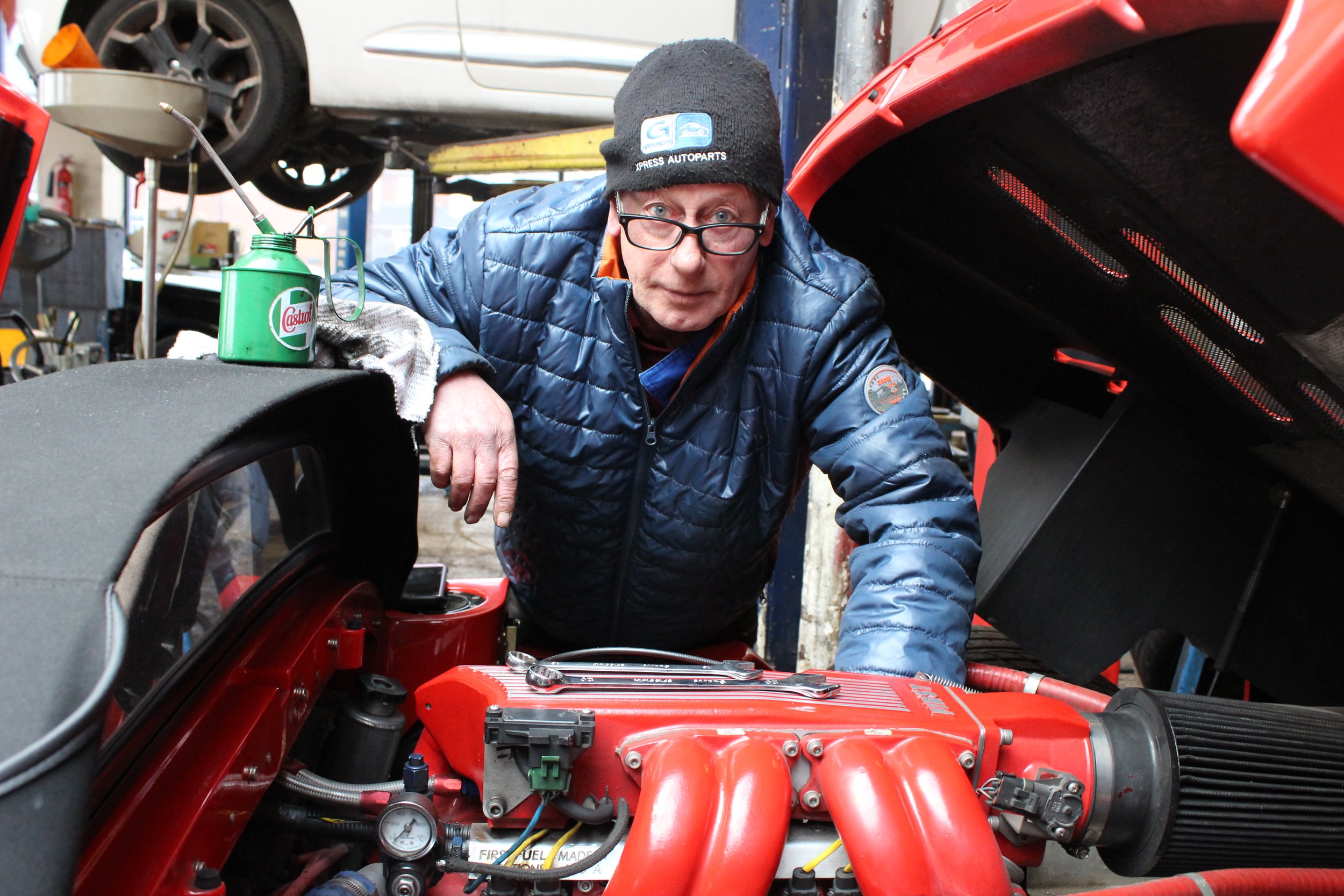
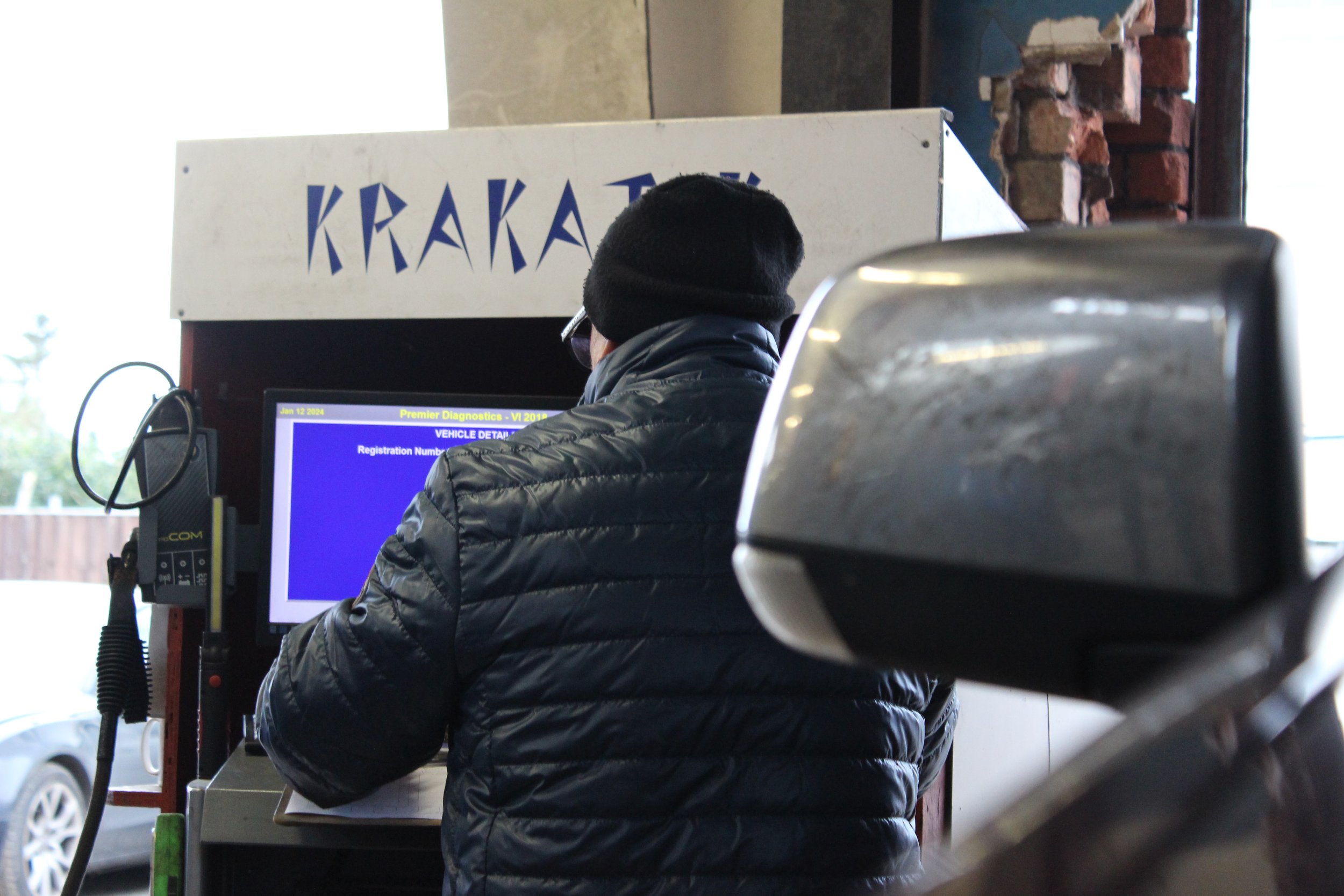
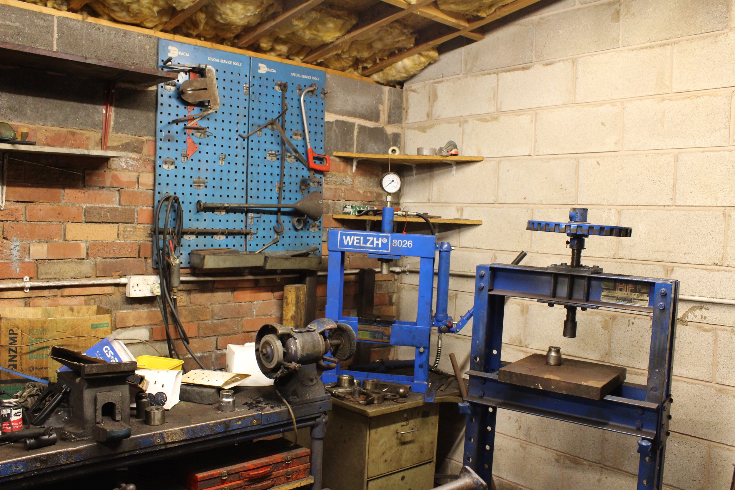
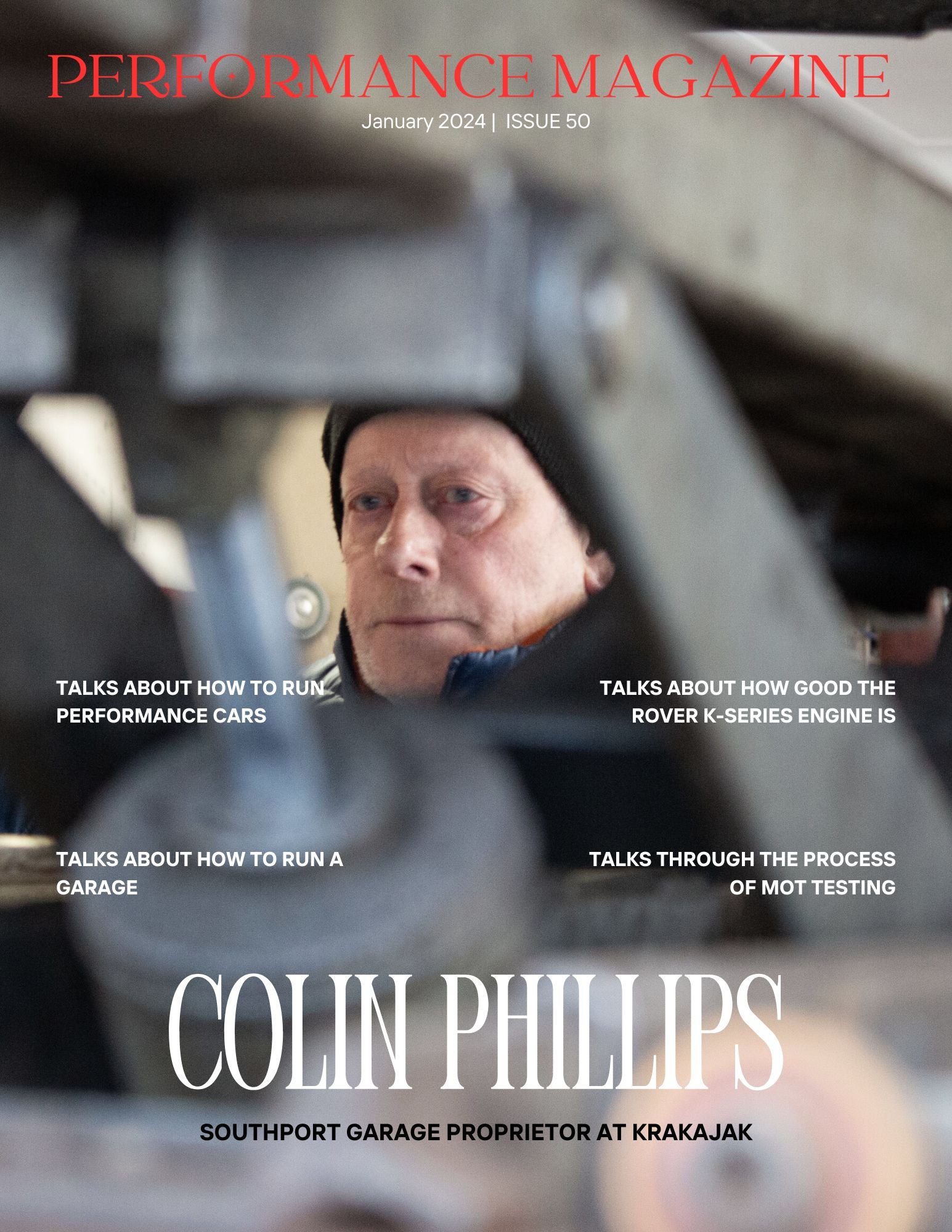
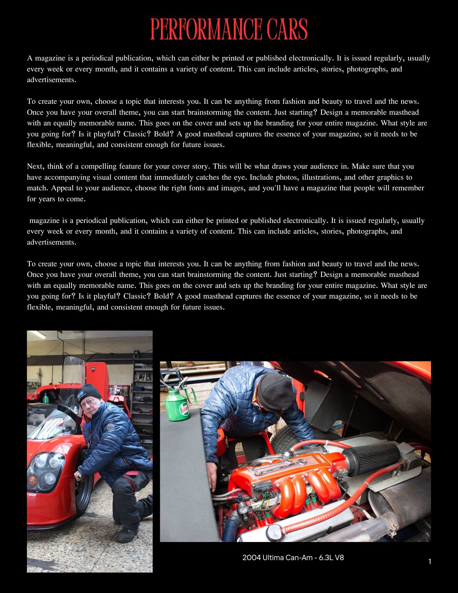
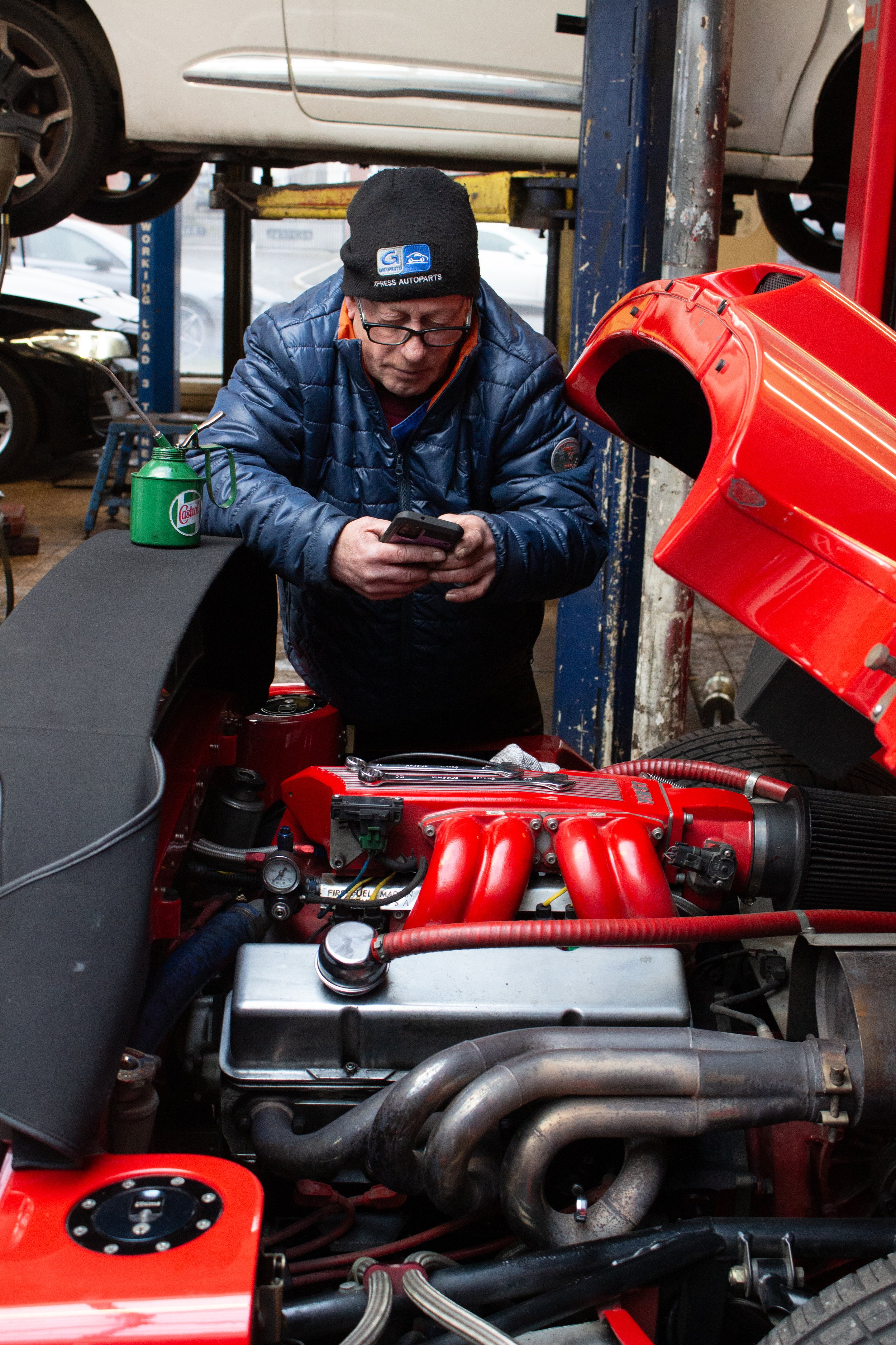
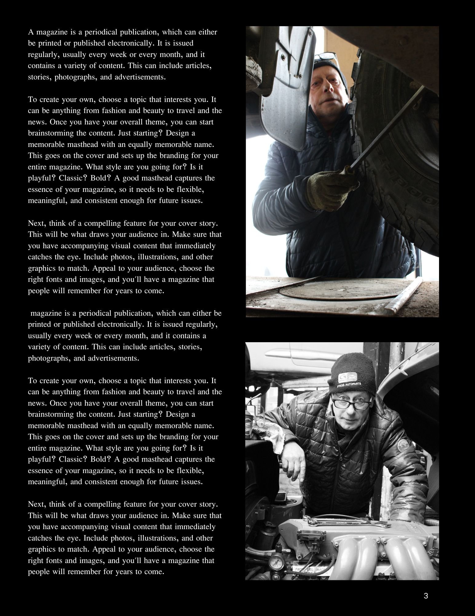
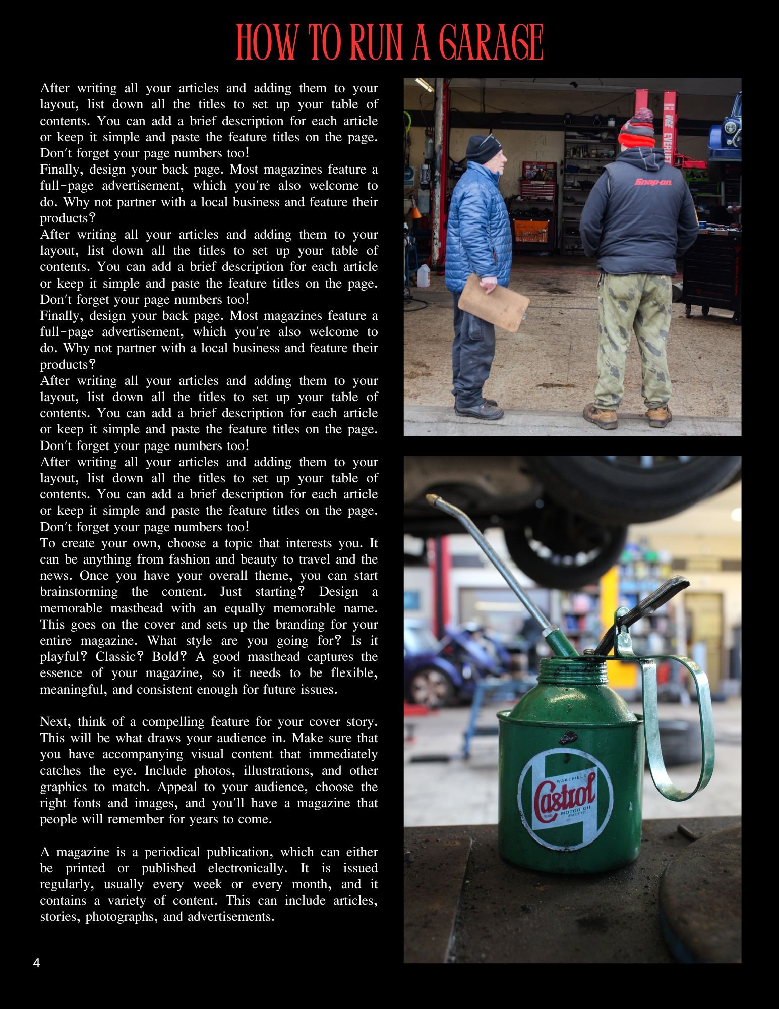
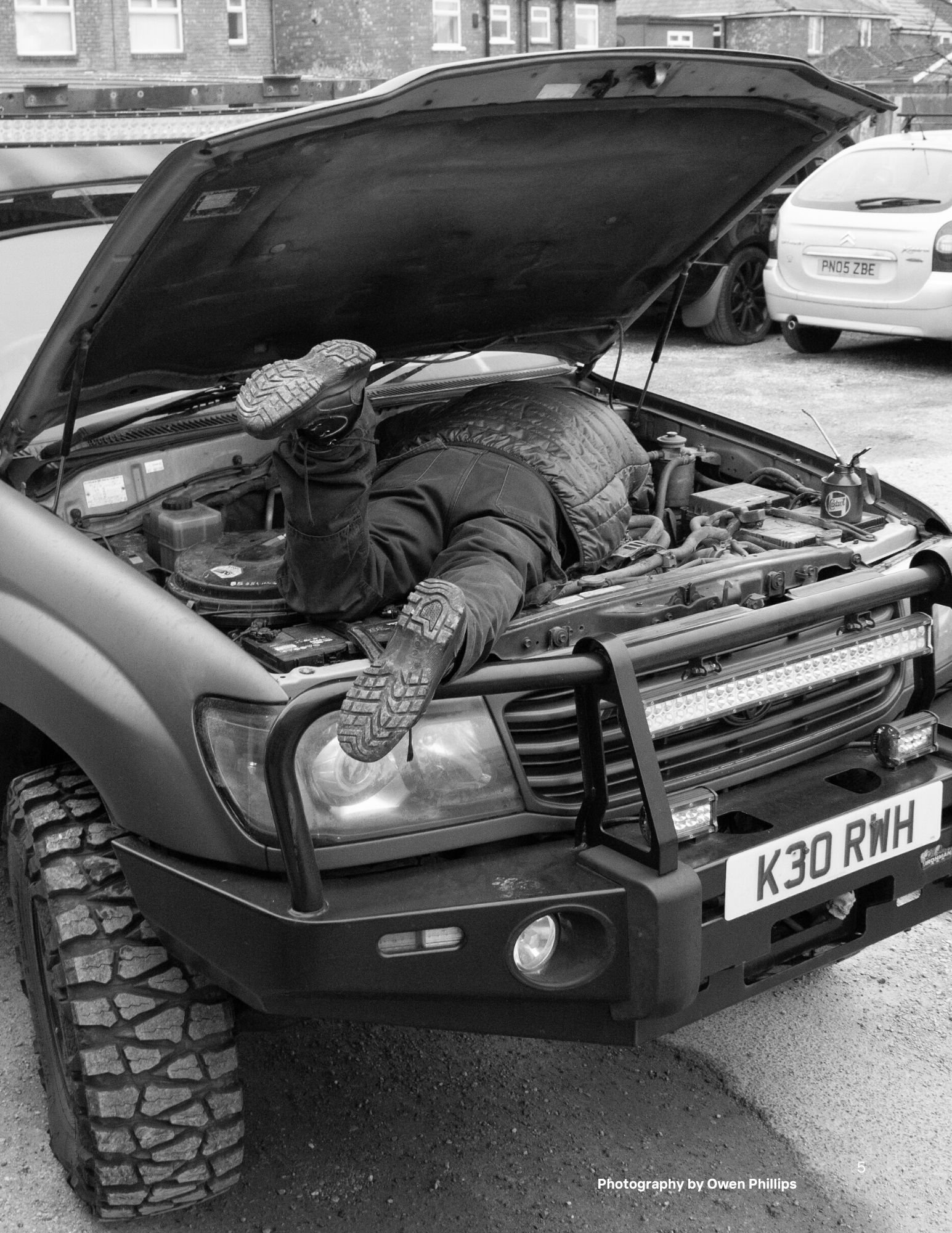
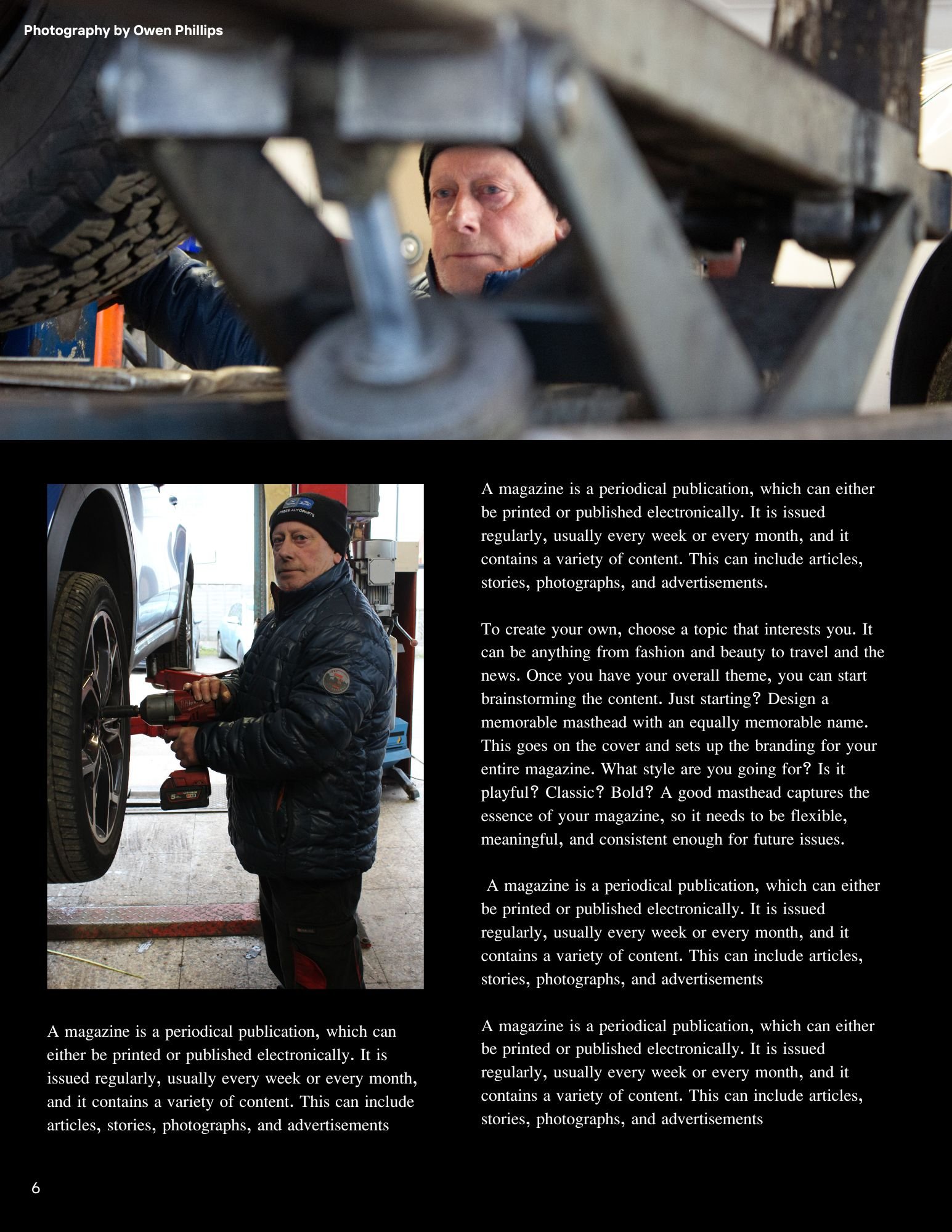
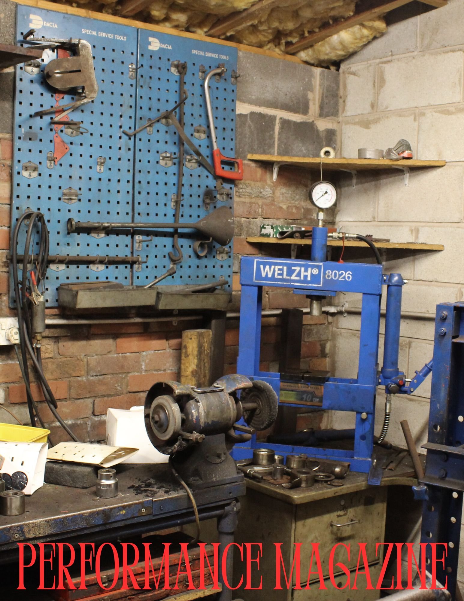
The main idea for this documentary photography unit is I am going to photograph a day in a life of my Dad in his work environment in a garage as he is a motor mechanic. My mood board of ideas below features shots that I would like you to emulate and take for my project. I will also create a magazine layout with a front cover, back cover and pages inside with a minimum of 15 images to be placed inside. As the brief suggests this is a good way to feature the photographs taken and as human beings we seem to be more curious about other peoples lives and by creating a zine it makes people feel more connected to the people were are reading about whether it is a magazine, newspaper or even generally an online news article/blog about them specifically.
Production
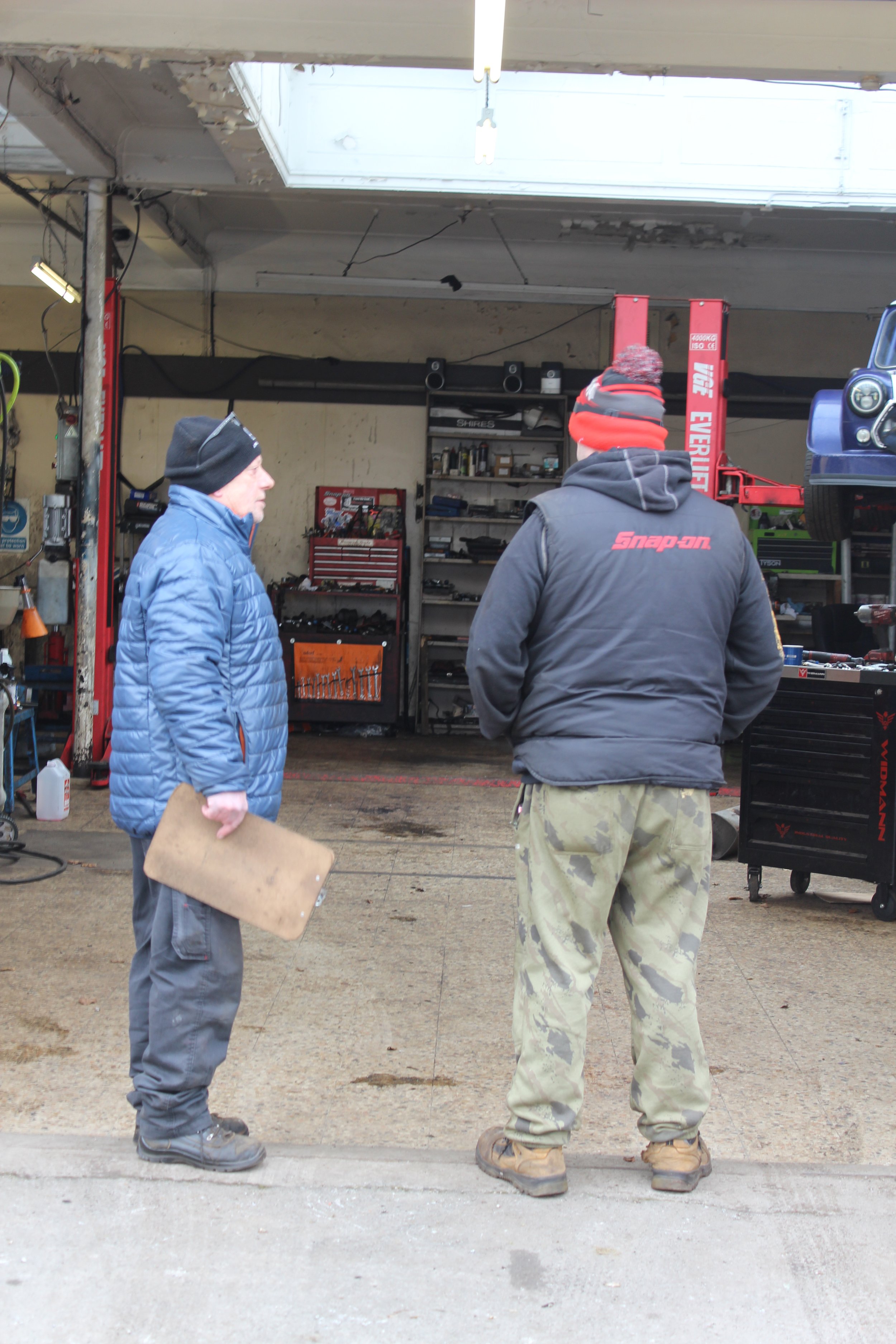

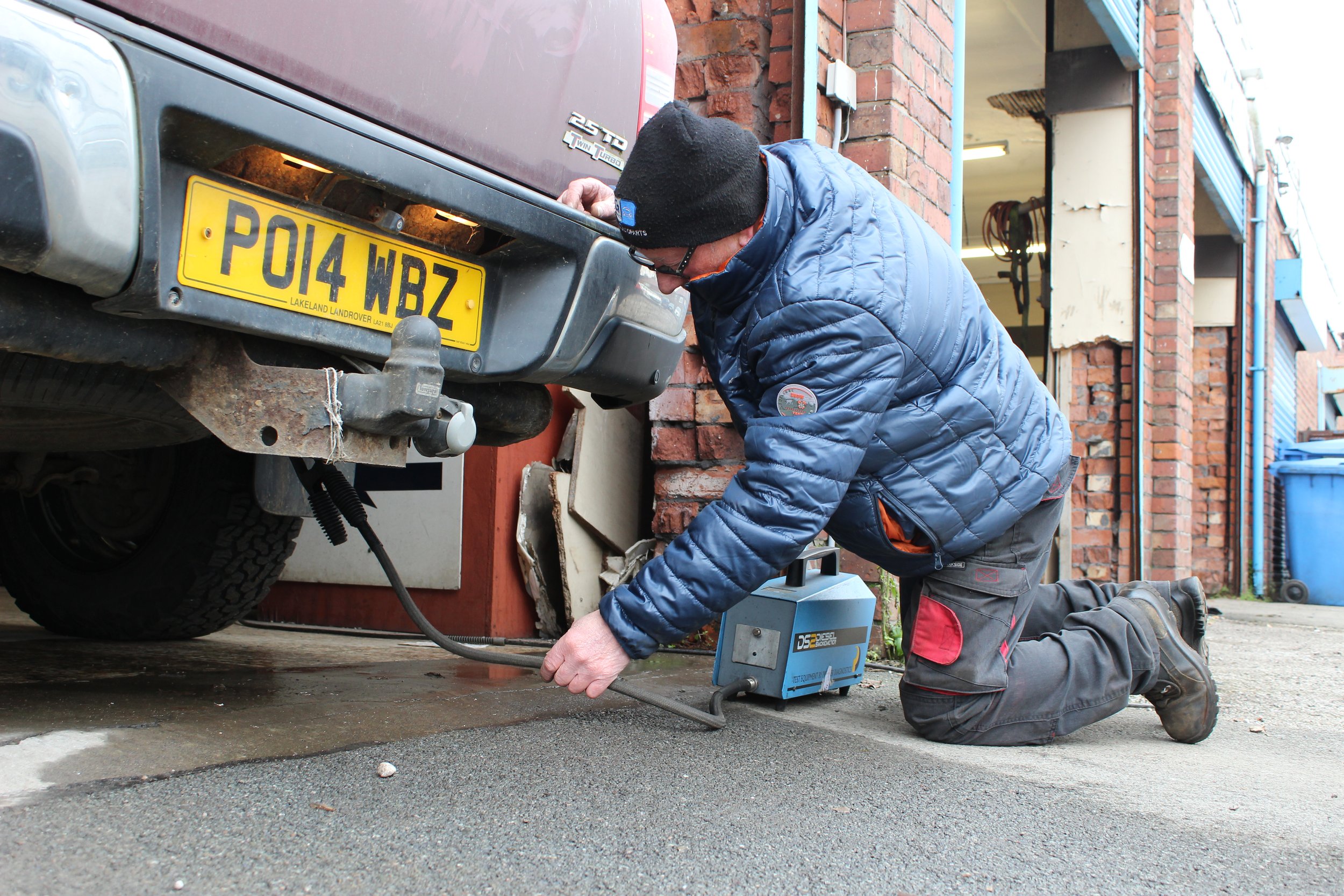
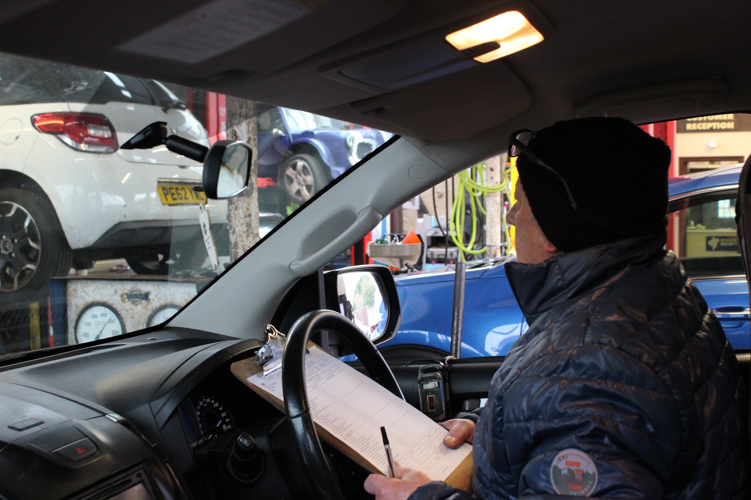

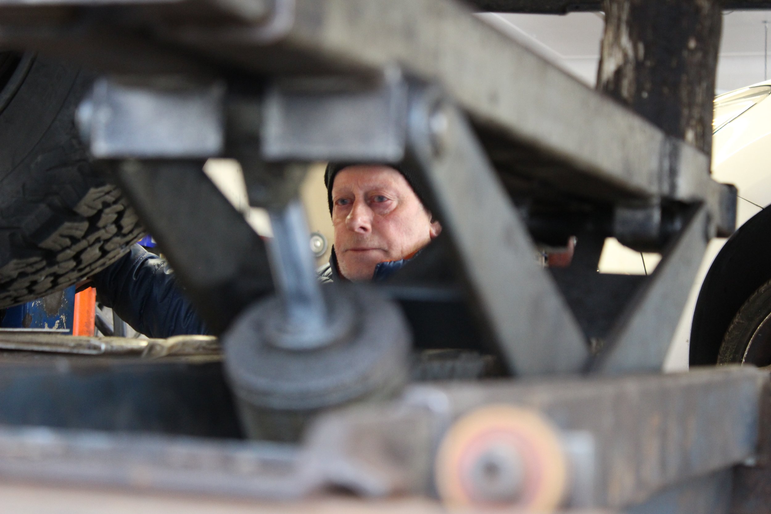
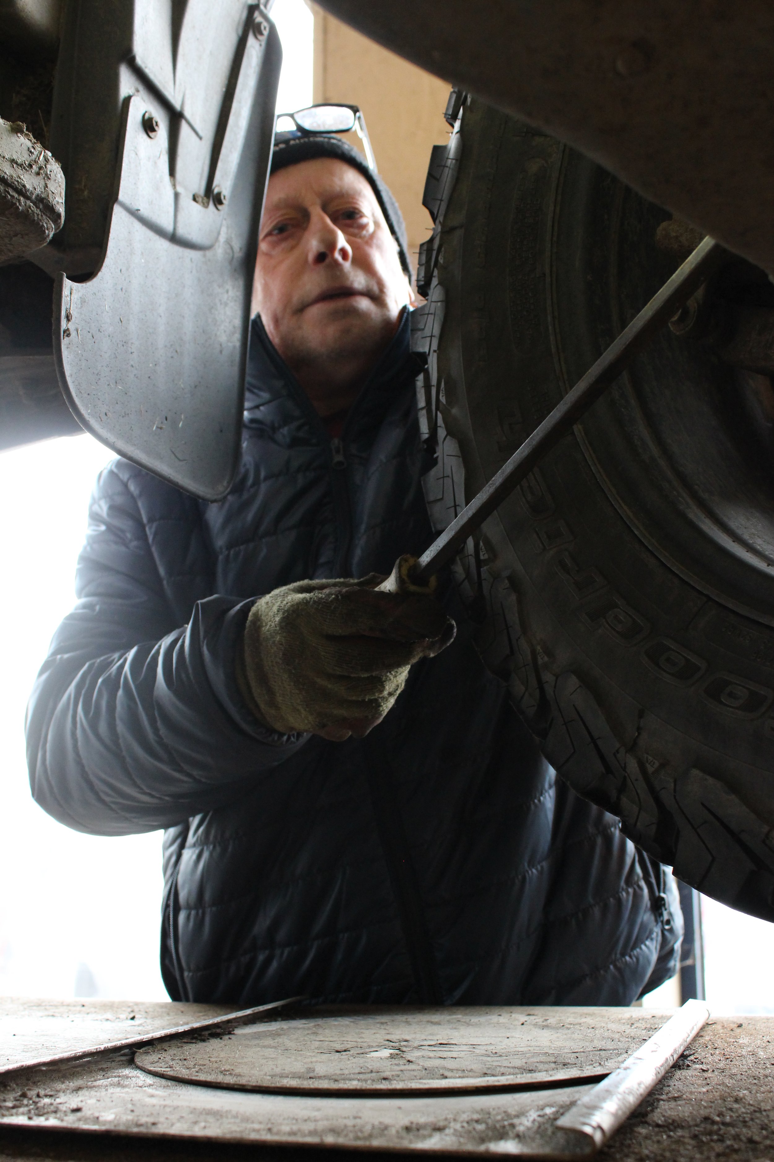
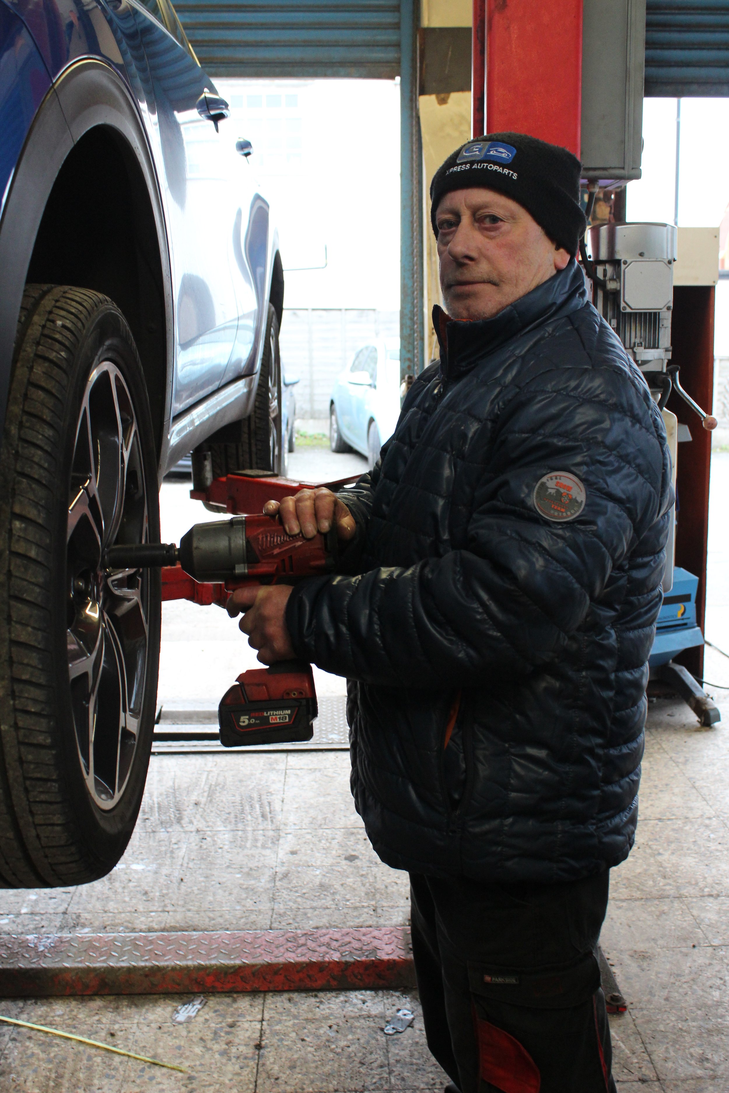
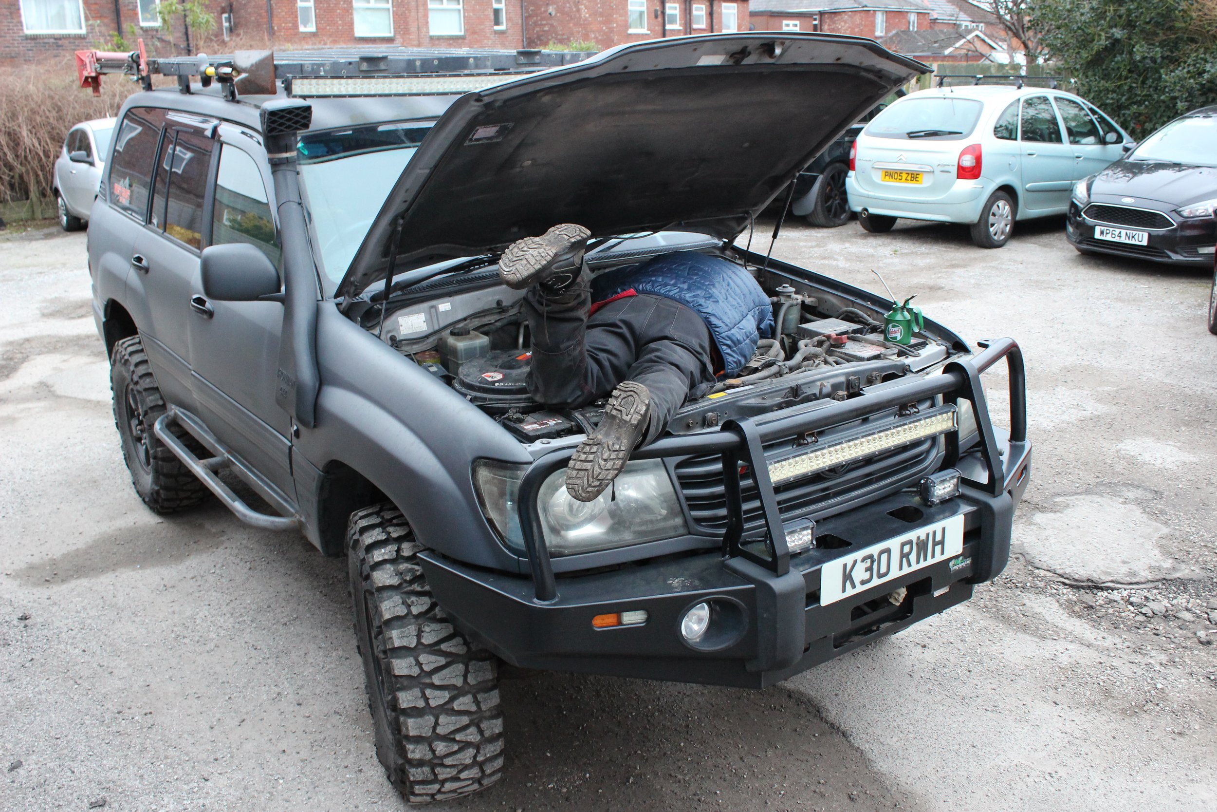
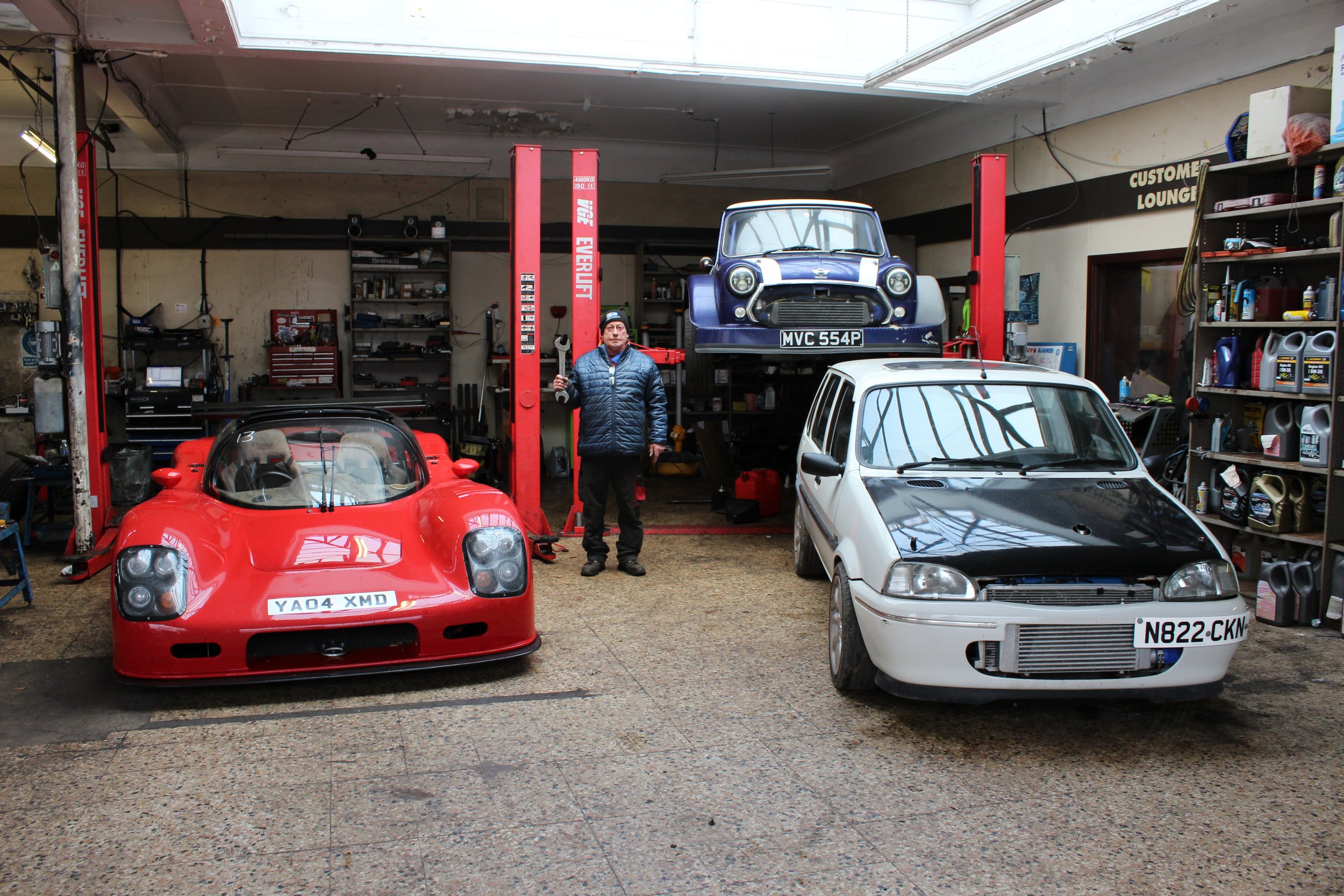

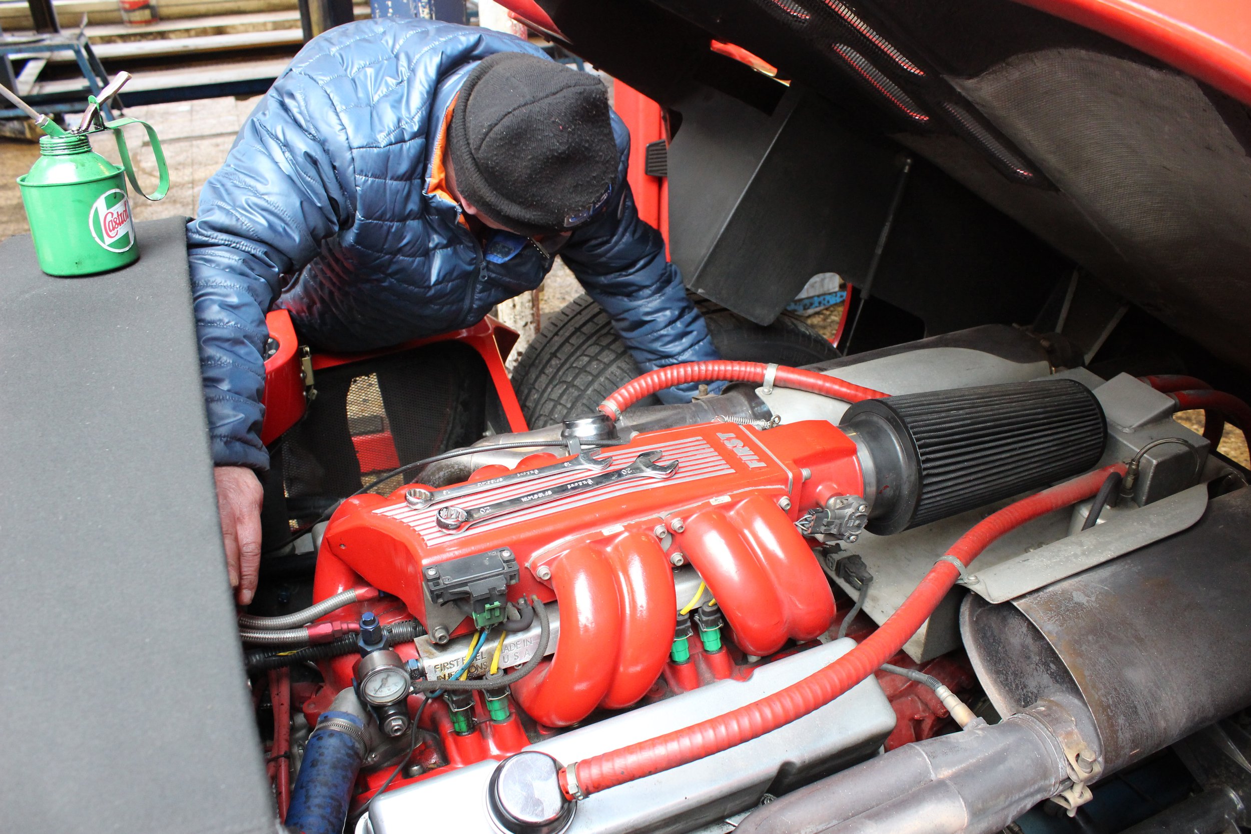
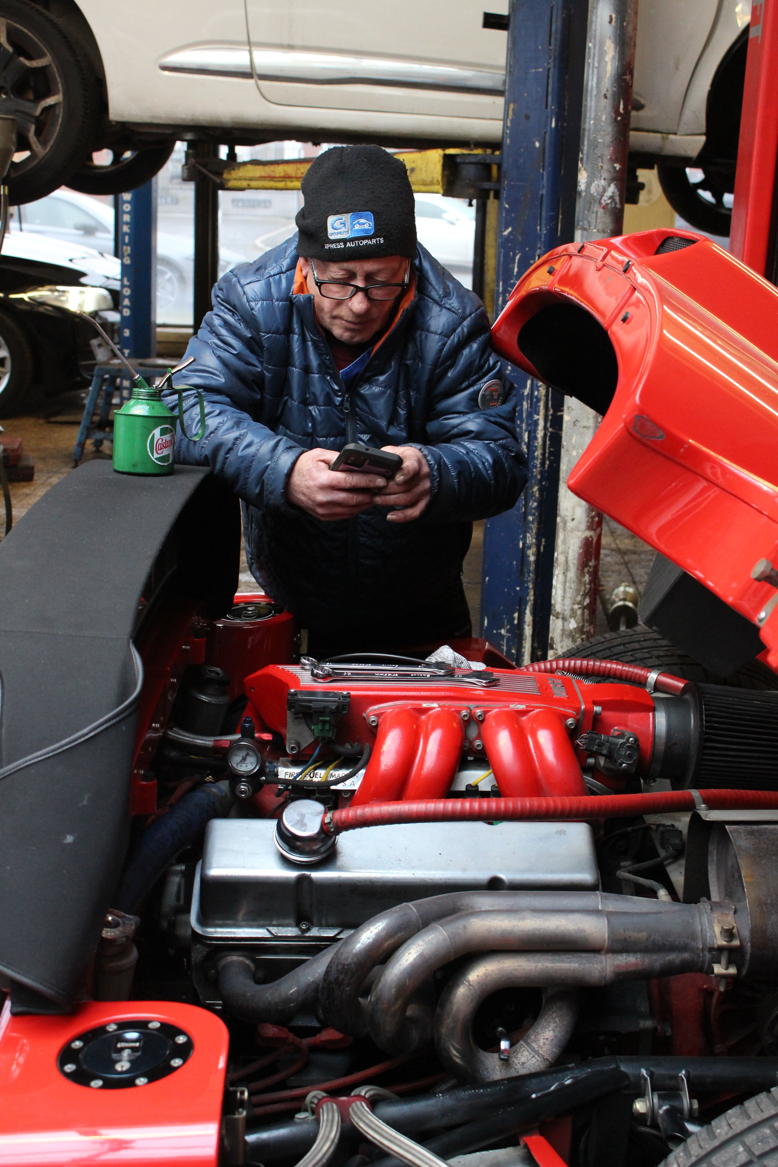
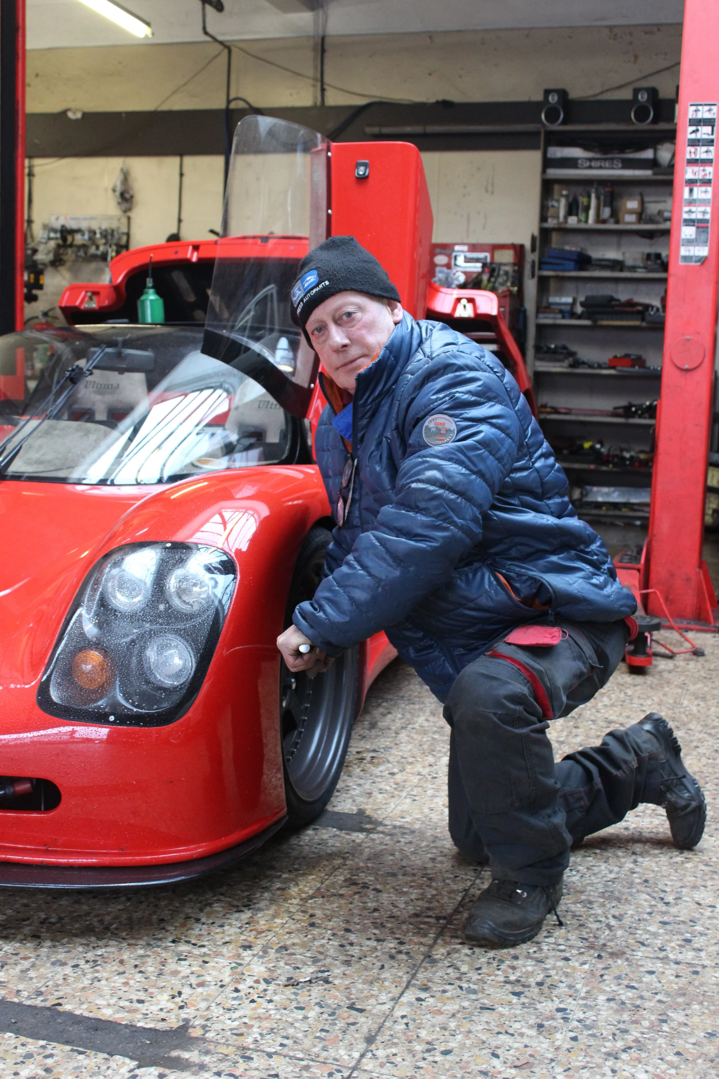
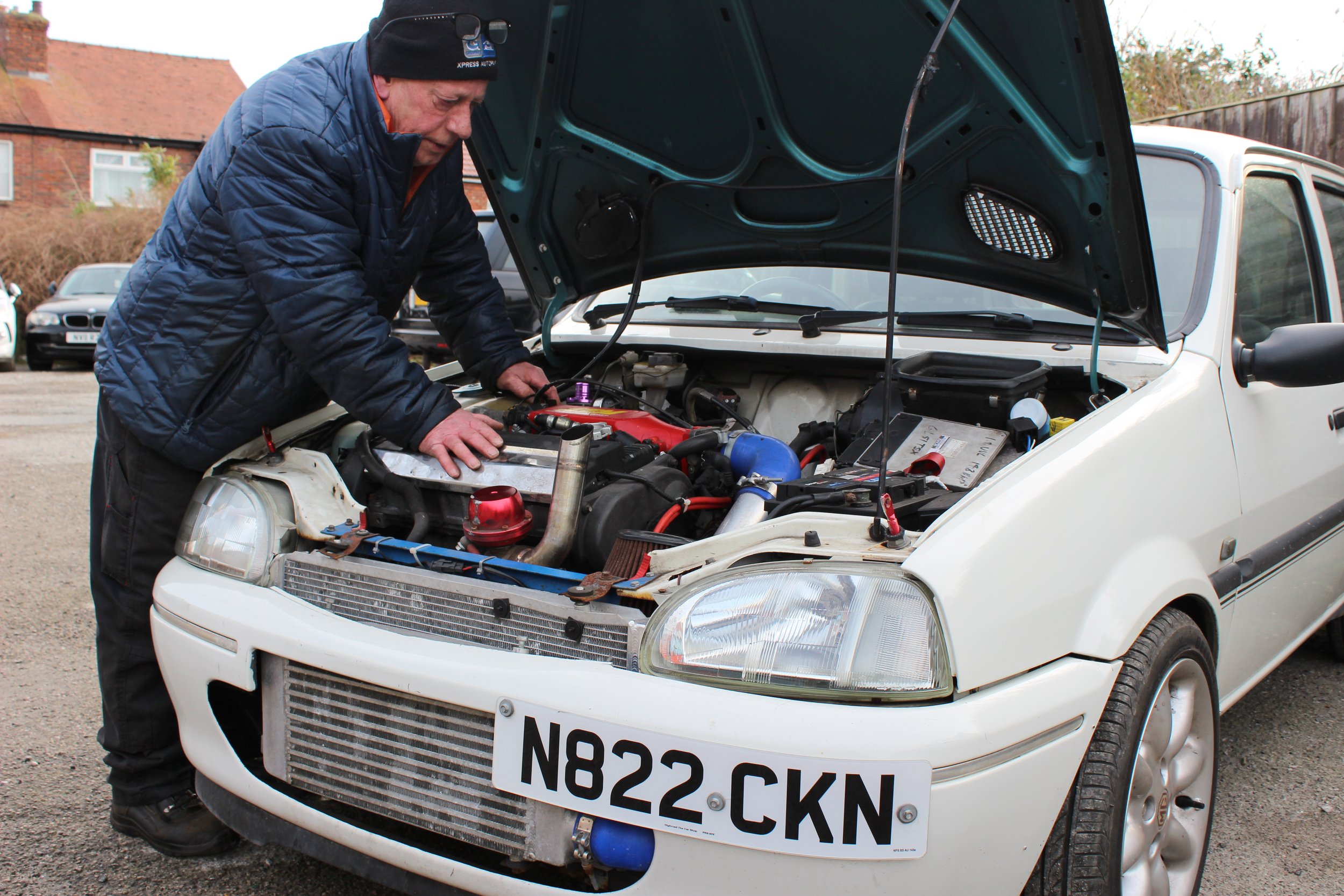
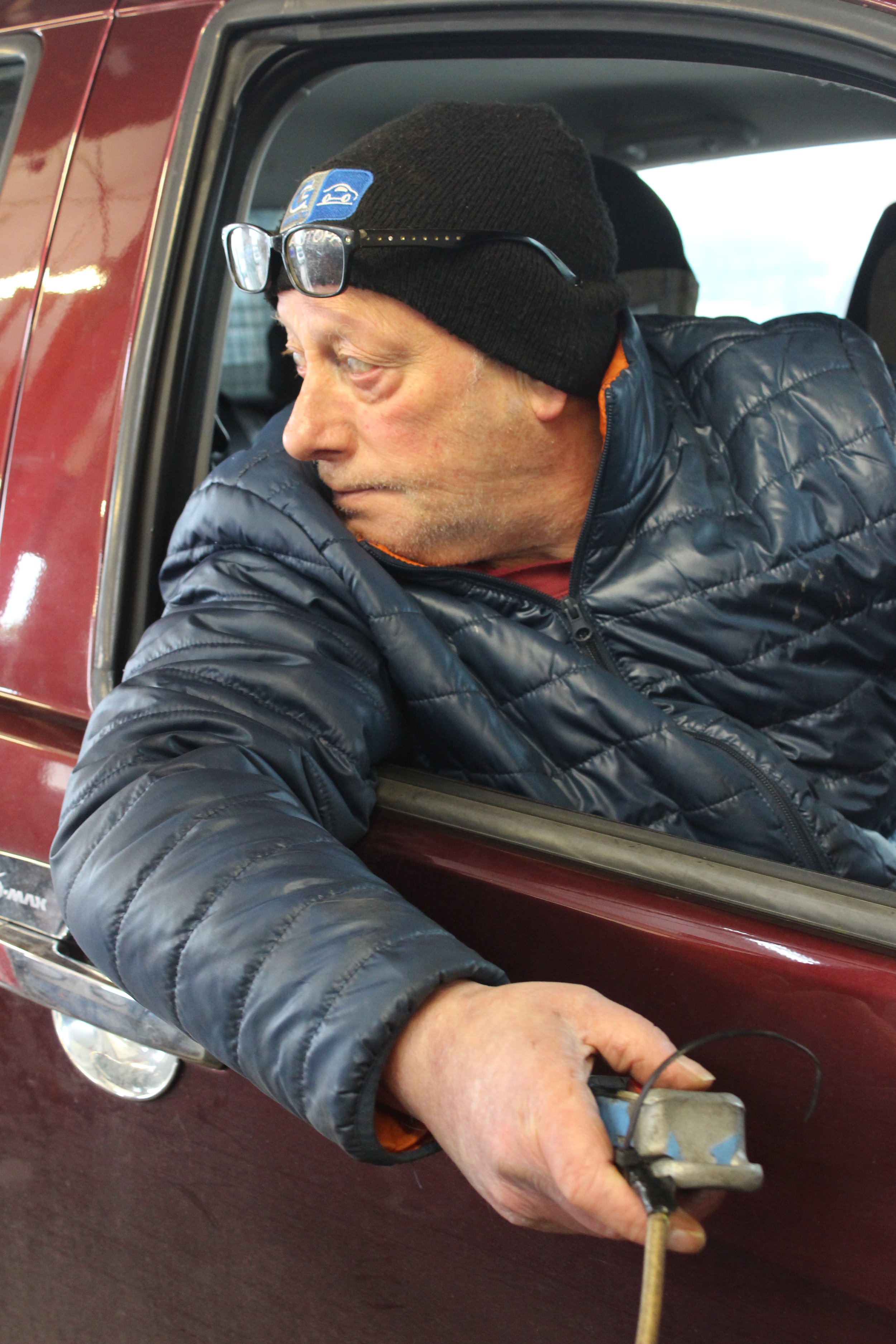
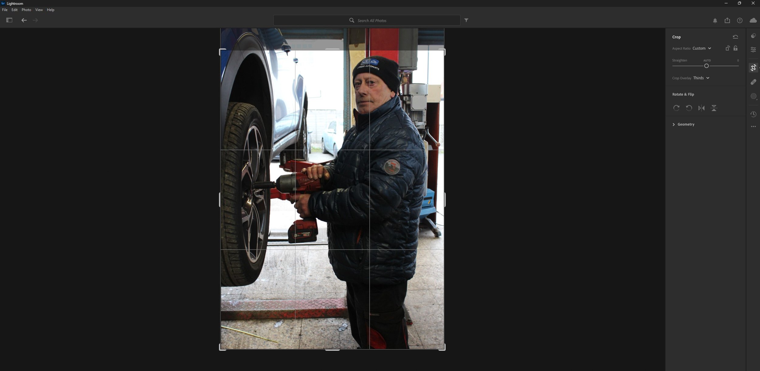
These photographs above are the non-edited images of the ones I used in the magazine mock-up. There is a minimum of 15 images for the zine and I have chosen 19 out of 181 images. As you will be able to tell above, I did my best to make sure the exposure settings are correct so I did little to no hue and saturation editing. There was only one image that I altered the levels due to poor lighting in the premises, but for all the other ones - the lighting is really good. I will only need to crop the image to delete some of the unnecessary parts of the image.
Post-Production
Edited Images For The Magazine
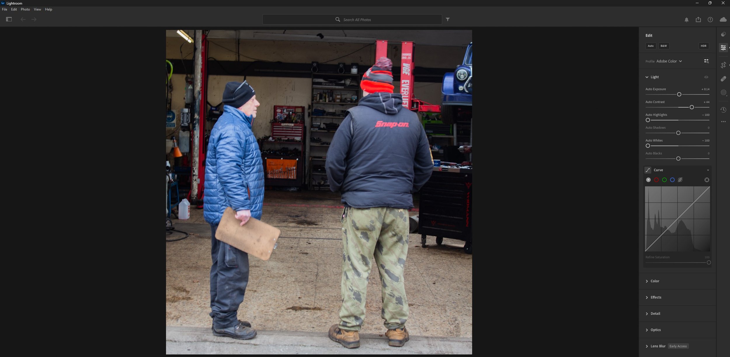
For this image, I altered the light levels as to me it seemed to bright. The contrast, the highlights and the white levels were mostly altered. This made the colours look more vibrant in the places I wanted to be able to be seen rather then looking somewhat white washed.
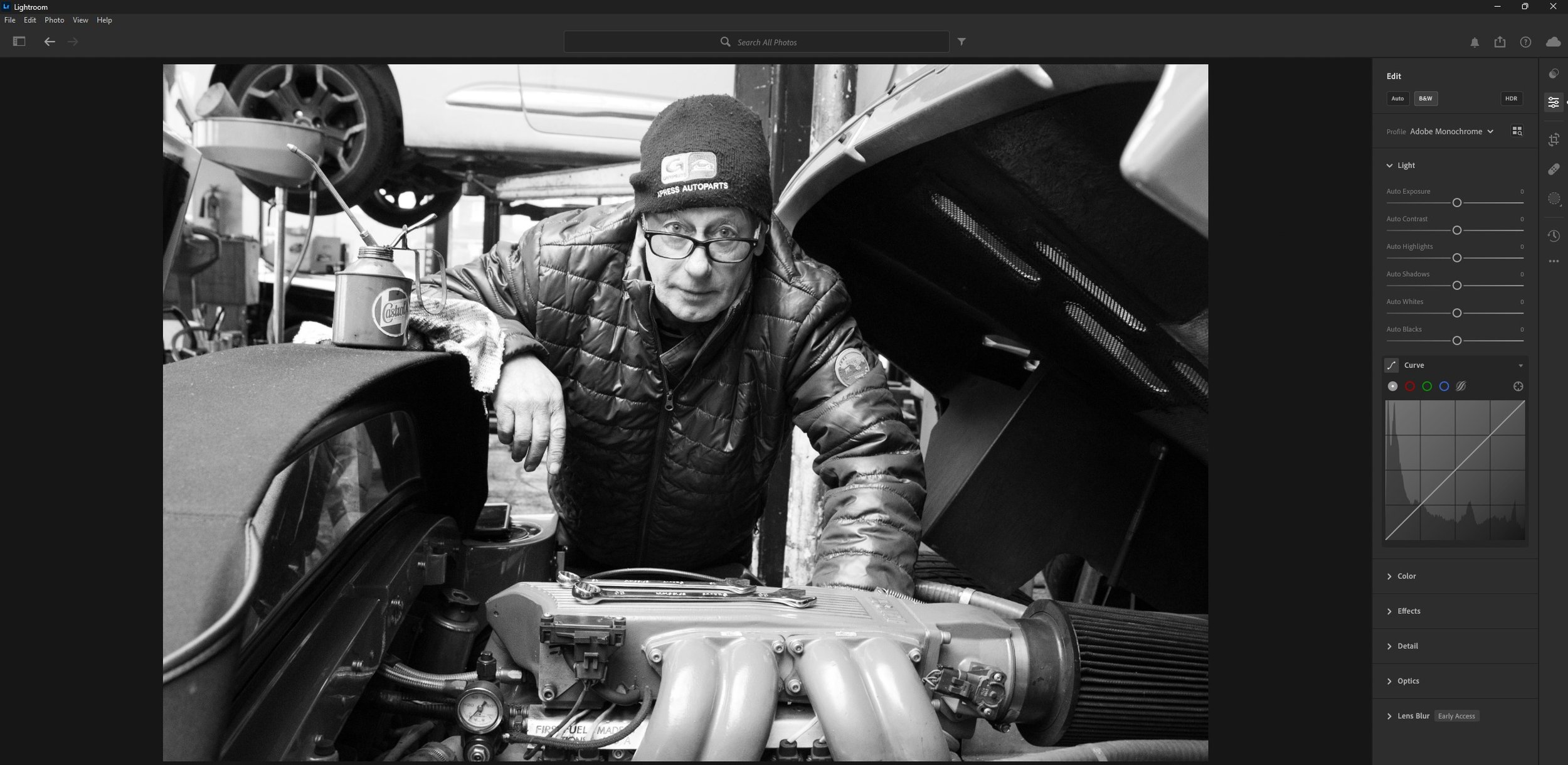
For this image I changed the image from colour to Black and White by clicking onto the B&W button inside Lightroom.
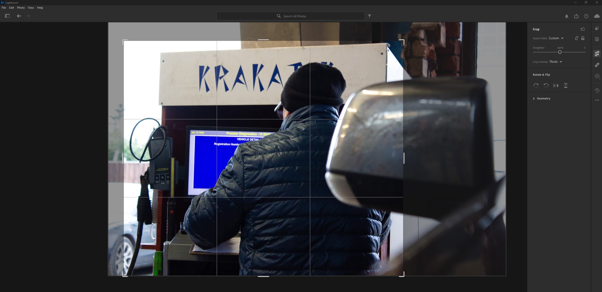

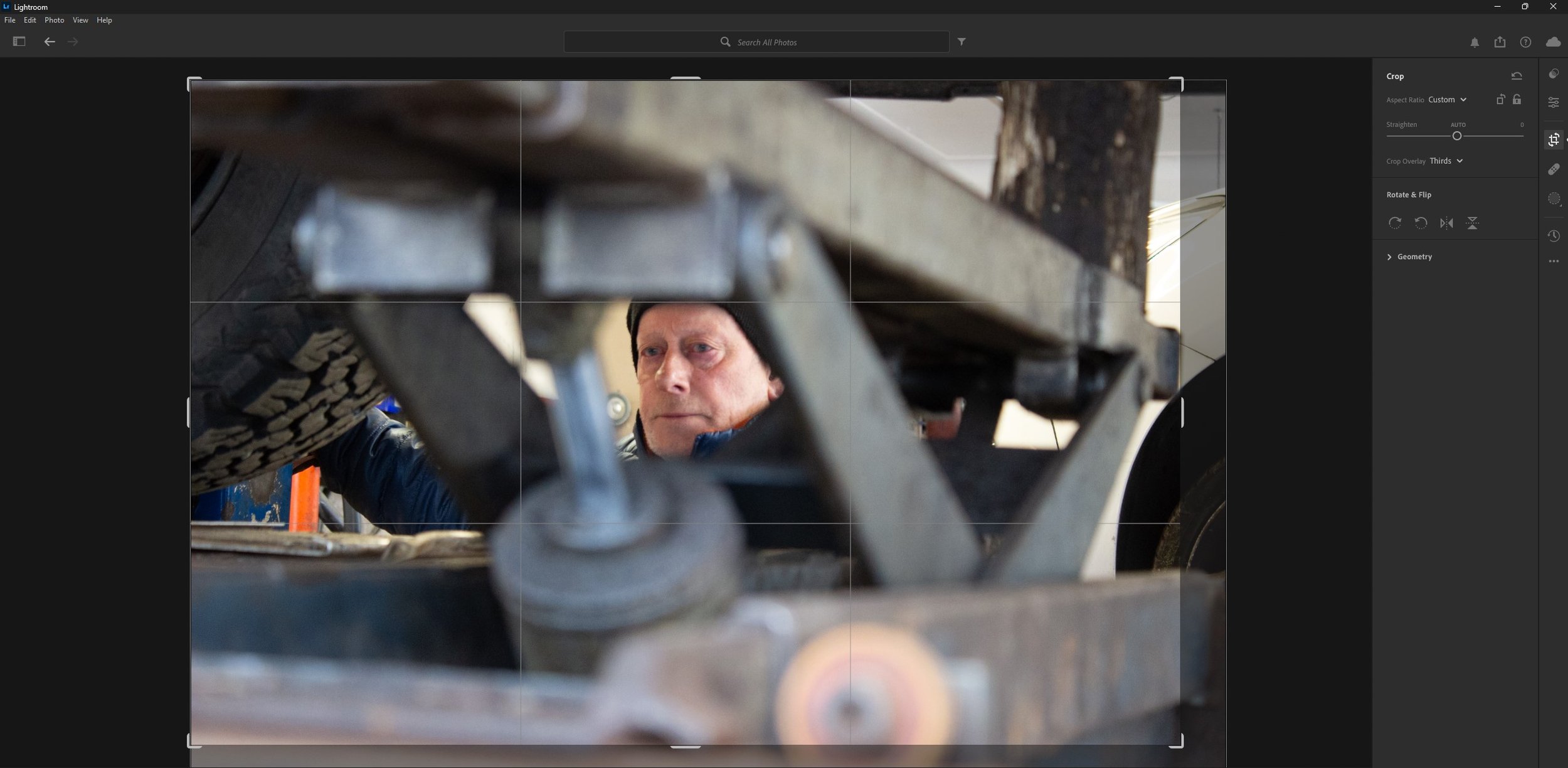
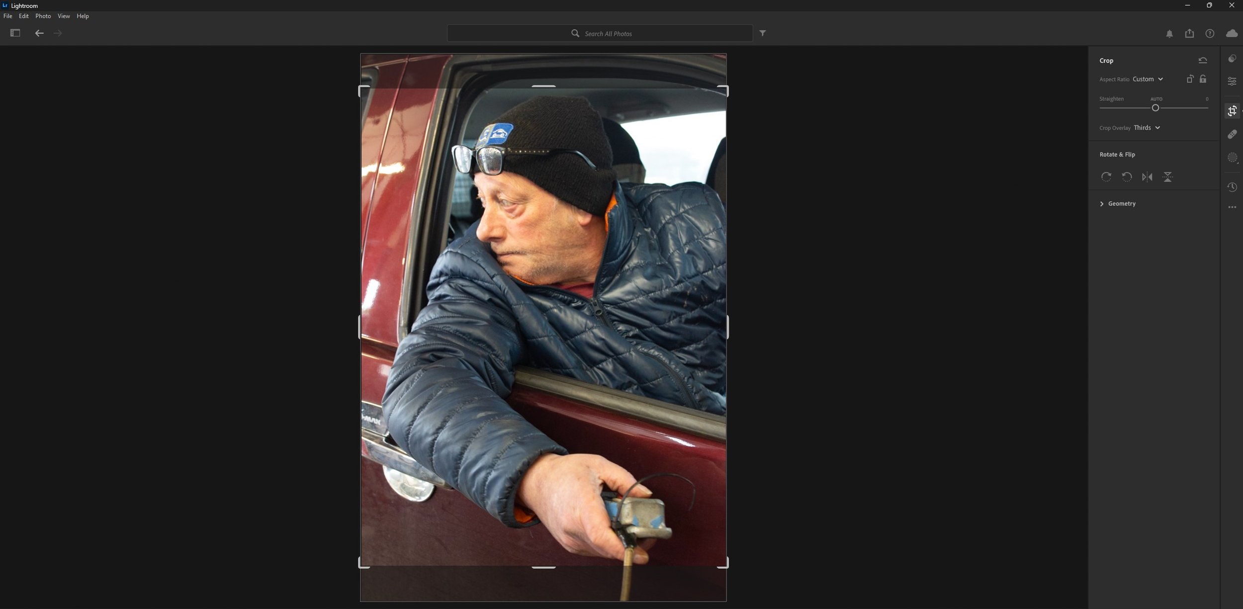
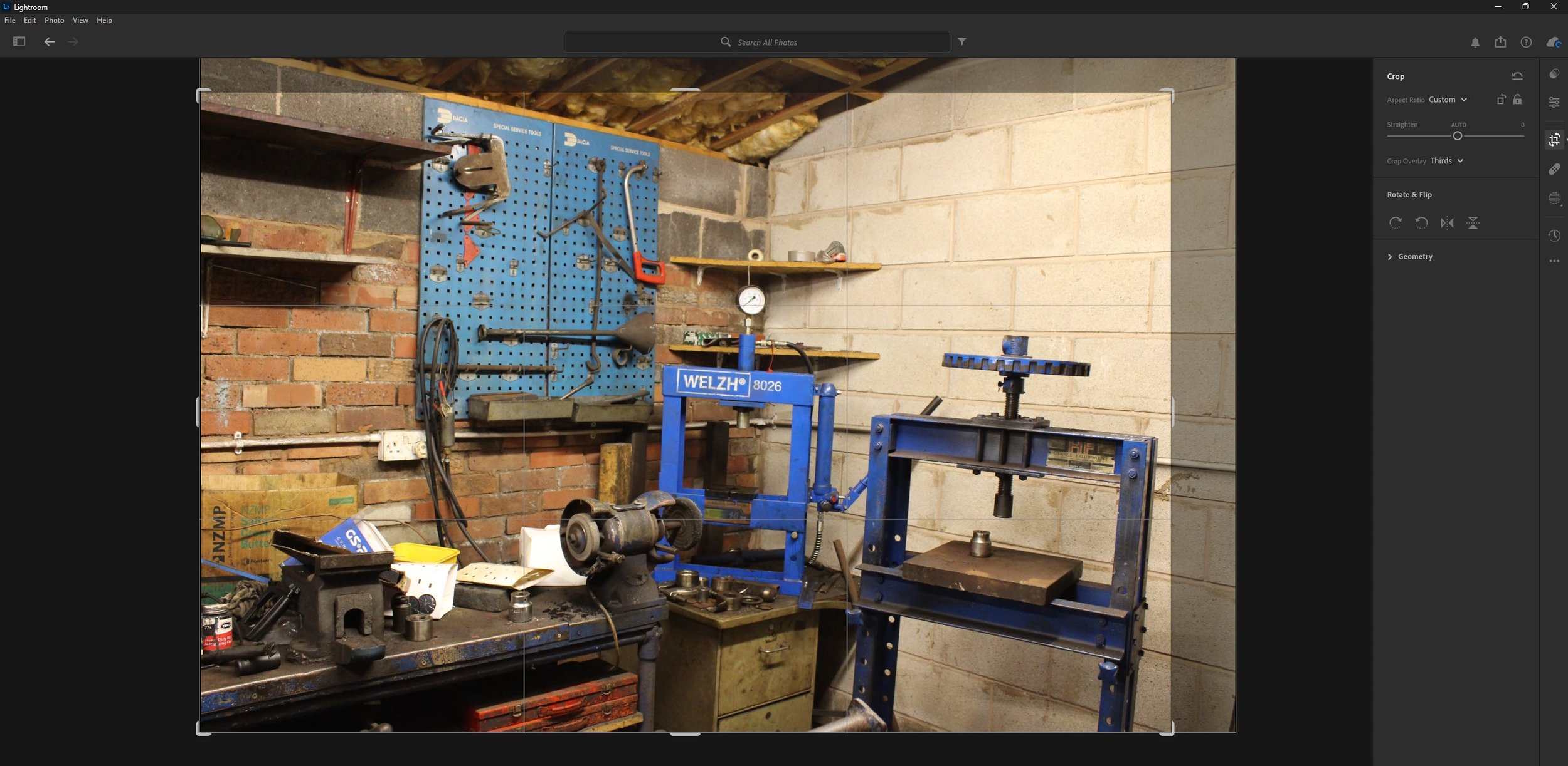
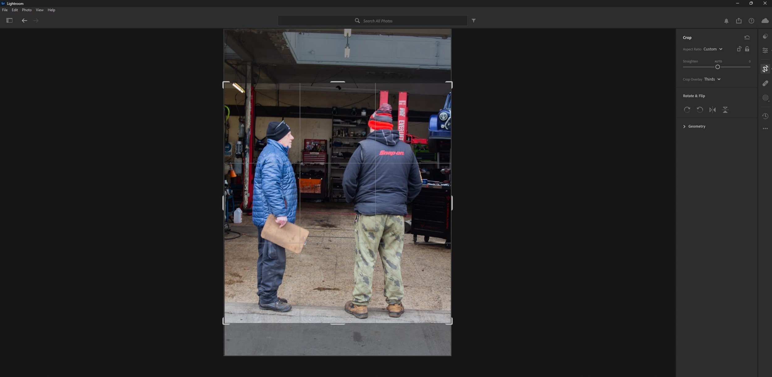
As you can see above, I have cropped the images to cut out the unnecessary parts such as some of the background to keep in focus the subject in the foreground.
The Magazine Layout
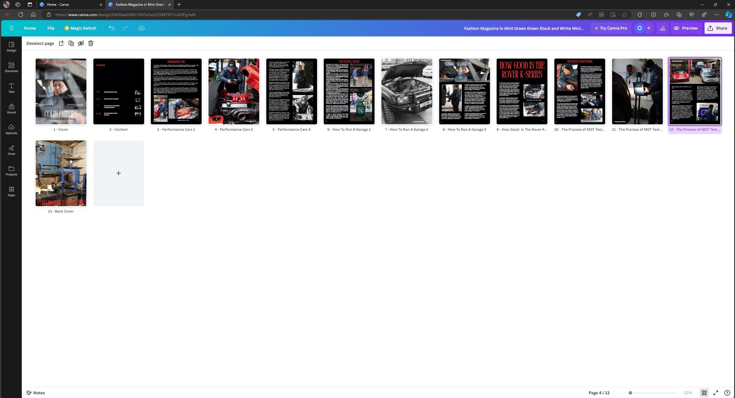
As you can see above this is the magazine layout, I used a template originally and I customised it to the way I wanted it. The graphic design suite I used is called Canva.
Presentation
Evaluation & Reflection
Annotate three strengths & three Weaknesses of the final Documentary Photography Images?
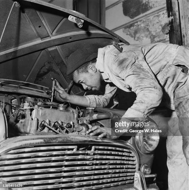
To start with – the pre-production planning for this project was good as I knew exactly what I was going to shoot and how I was going to do it for example, the Land Cruiser image was inspired from a 60s image using an old WW2 Jeep and someone small under the bonnet working on something. (All this is evidenced in the ideas section under pre-production) Secondly, the camera exposure settings used were very good as I didn’t need to alter the levels in Lightroom, there was only one image that I needed to alter, but that was mainly down to the poor lighting in the building which made it dark. Lastly the magazine layout which I picked from Canva looks good and after putting in my 19 images in, everything came together exactly how I wanted it too.Moving onto my weaknesses, I could have photographed more of my Dads spare time and what he does outside of work rather than dedicating it to his work in a garage, but with the time against me on this project I couldn’t do everything, Secondly I could of shot a more variety images of machinery or miscellaneous items then sticking to the image of my Dad working in a garage. Lastly I could of added my own text into the magazine layout so it looks more realistic, for example when he talks about performance cars, I could of written in about that specifically like an interview – (now this is me being a perfectionist)
Who was your intended target audience for your “Day in the Life Zine”?
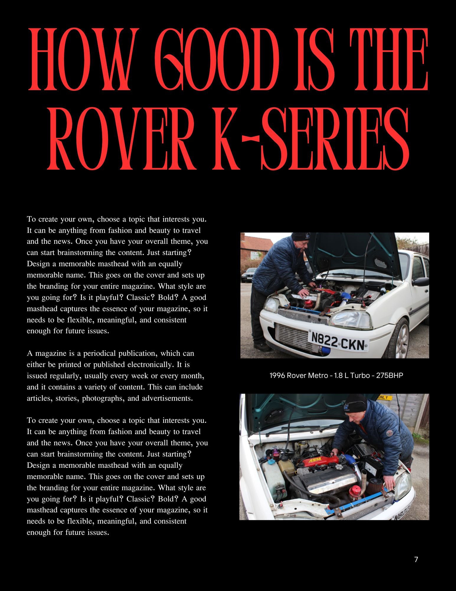
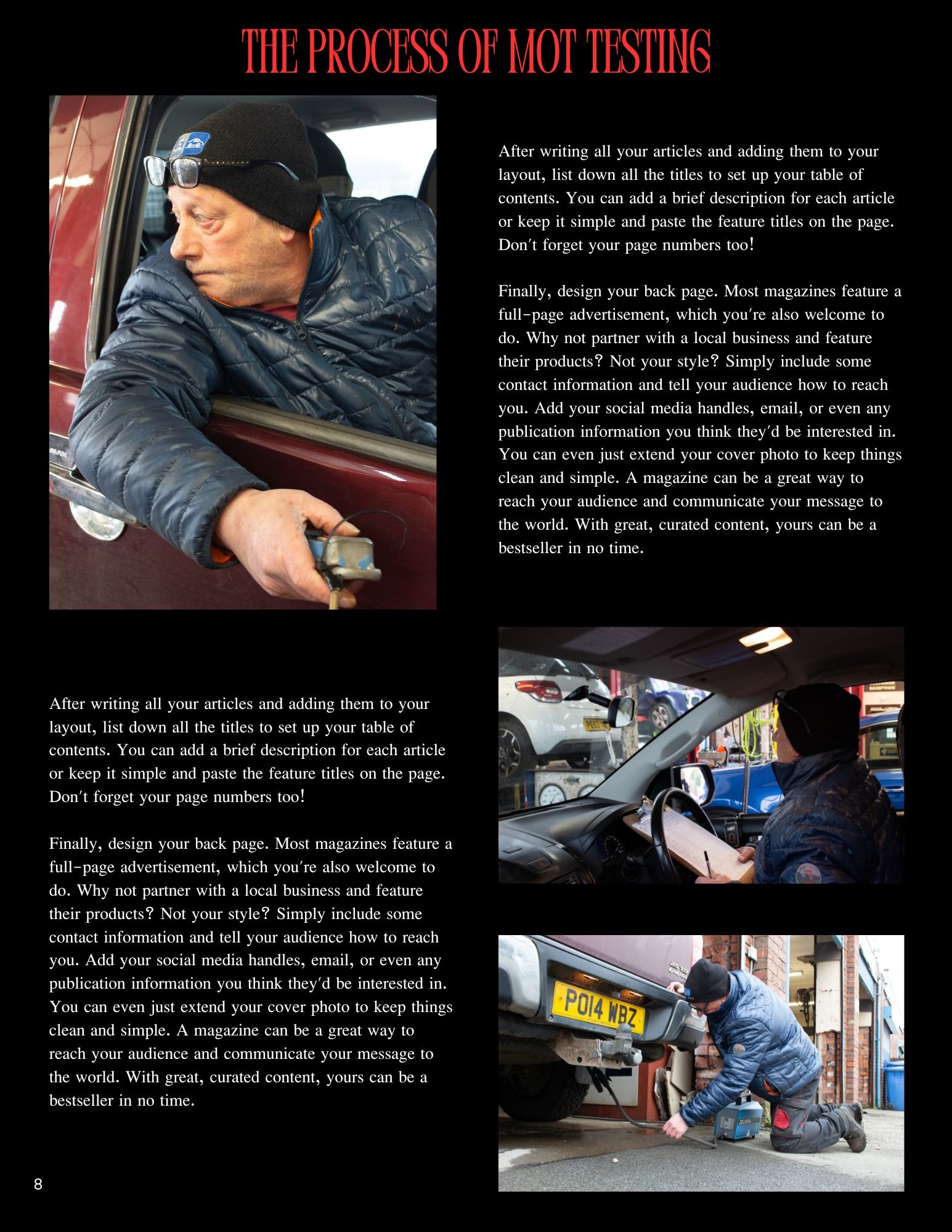
The intended target audience for my magazine is to the car industry or even somebody interested in cars generally interested to hear an actual mechanics take on things for example “the process of MOT Testing” or even attracted to a particular article such as “How Actually Good is the Rover K-Series engine” when back in the 80s and 90s it was known for its fragility and head gasket problems – what I am trying to say is that it is attracting people to read the article with their existing knowledge on such topics, but with their minds open to learn more about why this person thinks or how he thinks that way.
What were your key areas of development during this unit work?
The main area of development for me throughout this unit work is the photography techniques have improved significantly, as I am tailored towards more the film making side – I can transfer some of my skills from that field and put them into practice when taking photographs. The hardest part was making sure that the camera exposure settings were perfect before taking pictures as I didn’t want to alter levels in Lightroom. From that point of view, I am a perfectionist because it needs to be right otherwise it is not worth bothering with. It took a few days to practice and experiment with different angles and shot types to get the right one I wanted. I would go as far as going back on location again if I wasn’t happy with the pictures I’d got and reshoot.
Authentication Document

Television Commercial Production
The brief has asked us to create a 20 second TV Commercial / advert for either the TV or the Internet. It says it can either be shot in the studio or on location.
Before the internet commercials were mainly showcased on the televisions as that was really the only medium that it could be presented on.
Context & Research
Analyse x3 TV Commercials: -
With 20 seconds being the minimum for our own TV Commercial, I have picked adverts which have the duration of 20 seconds which will make it easier for me to analyse and also it is the same length as my final product.
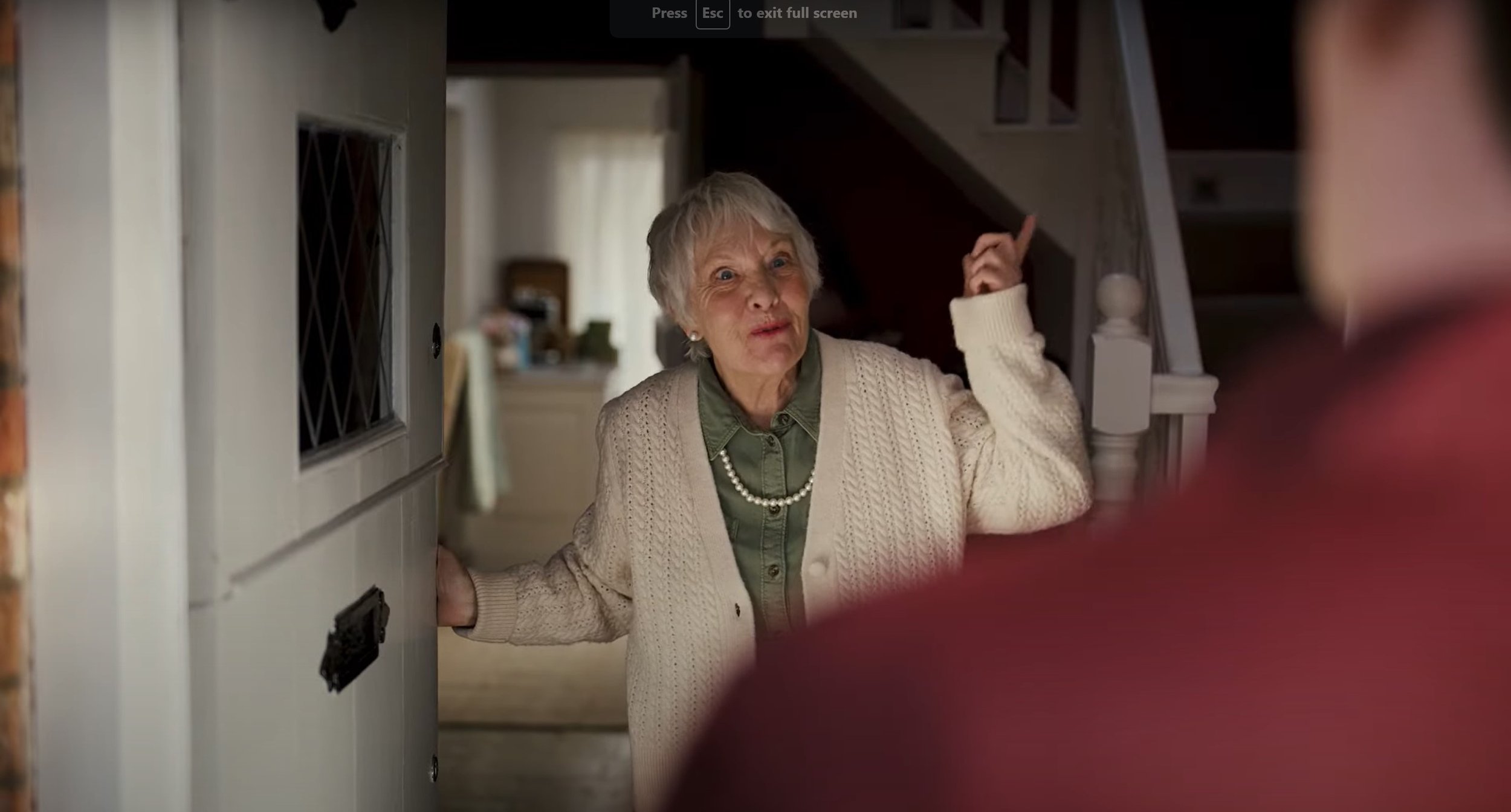
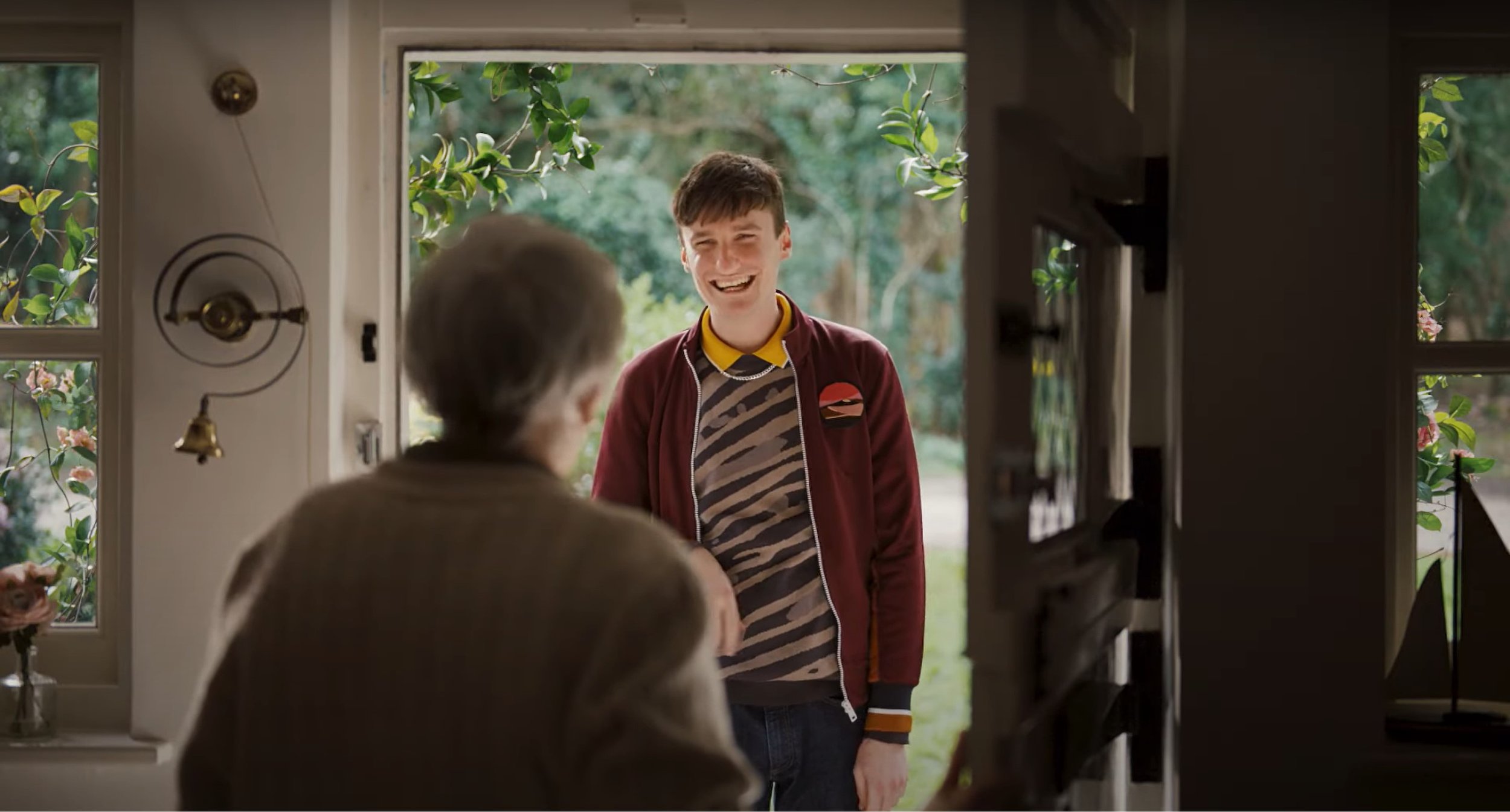
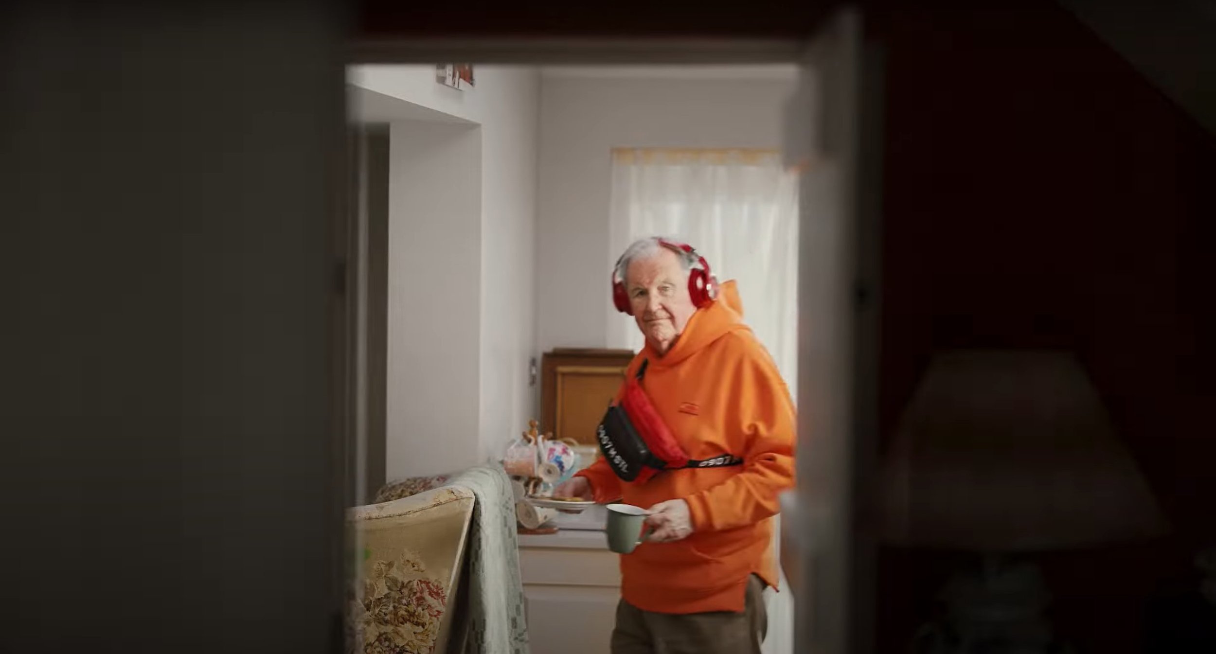
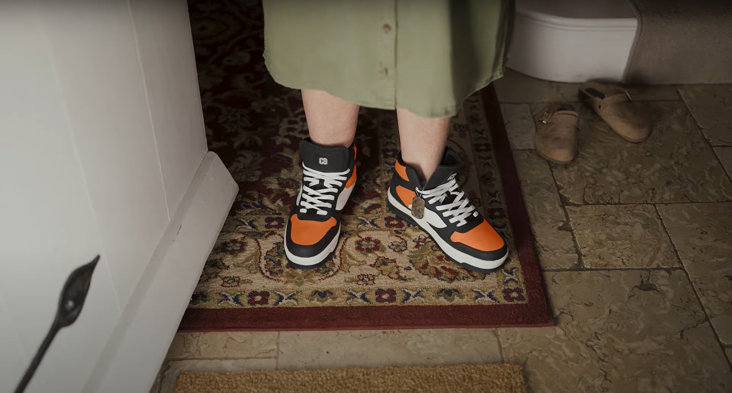
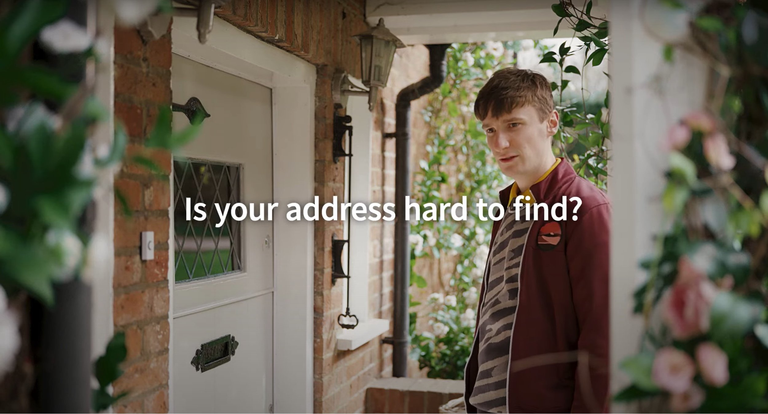
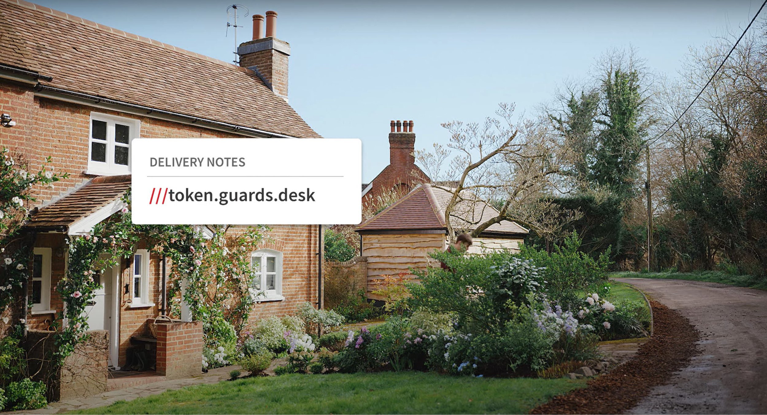
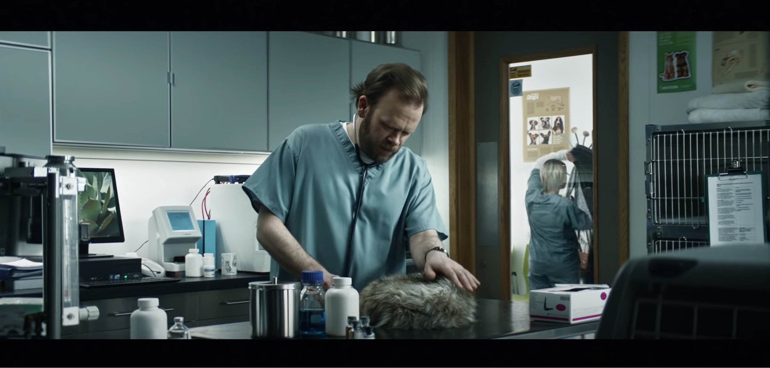
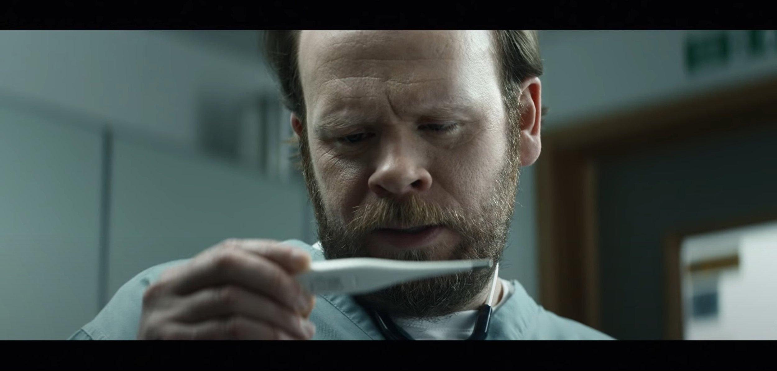
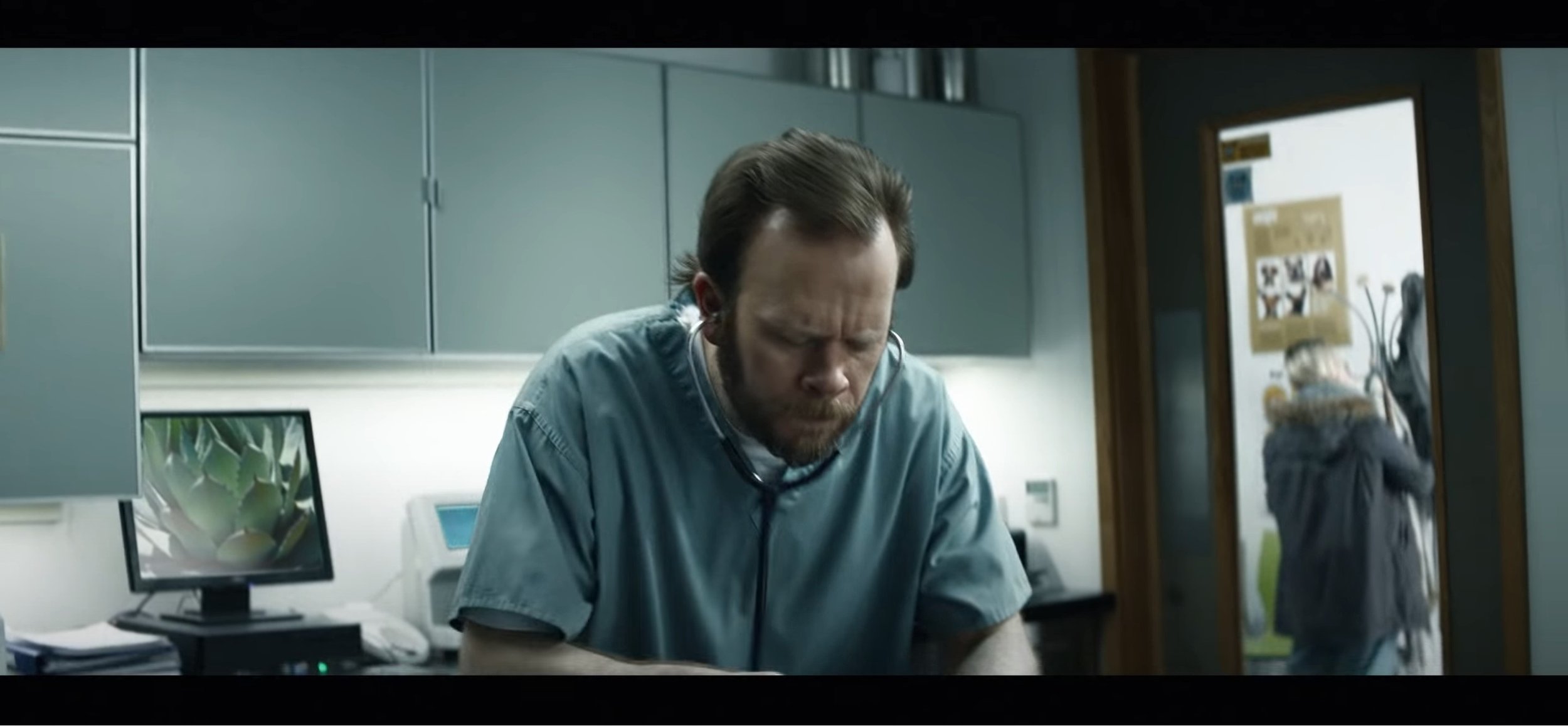
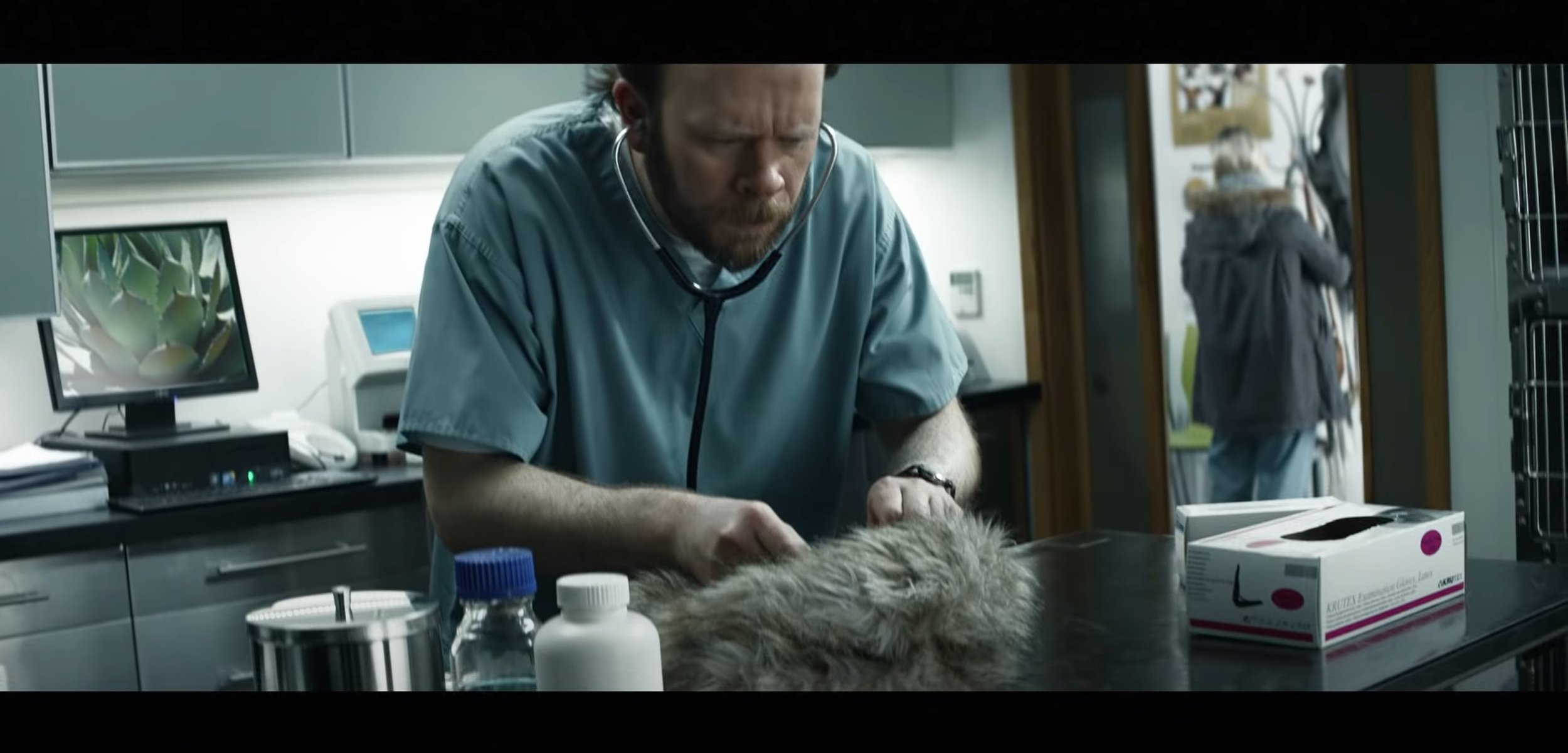
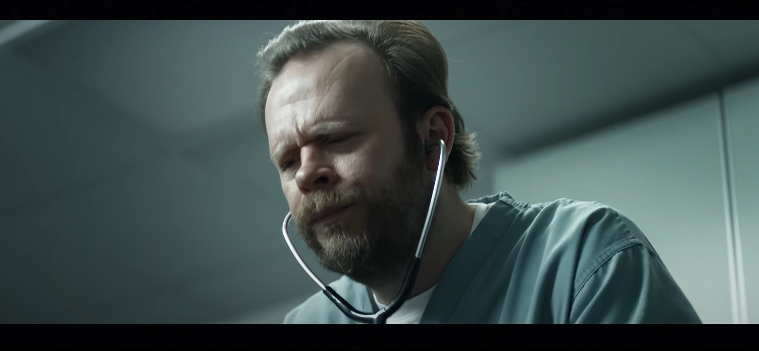
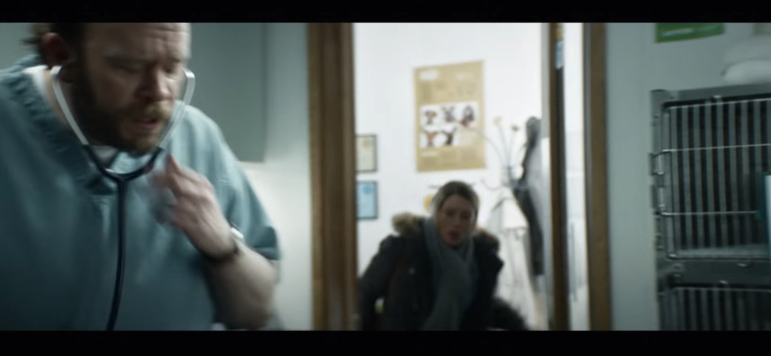
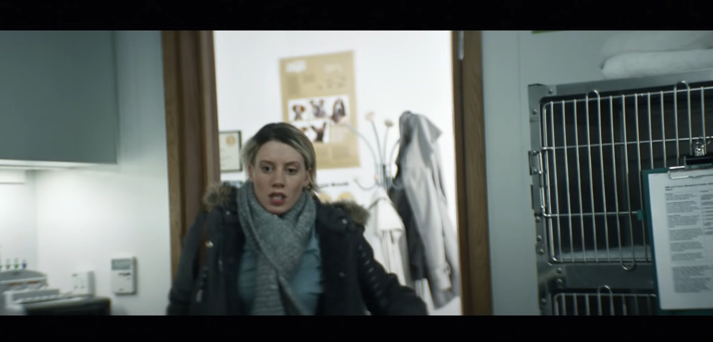
After watching this video a few times I can analysis this video, the ad uses basic shot types and angles through out, A medium shot is used at the beginning as the young man walks up to the old folks house, their is also a few close up shots focusing on the people walking around in the background with the man wearing the lad’s clothes, their is even a close up shot of the old lady wearing the lad’s footwear. Over the shoulder shots are heavily used as their is a conversation happening in this video and their is a wide shot at the end of the video as he walks away from the house. The lighting used is very generic, it heavily relies on the daylight to make the video bright enough. The target audience for this video is demographically 14 and above as the advert is on about using the right delivery service and stereotypically, people under the age of 14 nobody would be buying things online and having them delivered to your house. Their is also text used at the end of the ad which says “Is your address hard to find?” and then after that it comes up with delivery note with a bit of dialog of coding. Their is also screen grabs shown below to show what I am talking about above.
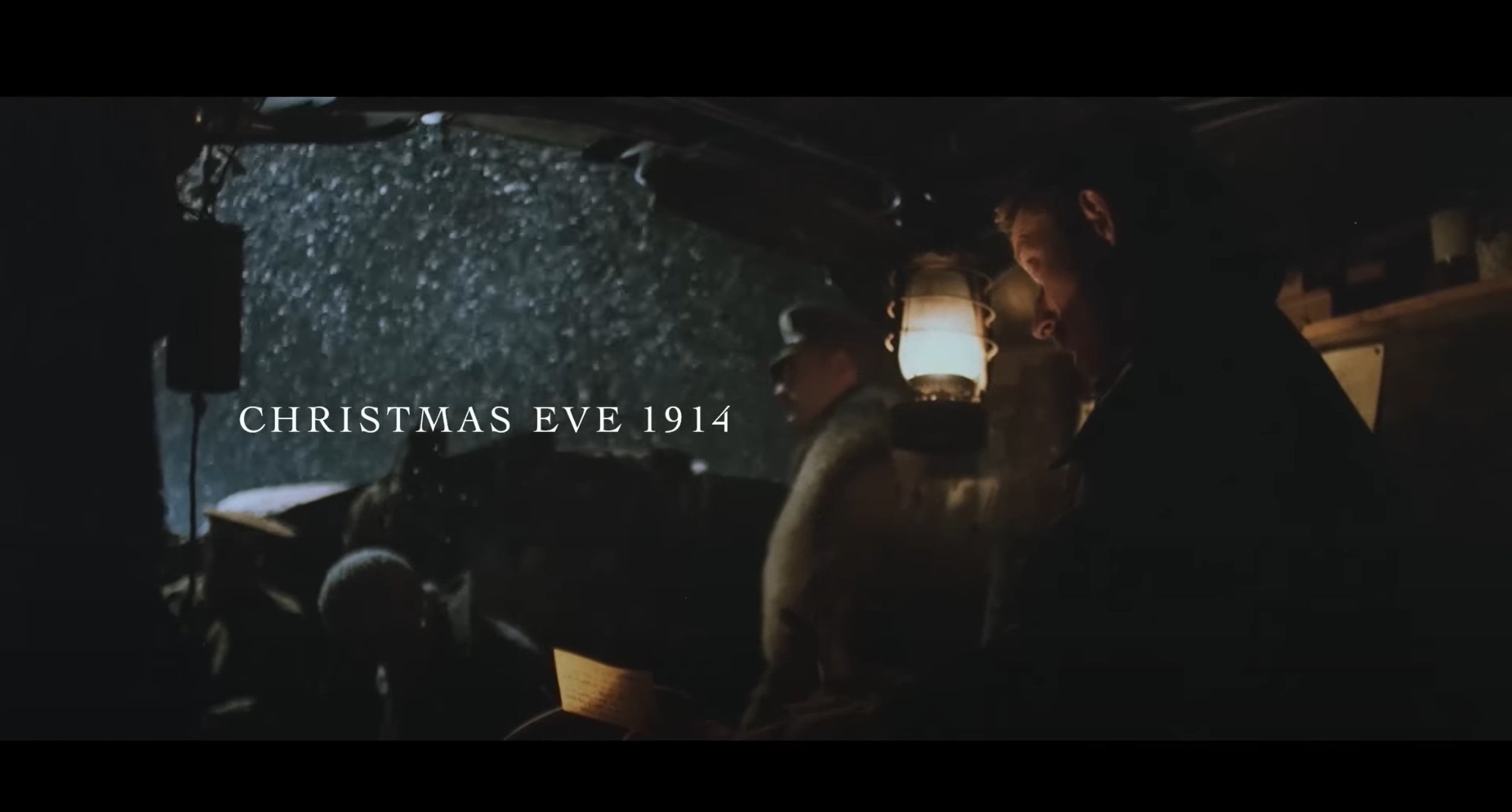
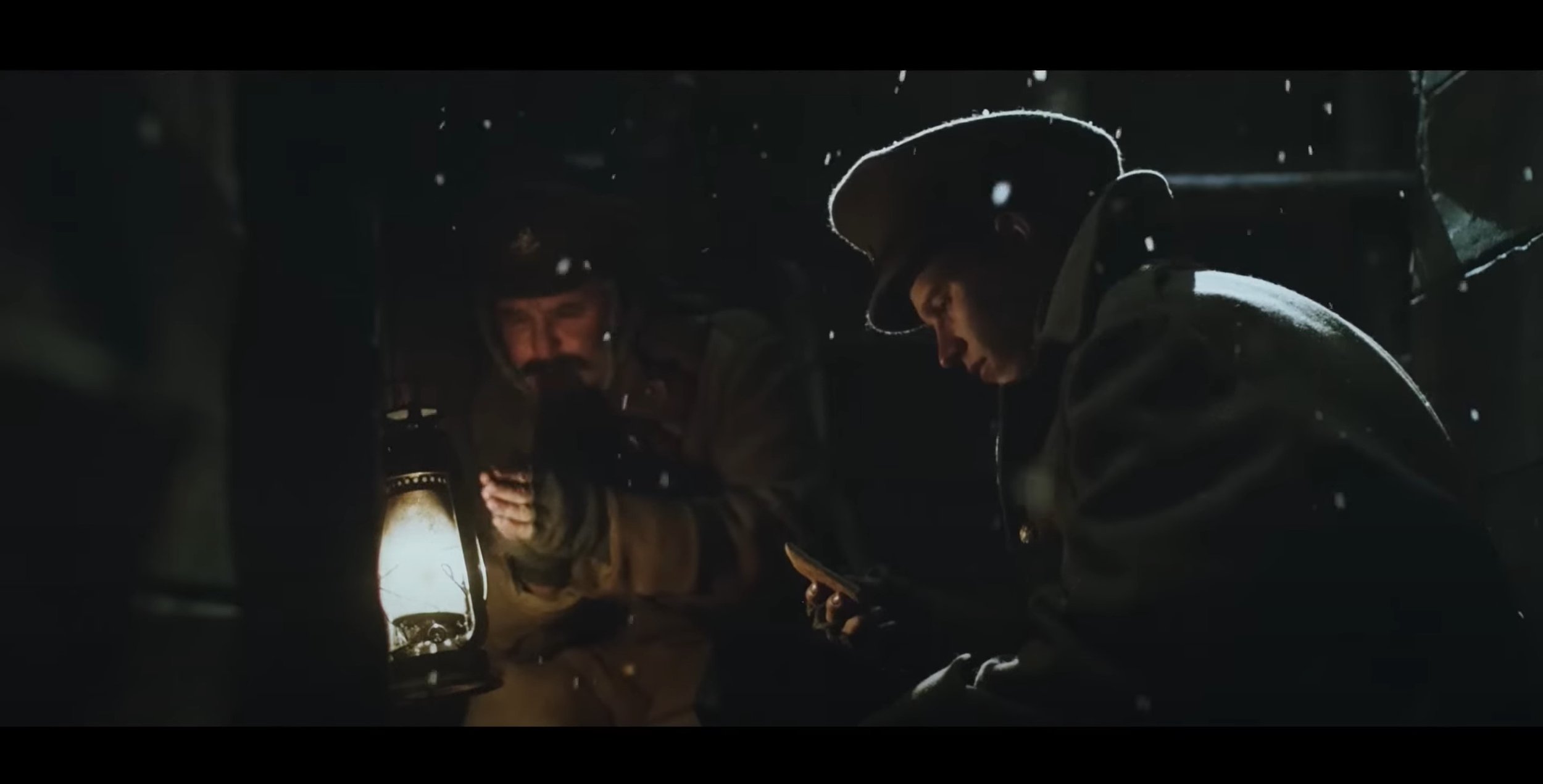
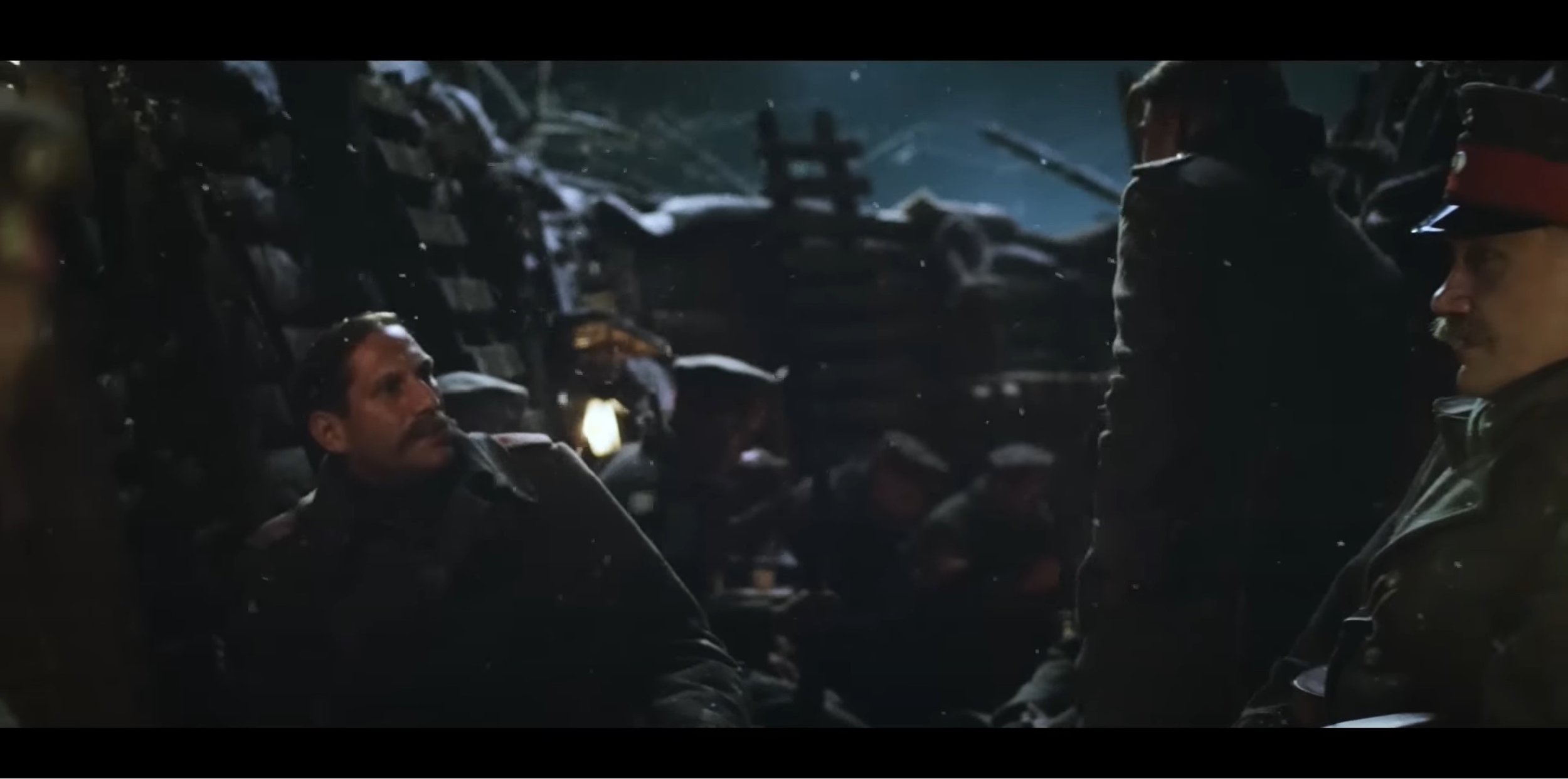
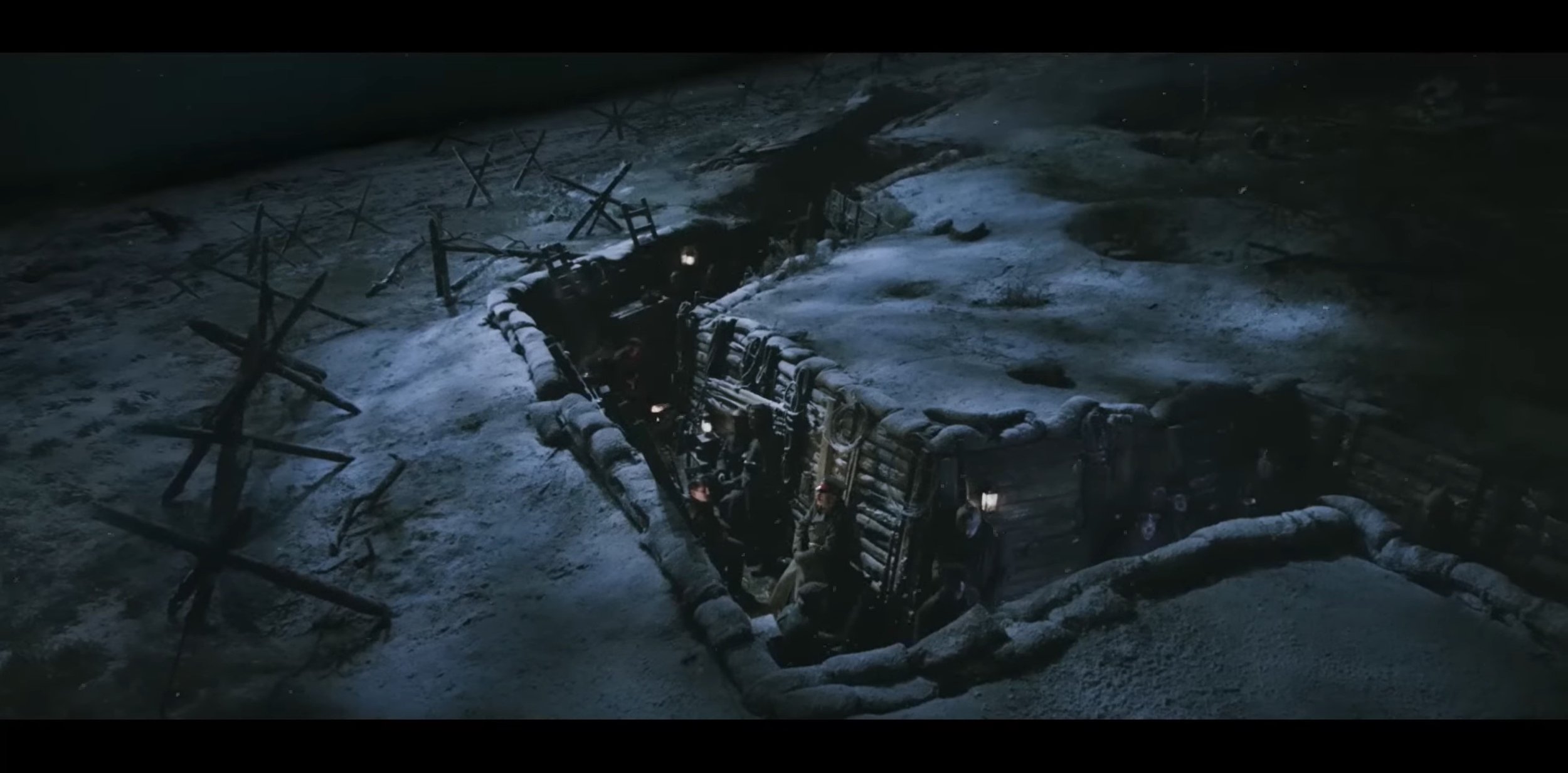
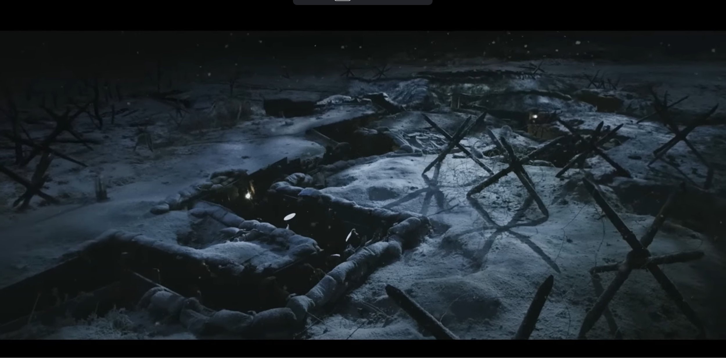
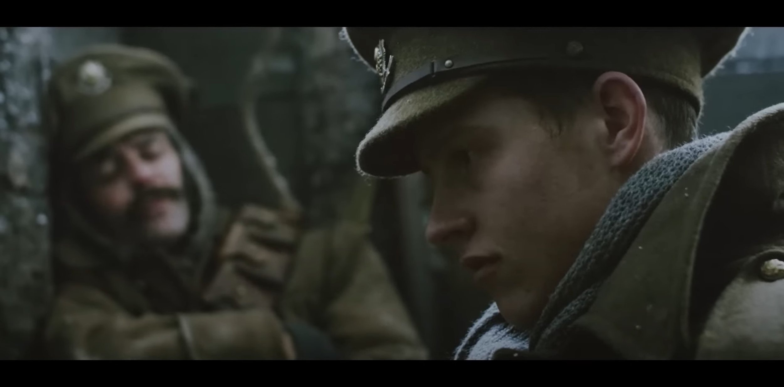
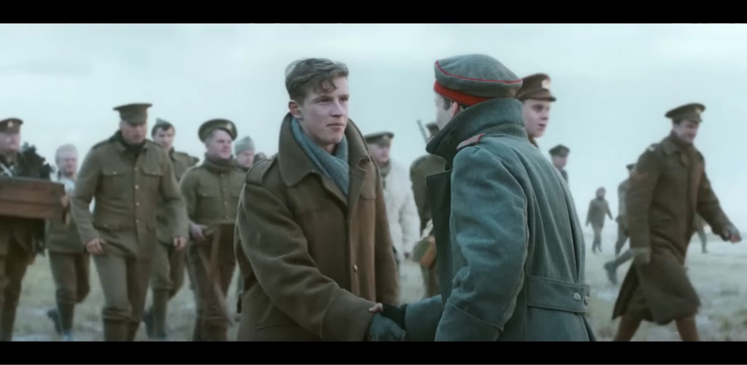
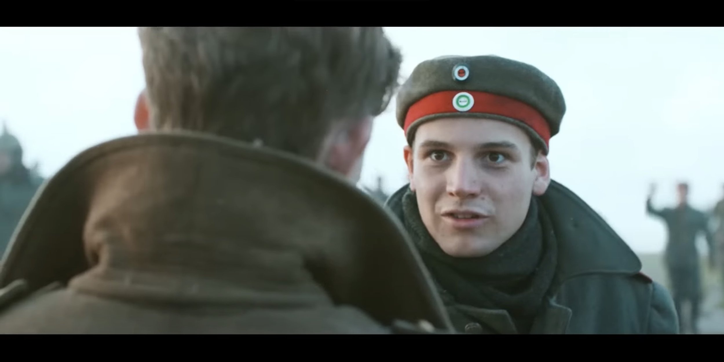
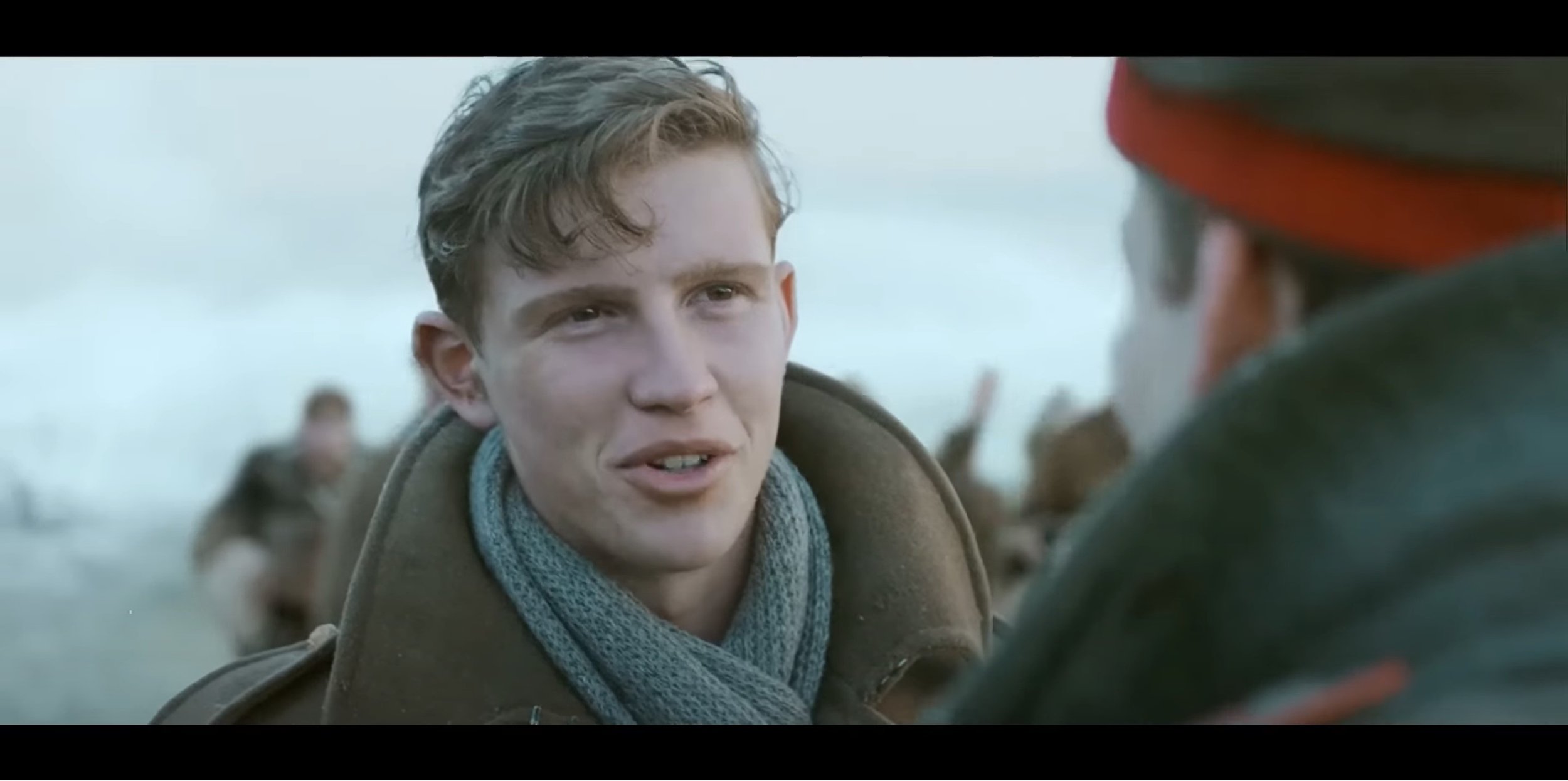
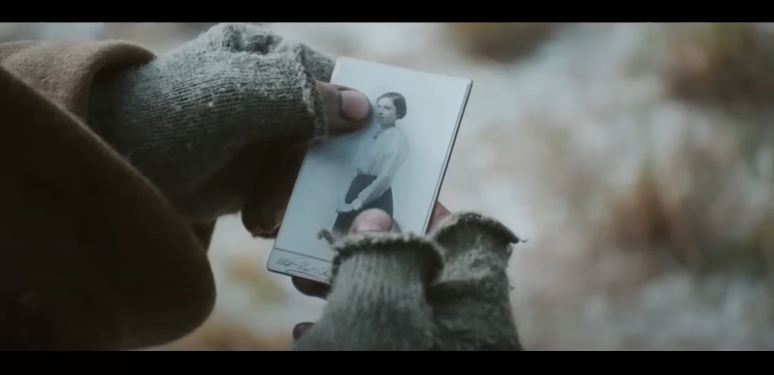
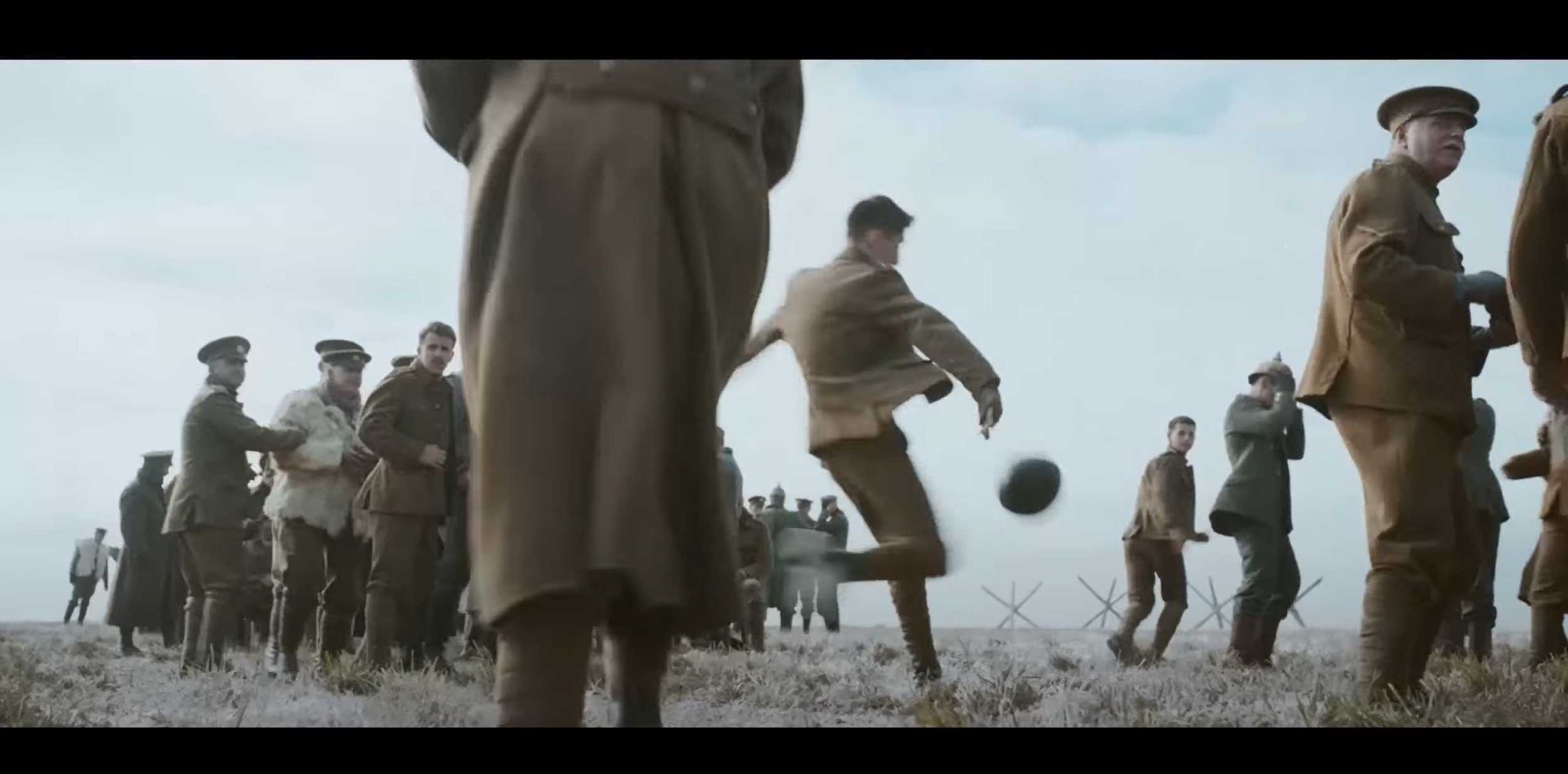
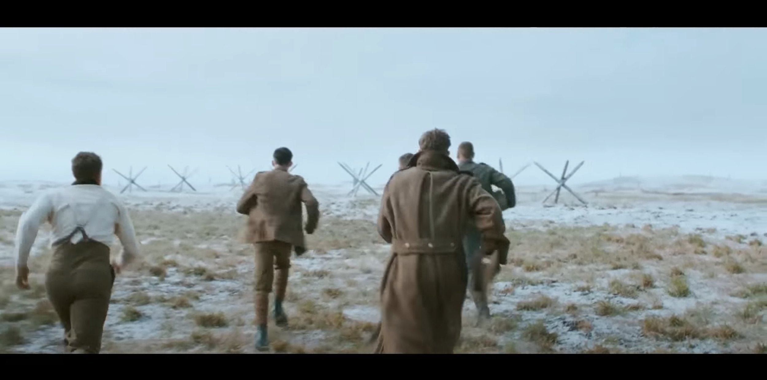
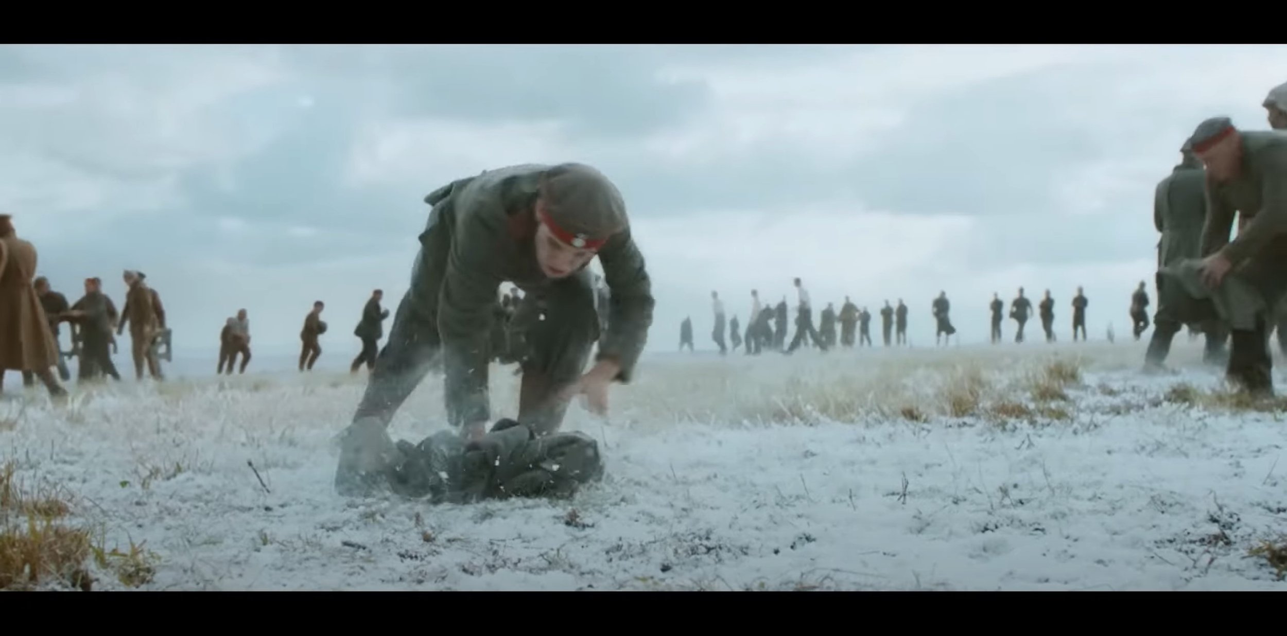
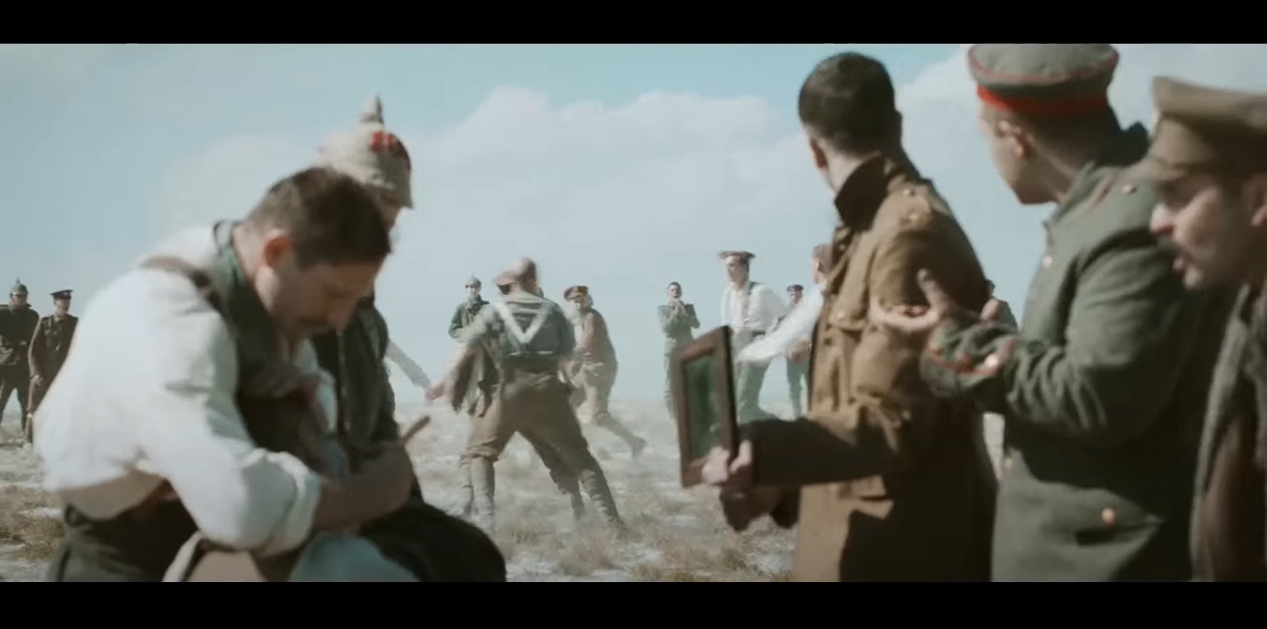
After watching this advert, it almost feels like a short film your watching but your not because it is an advert advertising for a supermarket called Sainsbury’s but at Christmas. In this commercial, Sainsbury’s has replicated the 1914 WW1 Christmas Truce between the Germans and the British on the Western Front. The target audience for this advert I think is any age because I think anyone could watch it and understand what the motto of the advert is and understand what is trying to portray. For me, this advert has been out for 9 years as of this blog was written and you can tell it has done itself justice if I can remember it for that long.
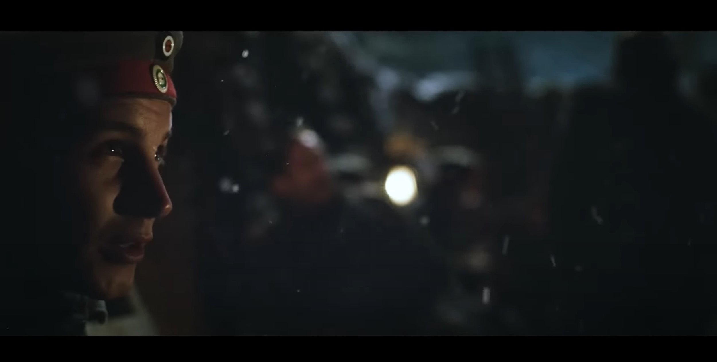
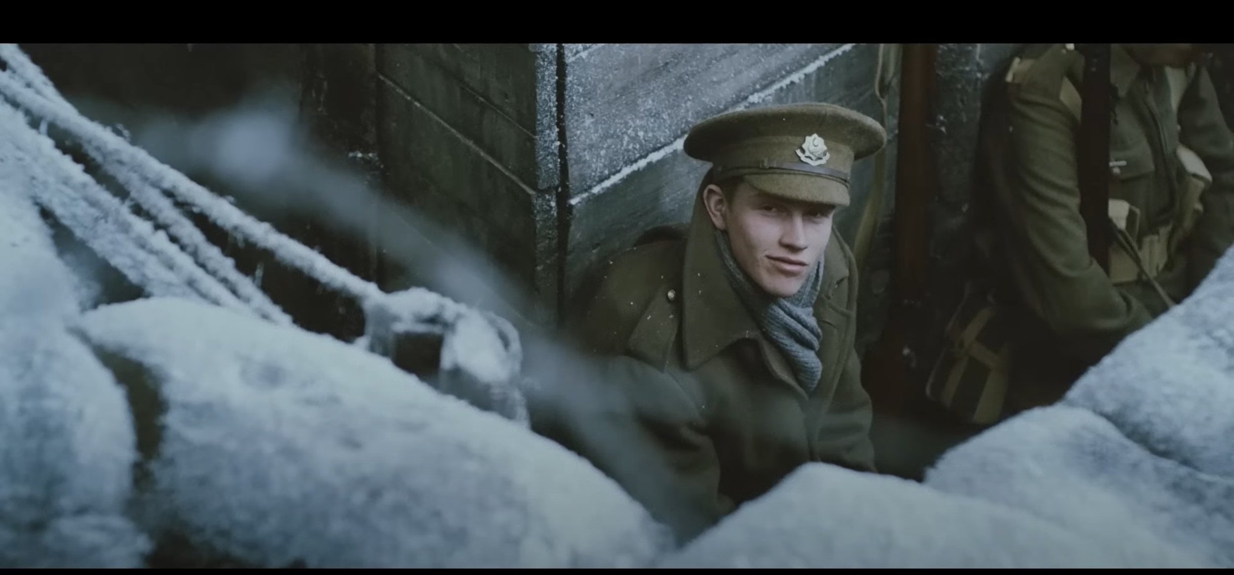
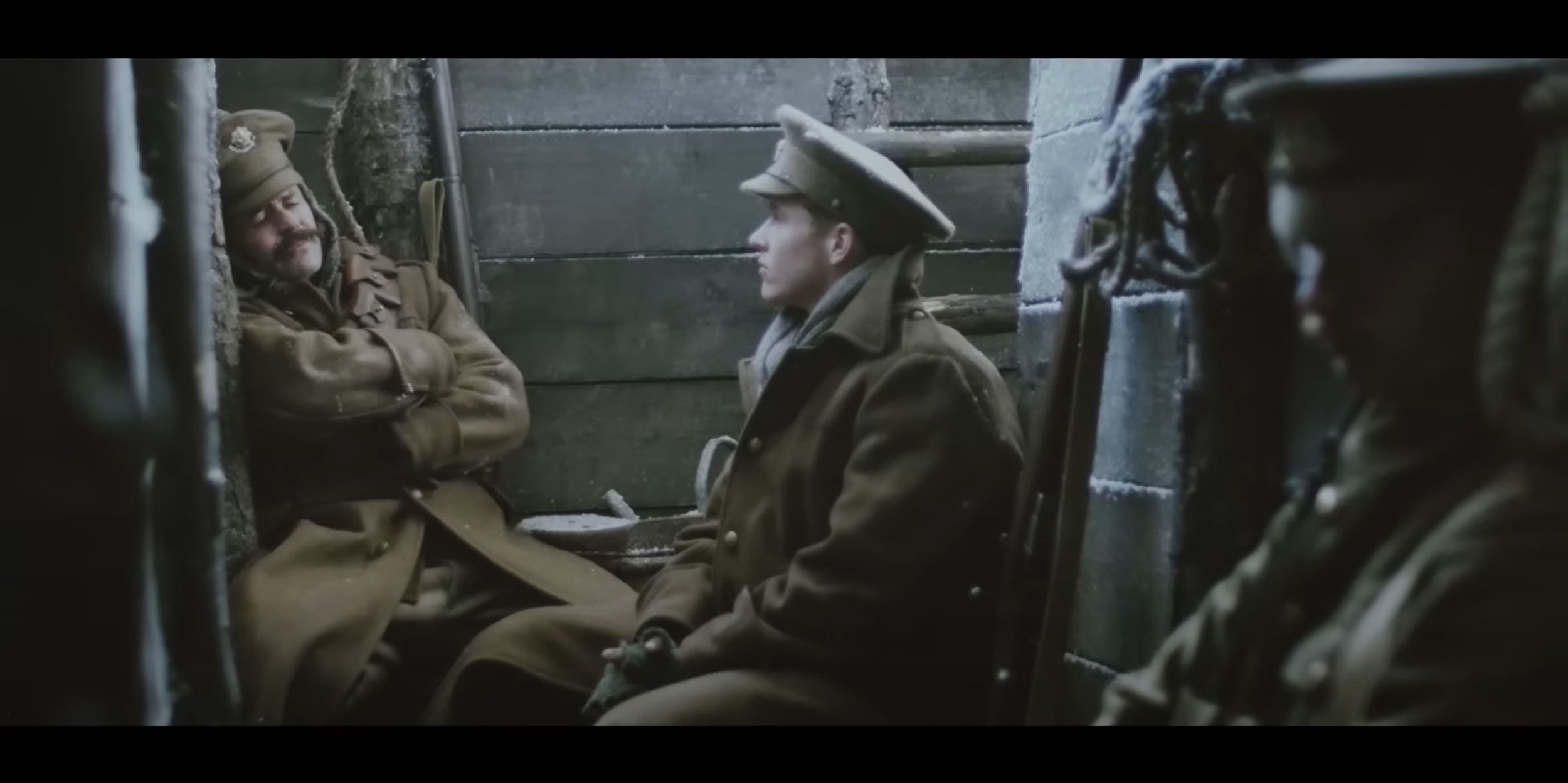
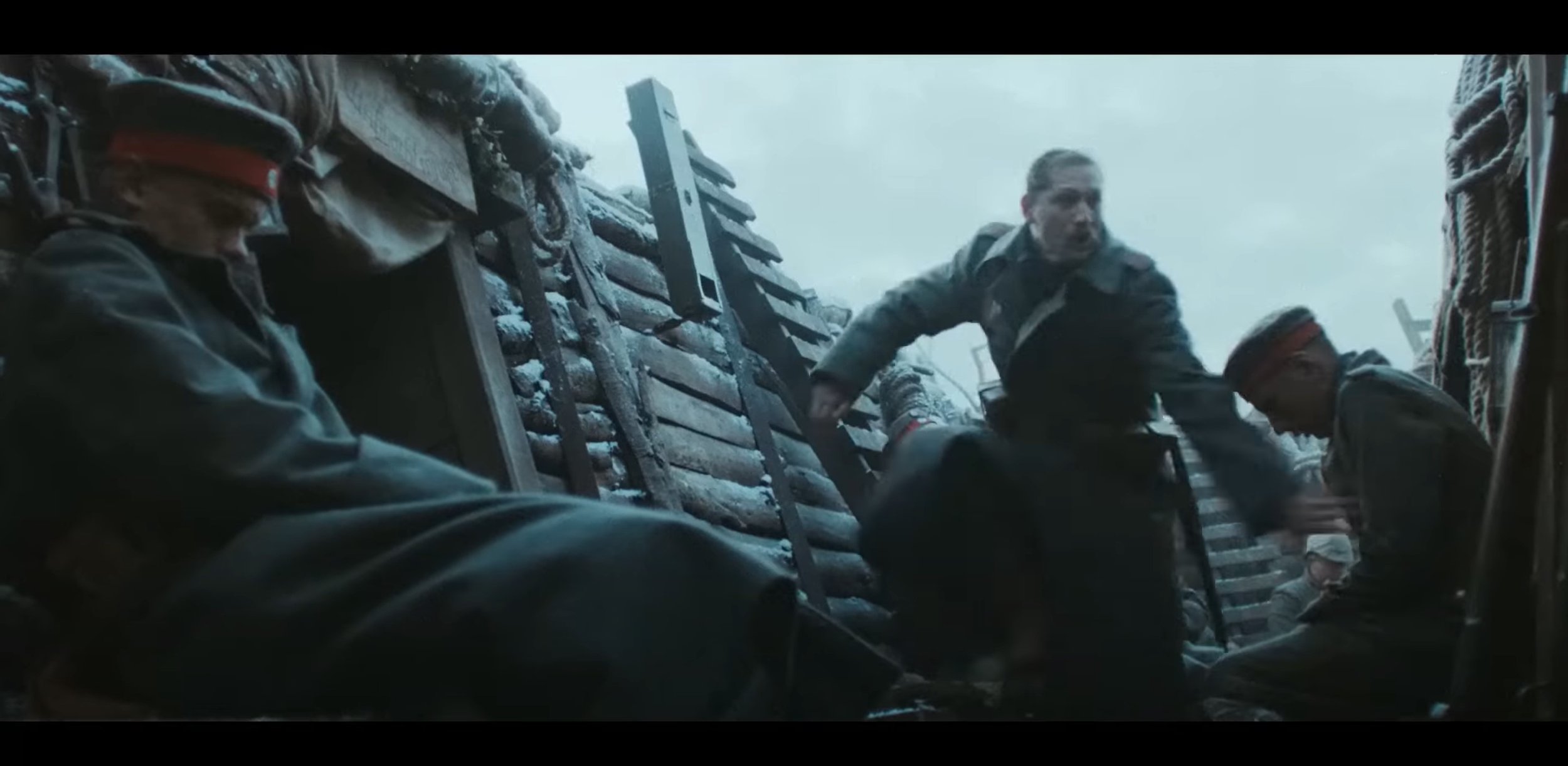
Now I’m going to talk about how artistically it has been created, firstly they have used the cinematic aspect ratio (2.4:1) to make it feel like you are watching a actual short film. As the beginning it uses the fade in transition and then at the same time some text gets shown which says “Christmas Eve 1914”. The lighting at the start is very dark as it is night time in the trenches, their is a catch light which is acting like moon light and their is a gas light used to show minimal lighting. Their is a variety of different shot types used through out in these scenes coming from over the shoulder shot, medium shot, close up shot and wide shot. The angles I see used in these scenes are high angle shots looking down into the trenches combing that with wide shot to show what it looks like from above. In terms of Camera movements, I see plenty of static shots and their is a few panning shots with some dolly zoom shots as well which is focusing on a certain subject.
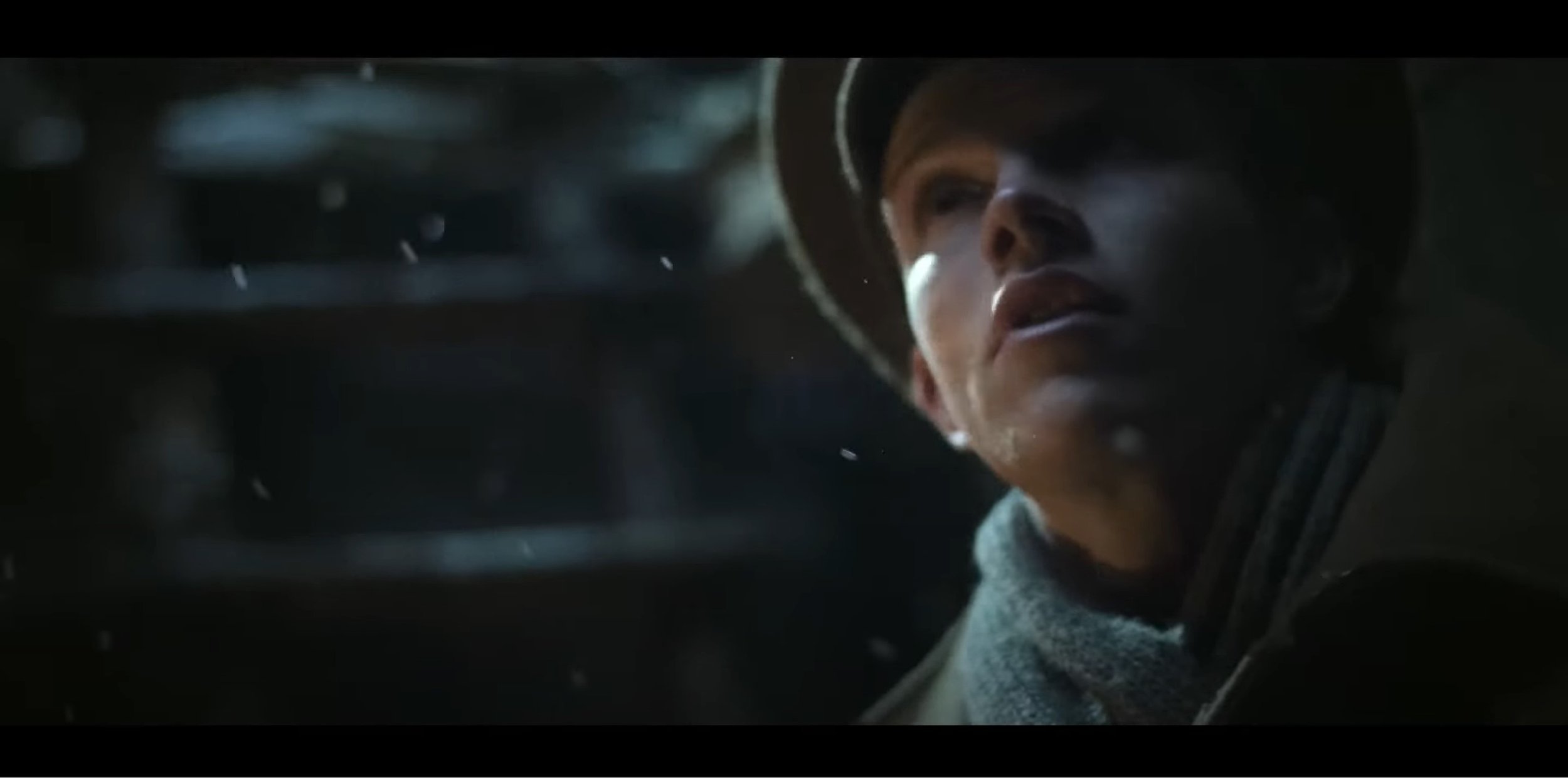
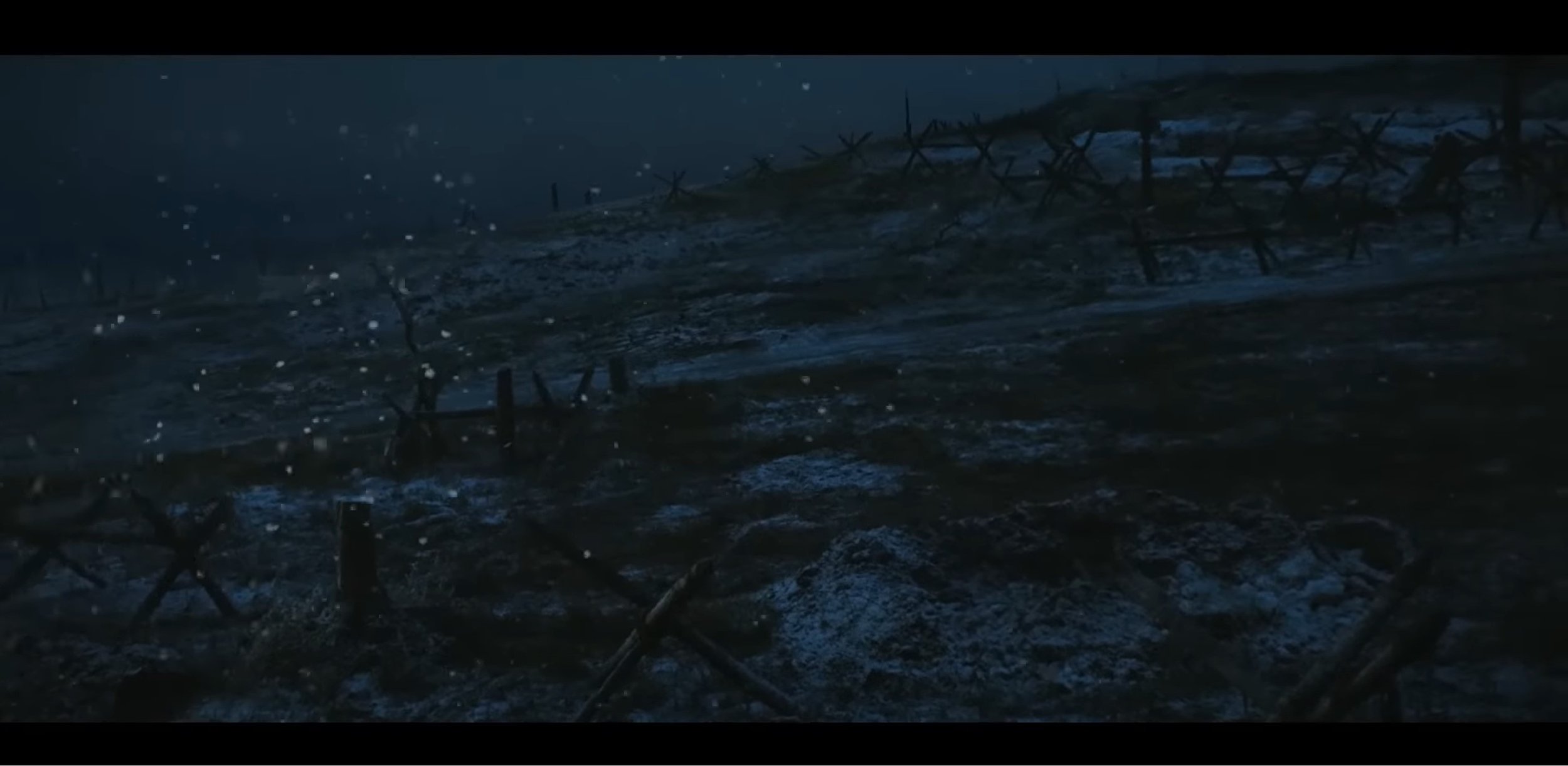
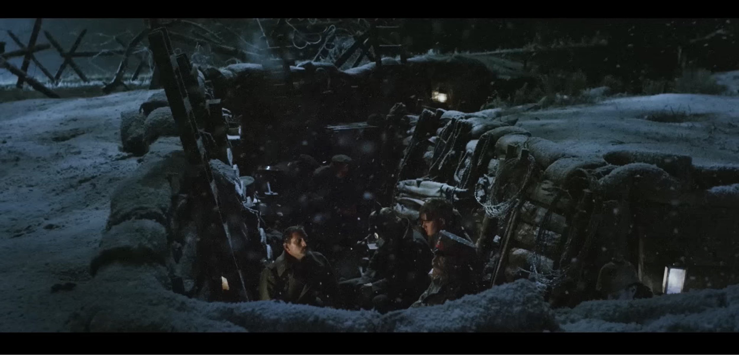
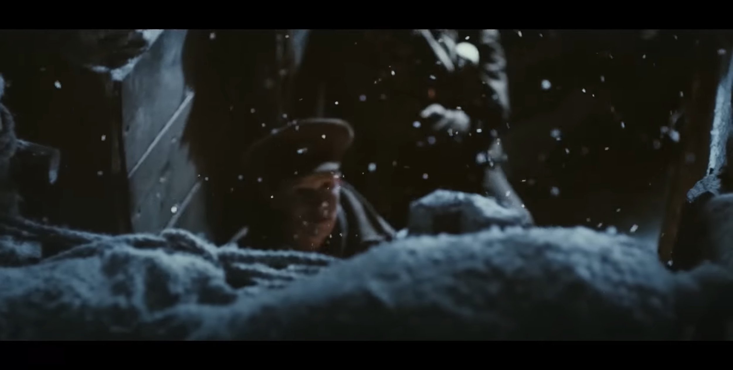
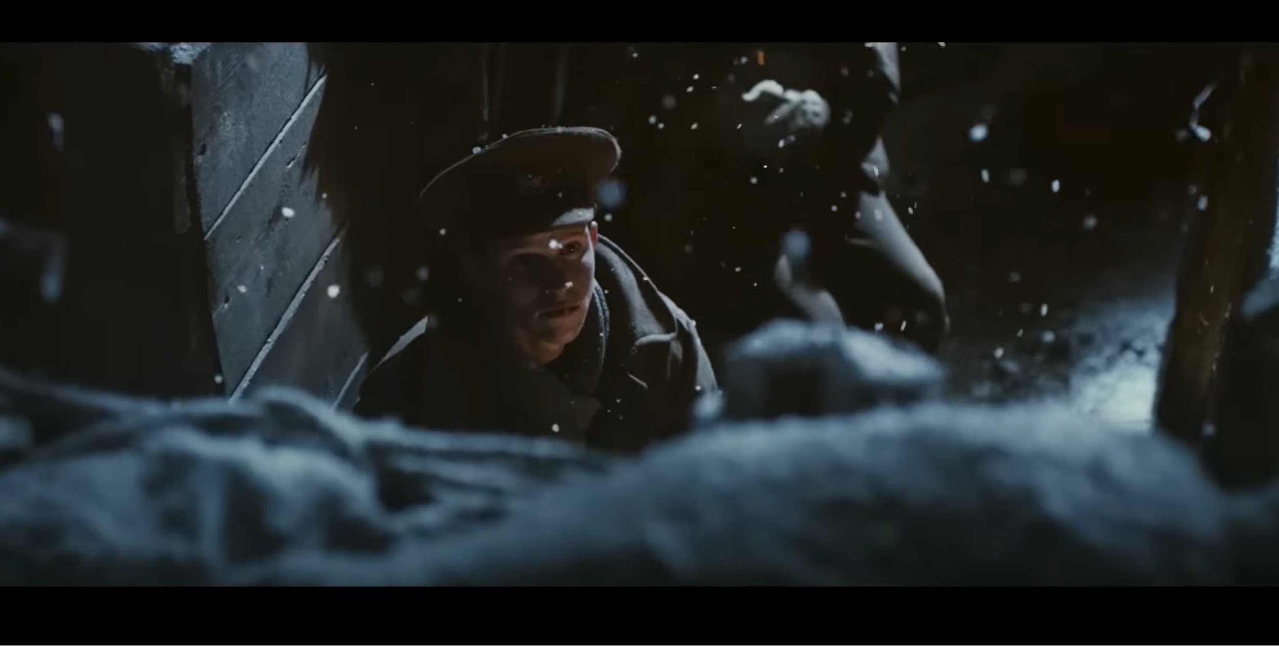
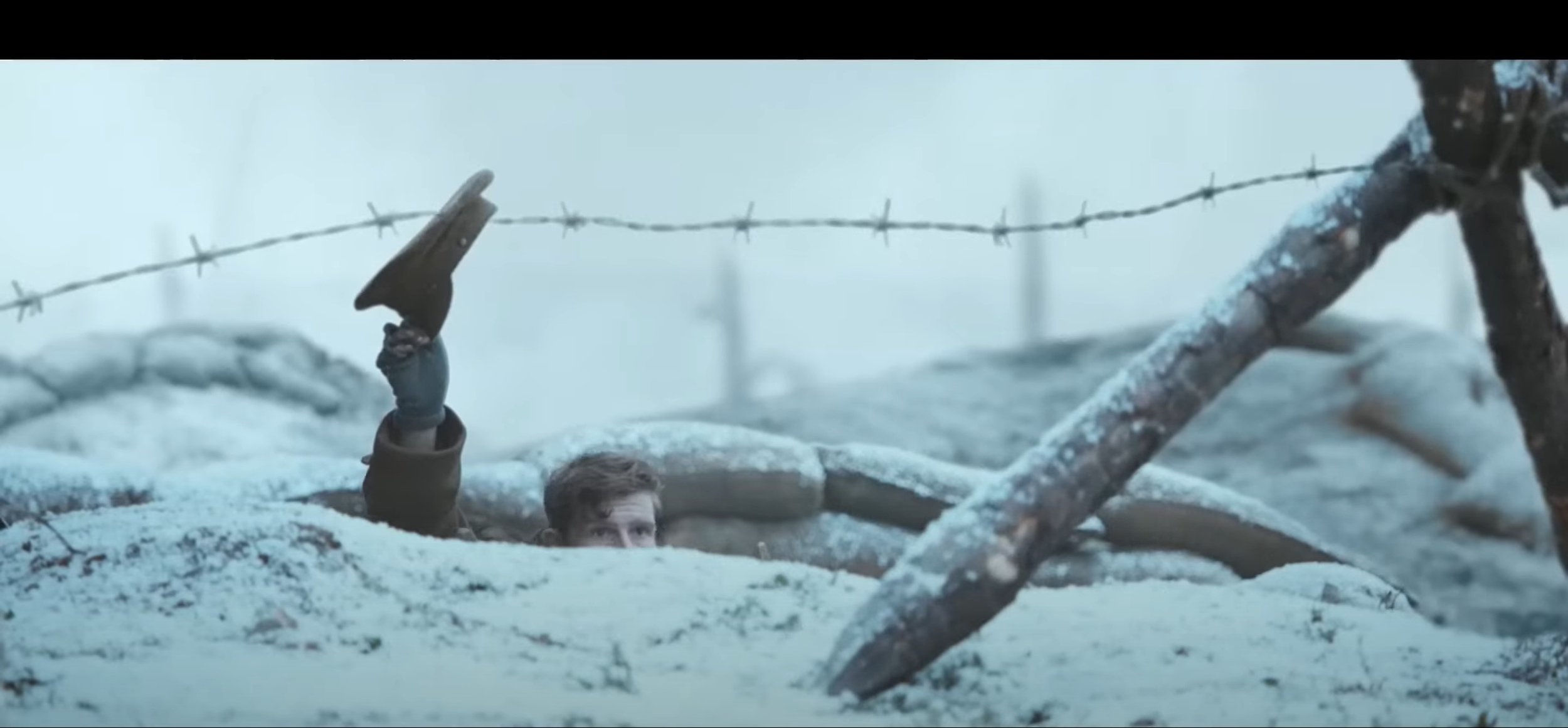
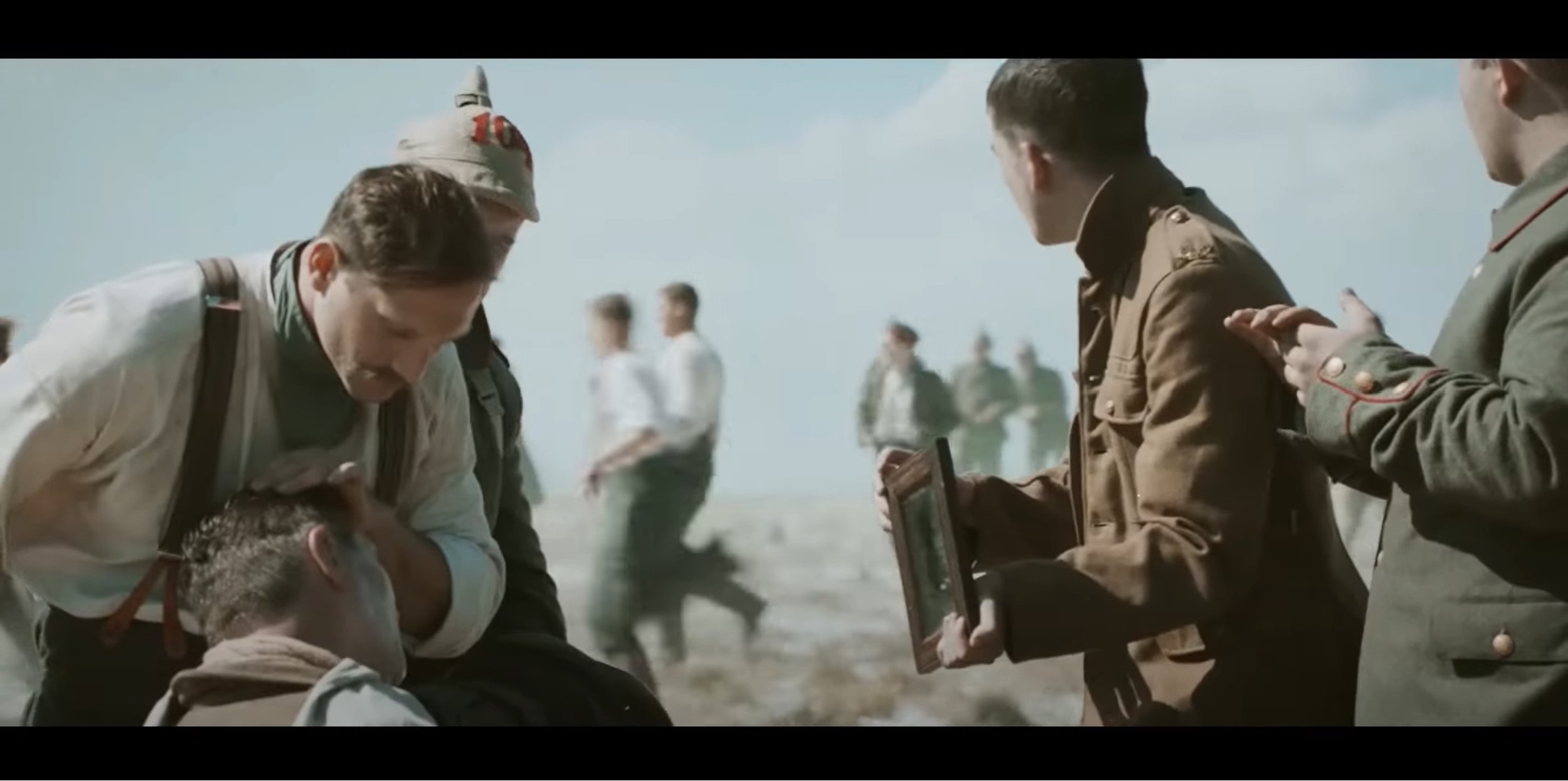
For the second part of this advert, it becomes day time and the video relies on the daylight to make it bright enough for the video, the shot types used in this section vary between over the shoulder shot, medium shot, medium close up and extreme close up. The type of angles used are a mixture between low angle which is was used in this to show the presence when the soldier is slowly showing their head over the top of the trenches and of course when the two countries meet in the middle of no mans land. The camera movements used are mostly static shots but their was a few shots in this section that used a slow dolly zoom and a slight side to side movement when the soldiers start moving to pick up the weapons and their is a tracking shot following the captain in no mans land.
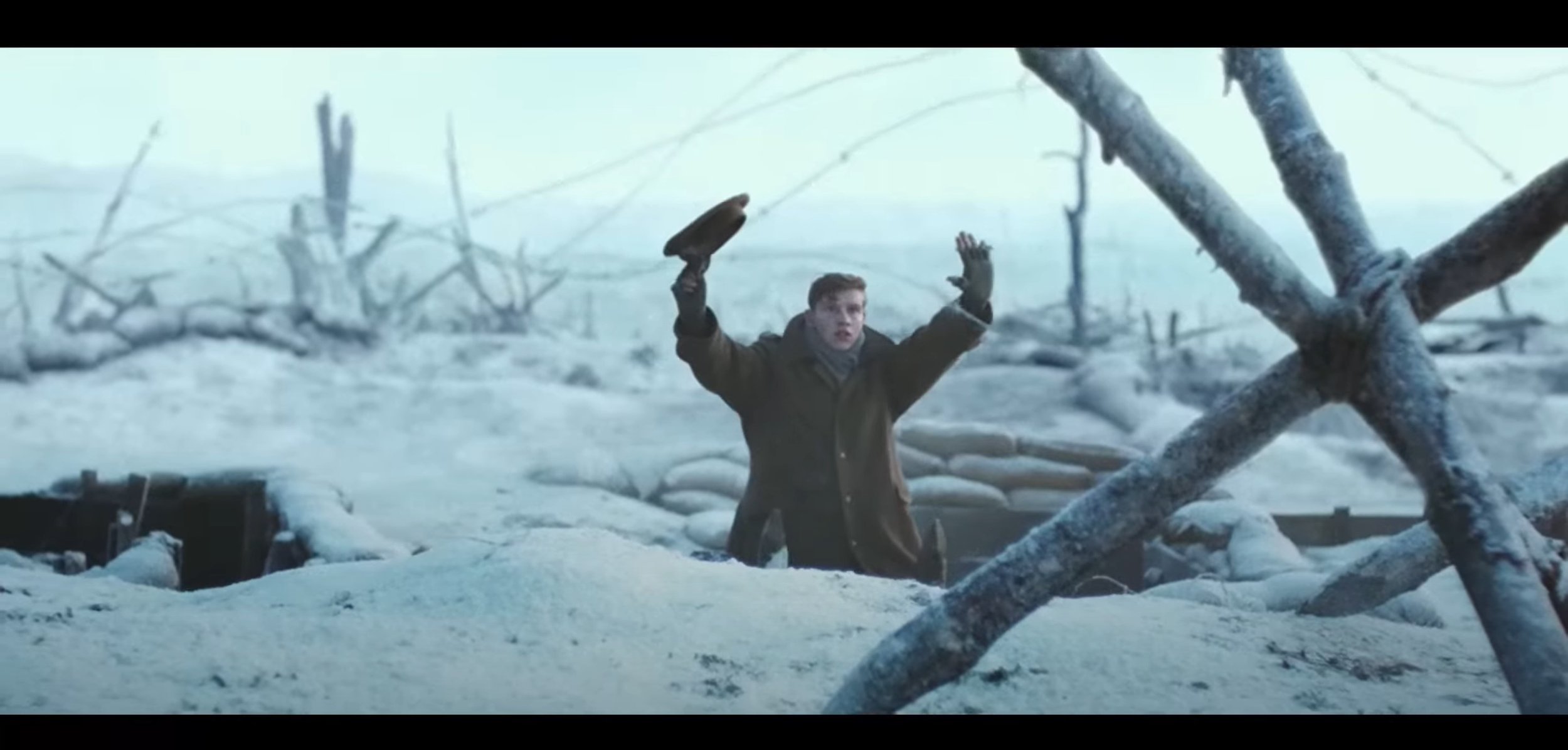
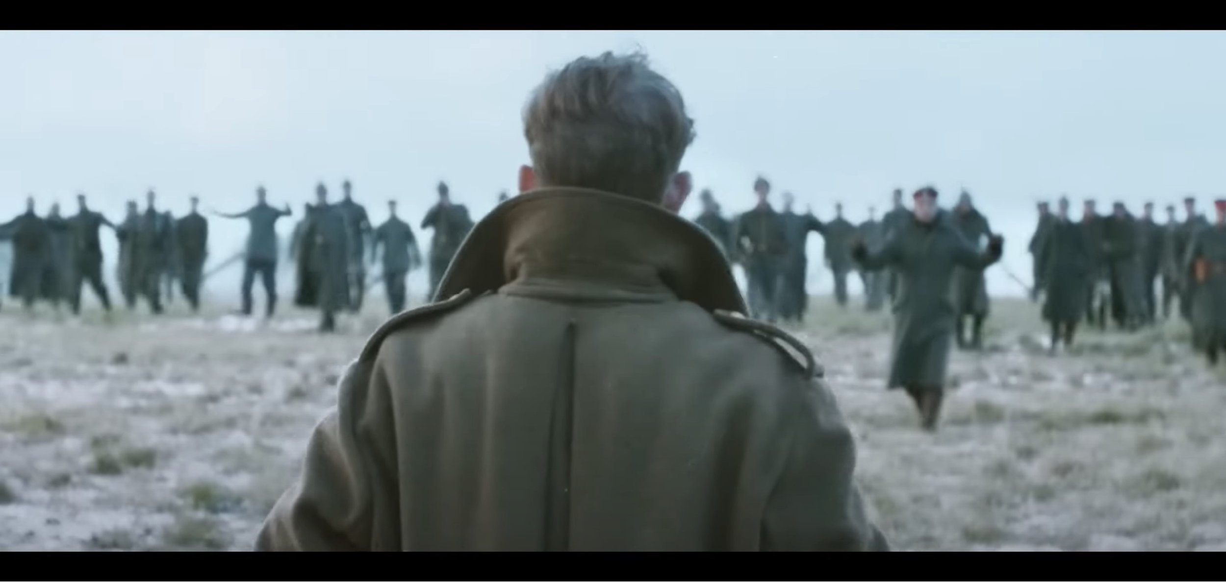
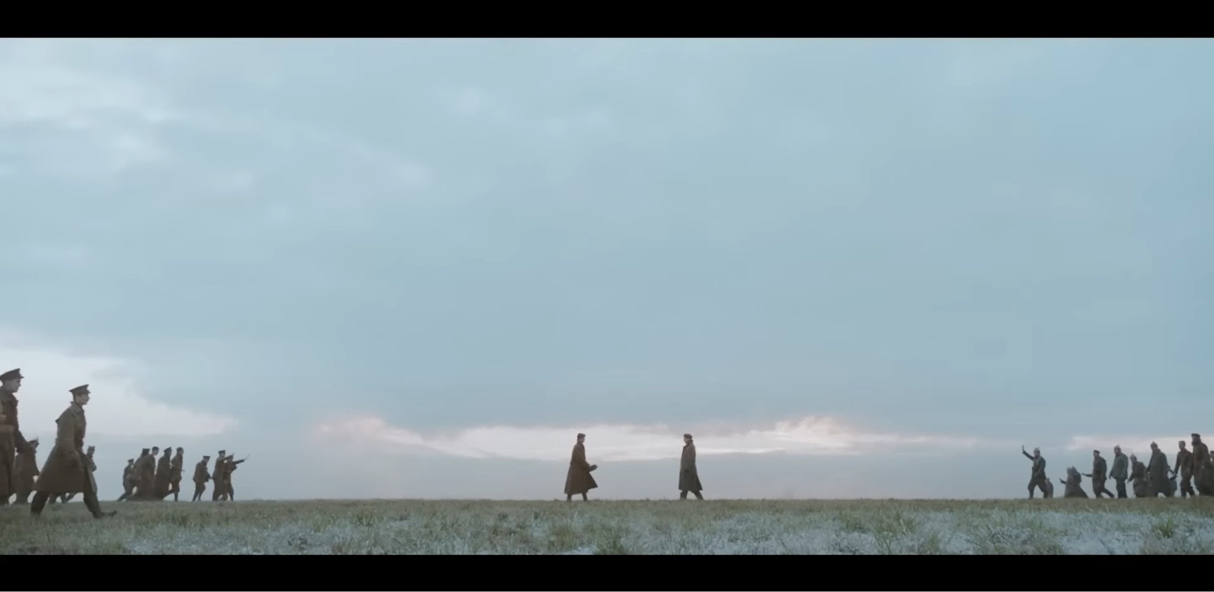
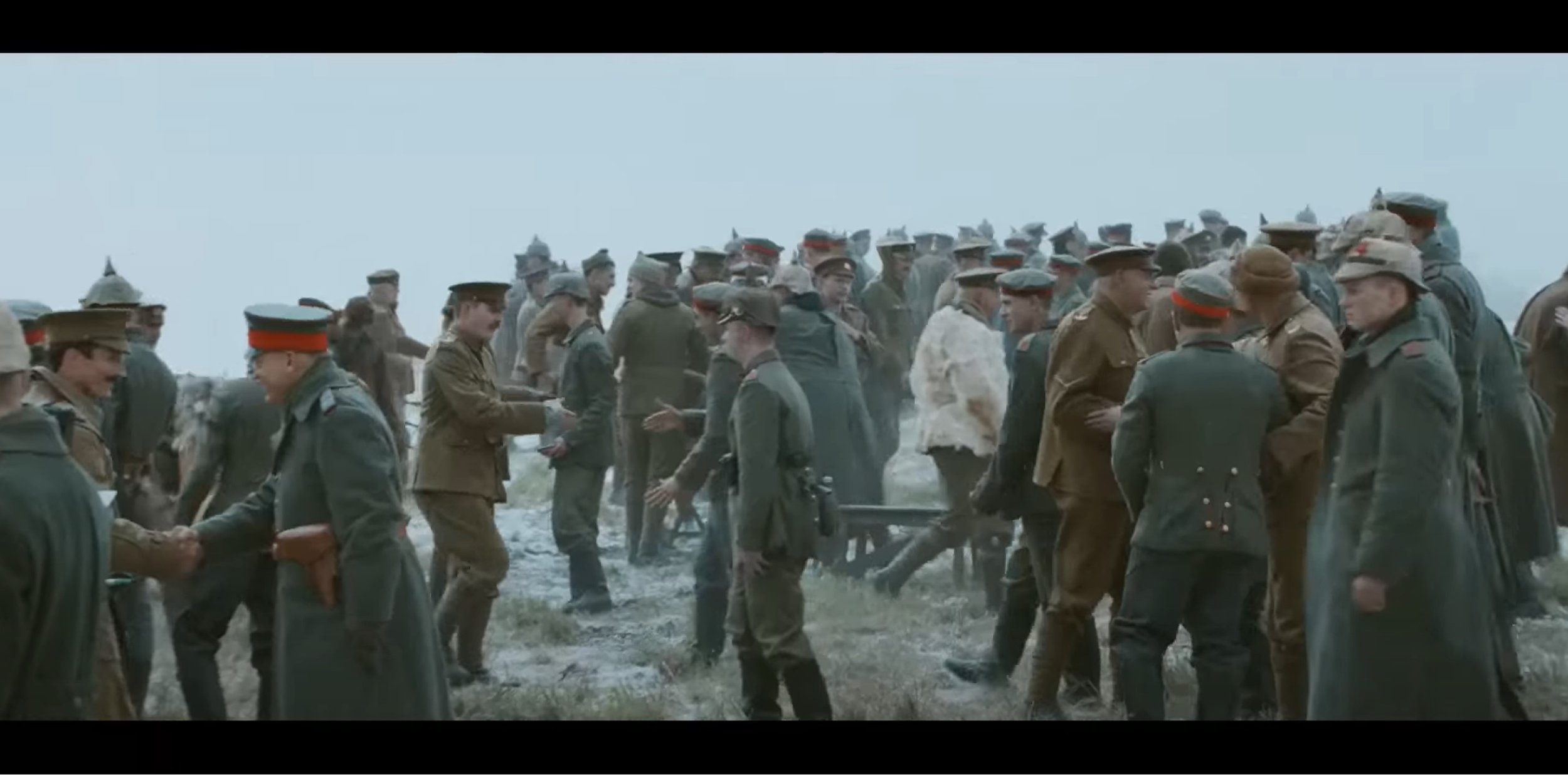
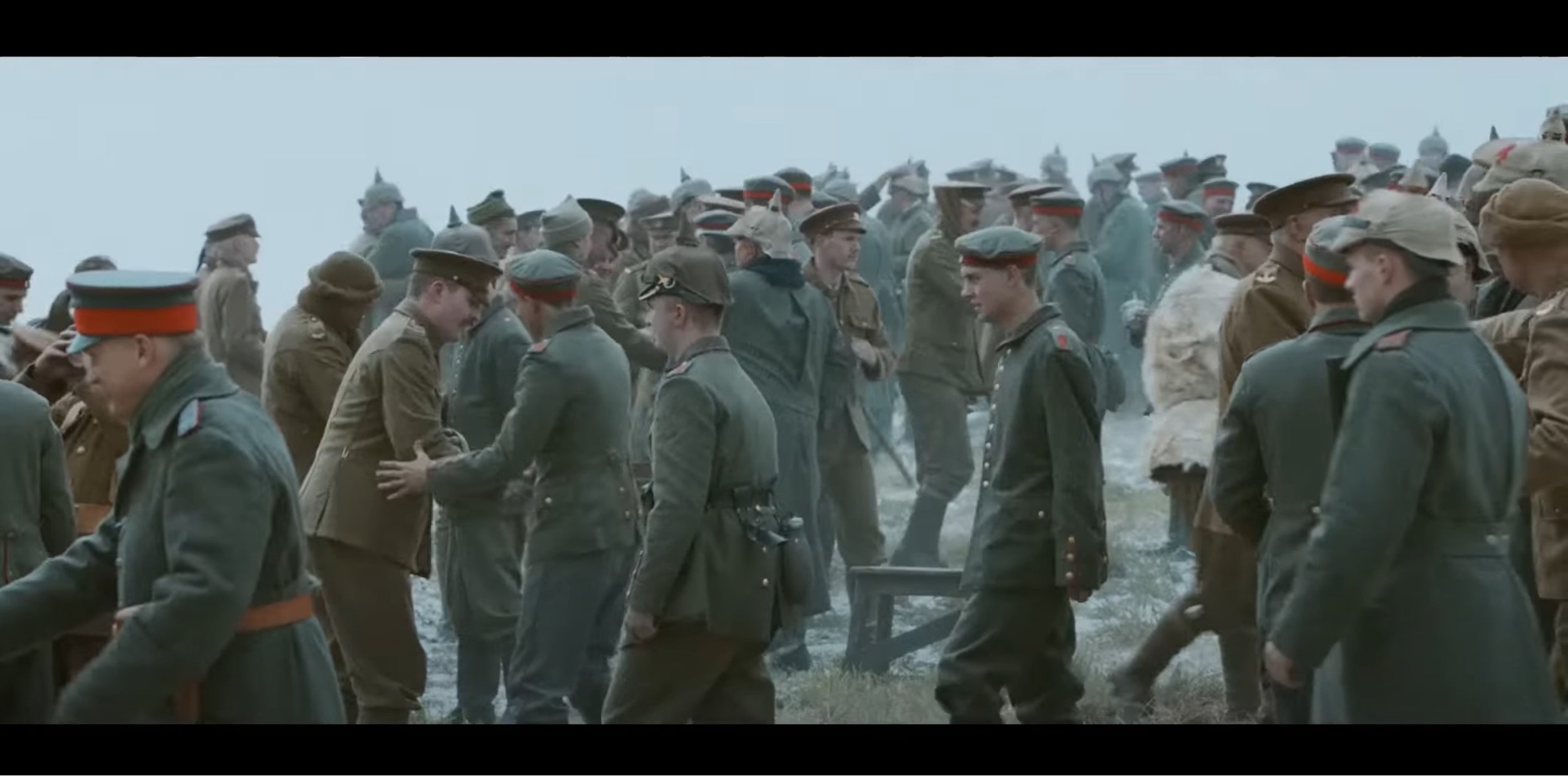
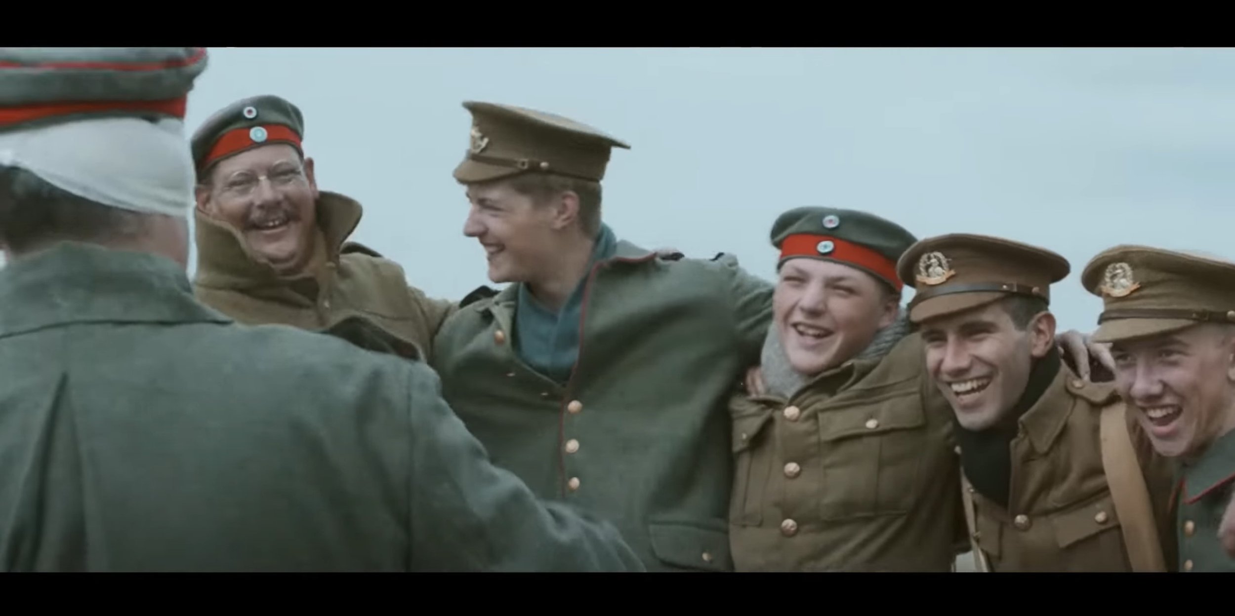
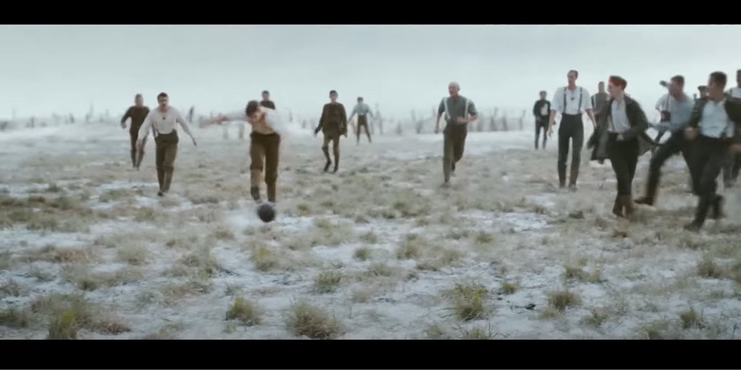
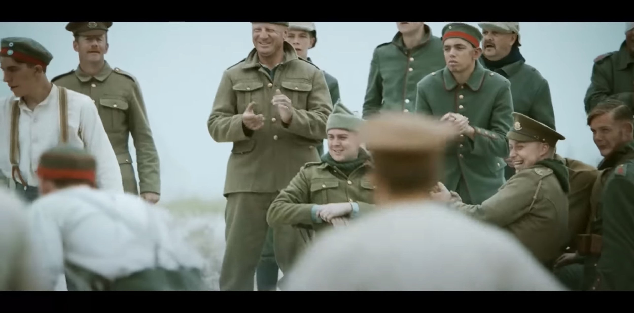
In the last segment, they unite in the middle of the battle field and play a bit of football in no mans land. Again for part, the video heavily relies on natural lighting from the sky to light up this video, in terms of shot types they use a mixture of over the shoulder, close up and even some medium shots. A dolly zoom movement shot is used zooming into the subjects from a medium wide type shot to a medium shot only showing from the waist and above. The angles which are used in this part are mostly eye level and low angle which shows presence of the subject and their is a few low angle medium close up shots which also focuses on what is happening in the distance as well. There is a bit of frame with in a frame action going on quite early on in the football scenes were you can see the action happening through the middle of the soldiers and then the camera re-focuses on the injured soldier and at the same time it pans left.
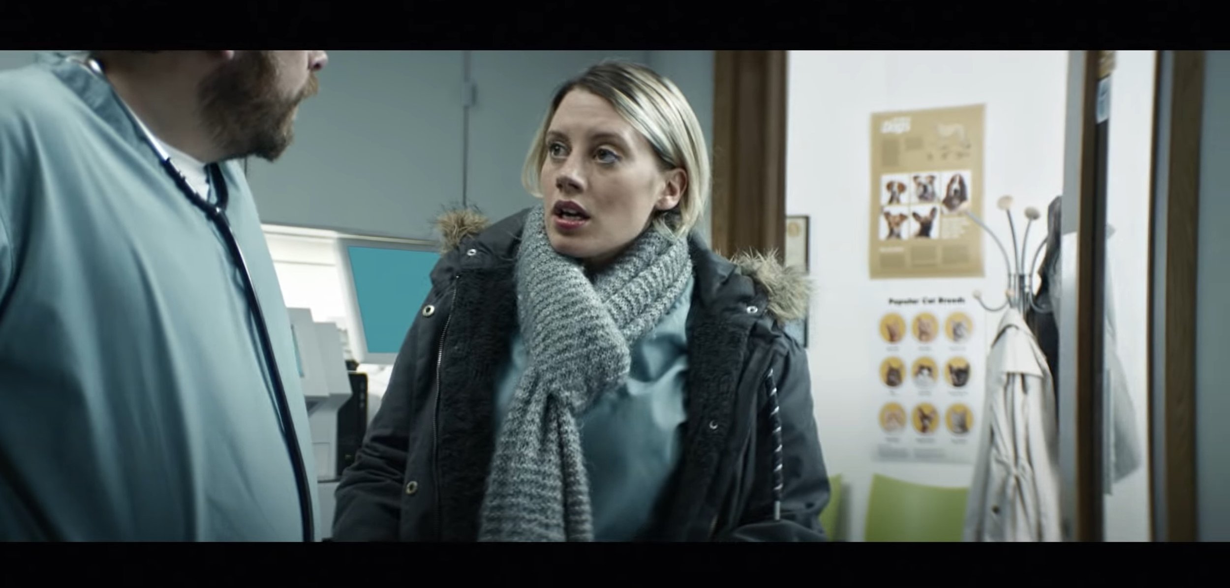
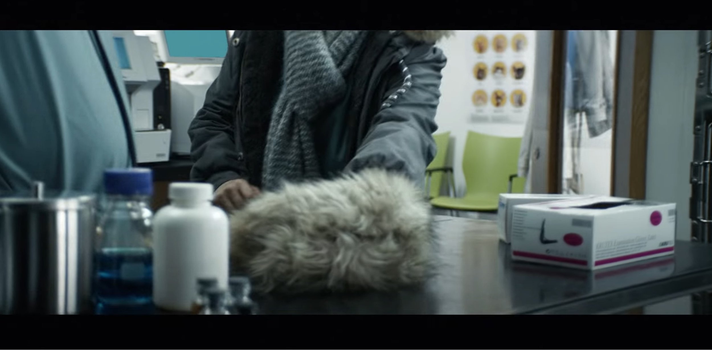
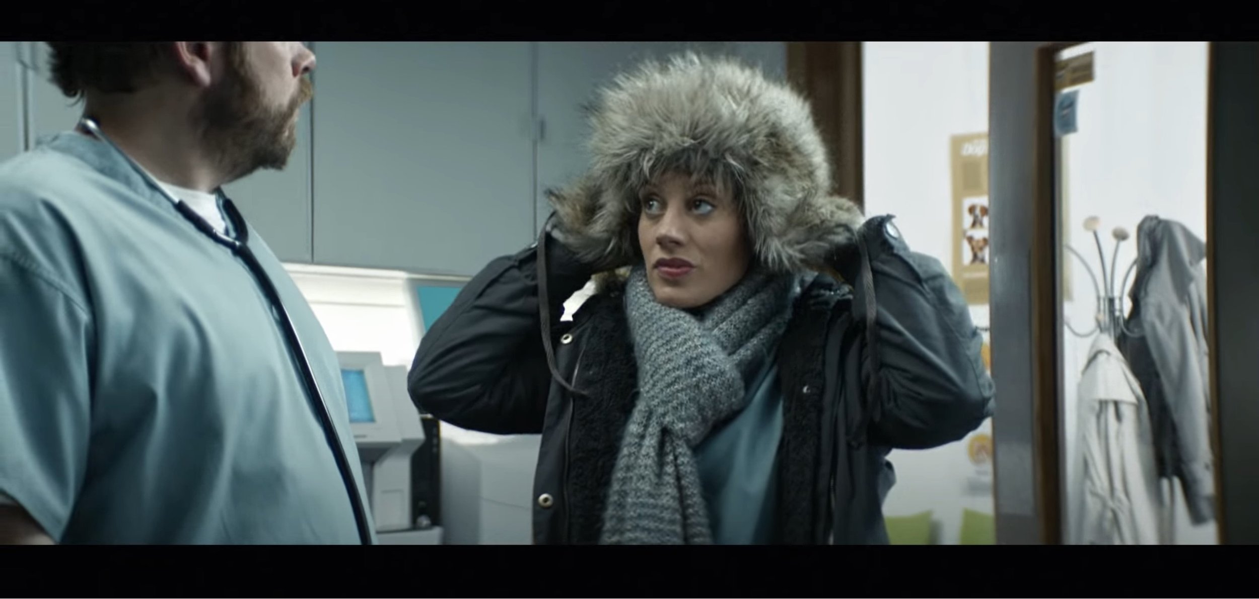
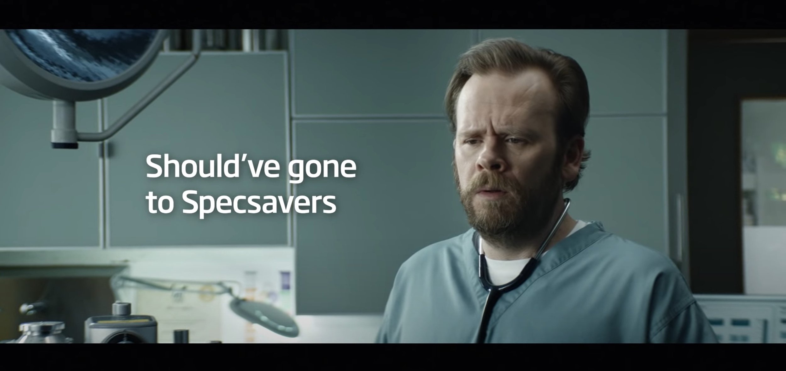
To start with, this advert has a very simple concept behind it but works really well for the type of advert it is advertising for. The target audience I think they are aiming it at is all ages as anyone who is struggling to see needs to get an eye test and with something almost obvious and staring at you. The lighting techniques used in this video are very bright and generic, their is nothing particularly special about it. The transitions that are used in this video are the simple cut to the next scene without any special effects and they are using the cinematic aspect ratio (2.4:1) in this video. The shot types which are used in this video are wide shot, close up shot and medium shot. The camera angles which are used to work with the shot types are mostly low angles and eye level. The movements are easier to analyse, the is a lot of up and down movement, for example from when looking at the doctor and then moving back down to the fluffy hat, next one is when the camera pans left and then zooms in quickly and then the camera moves down then back up. This is following the main subject in the next scenes, which is the women. Lastly at the end the advert finishes off saying “Should’ve Gone To Specsavers” with the doctor who has become the main subject in frame to the right of the frame with the text on the left, they have done this well by using a medium eye level shot.
The screengrabs are below to see what I am talking about:
Pre-Production
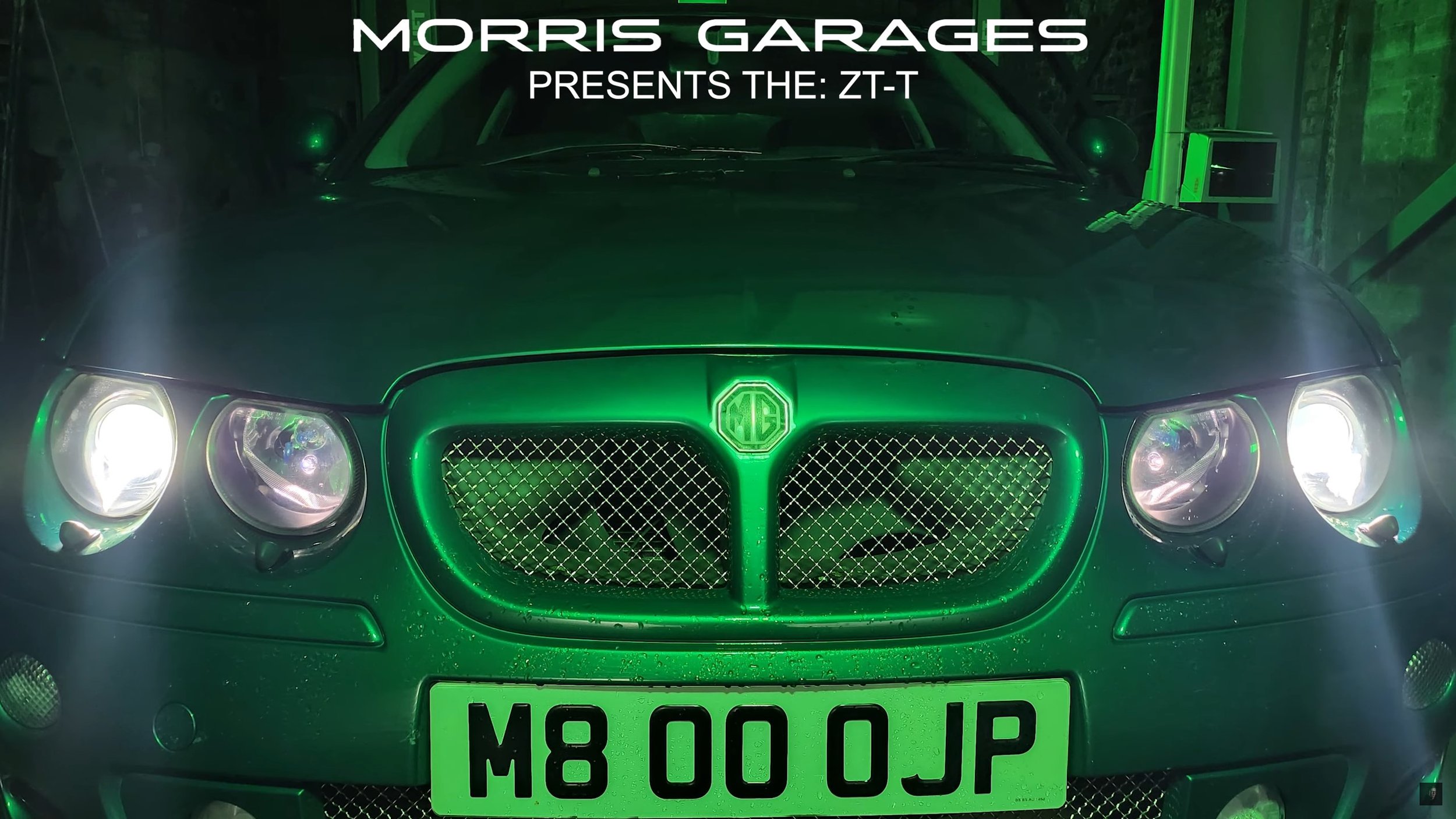
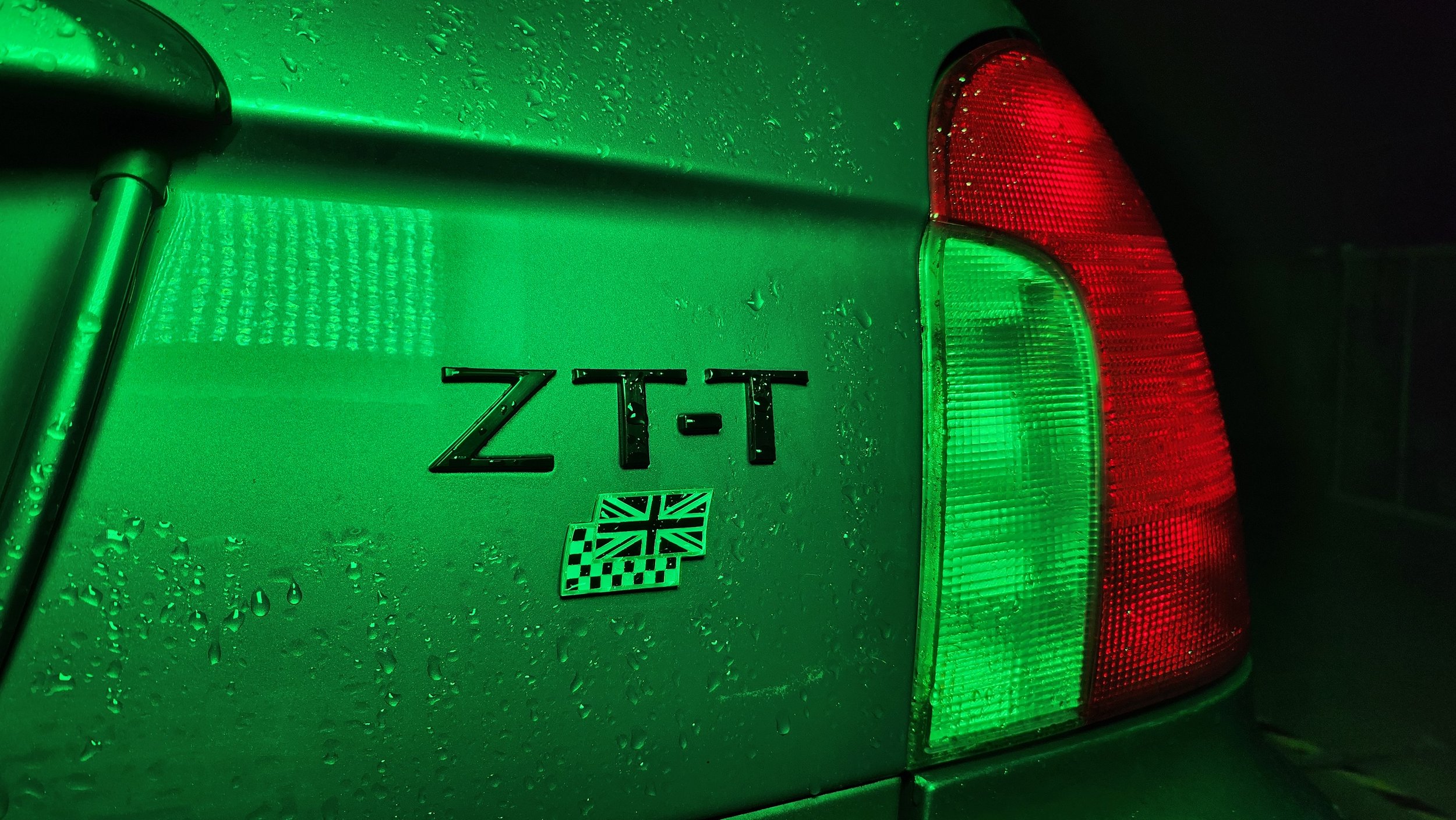
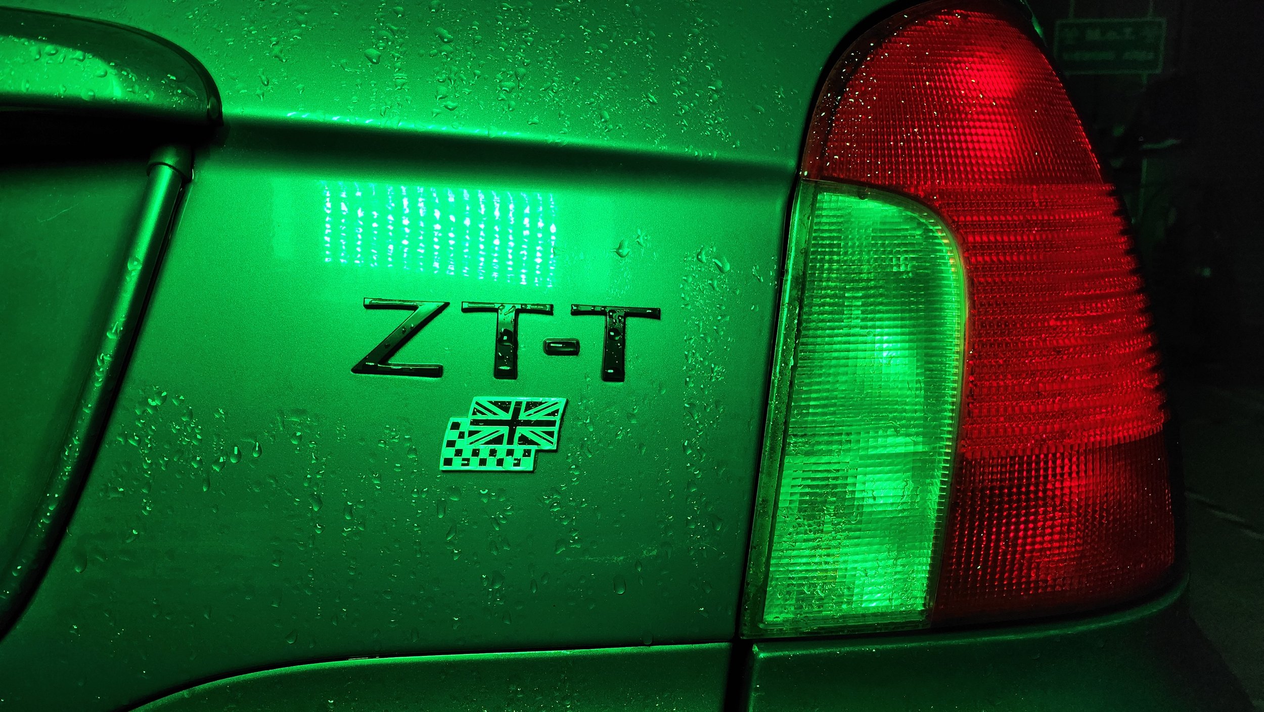
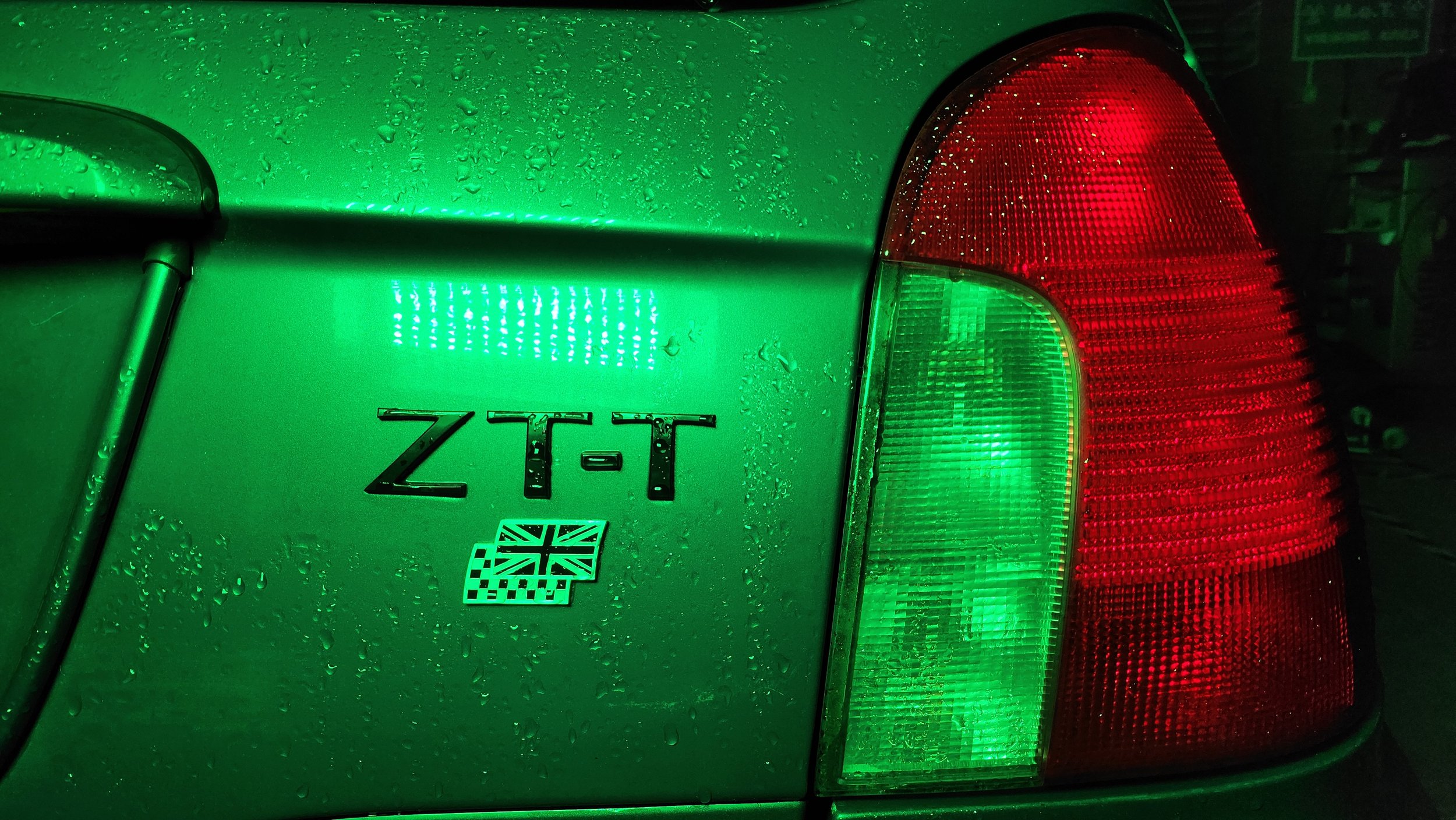
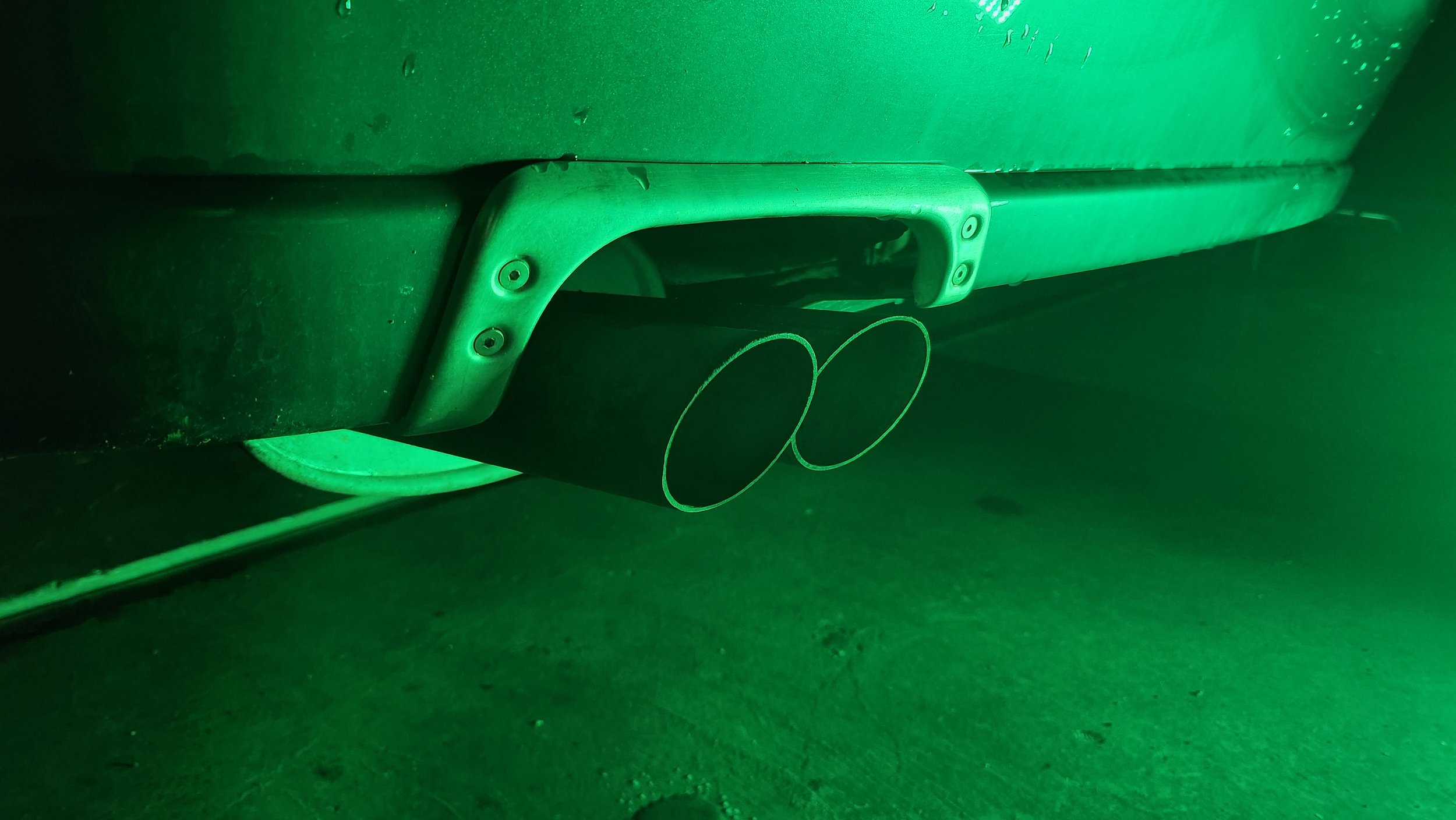
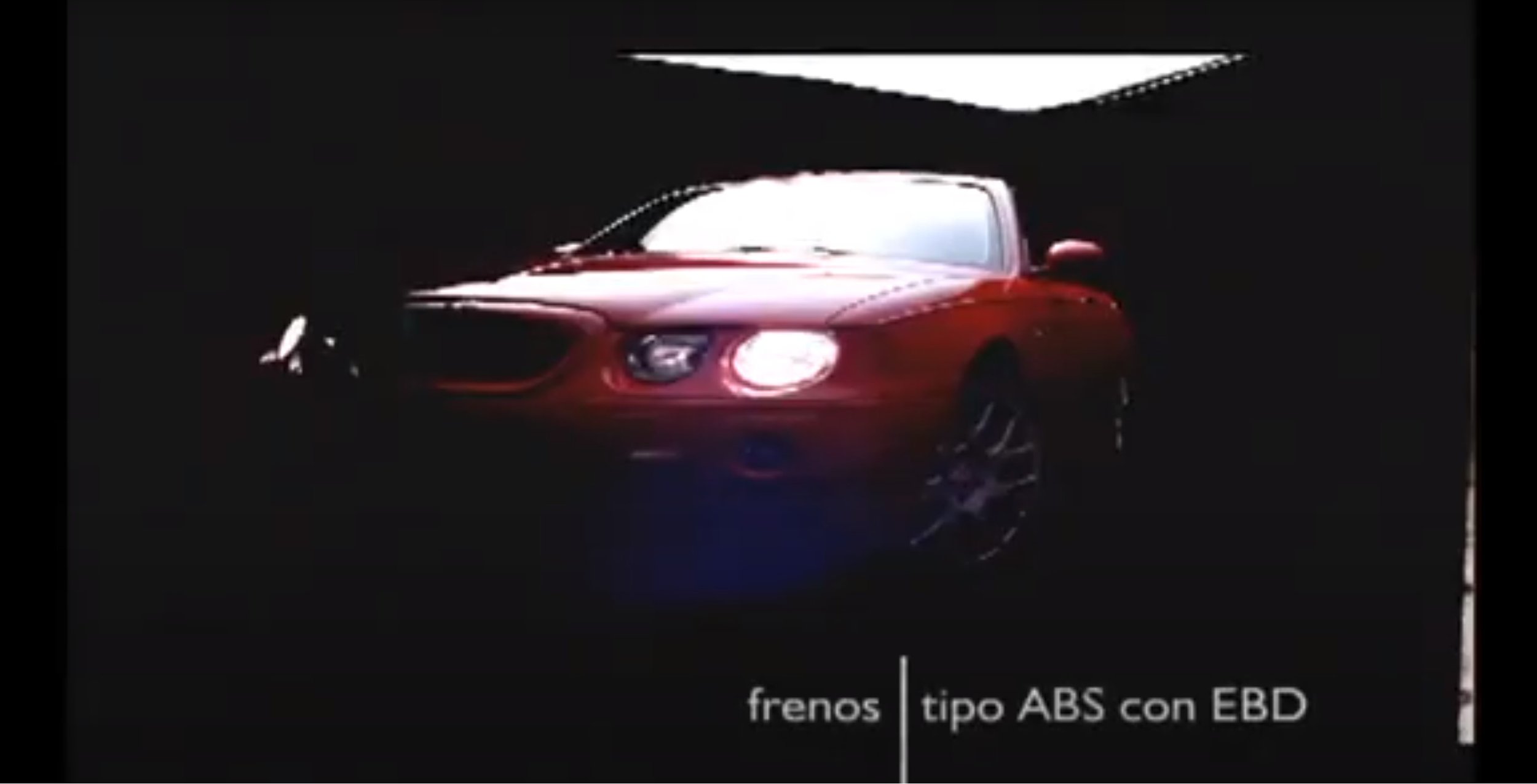
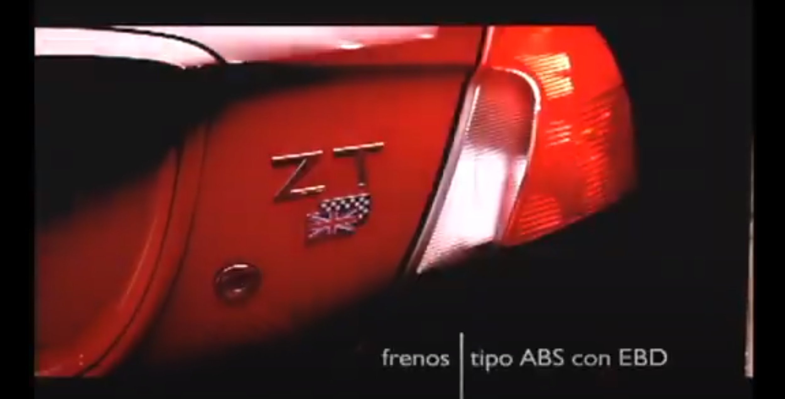
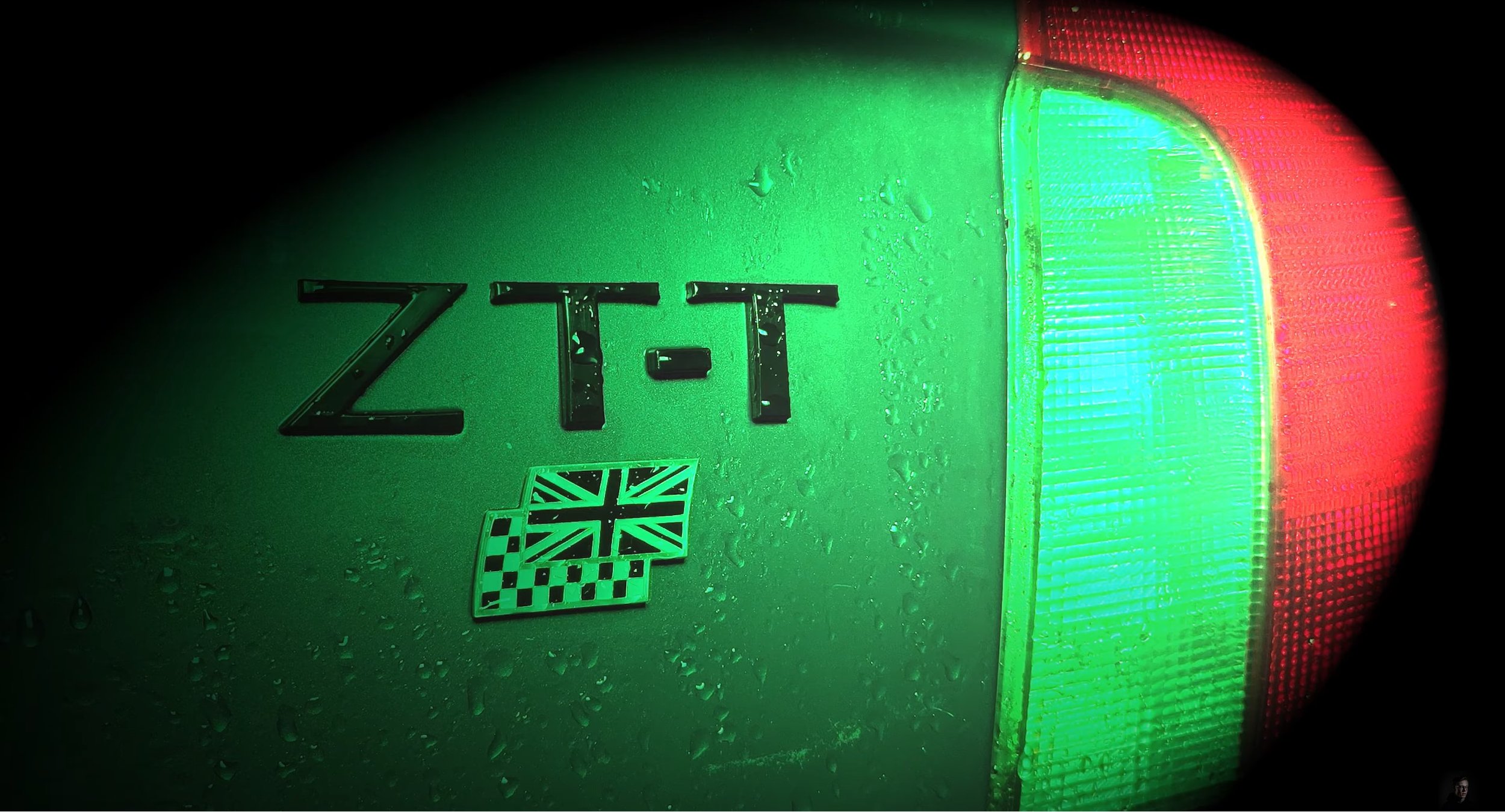
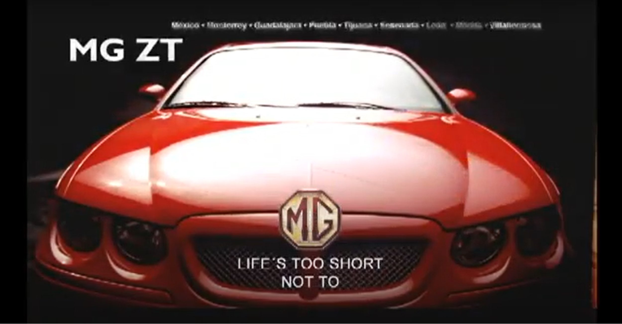
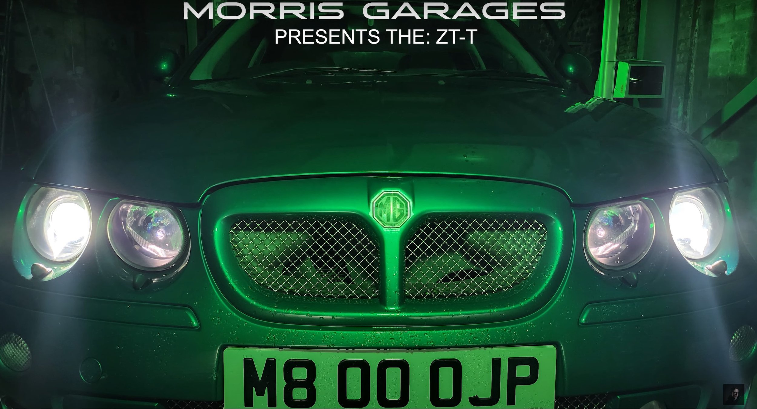
My Idea: - MG ZT | Commercial Ad
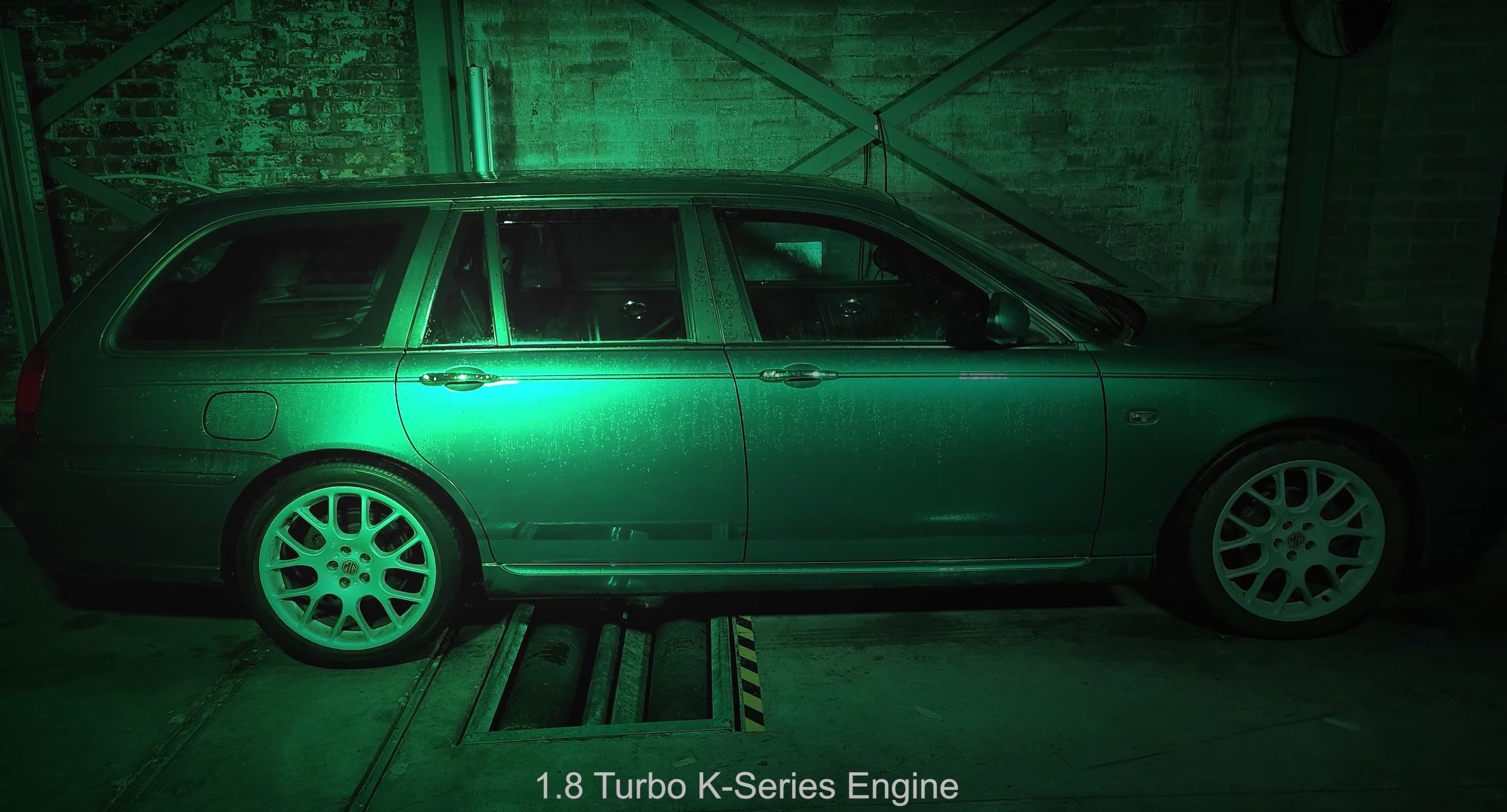
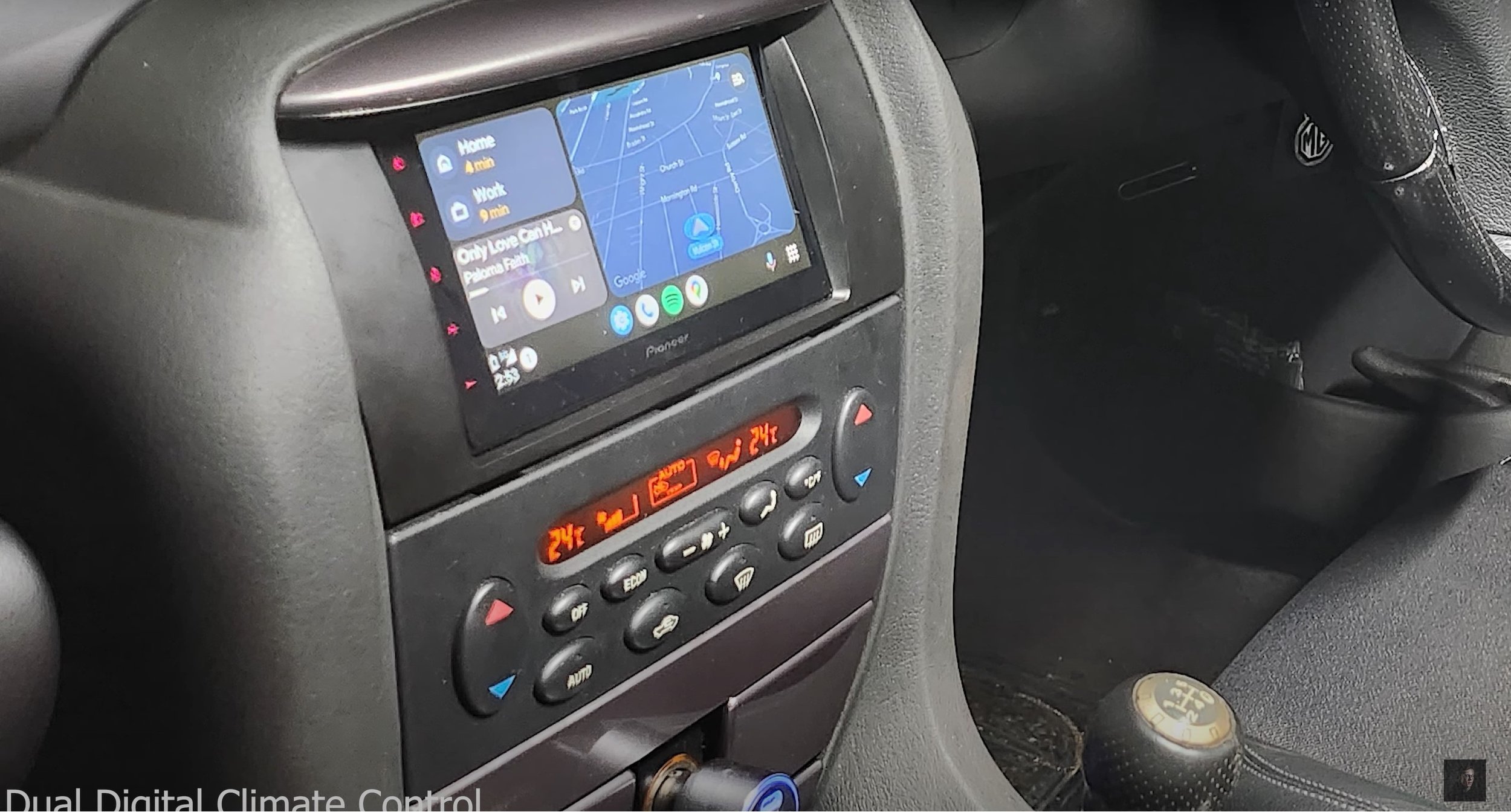
My idea is to create an advert which features my car (MG ZT-T) and use special lighting techniques. Something which isn’t too dis-similar to the one above, but I’ll do my take on the advert. I will also re-use the audio from the existing video as it fits with what I am trying to produce. The equipment I will need to produce this film is two light rigs, a light sabre for high lights. Most of what you can see is done in the post-production side, so I am heavily going to rely on the editing to bring out my final product. This is probably the hardest thing to make in the time scale set, but I am confident to make it work to the best of my ability. I will be filming inside in a garage and that is where I can set up my lighting etc.
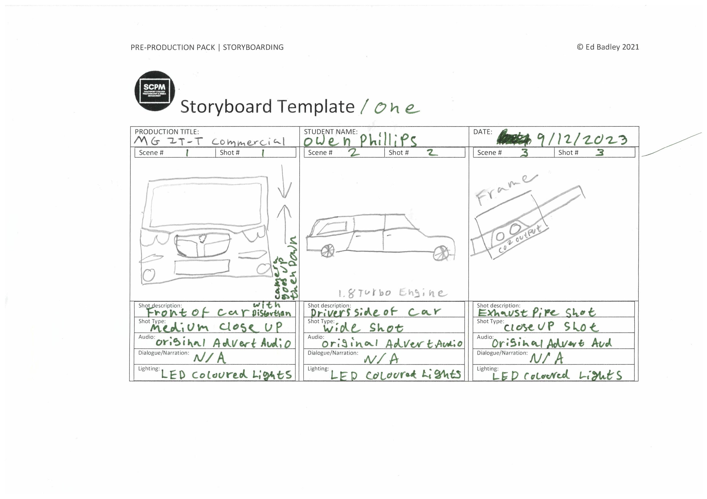
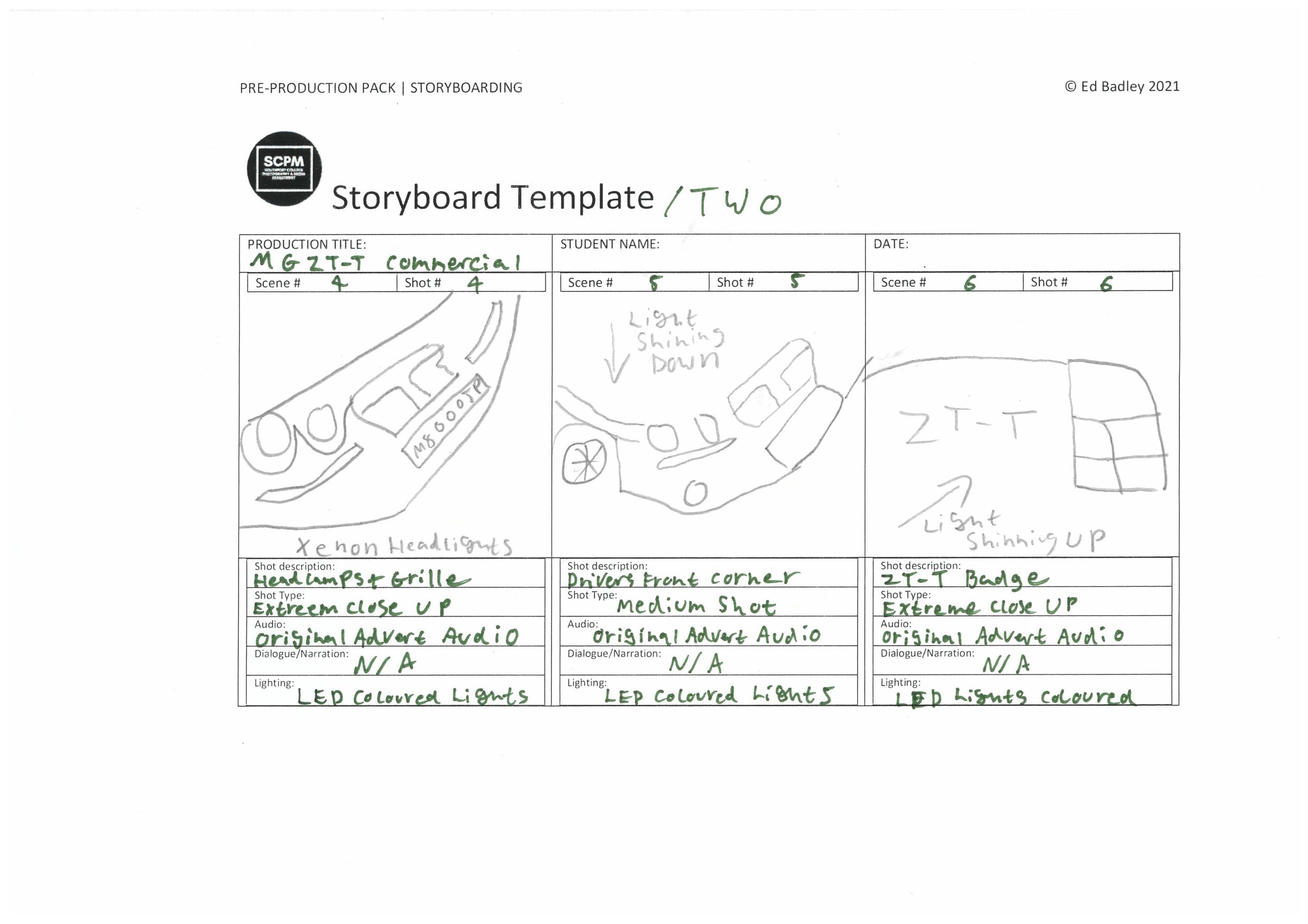
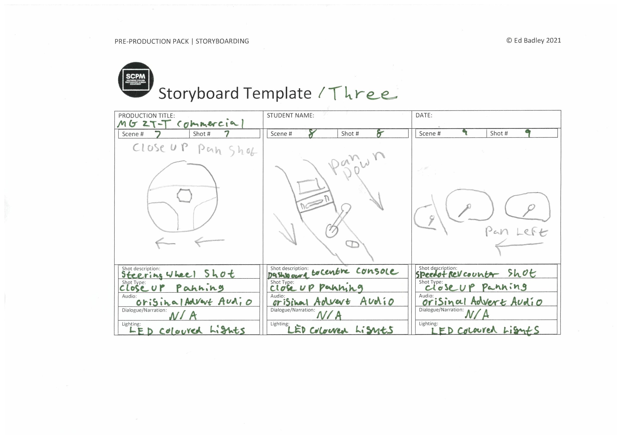
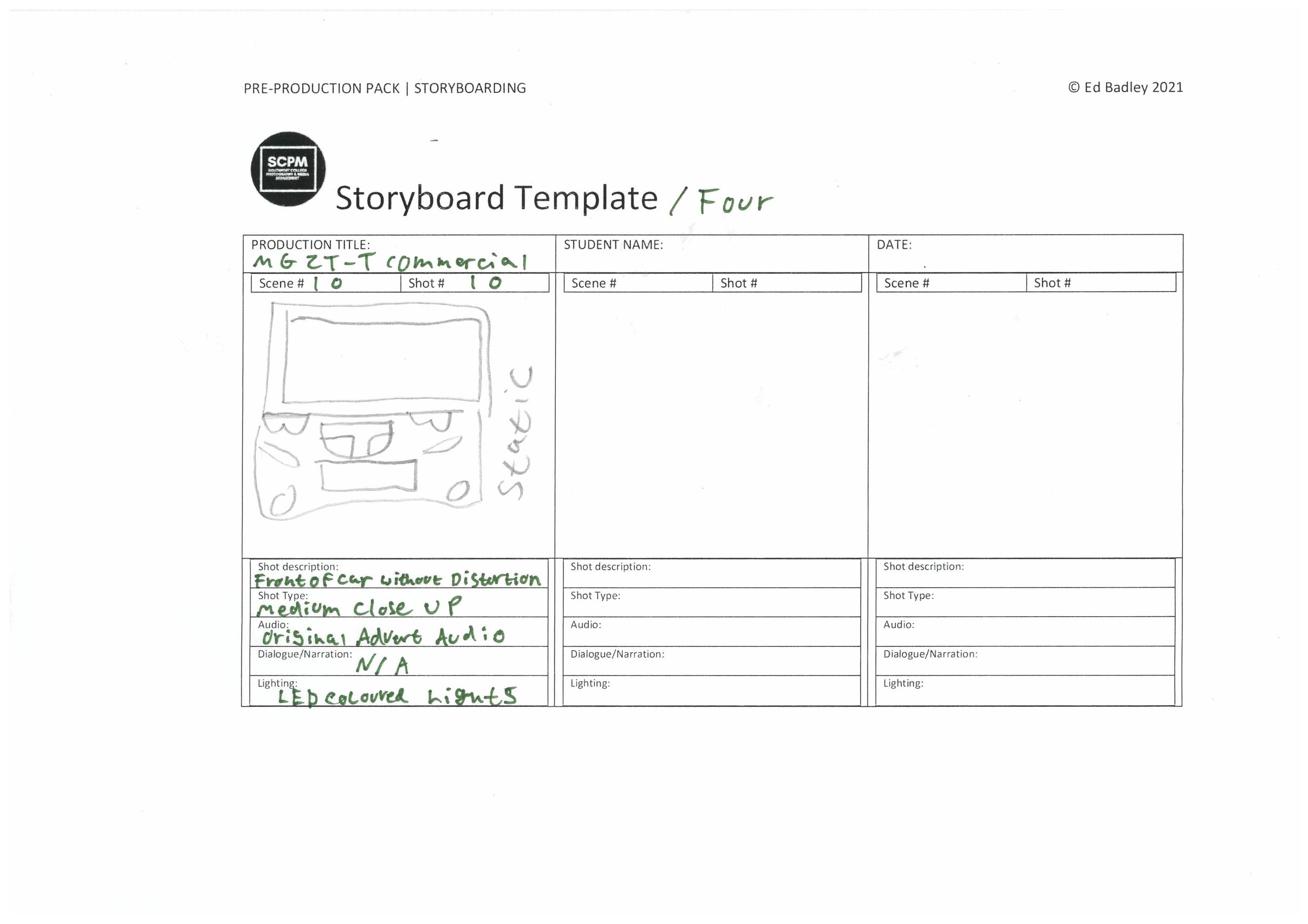
Storyboard: -
Shot List: -

Production
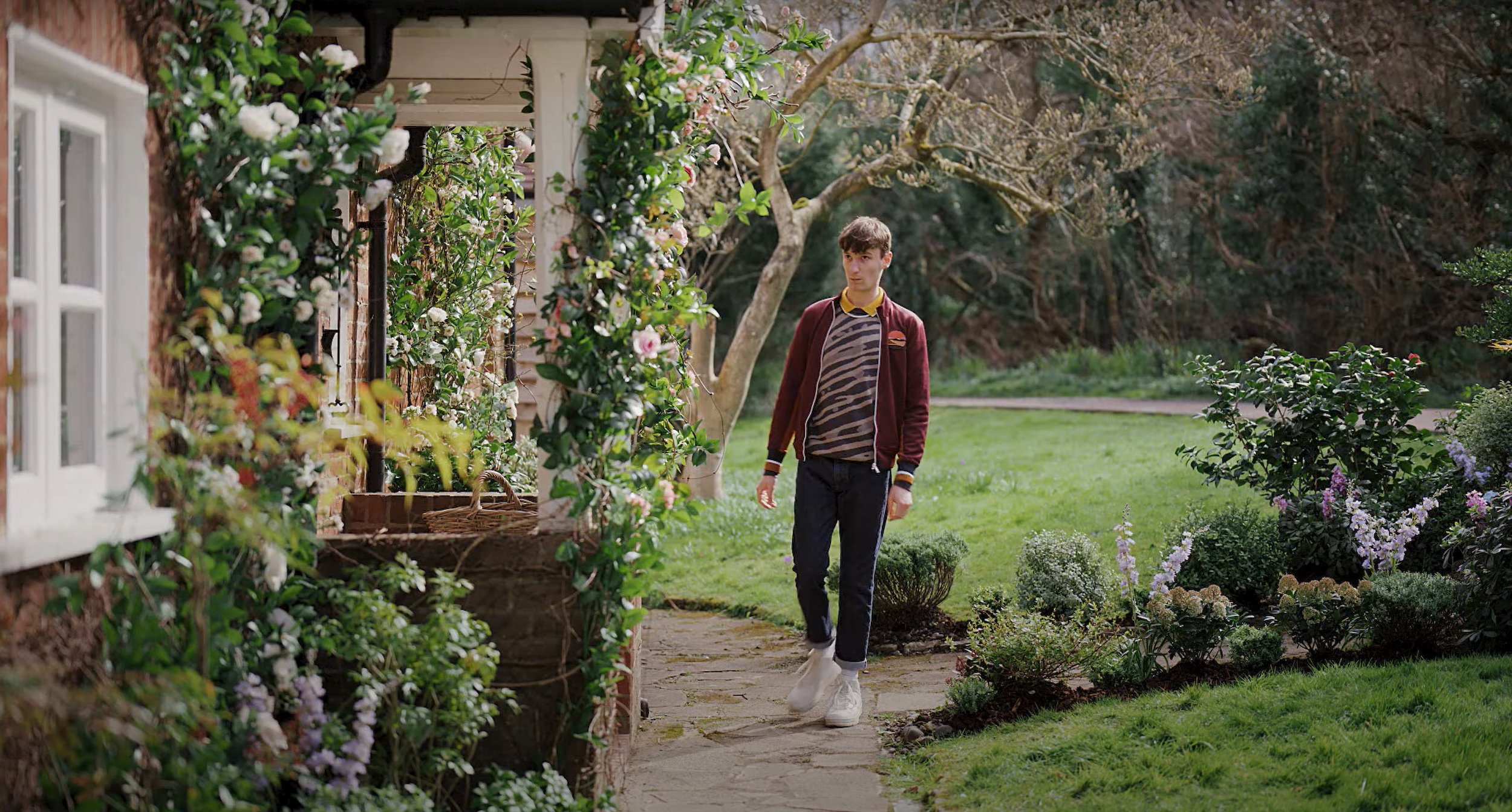
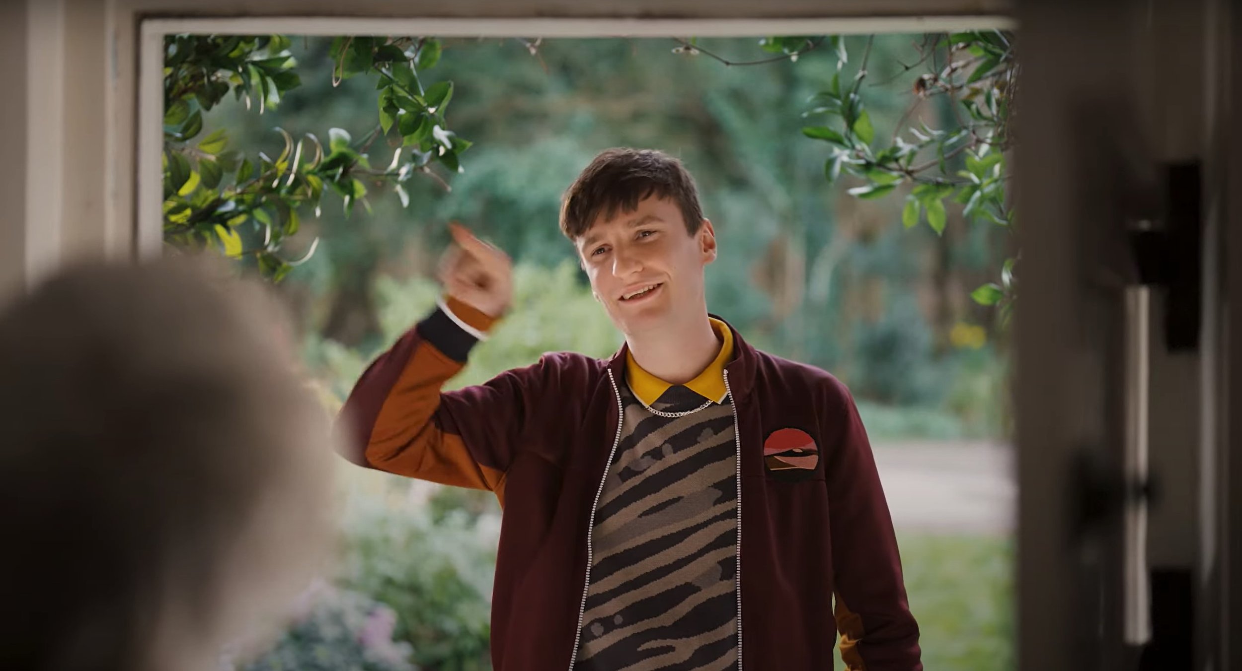
Behind the Scenes: -
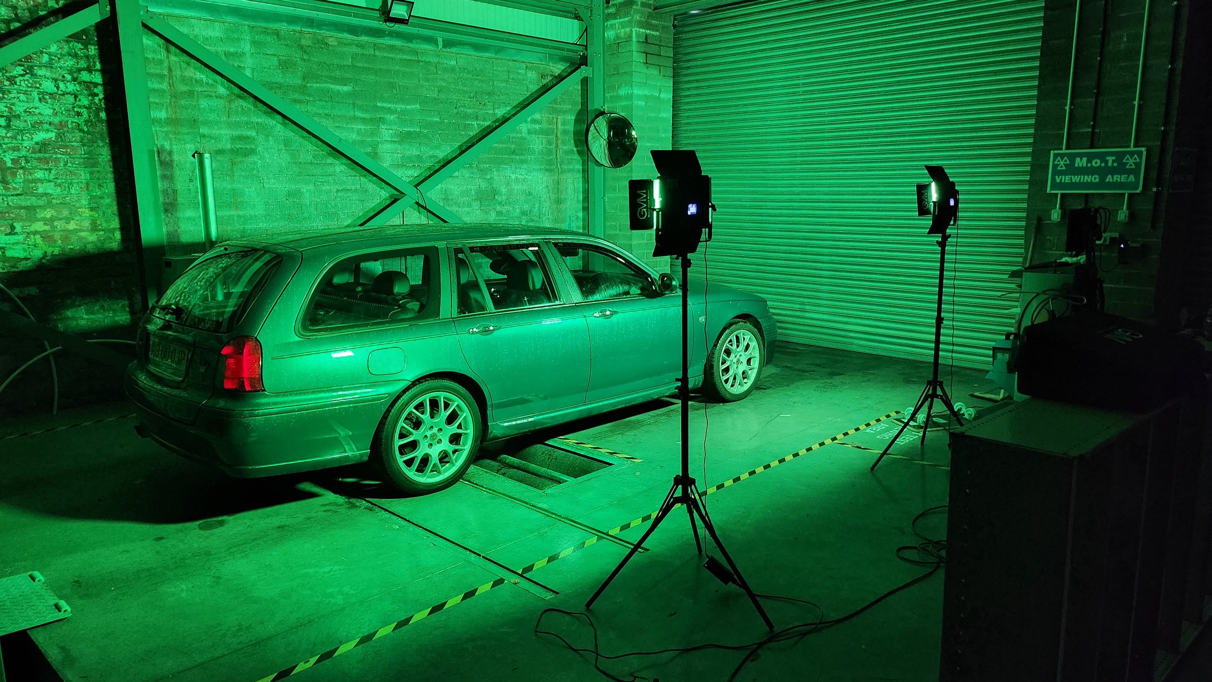
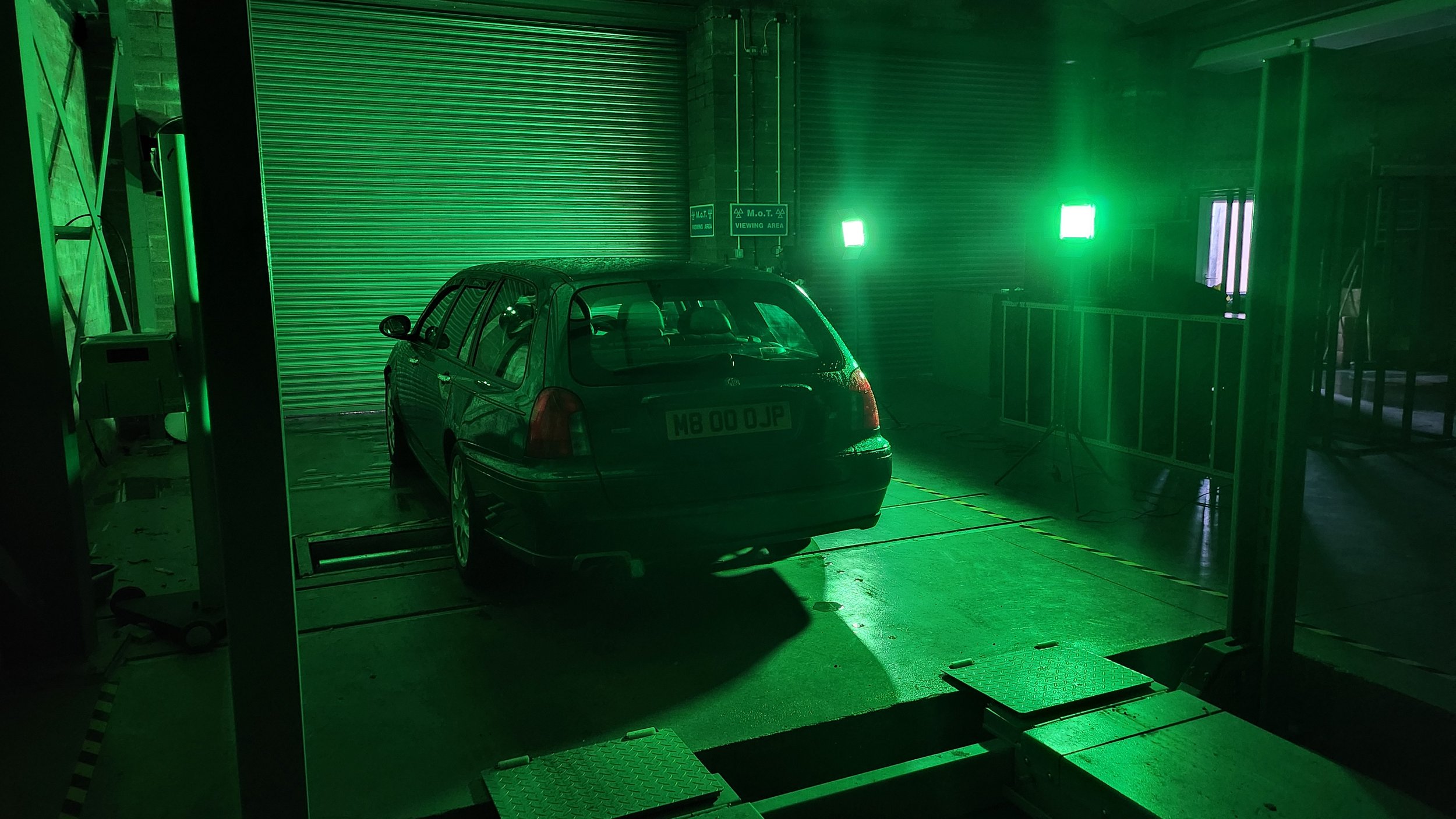
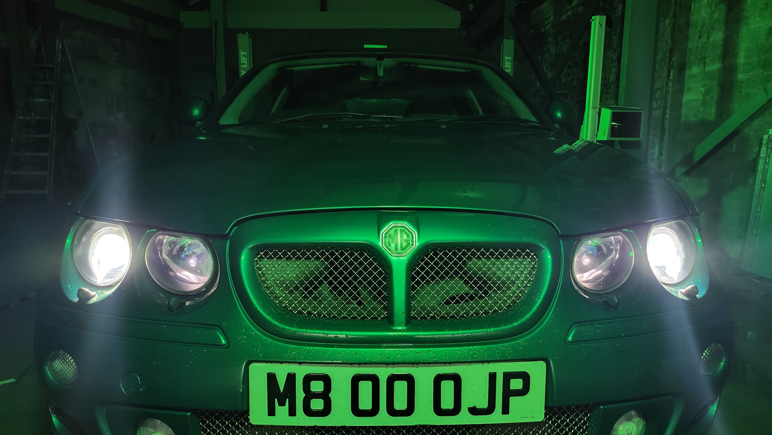
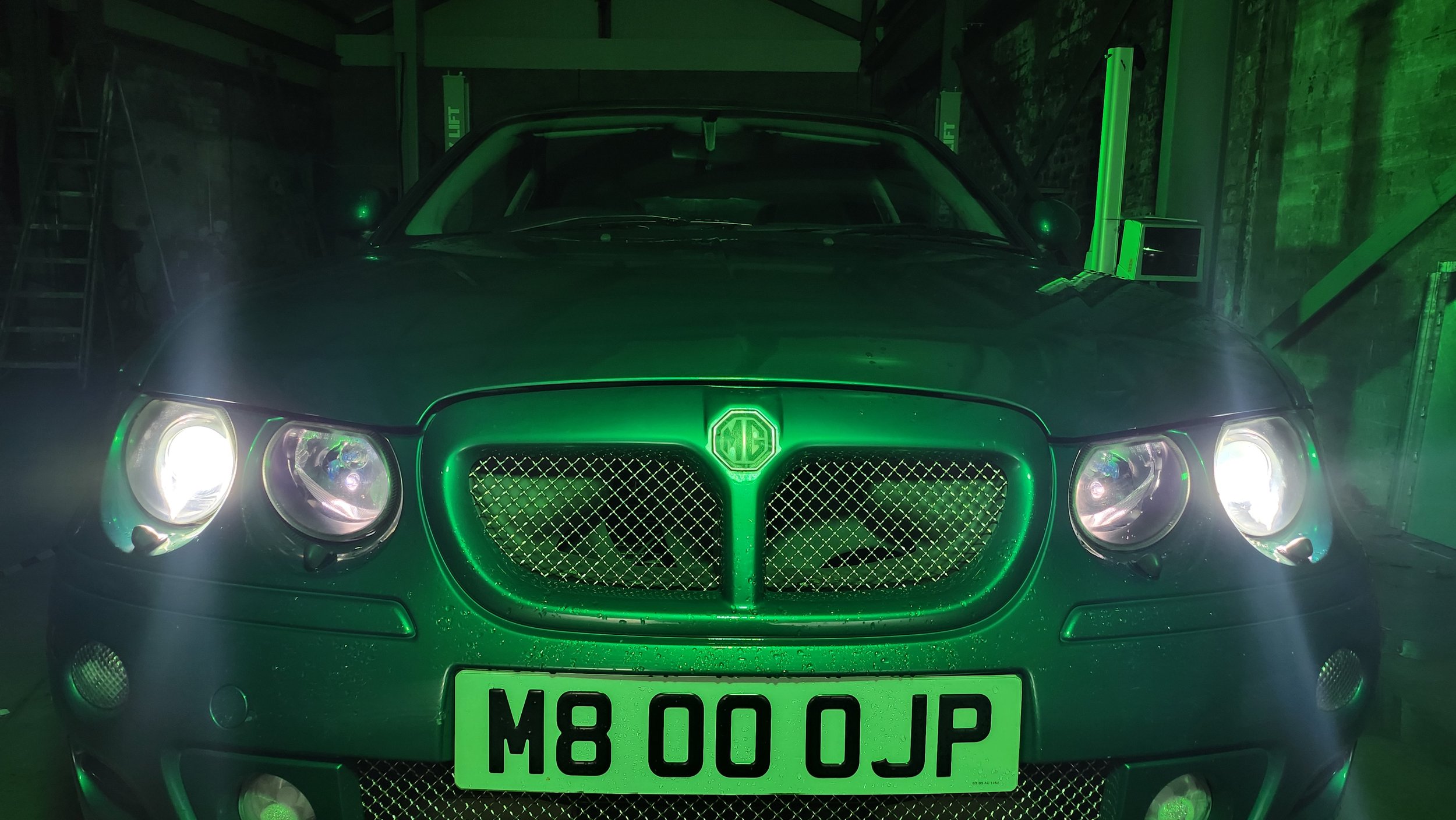
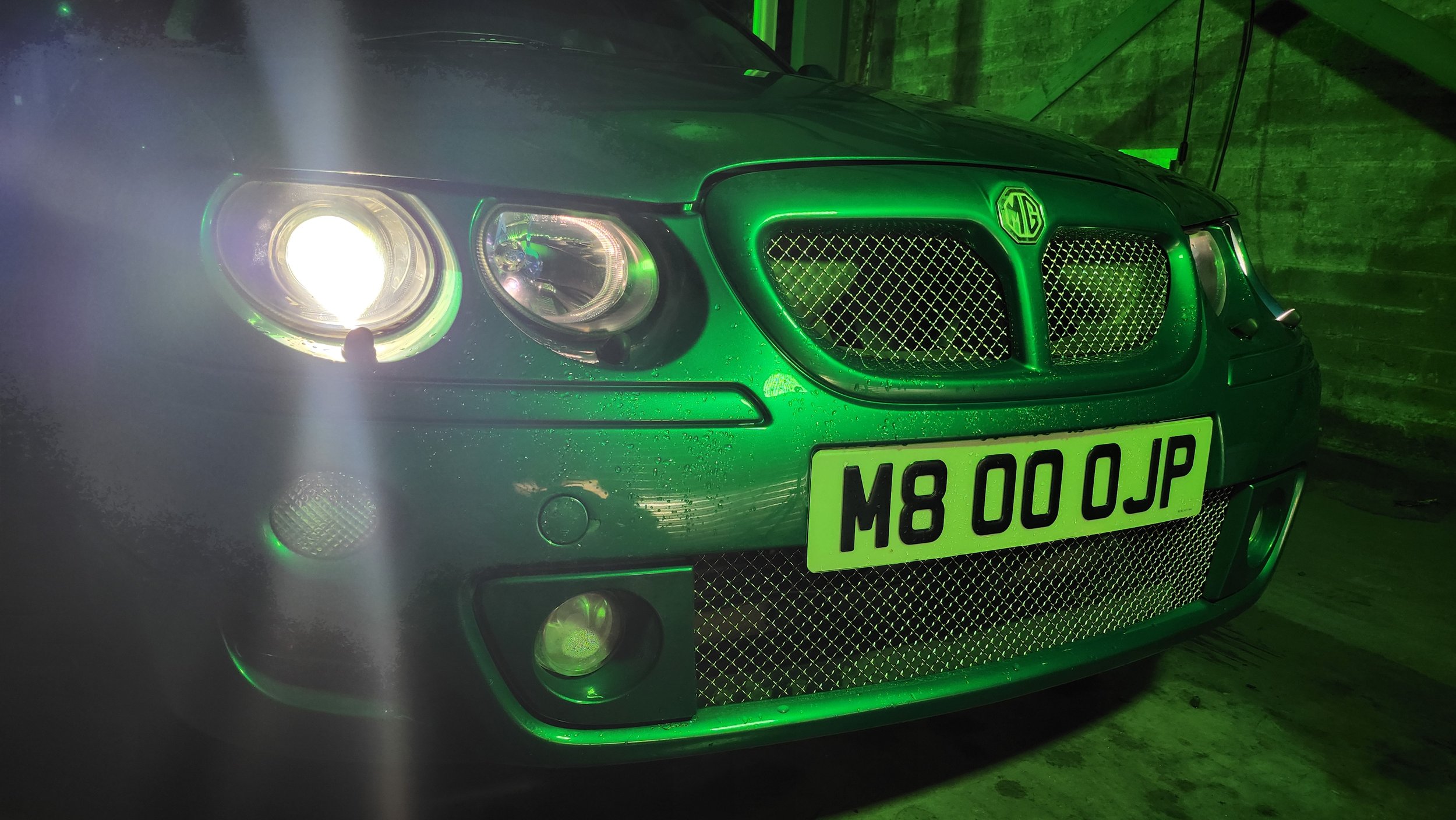
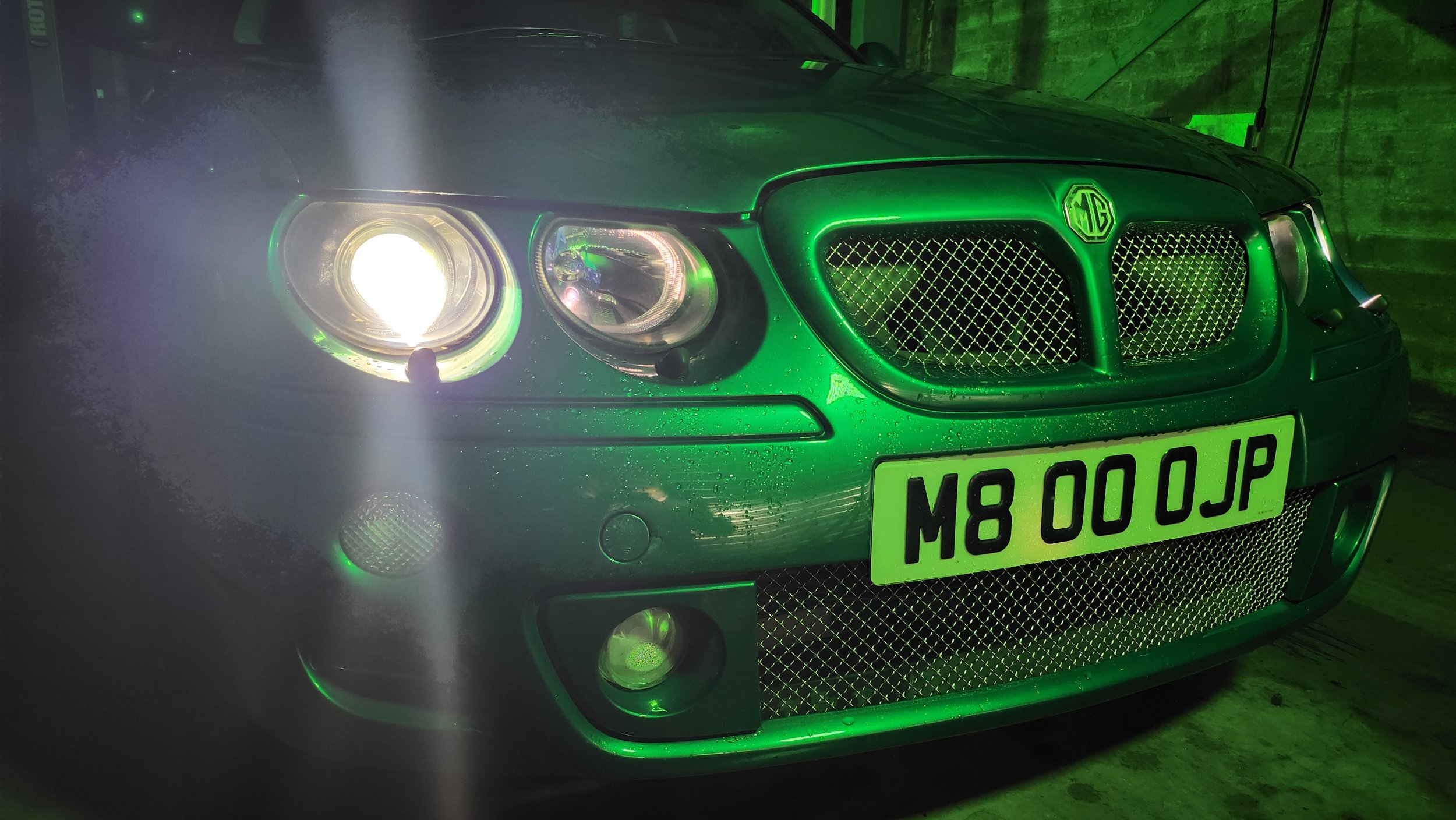
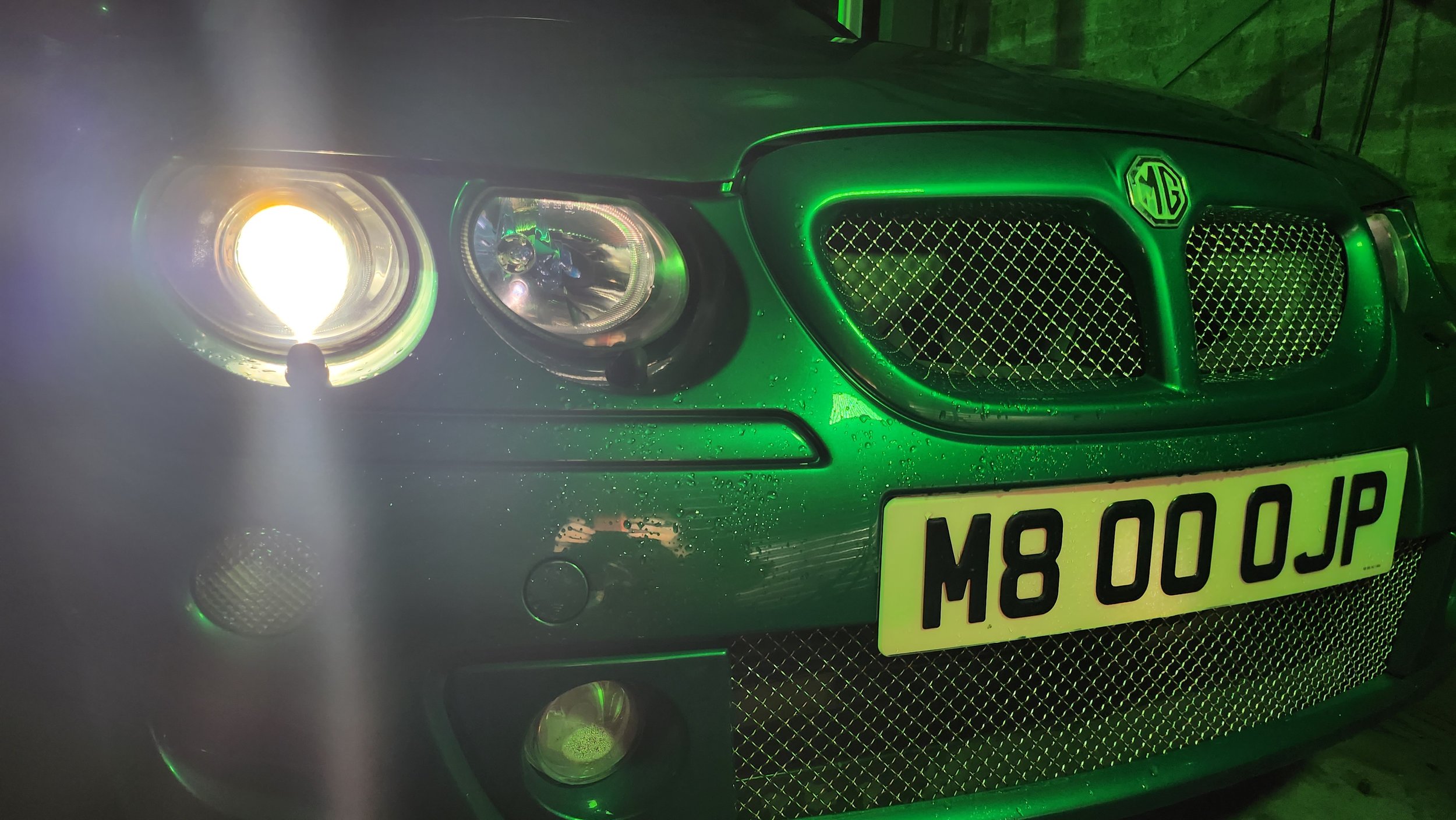
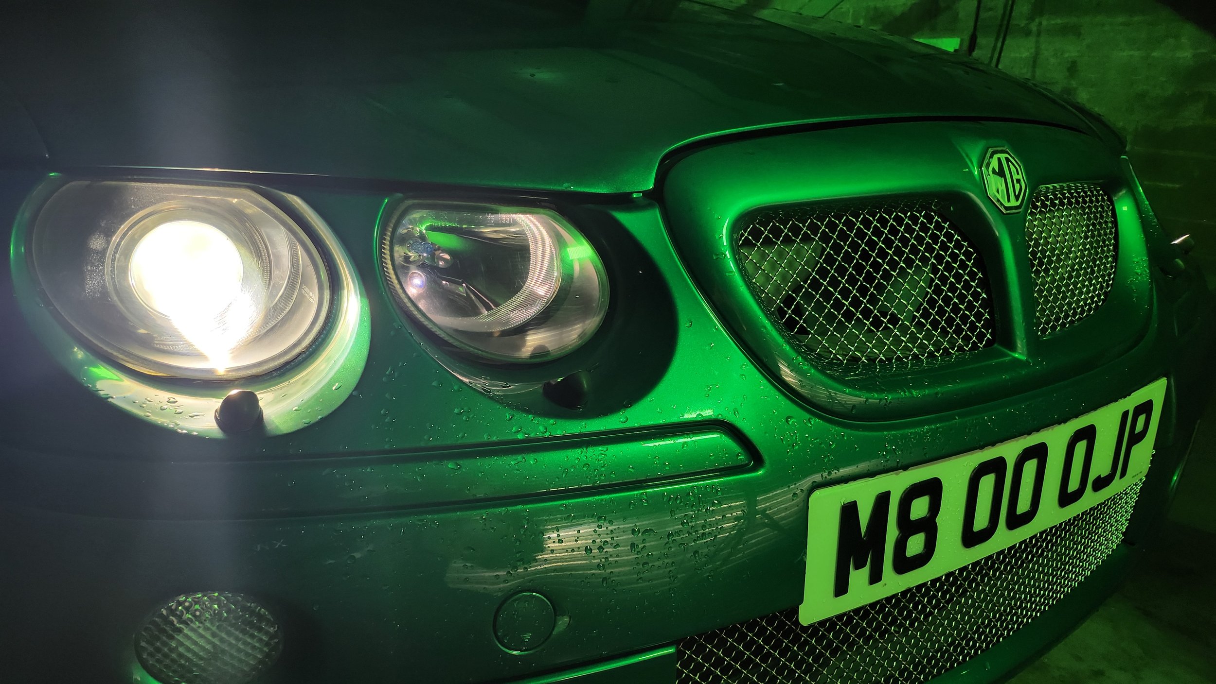
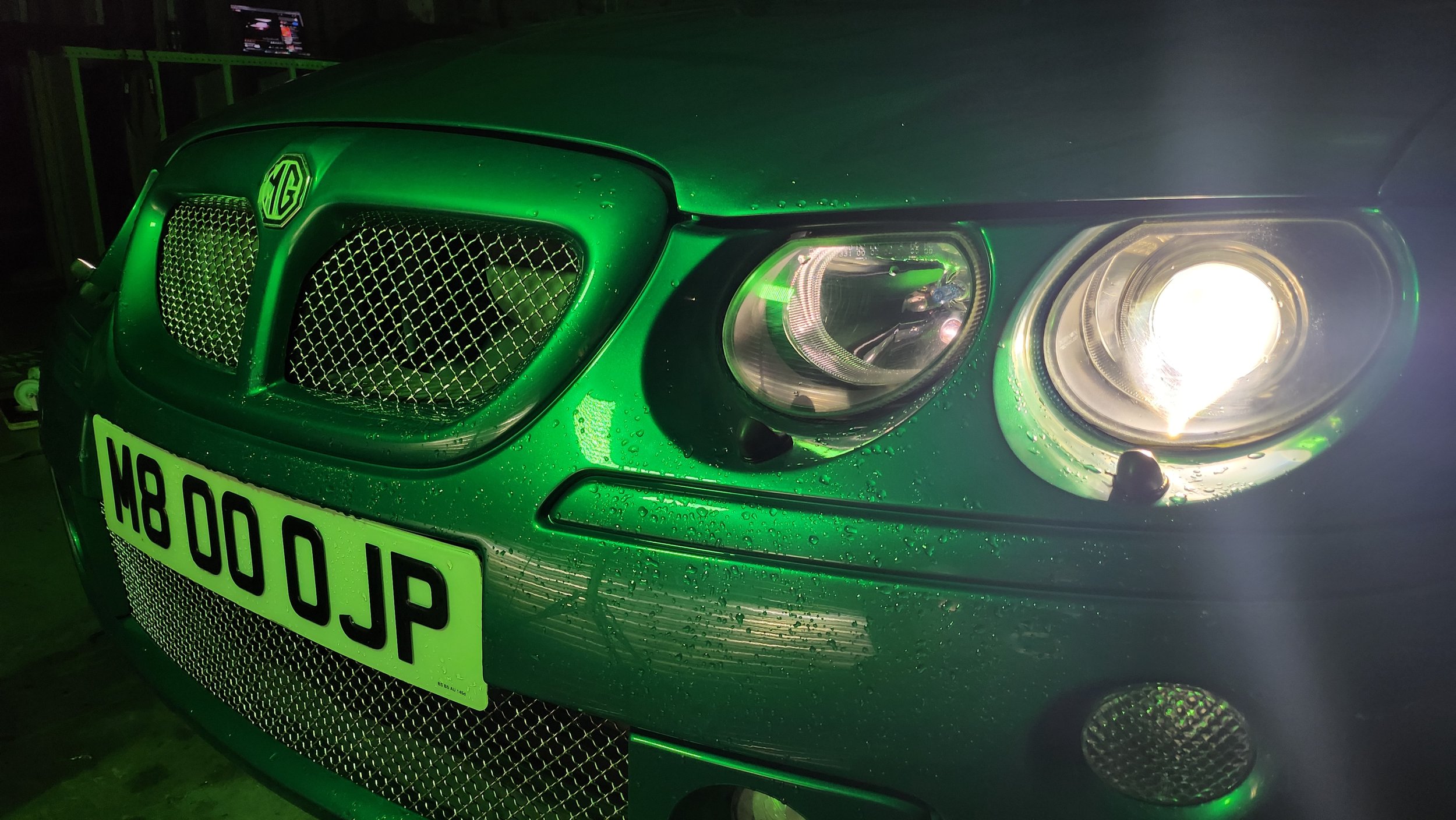
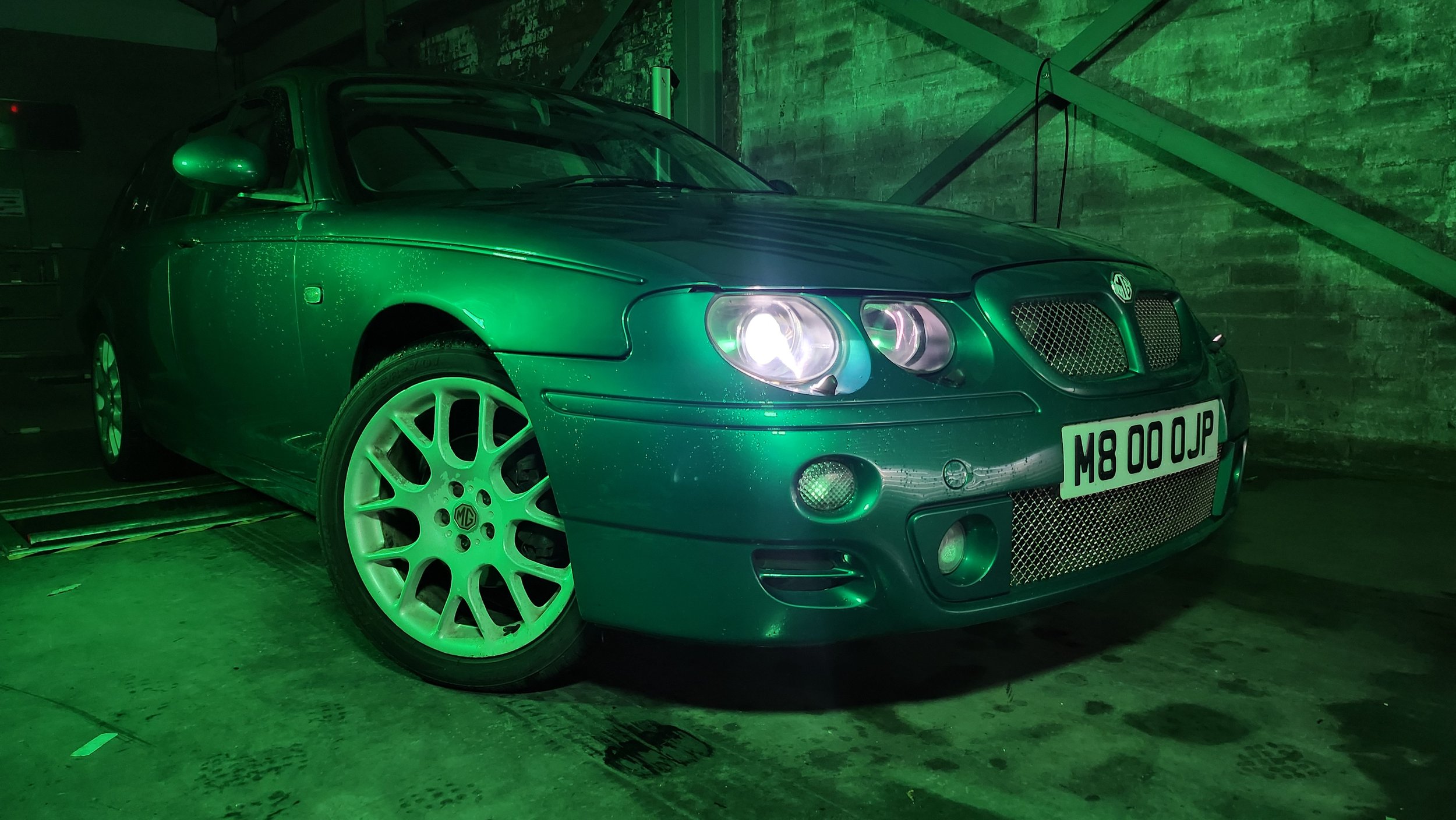
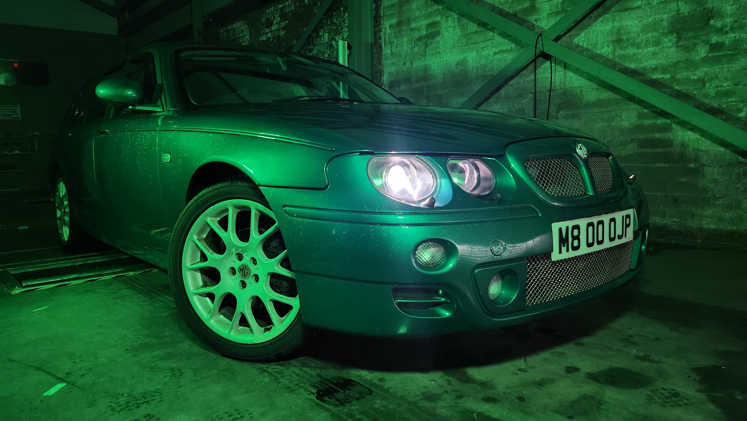
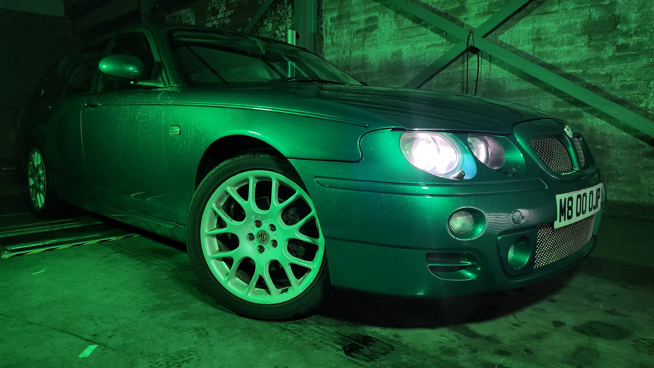
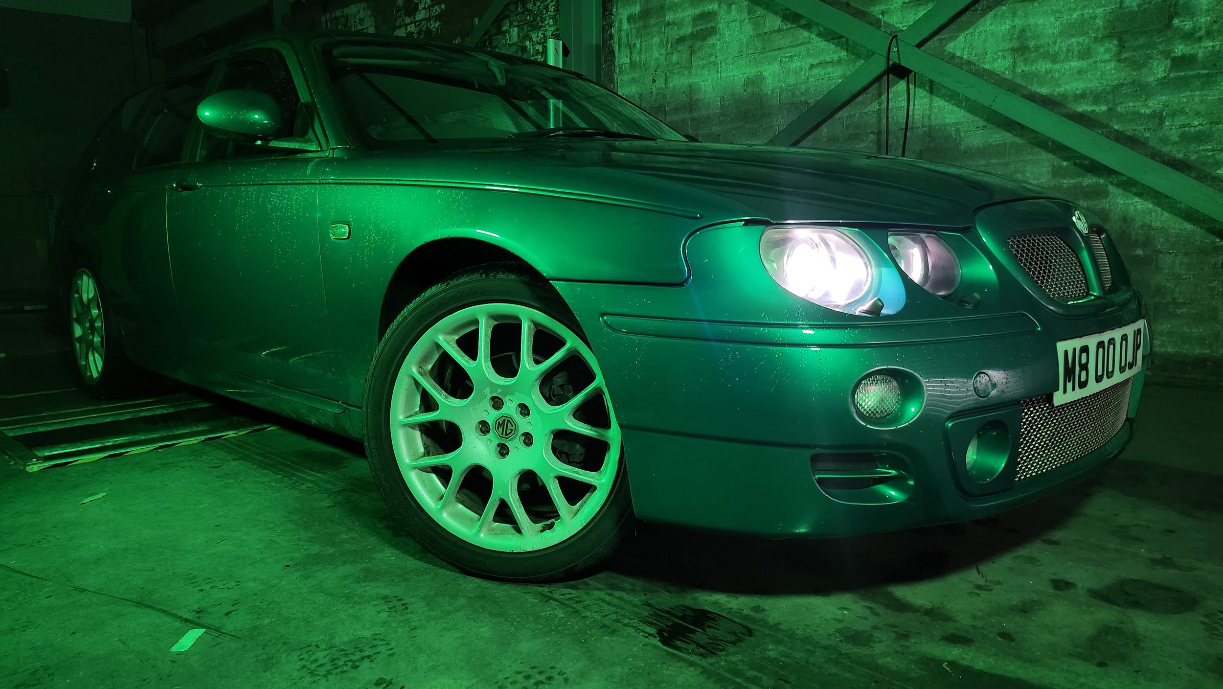
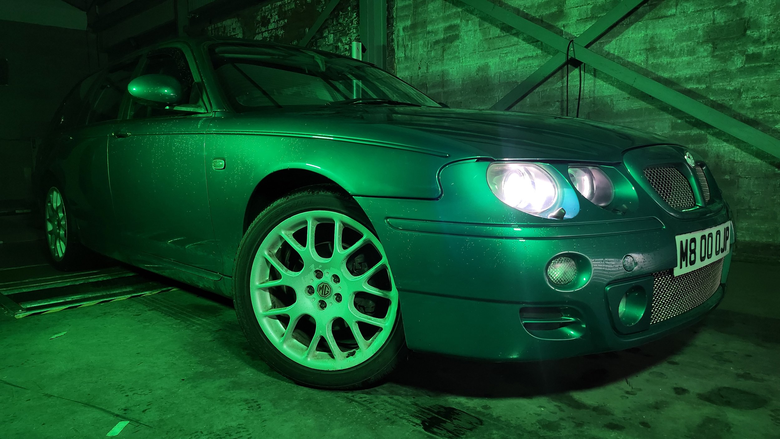
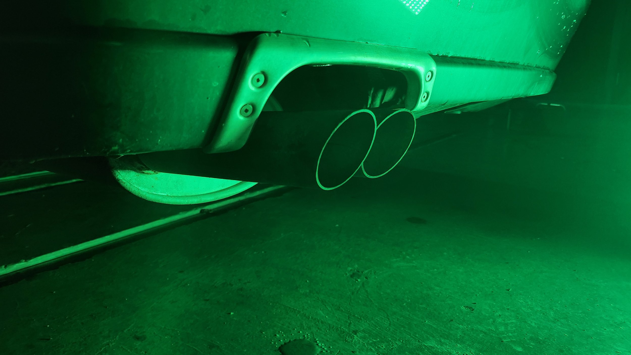
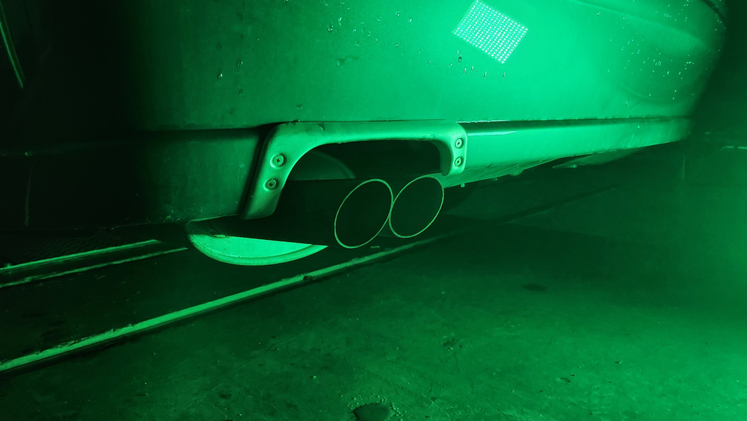
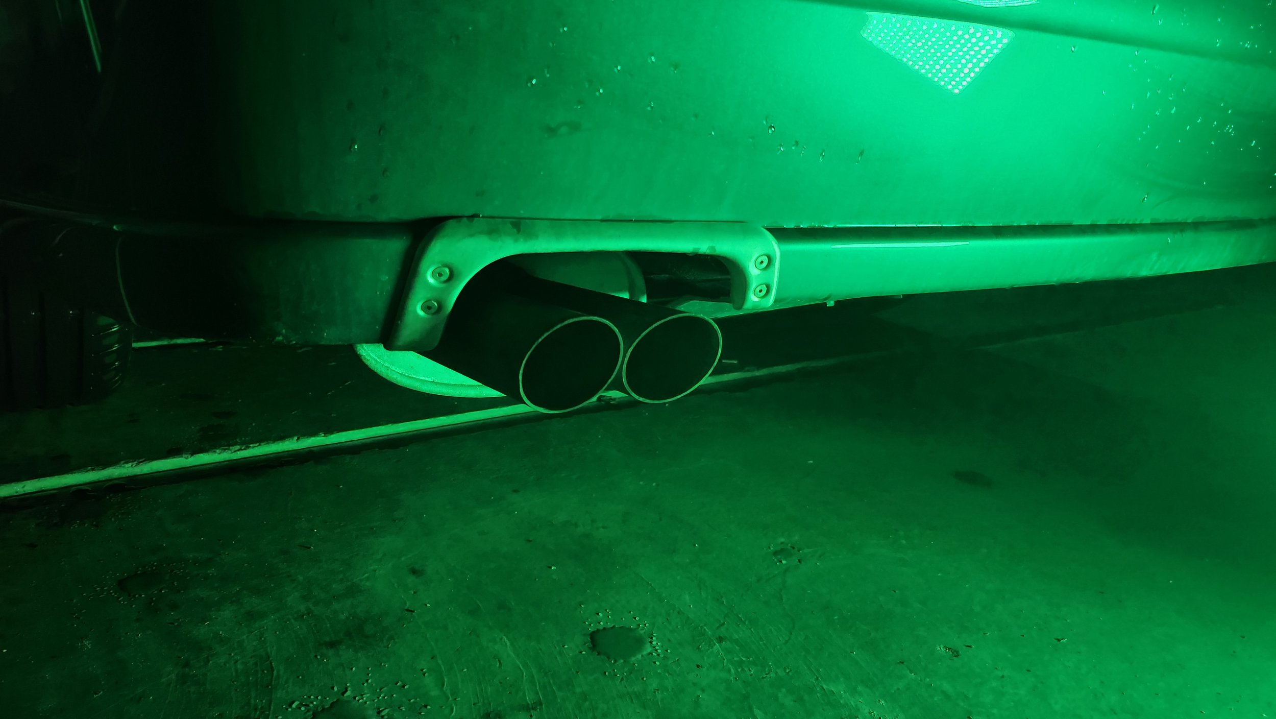
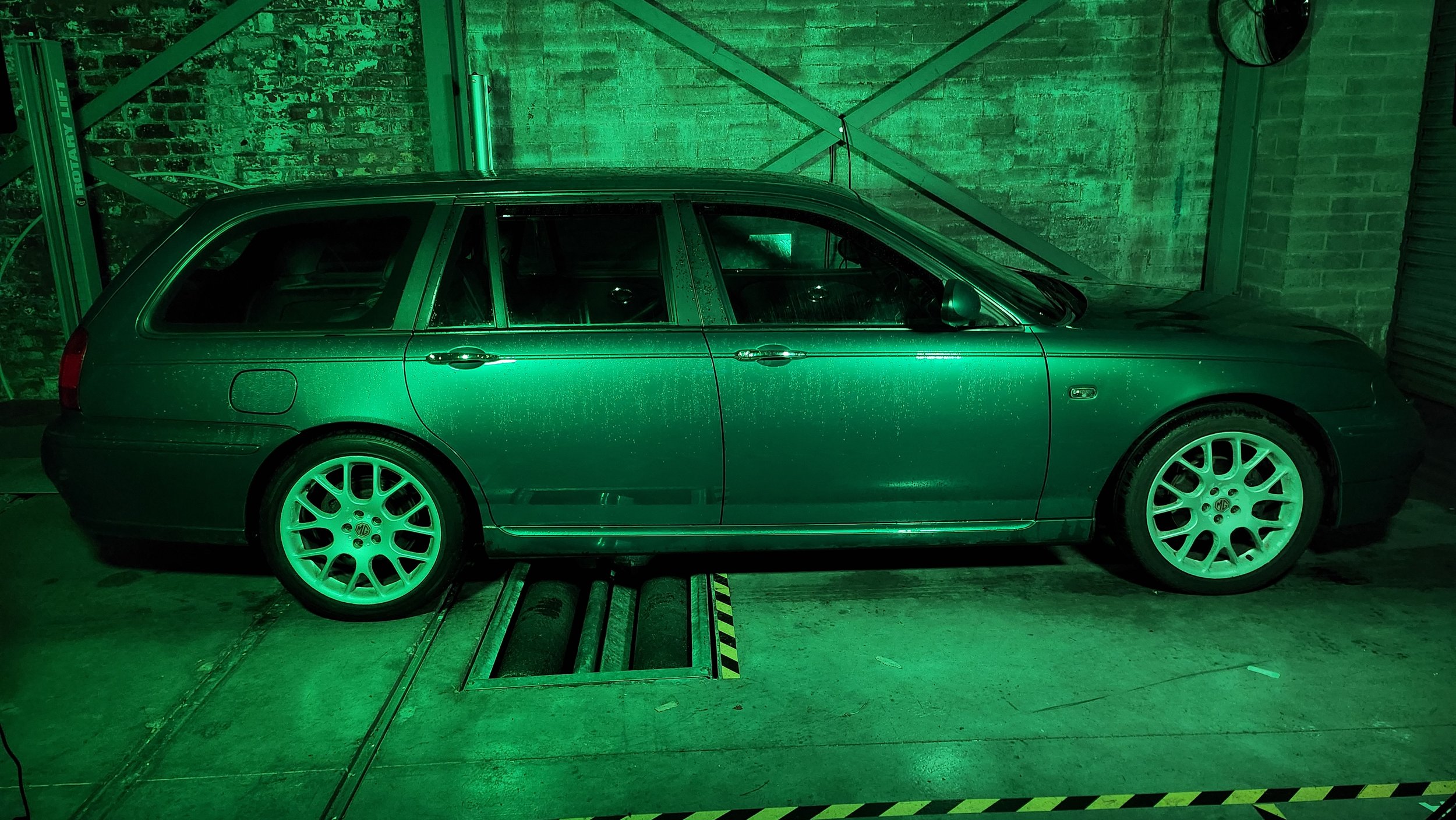
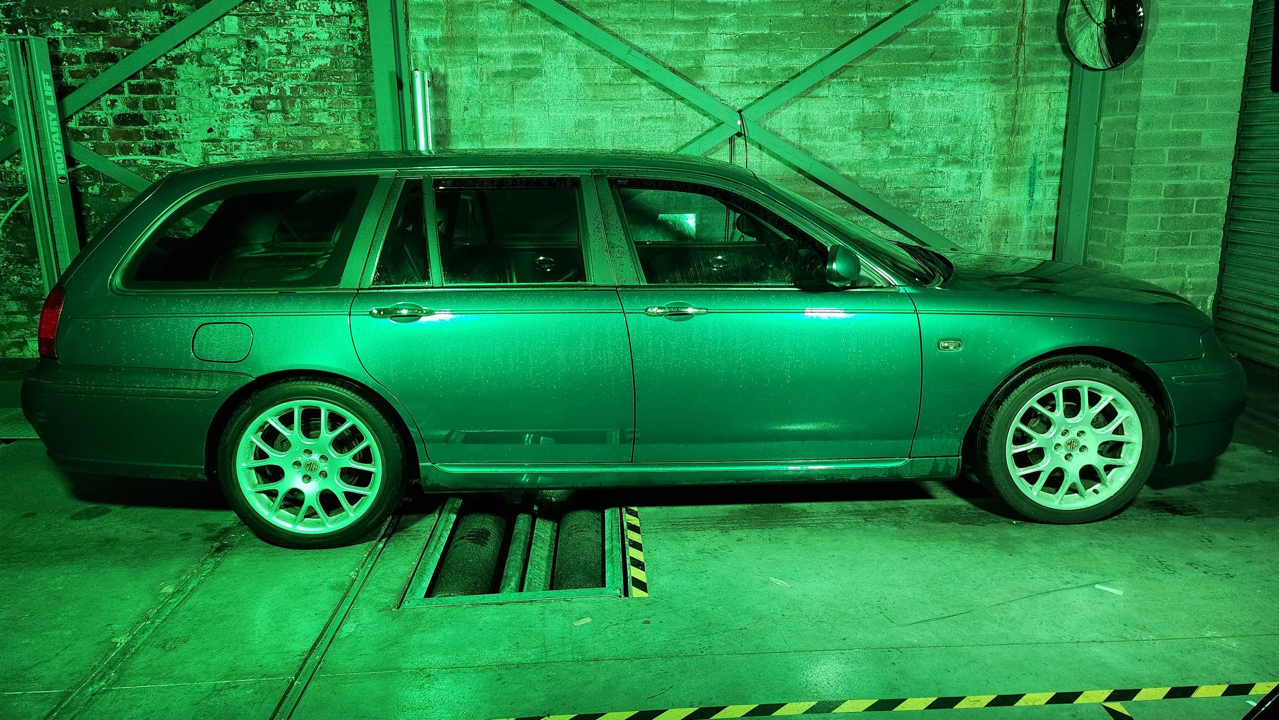
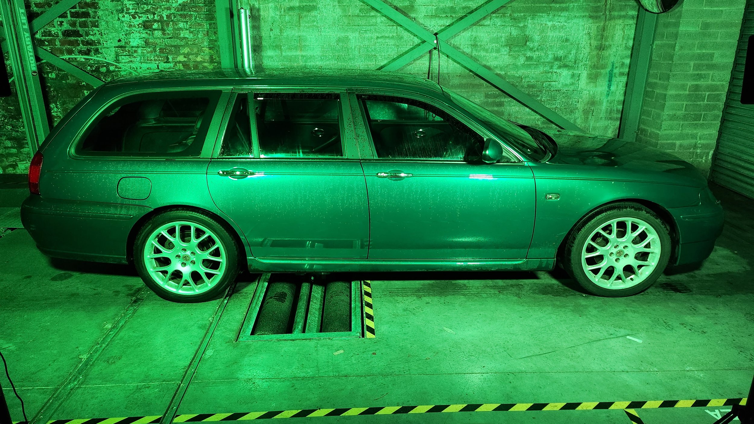
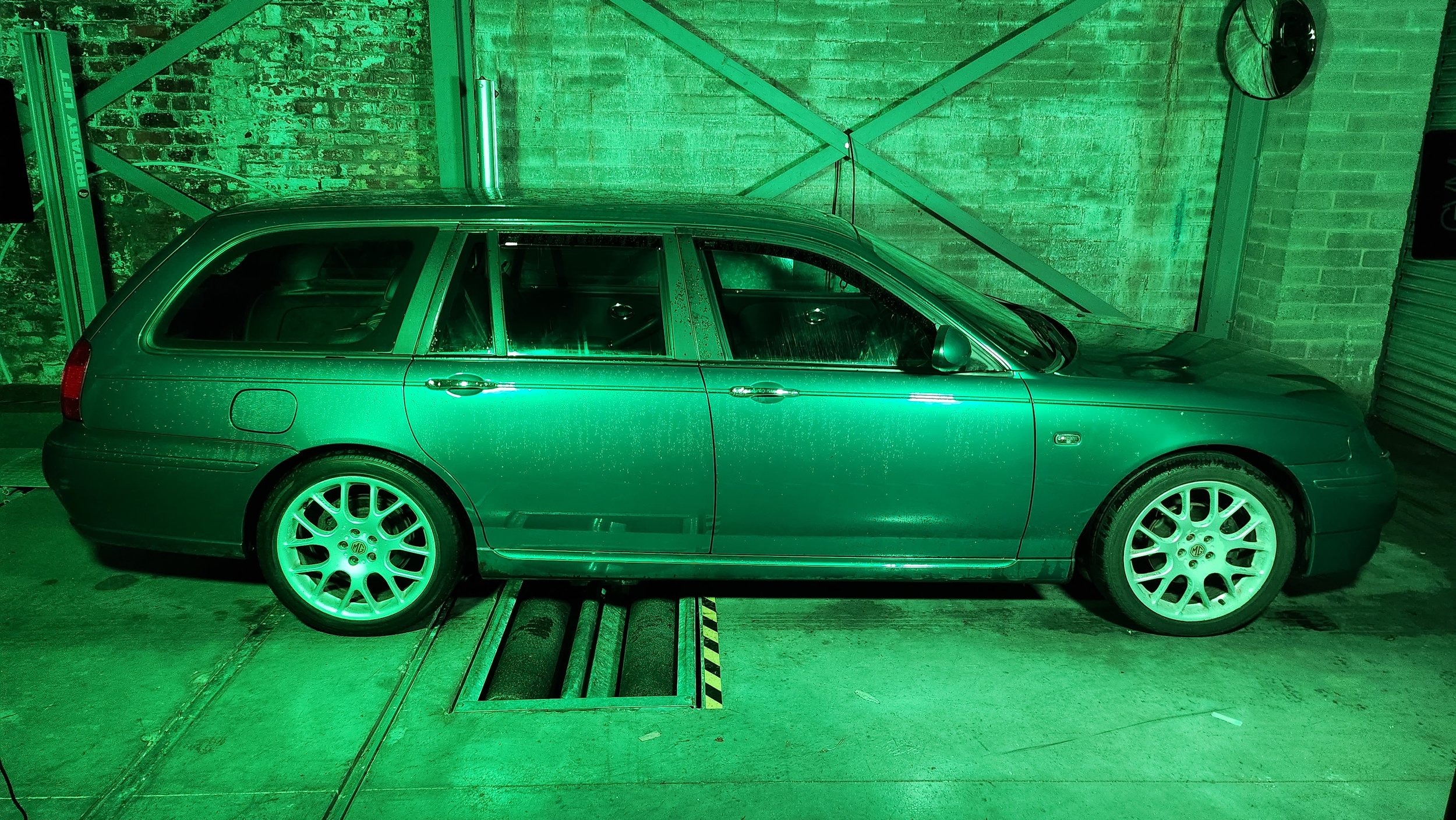
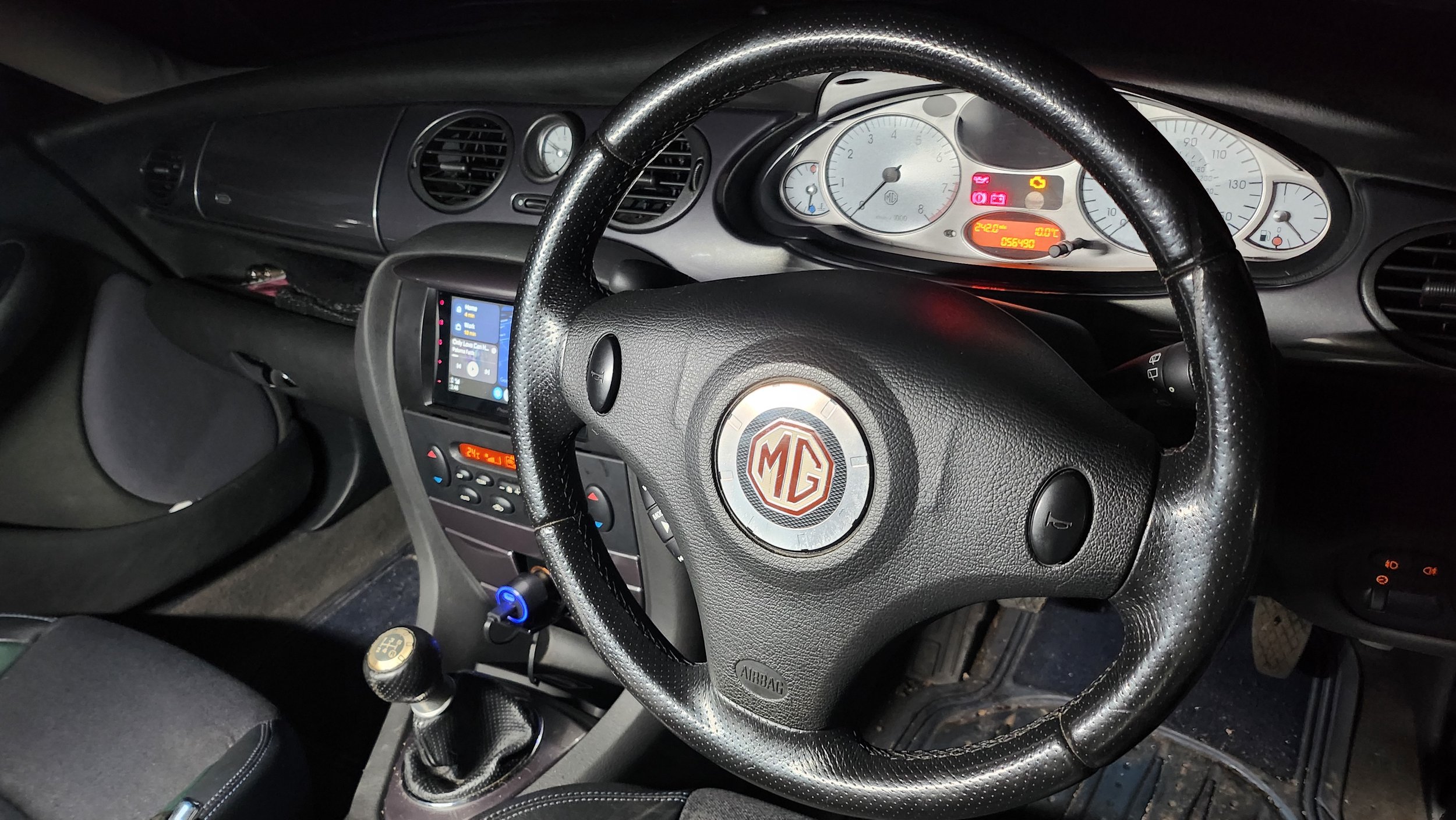
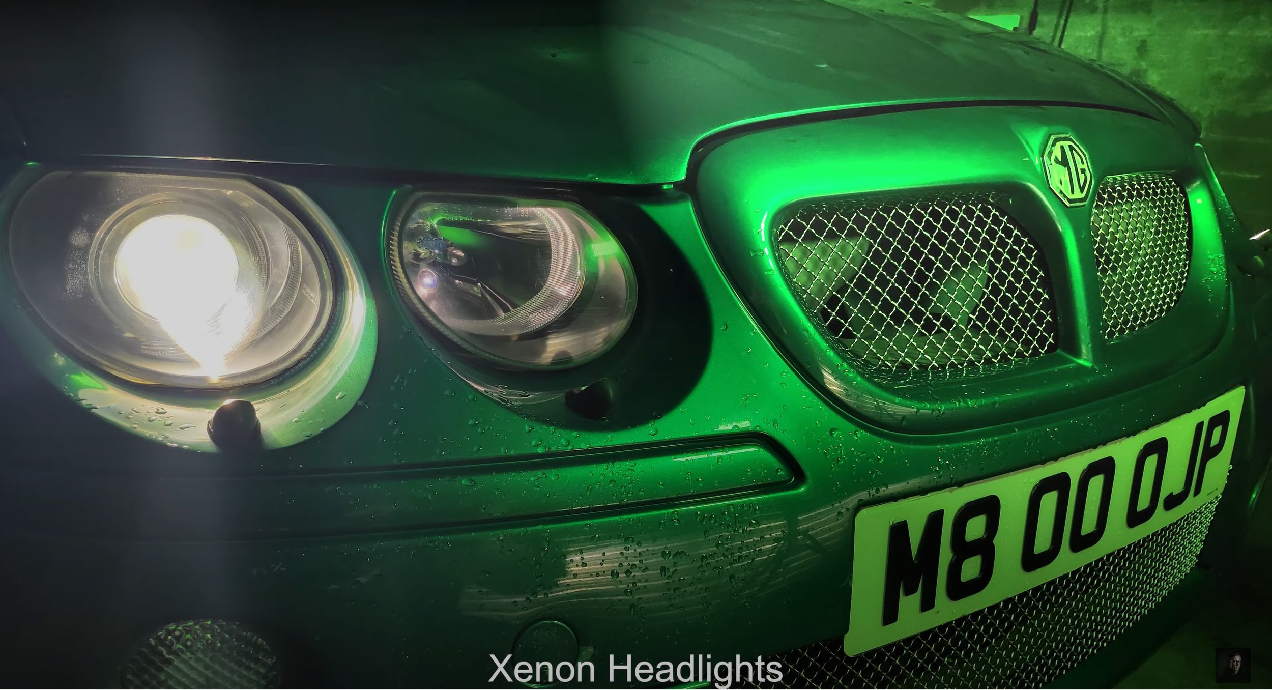
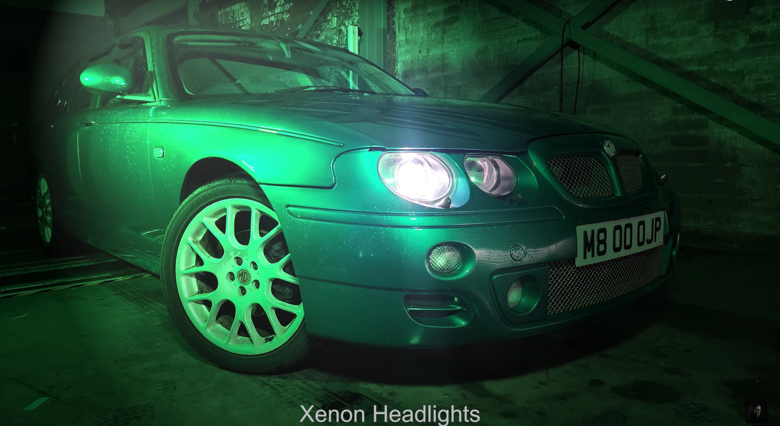
This is featuring the On Location Shots of the Television Advert Production, I have borrowed a fully functioning garage with a MOT Test Centre which happens to be down the road from Southport College. I spent one Sunday experimenting with the coloured LED lighting rigs to explore how I am going to shoot. I also was experimenting with a hand held light sabre which colour changes. After figuring out how I am going to shoot, in the afternoon on Monday I went back and photographed all the shot types and angles for the advert as I thought this was the best way to create this advert. Using bright white light or normal yellowy light didn’t do the car justice with its British Racing Green Colour, so I adopted for using a green light and it transformed the car on camera. I experimented with using a DSLR Camera and a mobile phone camera to see which one came out the best and it was my mobile which come out with the best results for this production, so I went with it. As you will be able to see, I shot from the driver side of the car because it is the best looking side compared to a dented wing and door. (which wasn’t my fault)
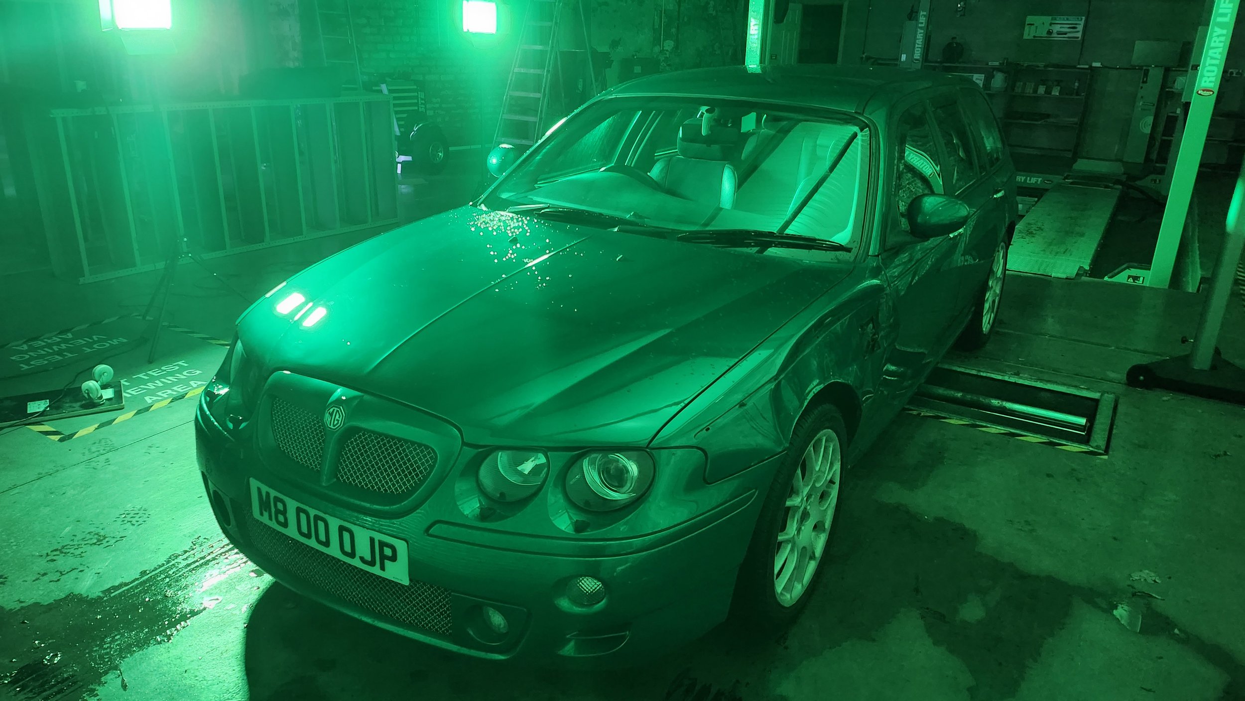
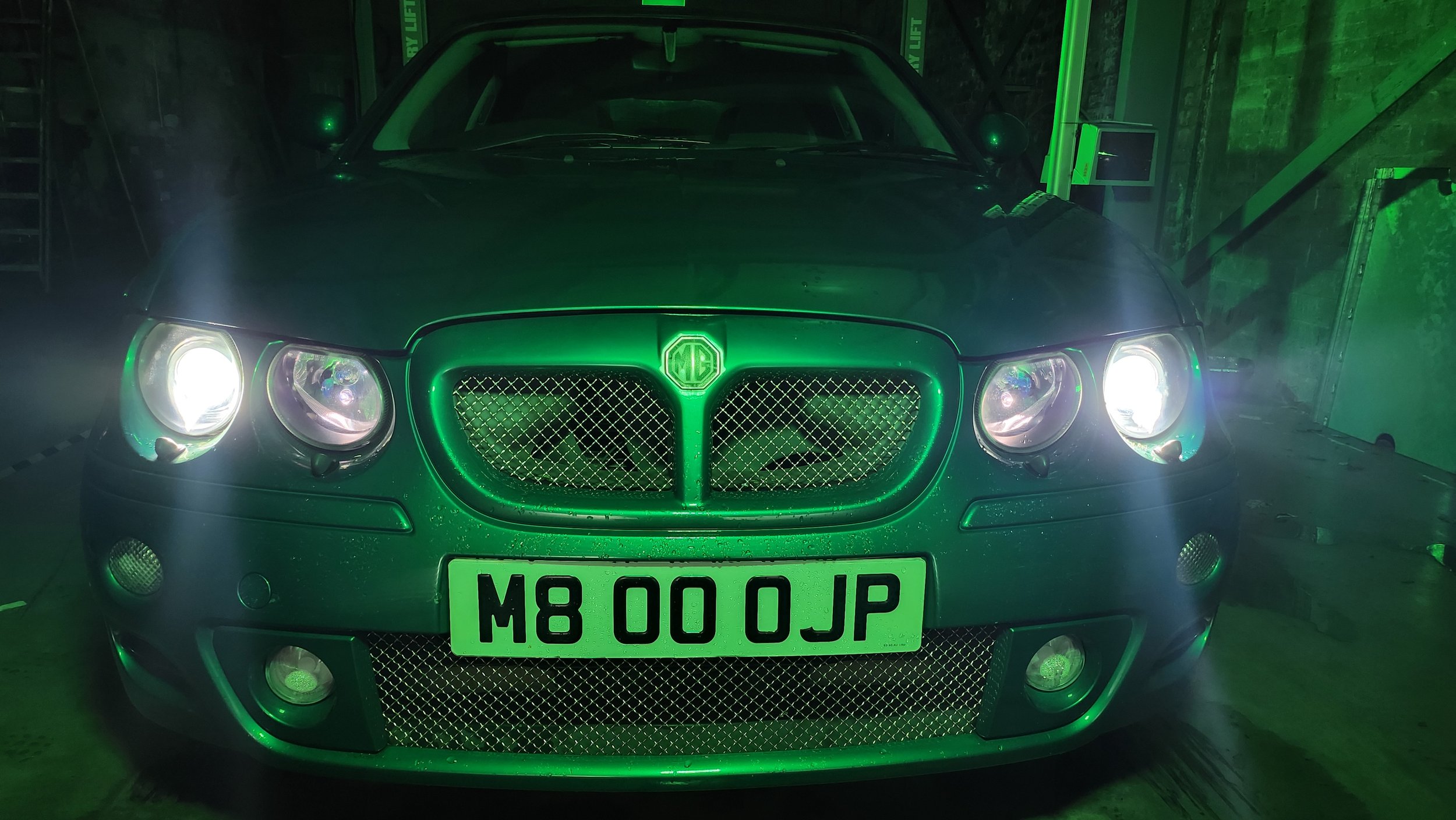
Production Photographs: -
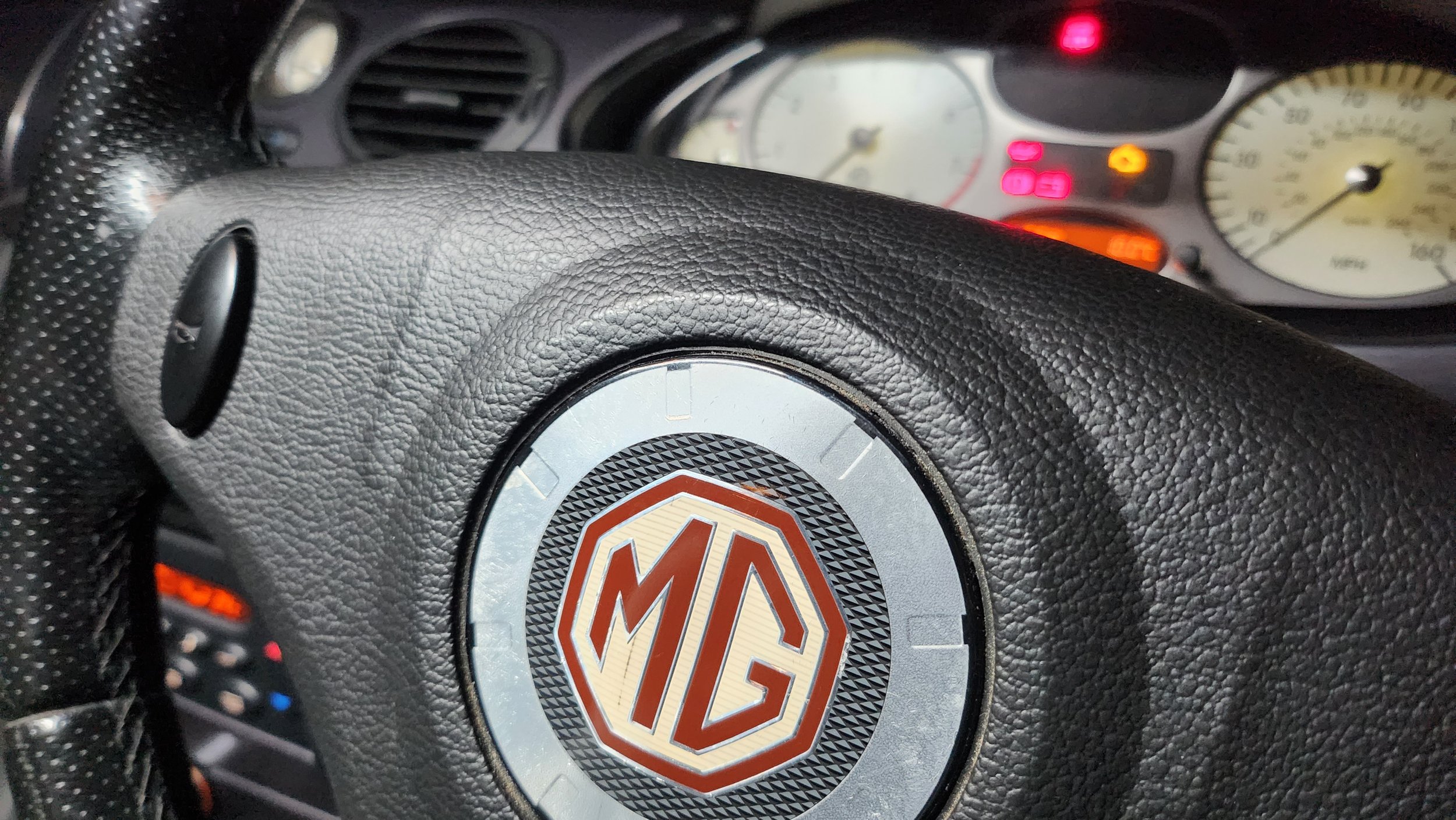
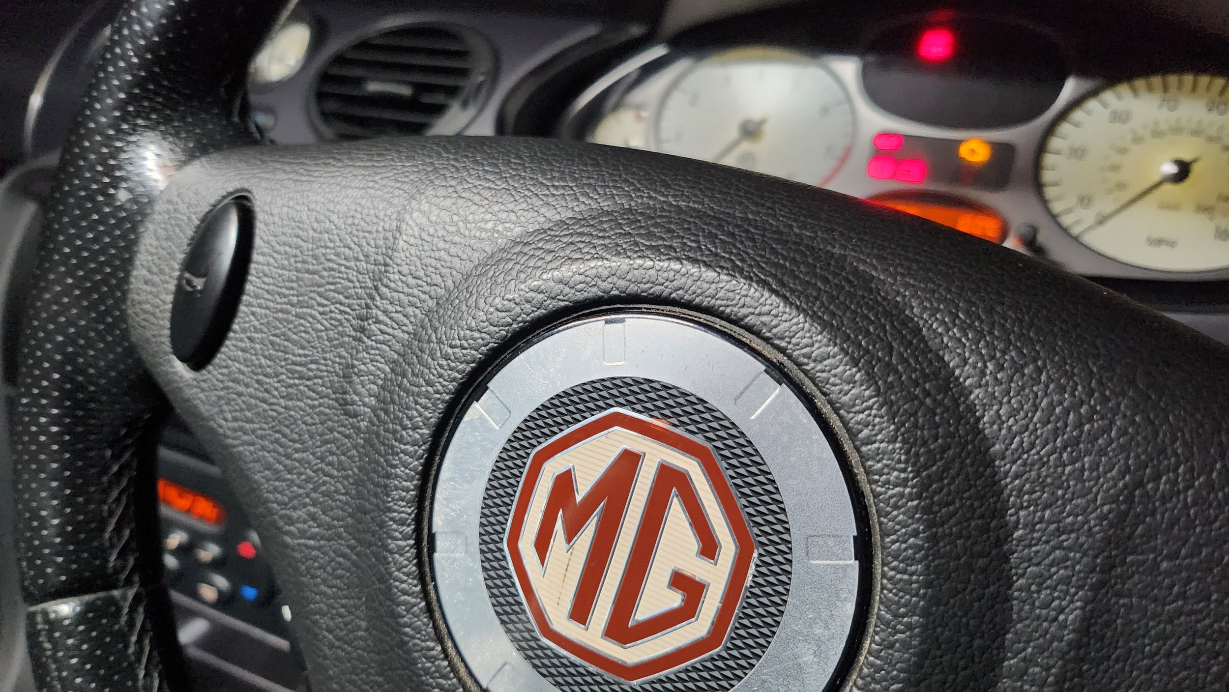
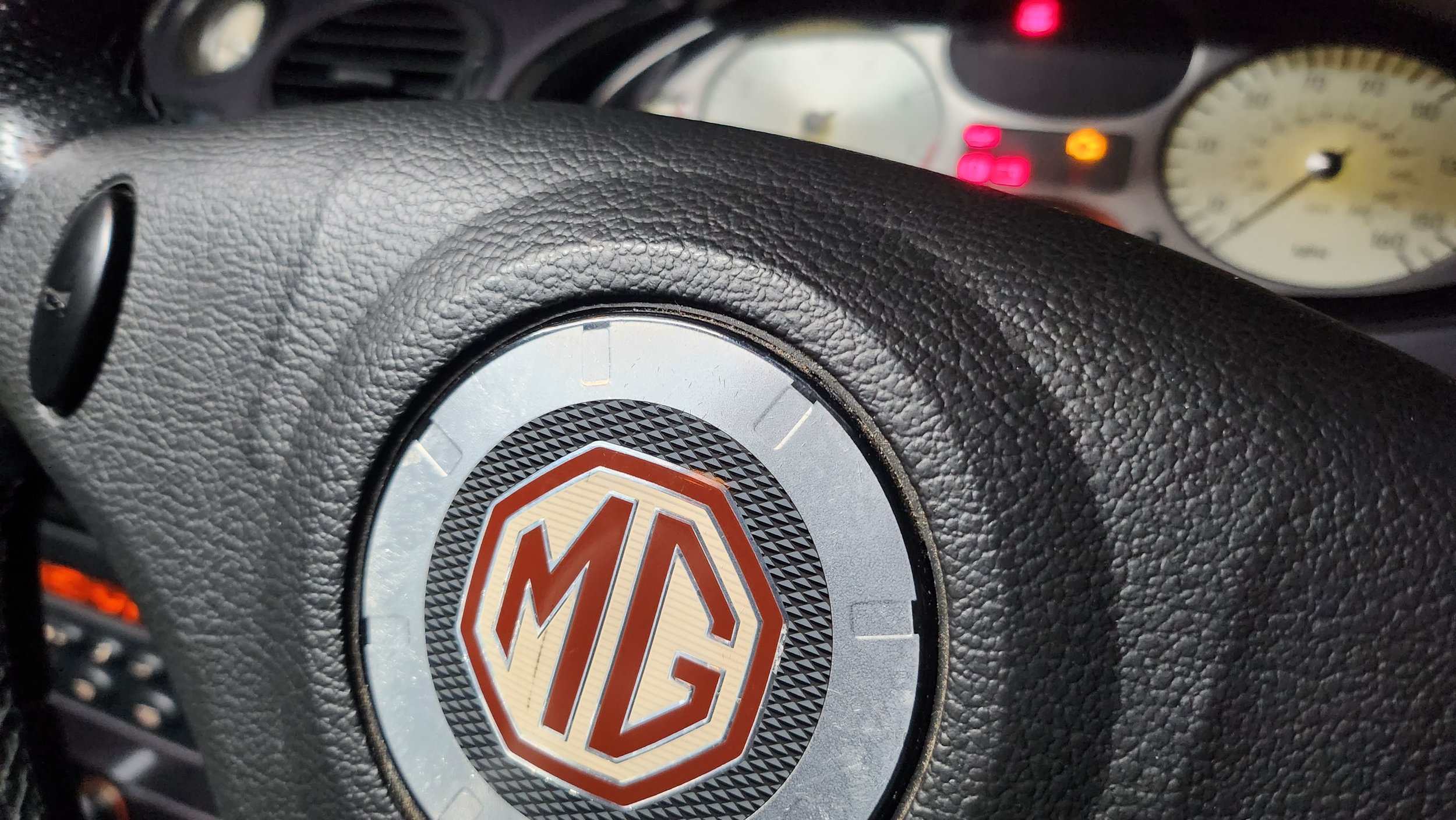
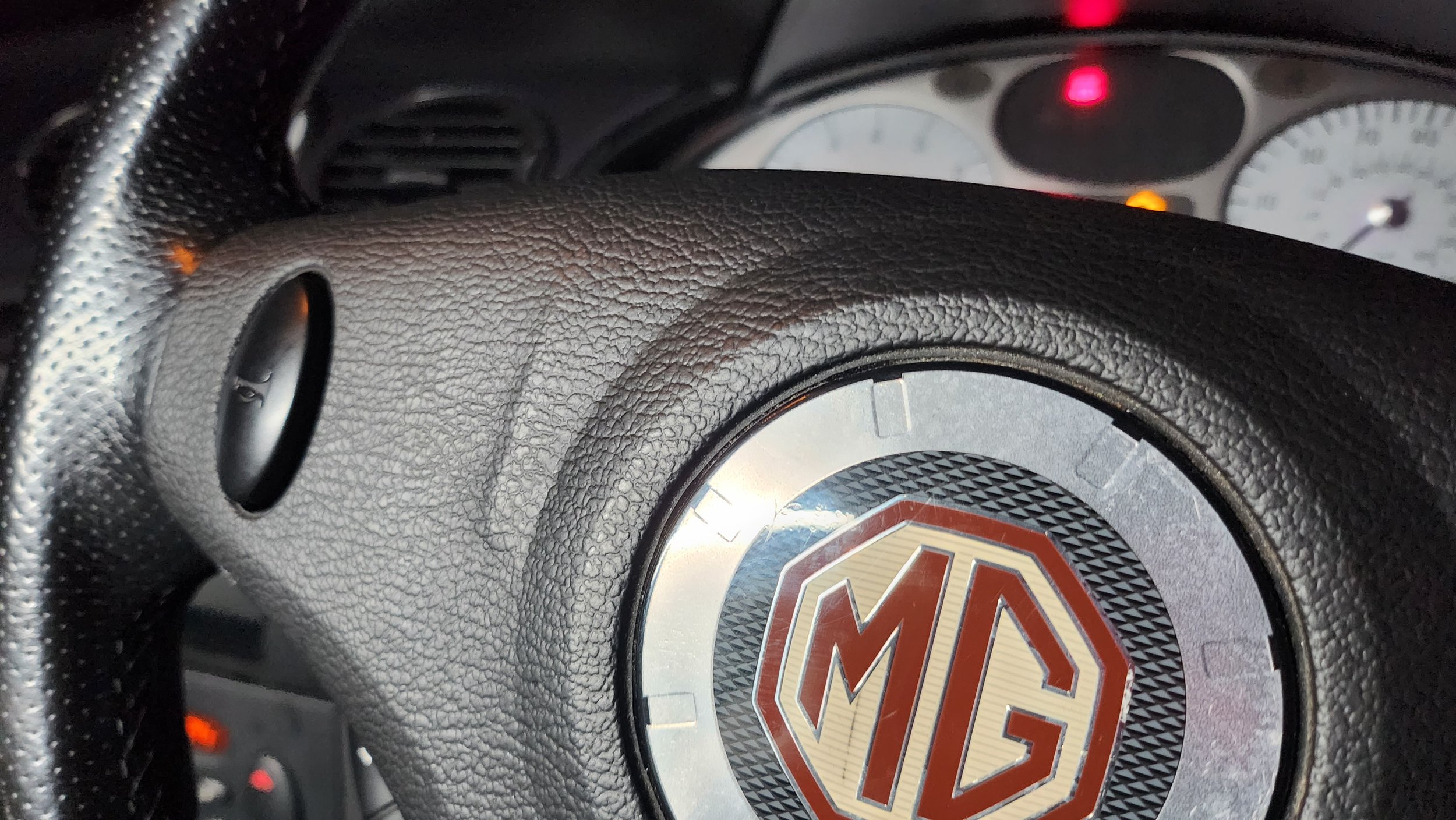
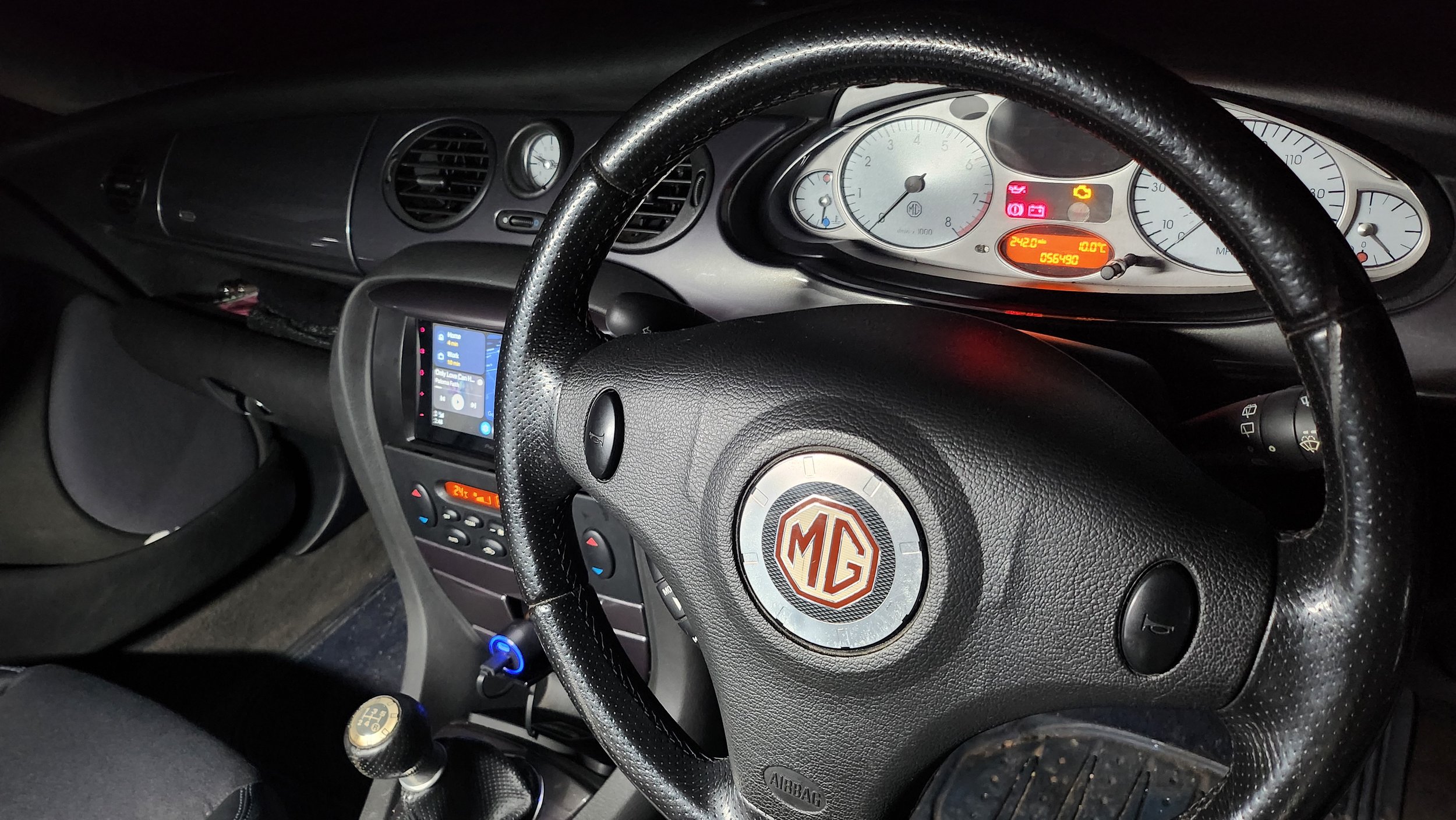
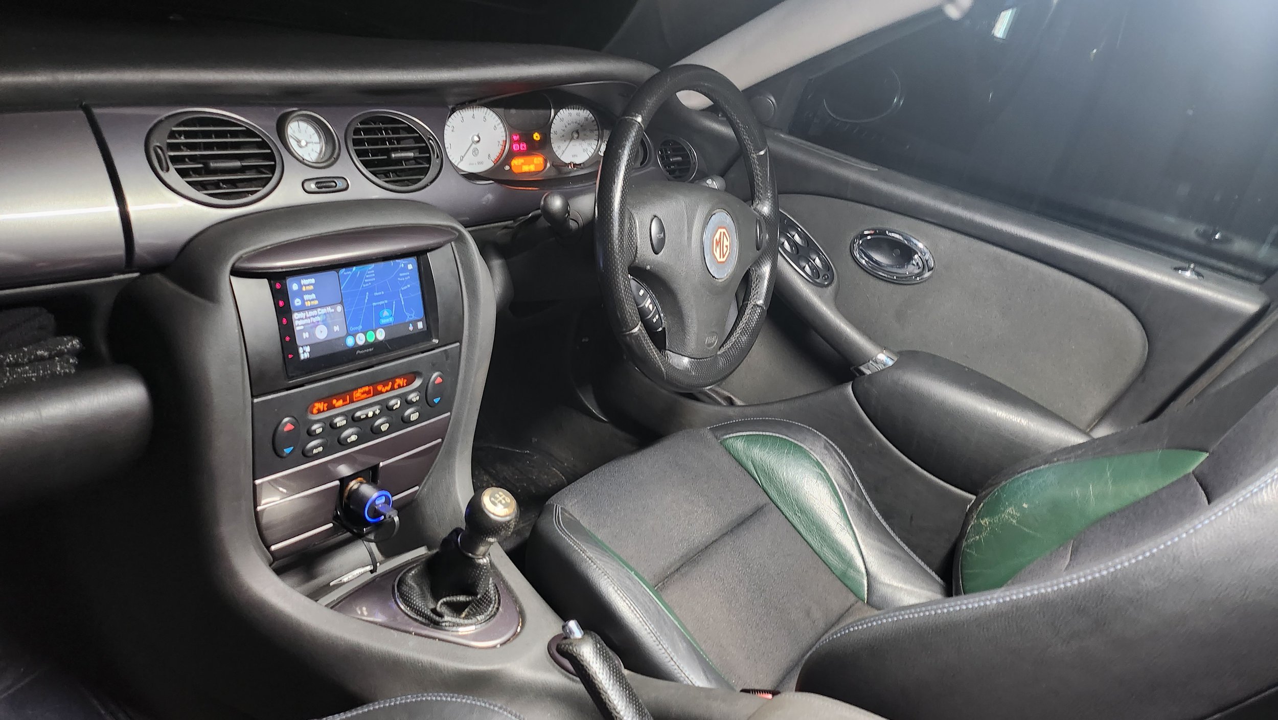
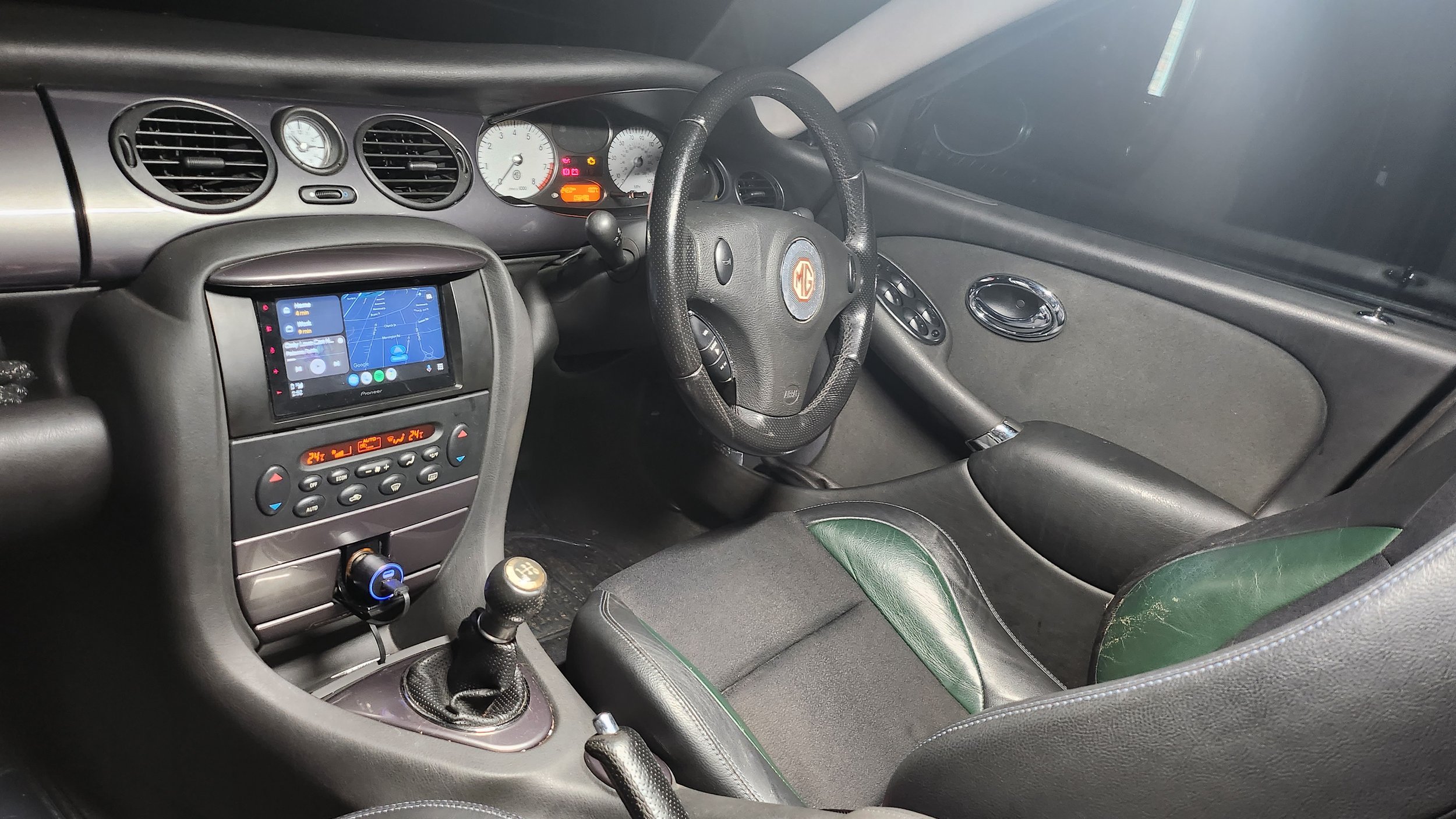
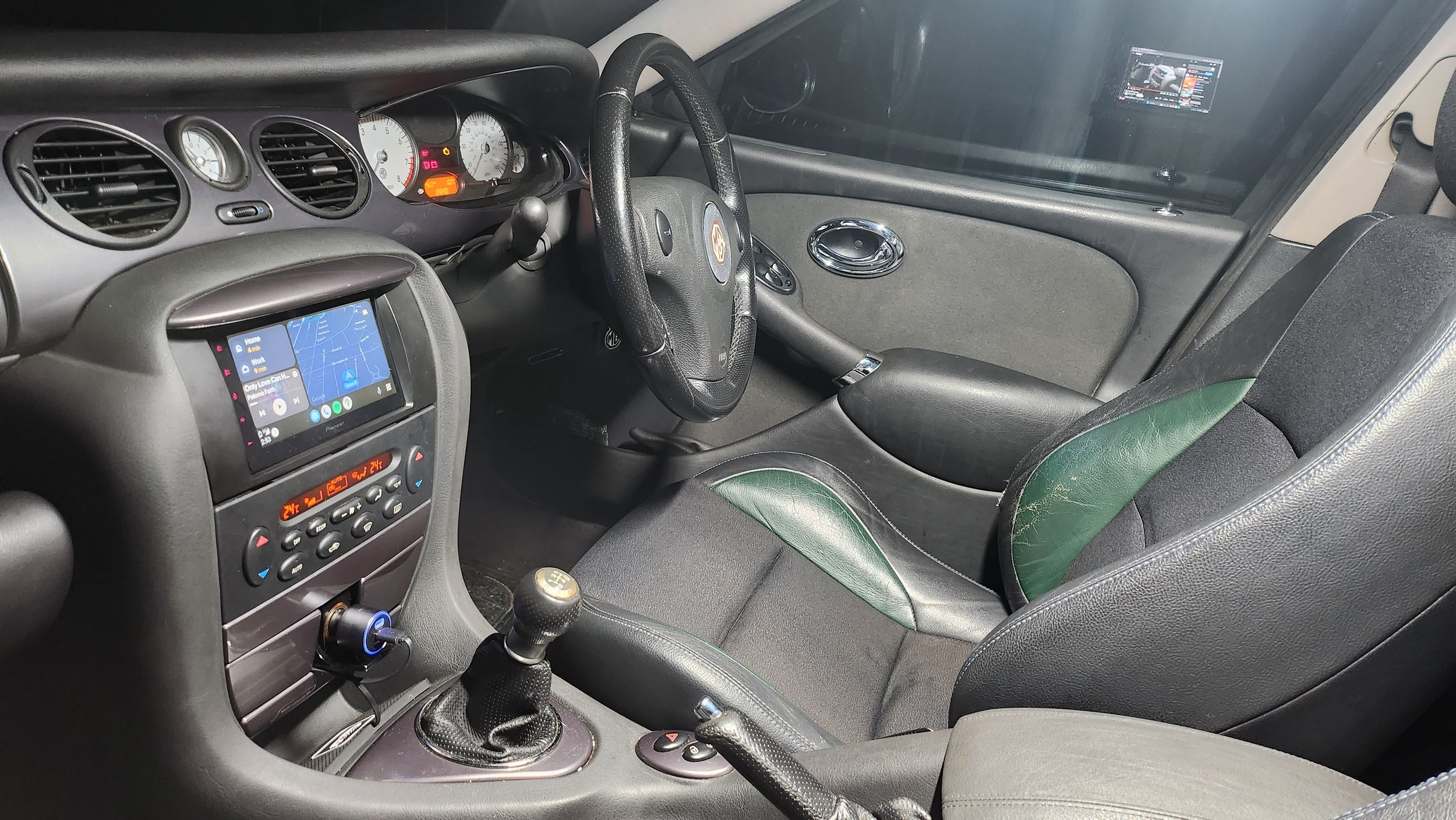
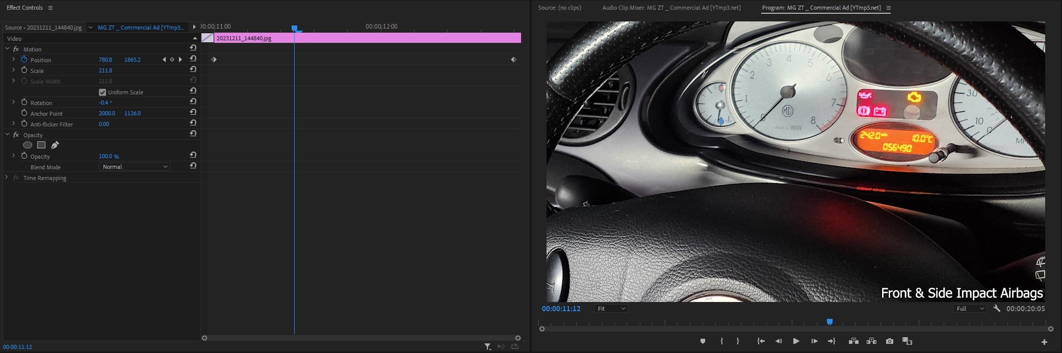
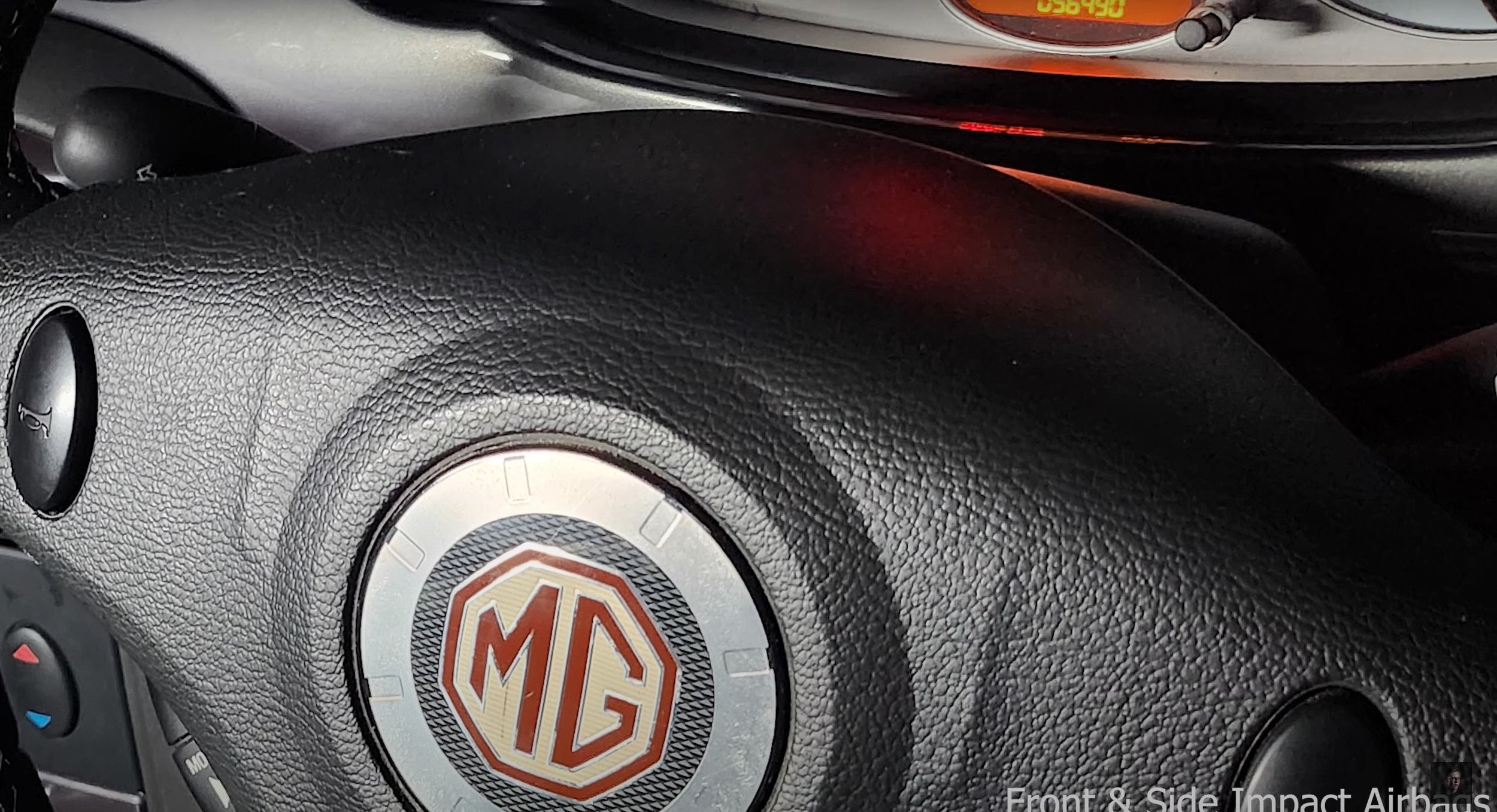
As you can see below, their is photographs which I have taken which I will be using in the advert. I have taken multiple images of the same angle or different angle from the same place so I can choose the best image to use in the final product. As you can tell the front images I have put on the Xenon headlamps and turned down the brightness of the camera on my mobile so you can clearly see the car and of course the headlights. As I said above I mostly shot the outside of the car from the drivers side of the car as it is the best looking side of the car currently. The interior images were shot by using the light saber on the brightest white setting and shot interior photos of the dashboard.
Post-Production
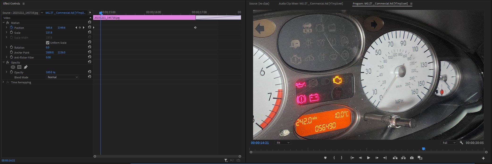
Premier Pro Timeline: -

As you can see above this is the timeline for my commercial production directly from Premier Pro. Firstly I will dissect the most obvious and easy things you can see from the timeline above, I will explain for in detail below about the glitchy transitions and lighting effects further on below.
First of all at the beginning and end I use the “film dissolve” transition which I use to show the start to finish of the video and it is very simple to use as you drag and drop it onto the image/clip. I have used a lot of “dip to white” effects to quickly transition from image to image but it was in line with the beat as it transitions. I have also added some text onto the images to show the specification of the car and what it comes with as standard. I used the standard arial font which is easy to read by anyone. Lastly in the last scene I added an image that I created using a website called myfonts.com which is where I created a font which I thought would relate and work with the words “Morris Garages” which is what “MG” stands for. I paired this png text image with the words in the arial “Presents The: ZT-T”. All this is a artistic decision made by myself.
Premier Pro In House Effects Used: -
Image One Glitch Effect

As you can see from the timeline above, this is how I created the glitch effect. As you can see their is time stamps above which represent certain aspects of the image to create this. The first set of time stamps, their is 4 at the top in row; they are in charge of the position of the image in the time frame created on the standard clip editing timeline. In this case it goes up and down then back to the default position. The next time stamps below, their are 13 in total in a row, they are in charge of the distortion and glitch effect and they decide in a timely order how and when should they happen on the image in the dedicated time frame set by the standard clip editing timeline. To actually create the effects, you have to play around with the “master amplitude” and the “colour distortion” to create the physical effects. I also used an effect called “VR Glitch Effect” which also helps create the glitch effect used above.
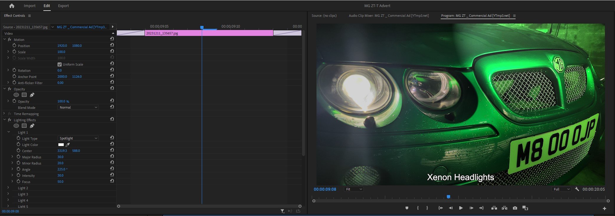
Image Two Lighting Effect

To create this particular lighting effect which shines a light in a straight line down the car in this case. You use a type of light which is called “Omni” and use the lighting colour as white and then what you do to animate it is create a straight line or squiggly line which shines the light in that direction, at the same time you use the centre time stamps to decide where the the light should start and finish. I also turned the brightness down around the circle to create a dark and mysterious atmosphere and make it look like it is specifically light up the car. This of course adds shadows to the background which shows the industrial aspect.
Adjustment Layer Transition to Image Three
For this transition, I created a adjustment layer which effects the clip it is encroaching and disrupts the stillness of the image. I used an effect called “Wave Warp” and this is the main thing which helps you create this effect, by altering the wave height and width makes the footage look like the footage has been disturbed or glitchy. I also set the direction of the glitch to happen at 90 degrees, I could of set it to 180 but it didn’t look as good as 90. I also set the wave speed to 5 and I also is set to effect every part of the image (all edges).
Lighting Effect For Image Four, Five & Six
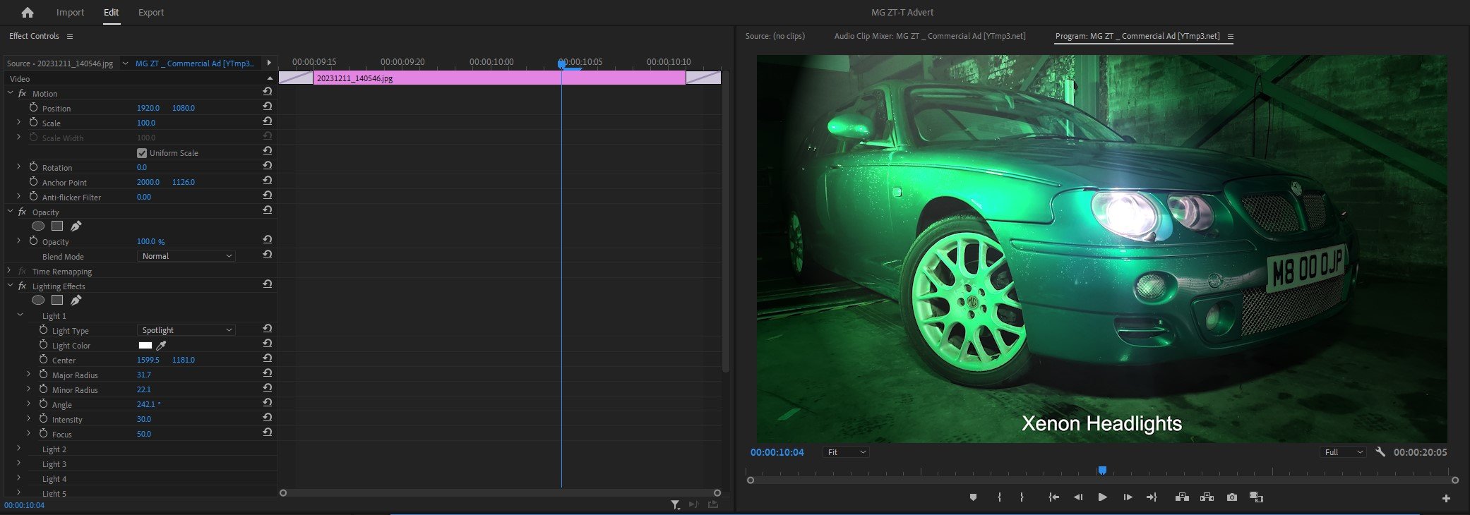
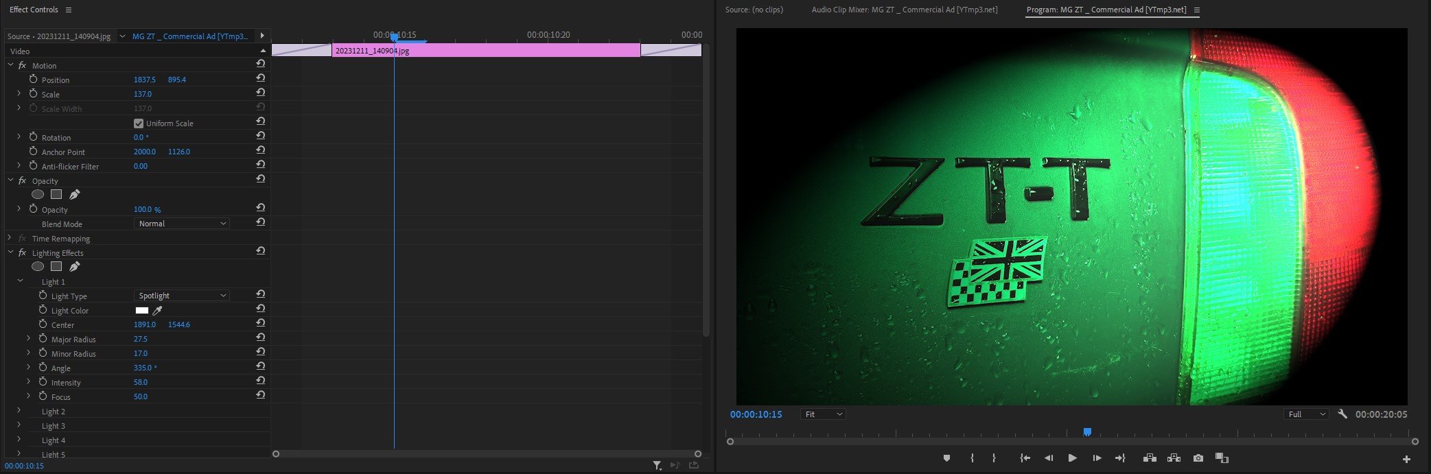
For these three images, I haven’t edited a crazy amount but what I have done is use the spotlight lighting effect overlayed onto the images in the places in which it looks good and left it. I haven’t timed them to come in using time stamps or anything like that, it is simply a overlay on top of the existing image. I have had to adjust the brightness of the background and altered the density of the lighting. As you can see above I have used the same concept through out with the images above, but altered the lighting to suit.
Animating Images For Seven, Eight & Nine
Lastly, To animate / move the images up and down the screen, a very similar concept to how I created the Omni lighting effect, I created a straight line down the image and the software simply follows the line but with a slightly zoomed in; so that the image doesn’t run off the frame when you animate it.
As you have read all of above, it looks fairly straight forward thinking about it and watching tutorials but doing it is a different thing, so I had to research to see how to do it. So below I have dropped in a little Bibliography so you can see where I learned how to do it and how I created these effects or transitions.
Compare & Contrast My Advert with the Original Advert: -
As you can see the obvious comparison is the angles are slightly different between the two adverts. I slightly changed them to make it look like my own film.
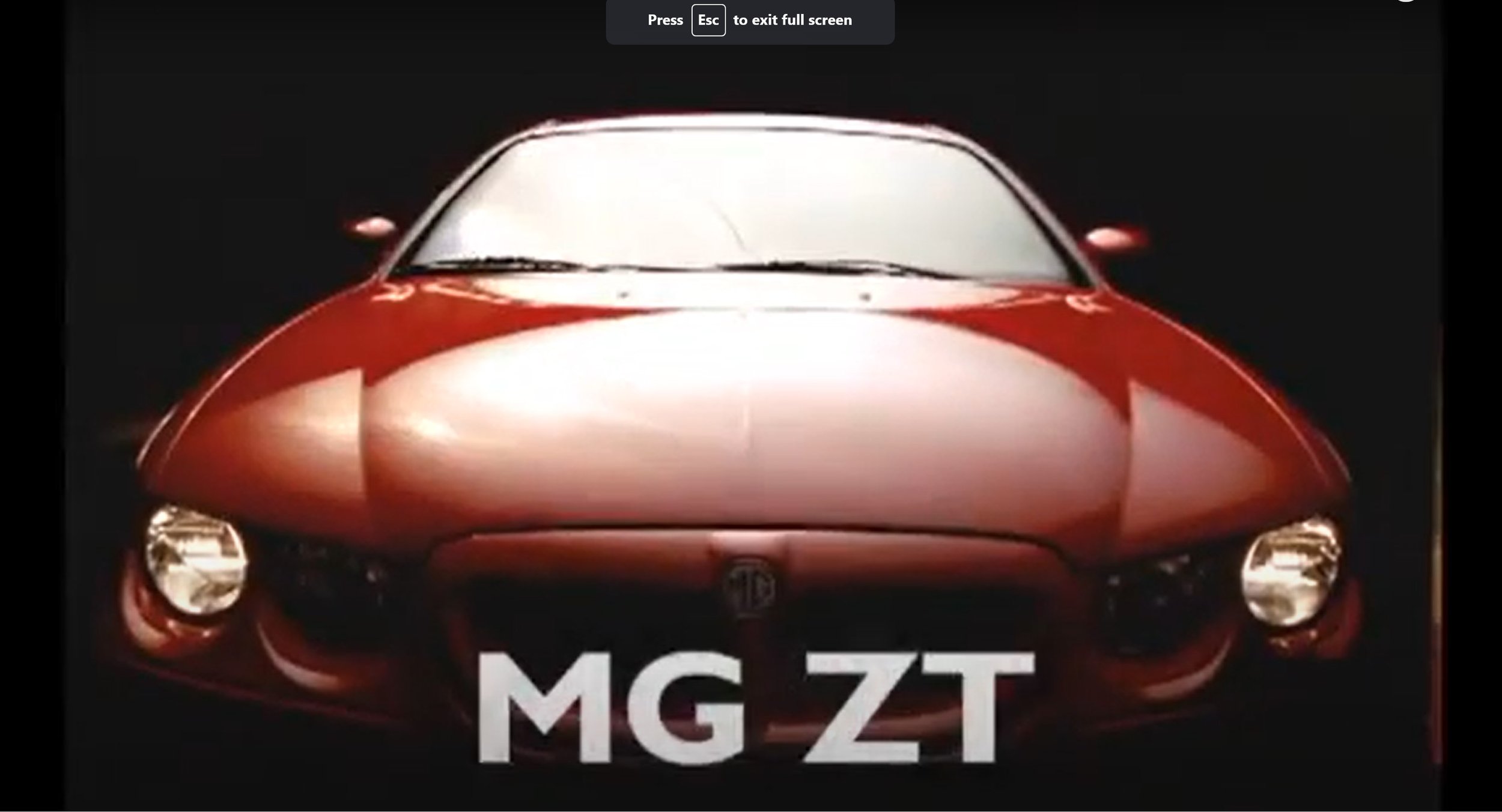
The huge different between my advert and the original one is that my video has the animated effect where the still image moves up and down and also it distorts at the same time. The original advert simply fades in and has the simple text which reads out “MG ZT” and then slide swipes up.
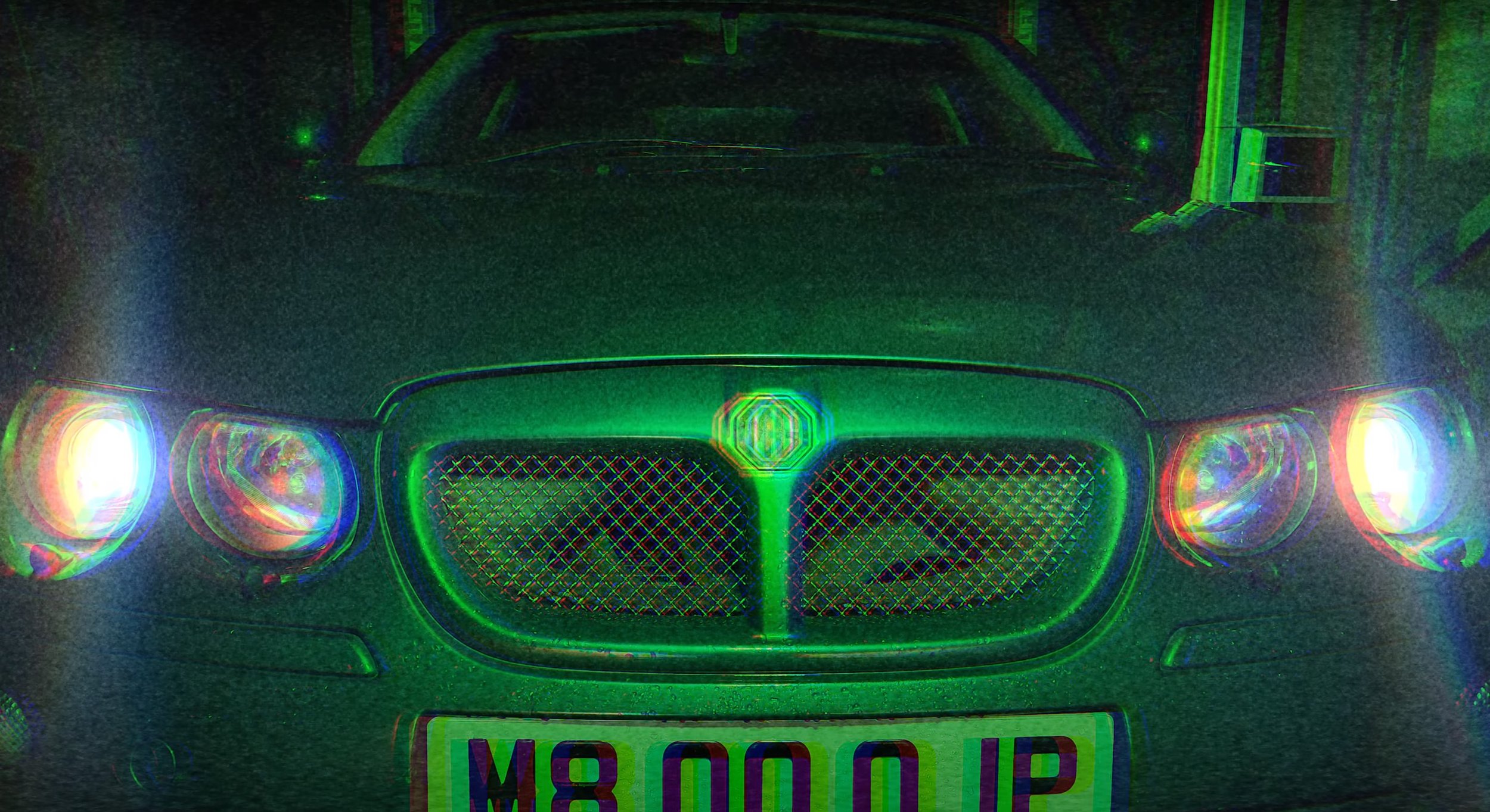
With both of these, I think the lighting techniques used in both mine and the original are brilliant, same wide shot used, but the cars are facing opposite direction. The techniques used are completely different as the originals uses a strong light to light the car up and mine uses what they call Omni light to simply shine a spec of light across the car.
The lighting techniques between the two adverts are different, I use a bright green light and the original advert is a standard white light which looks very glossy and shinny. The shot type is a low angle, The text is also different, they both read different things. For example mine reads about exhaust emissions and the other says performance figures.
The close up angle looks very similar between the two adverts, but angled slightly differently. The lighting is different as the original bright shinny light and my advert uses one spotlight shinning onto the car in green.
The low wide shot of the two cars is very different, the angles are slightly different as the original advert is angled more around the front of the car where as my advert is shot directly from the corner and shows depth to the car. The lighting techniques again are very different as in my advert I am using a green spot light coming down onto the wide of the car and the original advert shows the light directly coming from above lighting up the bonnet, roof and windscreen.
The original advert uses a slight Dutch angle and my advert uses a more straight on close up shot, the lighting techniques are very similar again with it on angle shinning onto the badge. Again my advert uses a green light and the original uses a bright white light.
The lighting techniques are very generic in these next three images, but the camera shot type is still a close up and the angle between the two adverts are different as my advert is slightly angled more at the steering wheel where as the original advert is angled more on a angle.
The shot types used are a close up, and the angles are very similar when comparing them to each other.
The huge difference between the two images is that my advert is more zoomed in onto the dials and gauges. The camera angles are different with these because the original is set at an angle when it pans across and my advert is less on angle and more head on at it as it pans across.
Compared to the beginning there is nothing really going on in this part of the original advert apart from the flickering text and logo and the headlamps are off, with my advert it is the same image used at the beginning but without any distortion or glitchy effects, I have only added special text which I created and I have left the headlamps on as I think that looked the best.
Bibliography: -
https://youtu.be/_MYBC4Yy7kk?si=ErkGPmNqolCPJIMH - Glitch Effect Tutorial
https://youtu.be/hx3jD6ngWLU?si=nOVzR8D2Fpz2wCjz - Lighting Effect Tutorial
https://youtu.be/pCvWwIetM1g?si=r0kOLw8D1Y4CSEDD - Still Image Animating Tutorial
https://youtu.be/cdEwVWF-4Lc?si=L27uYq65tGAkQ4vm - Glitch Transition Tutorial
Presentation
Evaluation & Reflection
Annotate three strengths & three weaknesses of the final TV commercial?
To start with the obvious thing, the post-production editing of this advert was good, coming from the glitchy effects at the beginning to the light effects. I spent a good half an hour experimenting with all the different options of how to do it and picked my favourite that looked the best for this production. Animating the still images was another thing which worked well and looked good. Secondly the camera angles and shot types which I shot looked good, I took multiple of the same shot so I could pick the best looking one, bearing in mind I didn’t use a tripod, so I thought I did well with that. Lastly, the production lighting techniques used were another thing I thought I was happy with because I experimented a lot to make sure there were hardly any catchlight shown in the still images, it wasn’t perfect, but it all worked how I intended it too.
Moving onto my weaknesses, I could have switched up the type of shot types and angles which I used then replicating the ones in the original advert from MG Rover. Secondly, I wish the lighting rigs were little bit better because they weren’t as good as I’d hoped. I think the white light would have looked far better, but it didn’t seem bright enough for my production, hence why I stuck with green light as I had a green car, so it worked well from that point of view. Lastly, some of the lighting effects used, for example on the low wide shot of the car, the post-production spotlight looked odd in that place and didn’t fit in with the video.
Who was the intended target audience for the TV Commercial?
The intended target audience for this car is 25 years and plus because of the type of car it is, it is an estate car. The age group it is mainly targeting is people who want family car which comfortably fits 4 people and plenty of luggage space, but they also want a sporty type of car. This car will not attract a younger generation from 17 years and up because of how expensive stereotypically it is and, they would not want to be seen driving an old person’s car.
What were the key areas of development during this unit work?
Experimenting with lighting techniques was a huge factor through out with this assignment because I wanted to create my advert with my car and fancy lighting techniques. As you saw throughout my advert, the main lighting used in the production was green and the reason why it was is because the cameras that I used wouldn’t pick up normal white light, even experimenting with camera settings didn’t work either. The best results that came out was using my phone camera and that really bought out the right kind of light for this production, but already knew that most of this would be altered in the editing stage.
Aside from that, I learned a lot about how to distort and glitch the camera in the editing stage, using video tutorials to help me, they shown me how to do it. Secondly, I learned how to create more lighting effects is another thing I learnt and how to move it like a spotlight. Lastly, I also learnt how to animate images, this made normal still images move and it sets the whole off the whole production when done correctly.
Authentication Document